

.avif)

What Is the Ideal QR Code Size on a Business Card? (+ Design Tips)
On This Page
You hand a business card to someone who might be your next client, they point their phone at the QR code, and nothing happens. Small mistakes in QR Code size on business card, contrast, quiet zone, module size, placement, or resolution can turn that moment into a missed connection. This article provides clear size rules, placement tips, and quick tests to help you design a business card with an optimal QR code size that’s easy to scan, visually appealing, and enables you to maximize professional connections.
Mobilo’s digital business card puts those rules into practice by offering tested sizing, clean layouts, and fast mobile scanning so your QR codes work reliably and your design stays professional.
Summary
- Small QR codes fail more often because cameras lose effective resolution; use the 1:10 rule for distance-to-code height. For example, a 12-inch scan distance requires about a 1.2-inch-tall code, and denser payloads increase the minimum size.
- Design guidance is clear: use 0.8 x 0.8 inches (2 x 2 cm) as the absolute minimum for short redirects, 1.2 x 1.2 inches for richer vCard content, and budget about 1.7 x 1.7 inches for full static vCards or when older phones are in scope, or aim for roughly 30 percent of card width when layout permits.
- Pilot and acceptance benchmarks prevent costly reprints: run a 50-200 scan pilot across representative devices and lighting conditions, and set a pass threshold such as 90-95 percent successful scans within two attempts, or a stricter 95 percent first-attempt success, with a median time-to-read under three seconds.
- Placement and breathing room matter as much as size. Provide at least 1 centimeter of clear, quiet space, which improves scan success by about 50 percent, and place codes at eye level or in the upper-right area, since 70 percent of users are more likely to scan when a code is at eye level.
- Production choices change the numbers, proof at final size on the actual press at a minimum of 300 DPI, and increase physical code size by roughly 10 to 25 percent for high-gloss, embossed, or metallic finishes to preserve module definition.
- This sizing and placement discipline matters at scale because 85 percent of consumers have scanned a QR code at least once, and 70 percent of marketers plan to increase QR use, so small layout mistakes compound into missed contacts and noisy CRM records.
Mobilo's digital business card addresses this by providing tested sizing defaults, scan analytics, and admin controls to standardize placement and validate scan performance before mass printing.
Why Do QR Code Sizes on a Business Card Matter?
Size matters, and not just a little. If you undersize a QR code, scans fail; if you oversize it, the card stops feeling like a business card and starts feeling like an instruction sheet. Get the dimensions right, and you protect conversion, brand perception, and the quality of leads you capture.
How Does Size Change Scanability?
Smaller codes reduce the camera’s effective resolution on modules, so phones struggle to resolve the pattern in real-world conditions such as low light, shaky hands, or quick handoffs at events. The practical rule of thumb I use is a 1:10 ratio; the scanning distance divided by code height should be about 10:1.
That gives you a simple way to calculate the minimum height. If people will scan from roughly 12 inches, the code needs to be about 1.2 inches tall. A dense payload or a high error-correction setting increases the number of modules and requires a larger minimum size for reliable reads.
What Breaks When Size Is Wrong?
This problem appears consistently across networking events and print runs. Tiny codes fail in poor light and during quick exchanges because autofocus and hand motion consume precious time; oversized codes disrupt the visual hierarchy and reduce trust in the card’s craftsmanship.
I’ve seen teams ship a single artwork to everyone because it was easiest, then watch follow-up form completions fall and CRM records become messy because many scans timed out, or users gave up before data entry. That friction looks small, but it compounds into lost conversations and noisy lead data.
How Should Teams Pilot and Benchmark QR Sizing?
Most teams handle sizing by guessing a size and printing thousands, because that approach feels low-effort and familiar. That works at a small scale, but as event volume grows, it increases costs, such as reprints, lost leads, and additional CRM cleanup.
Teams find that running a short pilot avoids those costs. Run a pilot with 50 to 200 real scans across the environments you expect, log time-to-first-success, and set a pass threshold, for example, 90 to 95 percent successful scans within two attempts.
QR Scan Testing & Analytics
Checkpoints should include scan-time analytics, device variety (including older phones), lighting scenarios, and post-scan redirect accuracy for CRM integration and UTM tracking. Platforms like Mobilo provide admin controls, CRM connectors, and scan analytics that let teams iterate on sizing and measure lift without reprinting thousands of cards.
What Design Tradeoffs Should You Watch?
Think of the QR code as a functional element within a visual composition. You must leave the quiet zone around it, maintain a strong contrast between modules and background, and avoid decorative treatments that obscure module edges.
Higher error correction improves wear and logo-overlay resistance but increases module count and minimum size. If your brand needs a subtle aesthetic, choose a slightly higher-contrast palette and keep the type size modestly larger to compensate, rather than shrinking it and hoping for the best.
Practical Checklist for Rollout
- Estimate typical scan distance, apply the 1:10 rule, and compute a minimum code height for each touchpoint, from handshake cards to counter displays.
- Control data complexity: Reduce the payload or use short redirect URLs so the QR matrix remains simple and scannable even at smaller sizes.
- Run the 50–200 scan pilot across representative phones and lighting conditions, record the success rate and time-to-scan, then lock the size once the benchmarks meet your threshold.
- Validate end-to-end: Confirm redirects, CRM field mapping, opt-in flows, and audit logs for compliance before mass print.
Related Reading
- Best Business Card Scanner
- What Makes a Good Business Card
- Business Card Trends
- QR Code Marketing Strategy
- What Are NFC Business Cards
- Professional Networking Tools
- New QR Code Technology
- Best Paid QR Code Generator
- What to Include on a Business Card
What Is the Ideal QR Code Size on a Business Card?
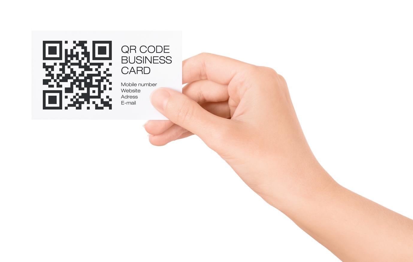
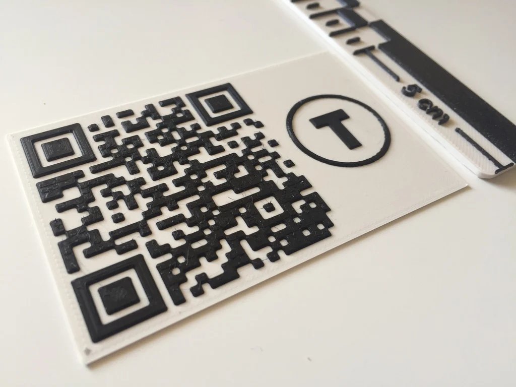
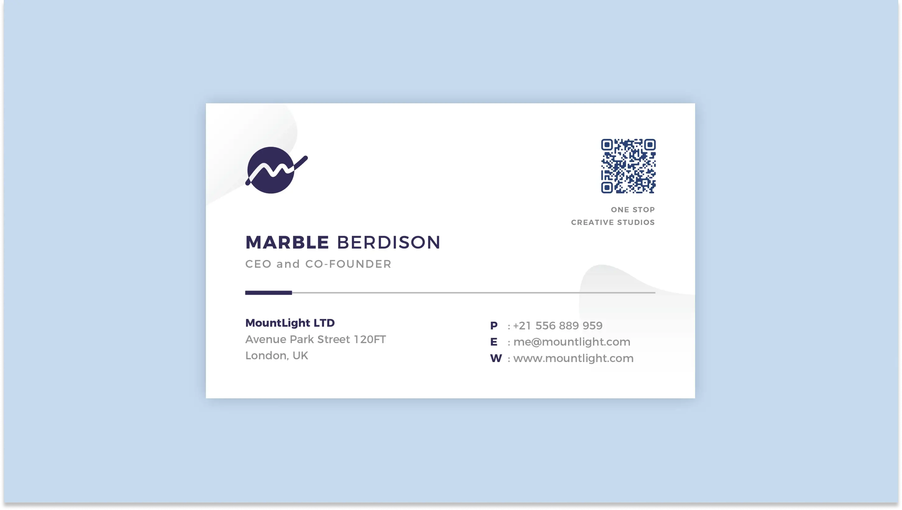
Pick sizes that match the data you need to carry and the production realities you face. Use 0.8 x 0.8 inches (2 x 2 cm) as the absolute minimum for simple URLs and short redirects, and use 1.2 x 1.2 inches (3 x 3 cm) or larger when storing richer contact content or overlaying logos. Keep a quiet zone around the code of at least four modules, prefer dynamic short-URL codes for enterprise cards, and always proofread at the final print scale on real phones before ordering runs.
How Should I Decide a Minimum Versus an Optimal Code Size?
Start with two practical thresholds, then adjust for real-world constraints. The baseline minimum, 0.8 x 0.8 inches, is what I treat as the smallest tolerable size for a clean redirect URL, and it follows the Graphic Design Stack Exchange recommendation that the minimum size for a business card QR is 2x2cm to ensure reliable scans. For anything denser than a short URL, increase the code so modules remain readable, with 1.2 x 1.2 inches as a practical working minimum for vCard-style payloads.
If your design permits, aim for a visually dominant code that is roughly 30% of the card’s width to balance visibility and layout, following the common guidance that using about 30% of the card's width keeps the code both scannable and design-friendly.
Why Do Printing Resolution, Finishes, and Card Size Change the Numbers I Should Use?
If you print on low-resolution presses, textured stock, or add varnish and foils, the practical edge definition of each module degrades. That contrast compression forces you to increase the physical code size so modules remain distinct to phone cameras. When we batch-produce premium cards, we always proof at final size on the same press and finish, because what looks crisp on-screen can blur after coating.
Treat the printer and finish as part of the specification, including 1:1 proofs, a minimum 300 DPI artwork, and inspection of the actual cutter and the corner radius. Then increase the code size by 10-25 percent for high-gloss or embossed treatments.
Do Static and Dynamic QR Codes Change the Minimum Size I Must Use?
Yes, and the effect is predictable. Static vCard codes embed full contact payloads, which increases the number of modules and raises the required minimum physical size, because each module becomes smaller as the matrix becomes denser.
Dynamic codes store a short redirect URL, so they typically render with fewer rows and columns and remain scannable at smaller sizes. This is why professionals choose dynamic codes to avoid trade-offs between data richness and scan reliability and to enable updates without reprinting.
How Do I Calculate Size When My Code Carries Different Amounts of Data?
Think in module density and viewing distance, not just inches. For denser static vCards, plan for a larger matrix, so each module prints at a defensible physical size. For dynamic redirects, you can assume a much lower module count, resulting in a smaller printed footprint.
Practically speaking, if you must include a full, static vCard on the card, budget at least 1.7 x 1.7 inches for scans from a typical handheld distance. If you use a dynamic short-URL vCard, 0.8 x 0.8 inches is a safe starting point. Always proof with the most constrained phone in your pool, because older devices and cheaper cameras are the ones that will fail first.
What Production and Layout Traps Cause Good Codes to Fail?
Rounded corners, heavy type near the quiet zone, UV coating that pools at edges, and cutter creep that clips a module will all kill reads. Another silent failure mode is placing the code too close to an edge where a die line or enclosure interrupts the quiet zone.
I have seen teams approve an elegant layout, only to see scan rates drop when a specialist's finish reduced contrast in the code's shadows. The fix is a production checklist that includes 1:1 printed proofs, quiet zone verification with a ruler, and scan tests after coating but before complete runs.
When Should Teams Treat Sizing as a Governance Decision, Not a Design Preference?
When cards are issued at scale, the familiar approach is to select one artwork and print thousands of copies because it is quick and straightforward. That works early, but as distribution grows, small sizing mistakes compound into missed conversations and messy CRM records.
Teams find that solutions like Mobilo, which combine digital card controls, CRM integrations, and admin governance, enable them to centralize updates and measure scan performance, reducing reprints and improving data hygiene while maintaining compliance controls such as SOC 2 and GDPR.
What’s a Rigorous, Practical Testing Protocol for Sizing Before a Full Print?
Run a controlled pilot that captures a variety of failure modes. Use at least 100 scans across five distinct handset models, across bright, dim, and mixed lighting, and measure first-attempt success and median time-to-read.
Set an acceptance benchmark, for example, 95 percent first-attempt success and median time-to-read under three seconds, then reduce payload complexity, increase physical size, or raise contrast until you meet the target. Log device types, firmware where practical, and the post-scan redirect path so you can reconcile failures with CRM ingestion and UTM tracking.
How Should Designers Balance Branding Against Scannability in Real Campaigns?
Design choices are tradeoffs. If you prioritize a perfectly symmetric layout or a tiny logo-embedded code, accept that you will need to increase the size or add error correction to compensate.
Higher error correction detects damage and overlays, but it also increases module count, which raises the minimum size. Limit decorative treatments that alter module edges, preserve the quiet zone, and choose dynamic codes so the landing experience carries brand elements rather than forcing them into the matrix.
Related Reading
- How to Put Linkedin on Business Card
- How to Share Linkedin QR Code
- How to Add Instagram QR Code to Business Card
- QR Code Instead of Business Card
- How to Scan QR Code on Iphone
- Aztec Code vs QR Code
- How QR Codes Work
- QR Code Analytics
- Linkedin QR Code Business Card
- How to Create Vcard
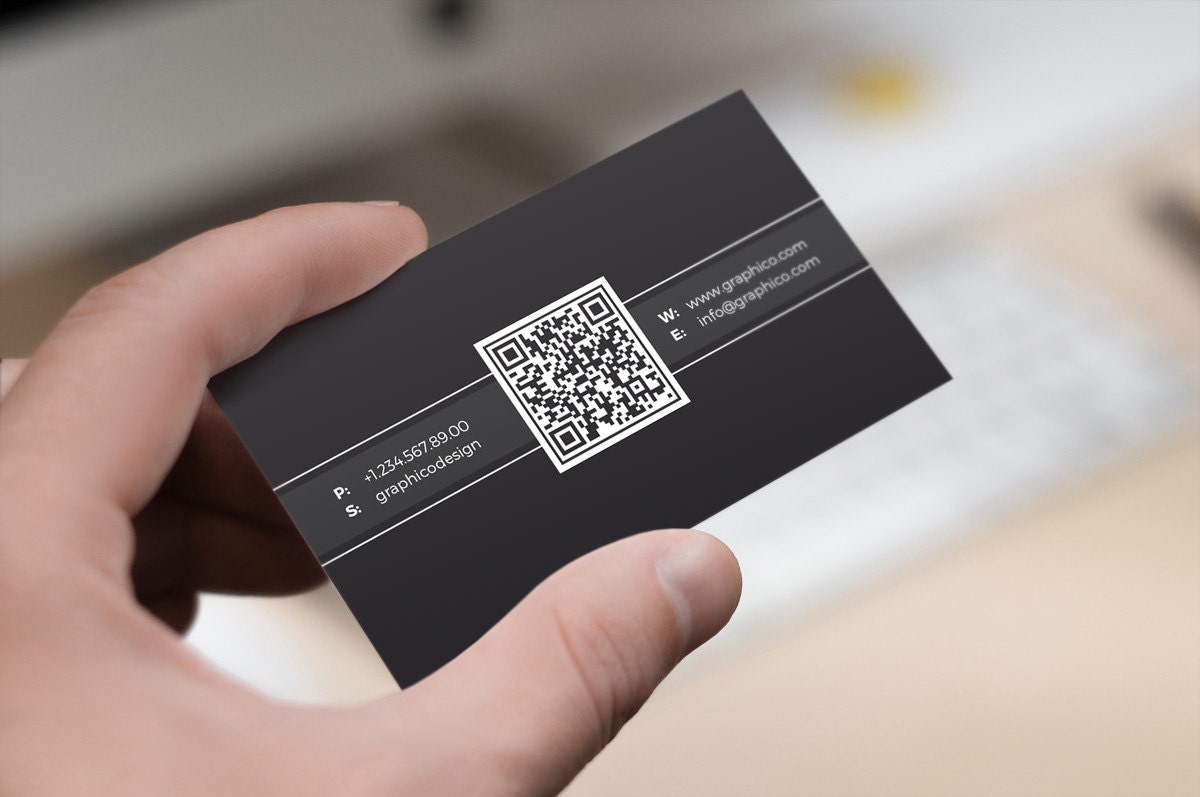
Placement and Spacing Tips That Make Any QR Code Easy to Scan
Visibility and obstruction are the two practical factors that determine whether a QR code on a business card converts a conversation into a contact or just becomes an annoyance. Place the code where people naturally look when you hand the card, keep a clean margin around it, avoid any folds, edges, or finishes that can clip or reflect the pattern, and use contrast and cues so scanning is immediate and confident.
Where on the Card Will People First Notice the Code?
People scan what they see first, not what the designer prefers. If you hand the card face up during an introduction, the upper-right or center-right tends to be the instant hotspot because the thumb and index finger naturally present that area toward the recipient’s line of sight.
Aim for a placement that faces the recipient when you hand the card over, and favor the back of the card when the front is busy with a headshot or headline. Place it so the code sits roughly at the eye-level plane used during handoffs. 70% of users are more likely to scan a QR code if it is placed at eye level, which is a simple behavioral lever you can exploit.
How Much Breathing Room Should You Give the Code in Real Terms?
Skip vague margins and treat the area around the code as sacred real estate. Practical testing shows a clear margin improves reliability, so ensure there is at least 1 centimeter of unobstructed space around the code, and keep that area free of typography, logos, corner graphics, varnish pooling, or foil.
In fact, ViralQR reports that a minimum 1 cm spacing around a QR code increases scan success by 50 percent, meaning a small layout decision yields measurable reductions in failed attempts and follow-up friction.
What Finishes or Production Choices Will Block Scans?
Avoid finishes that create glare or texture inside the code’s modules. Metallic inks, heavy gloss or spot UV over the code, deep embossing, and rounded-corner crops near the code all reduce contrast and distort module edges.
Avoid placing the code within or adjacent to folded panels, cardholder slots, or die-cut apertures, as these areas crease, warp, or become obscured in wallets and badge holders. Think of the code like a camera lens; any crease or reflective flare blurs the image and forces a rescan.
Static QR codes
Static codes lock the data into the image, so any obstruction or finish problem is permanent for that print run. Place static codes away from trim lines and decorative borders so cutter creep or corner radii do not remove the quiet area.
If you must put a static code on the front, give it more visual weight and a slightly larger clear zone than a dynamic code would need, because you cannot rescue a failed static experience with a redirected landing page later. This is where layout discipline pays off. A single miscut or smudged coating will require a reprint.
Customization Options
Because static code offers little in-code customization, it relies on the surrounding design to convey brand cues. Instead of embedding a logo inside the static matrix, place a small, high-contrast brand mark just outside the quiet zone and add a short, clear CTA line such as Scan to Save Contact. That cue decreases hesitation and prevents users from testing with other apps or guessing what the link does.
Analytics and Tracking
Static codes do not yield scan analytics, so placement must support a reliable human fallback. Add a short, human-readable URL or a short campaign code below the static code to correlate leads later via manual entry or event forms. This simple redundancy reduces the cost of lost attribution when scans fail, and it is a pragmatic way to recover value from static print without reprinting.
Content Flexibility
If your content may change, avoid locking it into static code that cannot be updated. When permanence is necessary, allocate adjacent space for a removable sticker or adhesive patch you can swap in the field, rather than forcing a complete reprint when details shift. That small logistics choice prevents the exhaustion teams feel when a minor update becomes a full production cycle.
Dynamic QR Codes
Dynamic codes provide more technical headroom, but placement still determines first-attempt success. Keep dynamic codes on flat, uncluttered panels and maintain a 1-centimeter clear area.
You can afford a smaller printed footprint because the matrix is simpler, but you cannot afford poor placement that causes slow autofocus or glare. Also, position the code so it faces the recipient when the card is handed, because even the best redirect loses the moment if scanning is awkward.
Customization Options
Use the surrounding real estate to brand the experience rather than overloading the matrix. Frames with short CTAs, a small logo outside the quiet zone, and gentle color themes that maintain at least a 4:1 contrast ratio make dynamic codes feel trustworthy, increasing the likelihood of scanning. When you add a logo or color accent, keep it strictly outside the module field, and test across devices to confirm the overlay does not create false modules.
Analytics and Tracking
Dynamic codes let you iterate placement empirically. Run placement A/B tests across two event formats or two card templates and compare scan rates, time-to-scan, and post-scan engagement, then fold those learnings into your print spec.
If you expect a meaningful program, aim for a stable sample size per variant before deciding, for example, accumulating at least 300 successful scans per placement to narrow sampling noise when you need reliable operational decisions about rollouts and print quantities.
Content Flexibility
Because dynamic codes can redirect, you can use placement to signal different value propositions. A code near your title can lead to a resume or case study tailored for hiring conversations; the same code on a sponsorship card can lead to a signup form.
That flexibility means you can keep the printed matrix identical while changing what it delivers. Hence, placement decisions are really decisions about which narrative you want to foreground in that moment.
A Quick Production Checklist You Can Use in Final Proofing
- Proof the finished card at 1:1 and scan it under the exact coating and lighting you will use in production.
- Measure the quiet zone after trimming to confirm that at least 1 centimeter remains, and check for any varnish or foil bleed.
- Place the code on the side of the card most commonly presented during handoffs, and rehearse a few handoffs to verify natural eye-level exposure.
- Test on a sweep of devices, including older phones and budget models, to ensure first-attempt success is consistently quick.
These small checks turn guesswork into governance and keep scans immediate.
Book a Demo Today and Get your First 25 Cards Free (Worth $950)
Most teams tolerate design guesswork around QR code size because changing workflows feels more complex than shrugging and printing more cards. That small habit quietly turns conversations into lost contacts and messy CRM records. We recommend testing platforms like Mobilo, which deliver professionally optimized, scan-ready QR codes and smart digital business cards with NFC, CRM syncs, admin controls, and zero upfront cost.
Book a demo today and get your first 25 cards free (worth $950), join over 59,000 companies generating 10x more leads at events, because in a world where 90% of business contacts never make it into your CRM, you cannot afford to keep using paper cards.
Related Reading
- Static vs Dynamic QR Code
- How to Put a QR Code on a Business Card
- RFID vs QR Code
- How to Track QR Codes
- Is QR Code Generator Safe
- How Much Does a QR Code Cost
- QR Code Accessibility
- QR Code Lead Generation
- Business Card Ideas With QR Code
- Dynamic QR Code Example


