

.avif)


What To Include on a Business Card To Boost Your Credibility
On This Page
In a world of digital and QR-enabled business cards, the details you choose decide whether you spark trust or fade into a stack. This guide on what to include on a business card highlights contact details, a transparent logo, job title, social links, a website, and an effective QR code so your card reads as professional at a glance as well as best business card scanner. Use it to create a business card that immediately conveys professionalism and trust, making a strong impression and boosting credibility with every connection.
Mobilo's digital business card helps you do precisely that by consolidating your contact information, brand, and a scannable QR code into a single, easy-to-share profile.
Summary
- Tactile quality strongly shapes first impressions: 72% of people judge a company or person by the quality of their business card. As a result, print materials function as immediate trust signals rather than mere accessories.
- A cheap-looking card has real business consequences, as 39% of people say they would choose not to do business with someone if their card looks low quality, making card design a form of reputational risk management.
- Time is scarce: 88% of business cards are discarded within a week, so each card has only seconds to communicate value, and a single clear CTA increases the likelihood of a follow-up.
- Contacts vanish quickly unless captured; roughly 90% of event leads never enter a CRM. One-tap capture and immediate tagging are essential to convert in-person exchanges into trackable opportunities.
- Production specs matter for consistent performance. Use industry-standard sizes such as US 3.5 by 2 inches or ISO 85 by 55 mm, set 3 mm bleed and safe zones, and export at 300 dpi to avoid trimming or legibility issues in print.
- Make QR and NFC reliable by design, with a QR quiet zone of four modules, a printed scan area of at least 25 mm square, and NFC chips embedded at least 1.5 mm from the edge to ensure functionality across devices.
Mobilo's digital business card addresses this by centralizing NFC, QR, and NameDrop capture with admin controls and CRM tagging so exchanges become trackable leads.
Why Do You Need a Personal Business Card?

A personal business card fixes two simple problems. Those people forget names, and forgotten names become missed opportunities. When you hand someone a card that reflects your voice and makes following up effortless, you convert a moment of introduction into a measurable next step.
Why Does a Physical Card Still Matter in a Digital Age?
The familiar answer is that a card is a compact credibility statement, and the data support it. According to Business Card Statistics, 72% of people judge a company or person by the quality of their business card, and the tactile quality of that object shapes first impressions in networking settings.
I learned this the hard way when I replaced bland company cards with my own design. I spent an hour crafting a layout, ordered printed, NFC-enabled cards, and within a week, calls started coming in. That quick change turned vague interest into scheduled conversations.
How Does a Card Let You Control Your Own Story?
When I decided to leave my last job and print cards on my own terms, the design stopped being a placeholder and started being a statement. Each face of the card served as a brief map of who I was professionally and where I wanted to go, with one line linking to my portfolio and another displaying the social handle that reflected my voice.
That control matters when you want to shape the first impression, because you are choosing the signals others remember, such as role, tone, and the following action you want them to take.
Why Does a Memorable Card Actually Increase Hiring or Sales?
This is not vanity. Physical cues quickly shape trust, which in turn affects decisions. According to Business Card Statistics, 72% of people judge a company or person by the quality of their business card. Hence, the tactile quality alters how someone values you before they even click a link.
39% of people would choose not to do business with someone who has a 'cheap-looking' business card. That means the card is not a decoration; it is a risk-management tool for your reputation. A cheap-looking card can close doors as surely as a strong one opens them.
How Does a Card Make Follow-Ups Simpler and More Reliable?
It’s exhausting when names evaporate after an event, and follow-ups turn into hope. The practical fix is not another notebook or a tray of business cards that get tossed. It makes contact exchange immediate and trackable, so the moment someone scans a QR code, taps an NFC tag, or accepts a NameDrop, you get a tagged lead that shows where it came from and what action they took.
I ordered mine, the package arrived in a week, and the difference was immediate. People no longer had to remember my last name, and I started receiving calls referencing specific pieces of work on my site.
What Should You Prioritize When You Think Beyond Aesthetics?
Treat the card as a contact asset, not just a piece of paper. Prioritize fields and features that translate into measurable outcomes, such as clear identity, one-click connection paths, and metadata that flows into your CRM. That kind of thinking keeps branding intact while making every exchange count toward pipeline and reporting, without sacrificing security or privacy when SOC 2 and GDPR controls are applied.
Related Reading
- Best Business Card Scanner
- What Makes a Good Business Card
- Business Card Trends
- QR Code Marketing Strategy
- What Are NFC Business Cards
- Professional Networking Tools
- New QR Code Technology
- Best Paid QR Code Generator
What to Include on a Business Card

Decide front versus back by role and action. Place brand and identity cues where they belong visually, and reserve the back for contact methods and a clear next step that drives follow-up. Use the front to signal who you are at a glance, and the back to make it effortless to act and to capture the correct metadata for later outreach.
What to Put on a Business Card: Front of the Card
1. Logo
Place a clean, high-resolution logo where it anchors the layout without dominating the type. Use a 300 dpi file for print, leave at least 6–8 mm of clear space around it, and choose a single color or reversed lockup for contrast so the logo reads in both light and dark finishes. If you include alternative logo marks, pick one and use the others only on material samples or special-edition runs.
2. Company Name
Make the legal or trade name clearly readable, and size it to compete only with the logo, not to overwhelm your personal name on the back. Spell the full name without acronyms unless the acronym is how customers search for you. Match the wordmark type’s weight to other card typography so hierarchy feels intentional.
3. Tagline
If you use a tagline, keep it no longer than five words and make it descriptive, not clever; it should explain the primary outcome you deliver. Consider a secondary, lighter font weight or a condensed typeface to keep the line legible without adding extra space.
Tip: Keep the front spare, and save operational details for the back so the layout breathes.
What to Put on a Business Card: Back of the Card
1. Your Name & Title
Print the full name you want searched and the functional title that clarifies your immediate value, for example, Product Strategy or Licensing Lead. If you expect international contacts, add a simple localization cue, such as a region or time zone. For client-facing roles, include a small headshot on the back only when recognition aids conversion.
2. Contact Details
List one preferred phone number, one monitored email, and a single website URL, formatted cleanly and without protocol prefixes. Use font sizes that make the phone and email comfortably legible at arm’s length, and choose a typeface with clear numerals. Design for the channel you answer first, and make it visually prominent.
3. Your Address: Online or Physical
If you have a storefront, include a concise street line and city; if you are digital-first, replace the mailing address with a short URL or landing page slug. Align the card’s visual identity with the landing page's so recipients see continuity upon arrival.
4. Social Media Handles
Add only platforms where you post professionally and regularly, and format handles without the at symbol to save space. Use small, recognizable icons to aid scanning, and limit the number of networks to two or three to avoid clutter.
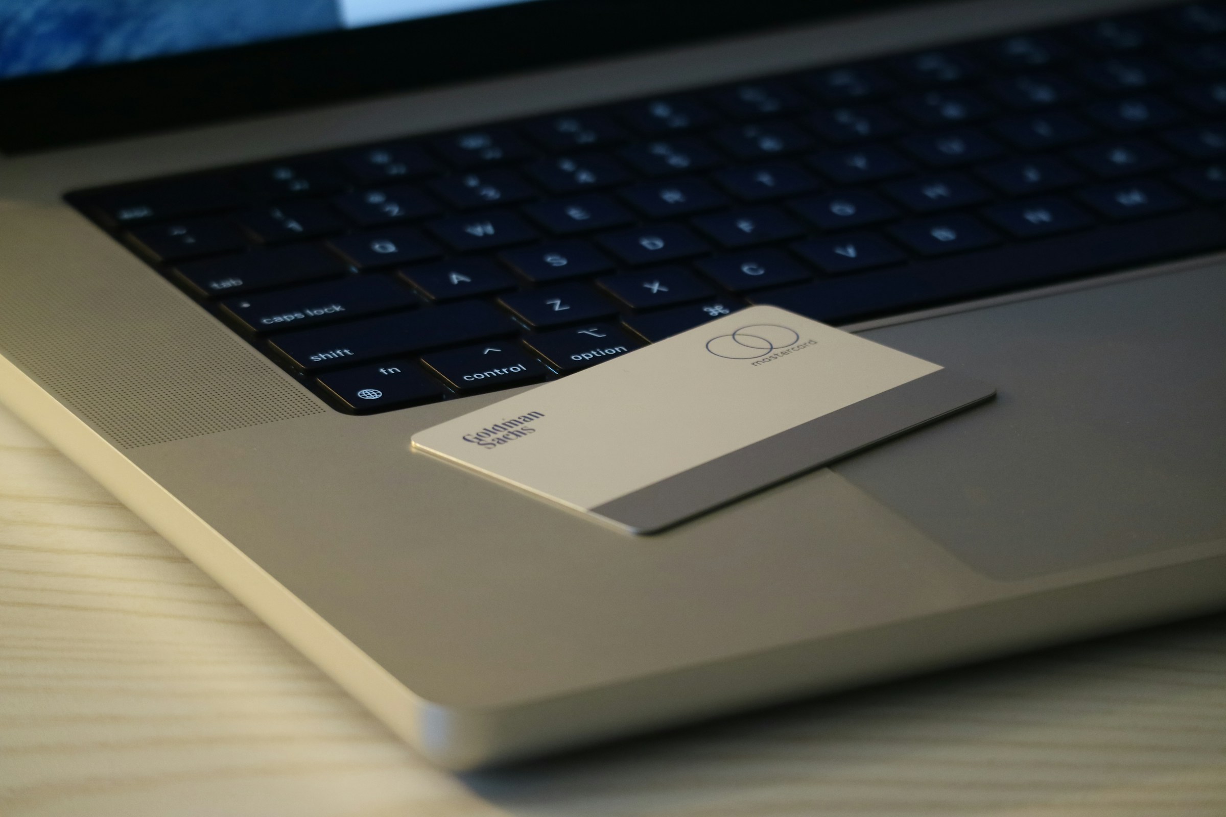
5. QR Code
Reserve QR placement to the back and size it so phones read it reliably, generally a minimum of 2 x 2 cm in print. Label the QR with the action it performs, for example, View Portfolio or Book Time, so scanning feels intentional rather than mysterious.
Tip: Pair a short human-readable fallback URL under the code for older phones.
What to Put on the Back of a Business Card
1. List of Services
A tightly edited service list, three to five items max, lets recipients quickly map your capabilities to their needs. Use parallel phrasing and avoid jargon so a slow skimmer can translate those lines into next-step questions.
2. Imagery
If you show work, crop a single compelling image that reads small and conveys style at a glance. Treat the image as proof, not decoration, and link it to a portfolio page so the visual promise is supported by context.
3. Special Offers
Offer codes or short-term incentives work when tied to measurable landing pages, so use unique promo slugs per campaign to track conversion. Keep terms brief and include an expiration date to encourage timely action.
4. QR Code
A QR that points to a structured personal landing page lets you capture UTM parameters and measure which meetings produced visits. Label the experience and ensure the landing page has a single, focused call to action to reduce drop-off.
5. Testimonials
Include a one-line client quote only if it names a measurable outcome, for example Saved 30% on procurement, and attribute it with a first name and company. Short specificity beats generic praise.
6. Appointment Reminders
Design a writable area with subtle boxes for date and time if appointments matter to your business, and use a faint grid to keep notes legible. Consider a perforated or printed calendar grid for high-frequency service businesses.
7. Loyalty Program
If you run a stamp or punch system, state the rules in six words or fewer and include a code that links visits to a CRM profile. Make the reward repeatable and straightforward so it becomes an operational habit.
8. Networking or Social Media Information
If networking is a priority, call out the types of introductions you want. For example, looking for marketing partners, and including a handle or keyword people can tag you with. This guides others to make relevant connections on your behalf.
What to Include on a Personal Business Card
1. Your Name—The One You Want Them to Google
Use the professional name you publish under, and ensure it matches your public profiles and domain. Consistency between card name, email handle, and portfolio URL reduces friction when someone follows up.
2. What You Do or Want to Do
Label yourself with the role you are pursuing, not the temporary title that clouds your intent. Combine two words that capture scope and discipline. For example, UX + Product Strategy.
3. Your Personal Portfolio Site
Point to a single portfolio or About page that controls the narrative, and provide a shortened slug on the card so users can type it without errors. Ensure the landing page mirrors the card’s language and delivers a single next step.
4. Phone Number (Preferably Your Cell Phone) And/Or Personal Email Address
Provide one phone number and one email address, both of which you check daily. If you prefer asynchronous communication, make email the primary channel and provide minimal voicemail guidance.
5. Social Handles As Applicable
Choose platforms that demonstrate the skill you want to be hired for and keep the selection tight. If you publish long-form writing, link to that profile; if you show design work, lead with image-driven platforms.
6. (Optional) A Personal Logo
If you have a simple, reproducible mark that scales to small sizes, use it. If it adds confusion or extra type, skip it. Simplicity is a reliable test for whether a personal logo belongs on a card.
Optimizing Business Card Design
Front-focused layout choices, CRM-ready field design, and material selection are not separate decisions; they work together. Choose a primary CTA on the back that aligns with an actionable CRM field, for example, Book Call or Request Quote, then make sure the landing page or scanned payload returns structured data like first_name, last_name, company, title, email, phone, source_card_id, and campaign.
For physical materials, decide upfront whether the card is a brand signal or a disposable token. Paper stock choices, thickness, and finishes affect perceived value and postage costs, while wood and metal options require adjusted QR placement and longer printing lead times.
Production Checklist and File Specs
Export artwork as CMYK PDF for print, include 3 mm bleed, and outline fonts to avoid substitution. Provide a separate high-contrast SVG for each chip or NFC imprint, and test QR code readability at 50 percent scale before approval. Set a reorder cadence and maintain a single, versioned asset repository so every print run matches your current messaging and legal name.
Related Reading
- How to Put Linkedin on Business Card
- How to Share Linkedin QR Code
- How to Add Instagram QR Code to Business Card
- QR Code Instead of Business Card
- QR Code Size on Business Card
- How to Scan QR Code on Iphone
- Aztec Code vs QR Code
- How QR Codes Work
- QR Code Analytics
- Linkedin QR Code Business Card
- How to Create Vcard
Recommended Business Card Printing Guidelines
A business card must be engineered for production as much as it is designed for people, so start with the mechanical specifications you will hand to a printer and finish with real-world testing across devices and lighting conditions. Get the dimensions, file setup, paper choice, finishes, and tech checks right, and the card will perform consistently as a measurable contact asset.
What Exact Dimensions and File Specs Should I Use?
Start with industry-standard sizes so the card fits wallets and trays:
- US standard 3.5 by 2 inches (89 by 51 mm)
- ISO business card 85 by 55 mm
- Japanese size 91 by 55 mm for APAC contexts
Build your artboard with at least 3 mm bleed, keep key content within a 3 mm safe zone, use 300 dots per inch for raster assets, export the final artwork as a CMYK PDF/X-1a, supply vector logos (outlined fonts), and include crop marks. Ask for Pantone references if color fidelity is critical, and provide a hard proof or printed sample before any large run.
Which Paper Weights, Finishes, and Sustainable Options Give You the Best Signal for the Least Waste?
If you want a card to feel durable without screaming luxury, aim for 350 to 450 gsm stock or a 14 to 16-point board equivalent; 300 gsm is fine for economy, 400 gsm for perceived premium. Consider soft-touch coating for tactile authority, spot gloss or UV for selective emphasis, and foil or blind-embossing for logos that must pop.
If sustainability matters, choose FSC-certified or post-consumer recycled stocks and soy- or vegetable-based inks. For NFC-enabled cards, prefer PCR plastic cores or laminated recycled boards that protect electronics and extend lifespan.
How Do I Make QR Codes and NFC Chips Reliable in Production and Use?
Design QR codes with a clear quiet zone equal to four modules around the code, keep the printed scan area at least 25 mm square for single scans at arm’s length, and avoid varnishing or heavy metallic finishes on the code itself.
For NFC, locate the antenna area away from metal printing elements and foil stamping, embed the chip at least 1.5 mm from the edge, and request functional testing across Android and iOS devices before the full print run. Always provide a short, typed fallback URL next to the code in case a scan fails.
What Rules Keep Typography and Color Readable in Noisy Environments?
Limit the type palette to two complementary faces, favoring a neutral sans for body text and a stronger display face for names or company marks. Use larger sizes for the name and primary CTA, tighten tracking only on display text, and set line height at 120 to 140 percent for multi-line items.
For color, require a minimum contrast for body text that meets standard accessibility targets, and reserve busy or low-contrast combinations for decorative areas only. Keep the palette to two primary colors plus one accent color so the eye is quickly drawn to the call to action.
What Should My Print Workflow and Sampling Process Include?
For small runs and fast iterations, choose digital printing; for predictable color at scale, choose offset and ask about the minimum run size at which offset becomes cheaper. Order a printed proof and a production sample of your desired finish, verify the exact crop and corner radii, confirm that inks are correctly set on your stock, and run a functional check on every NFC-coded sample and QR-printed proof.
If you plan a specialty technique like letterpress or foil, request a press check or a certified photo of the press sheet under daylight conditions.
Why Cut Back on What Goes on the Card, Even When You Want to Show Everything?
This pattern appears repeatedly across client-facing teams and early-stage companies. A crowded card seems thorough, but becomes unreadable and ignored. White space is a conversion tool, not a luxury; the card should prioritize a single visible CTA, a succinct identity cue, and the connective plumbing that will be tracked digitally after the exchange.
When the card is used as a measured asset, physical quality and functional clarity are the difference between a scanned contact and a tossed card, which matters because first impressions have real commercial consequences, according to Print To Brand. 72% of people judge a company or person based on the quality of their business card. Also, the reputational downside is real; remember that 39% of people would choose not to do business with someone who has a 'cheap-looking' business card.
Practical, Step-by-Step Checklist to Turn Design into a High-Quality Final Product
- Confirm the intended size and regional variant, and set the artboard with 3 mm bleed and 3 mm safe margins.
- Gather assets: Vector logo, brand color specs (Pantone if needed), final text strings, and a verified CTA URL.
- Choose stock and finish: Pick GSM, coating, and any embossing or foil; request sustainability credentials if required.
- Specify file format: CMYK, 300 dpi raster, outlined fonts, PDF/X-1a with crop marks.
- Design with hierarchy: Name and CTA are dominant; utility info is secondary; leave space for notes if you use that habit.
- Integrate tech: Position the QR code in a quiet zone, clearly mark the NFC placement, and avoid metallic treatments near either element.
- Order a functional proof: Printed sample plus NFC/QR verification on multiple devices and lighting conditions.
- Run a small pilot batch, gather feedback from 10 team members across different use cases, and iterate before placing a whole order.
- Lock the print spec and request a press check or certified color proof for runs over 500 pieces.
- Maintain a single-file spec and sample archive so every reprint matches the approved production sample.
Related Reading
- Static vs Dynamic QR Code
- How to Put a QR Code on a Business Card
- RFID vs QR Code
- How to Track QR Codes
- Is QR Code Generator Safe
- How Much Does a QR Code Cost
- QR Code Accessibility
- QR Code Lead Generation
- Business Card Ideas With QR Code
- Dynamic QR Code Example
Book a Demo Today and Get your First 25 Cards Free (Worth $950)
We know how often contacts vanish after an event. Roughly 90% never enter your CRM and take the pipeline with them. Platforms like Mobilo, used by over 59,000 companies, turn each exchange into an enterprise-ready contact asset with NFC, QR, and NameDrop capture, lead enrichment, lead-source tags, and custom CTAs, ICP scoring, SSO provisioning, and SOC 2 and GDPR controls that push clean, scored leads into your CRM and can generate up to 10x more leads.
Book a demo to see it in action and claim your first 25 cards free, a $950 value.


