What Makes a Good Business Card & How Can You Make Yours Memorable?
On This Page
After a busy networking event, you pull out a stack of cards, but many blur when you try to scan them because of tiny type, crowded layouts, or low contrast. In the world of best Business Card Scanners, knowing what makes a good business card matters: clean design, readable typography, clear contact fields, and enough white space so scanners and people can read it easily. This article provides practical guidance to help you create a business card that instantly impresses, clearly conveys your information, and leaves a lasting, professional impression that enables you to stand out and build valuable connections.
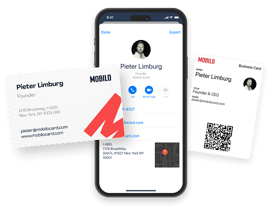
To help you do that, Mobilo's digital business card makes it simple to design a polished, easy-to-scan card, keep your details up to date, and share them in ways that turn quick meetings into lasting contacts.
Summary
- Clarity and legibility drive credibility. 72% of people judge a company or person by the quality of their business card, so typography, contrast, and white space should be prioritized to communicate information at a glance.
- Material choices influence buying decisions, since 39% of people say they would choose not to do business with someone if their card looks cheap, making stock weight and finishes key conversion levers.
- Functional value extends a card's lifespan: 88% of business cards are discarded within a week, so adding a single proper CTA or a practical back-side element can meaningfully increase retention.
- Design governance becomes an operational issue as teams grow. When the number of roles exceeds about 30, manual production becomes a recurring burden. At the same time, a standardized rollout across 60 people cut production time from days to minutes in one case study.
- Small production and layout checks help prevent significant failures. For example, a simple prototype test in which an outsider should find the phone number in under five seconds, and requesting a press sheet proof catches color, registration, and trim problems before a big run.
- Digital capture matters for pipeline integrity: up to 90% of business contacts reportedly go missing from CRMs. A single, scan-friendly link with tracking analytics can reduce follow-up friction and lost leads.
Mobilo's Digital Business Card addresses this by centralizing templates, enabling NFC and QR code sharing, and integrating with CRMs to reduce administrative burden and improve lead tracking.
What Makes a Good Business Card?

A business card’s core purpose is to communicate who you are and how to reach you, in a way that feels credible and memorable within seconds. Its effectiveness stems from clear information, professional presentation, and alignment between visual cues and the brand story you want to tell.
Why Effective Business Cards Matter
A physical card is the most compact, tangible version of your professional promise. It grounds a conversation, reminds the recipient of the precise offer you made, and serves as a personal landing page they can return to later.
That matters because, according to Print To Brand, 72% of people judge a company or person by the quality of its business card. Published in 2025, the card’s material and finish function as an instant credibility signal rather than a trivial flourish.
Turning Handshakes into Action
People still make buying decisions in person, and a card translates a brief handshake into the next step. When follow-up is easy and obvious, conversations convert; when it is fuzzy or buried behind friction, the lead quietly dies.
This pattern appears across events and meetings. Unclear next steps and opaque processes cause interest to evaporate faster than any marketing campaign can recover.
Key Elements of a Good Business Card
What needs to be on the card is austere and unforgiving. Your card must deliver the essentials without forcing the receiver to play detective.
- Full name and professional title, prominent and legible.
- Company name and a transparent logo for brand recognition.
- One reliable phone number and one professional email address.
- A single website URL or a short custom landing page address that centralizes your services and calls to action.
- Optional: One or two social handles if those channels matter in your sector.
Leave off extraneous phone numbers, personal home addresses, or long lists of certifications that clutter the layout. Everything on the card should have a clear purpose:
- Enable a follow-up
- Confirm identity
- Reinforce the brand promise
Characteristics of a Good Business Card
Put the name and title first, then the quickest path to contact. If you are in sales or events, prioritize including a mobile number and a short URL to a contact or booking page. Simplicity reduces friction; ambiguous or crowded contact blocks cost you replies.
Don’t make people squint or hunt. Use spacing and hierarchy to draw the eye to the most critical action you want someone to take, whether that is phoning you, visiting a page, or scanning a QR code.
Use Easy-to-Read Fonts
Choose typography that performs at small sizes. Sans-serif or modern humanist faces at readable weights keep things crisp. Limit yourself to two type choices, or two weights at most, to avoid visual noise. If your title is long, truncate sensibly so lines don’t wrap unpredictably.
Choose Quality Materials And Don’t Cheap Out
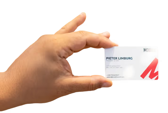
Thin, flimsy stock signals low attention to detail and can reverse whatever credibility you earned in the conversation. That’s why, in the real world, reports published in 2025 that 39% of people would choose not to do business with someone who has a cheap-looking business card show that perceived quality directly affects commercial intent. Texture, thickness, and finishing choices are not vanity; they are conversion levers.
Use Clean and Captivating Design, or Go All-In on Bold
Your logo should anchor the layout without drowning out the information. White space is not wasted space; it guides attention. If you opt to be bold, make that decision complete, like a striking color, a tactile element, or a distinct material choice that fits your brand voice. Partial, indecisive styling looks amateurish.
Practical Tradeoffs and Emotional Realities
When we redesigned contact capture for a sales org over a three-month pilot, the team lost fewer leads simply by shortening the follow-up chain; average response time dropped by measured hours, not days. Reps felt less embarrassed about missed promises, and prospects felt respected because the next step was obvious.
This ties back to a more profound frustration I often see. Customers stop trying to resolve minor frictions because the process feels deliberately opaque, not because they do not want to engage.
Small Design Choices Compound
A single misplaced phone icon or an extra line of text can turn a clear path into a dead end. That is why consistency and predictable behavior across every card in your team matter more than a dozen creative experiments done without governance.
Bonus Tip for Small Business Owners
If you run a small shop, use the card to state one clear value proposition, not your entire backstory. A short tagline plus a single CTA on the card focuses attention and speeds the buyer’s decision. If your business relies on trust, make physical quality and consistency your top investments; those are the small signals that create disproportionate trust in early conversations.
Related Reading
- Best Business Card Scanner
- Business Card Trends
- QR Code Marketing Strategy
- New QR Code Technology
- What Are NFC Business Cards
- Professional Networking Tools
- Best Paid QR Code Generator
- What to Include on a Business Card
13 Golden Rules for Designing a Good Business Card

A sound business card does two things well: it makes contact effortless, and it creates a clear next step the recipient can act on. The rules below are practical, terse, and focused on making your card a memorable personal landing page and a measurable lead-capture tool.
1. Simple, yet Striking
Keep the copy tight so someone can read and act at a glance. Prioritize one clean call to action and remove anything that competes for attention. Use a single dominant visual element to make the card identifiable in a rack of dozens.
- Essentials to include: Name, job title, email, phone, website, one social handle
- Optional: QR code, headshot, short slogan
2. Keep Your Audience in Mind
Design choices should solve for the recipient’s context, not your personal taste. If you network at trade conferences, choose readability and scan-friendly elements. If you meet creatives, you can take more visual risks, but only if those risks improve recognition for that specific audience.
3. Keep It On Brand
Match the card to the rest of your identity, colors, fonts, and voice, so recipients find a seamless trail from hand to website. Consistency reduces friction when people search for you later; inconsistent cards force extra mental work and fewer follow-ups.
4. Get Creative and Stand Out
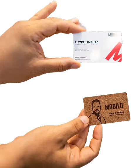
Use novelty to aid memory, not to obscure information. Try edge printing, die-cut shapes, or tactile finishes that invite touch, but test legibility first. A clever gimmick that hides your phone number is a failure.
5. Keep Readability in Mind
Select a classic, high-contrast typeface and test it at the exact dimensions you plan to print. If a decorative font is essential to your brand identity, reserve it for a logo or a single word, and keep body text plain and large enough to read without squinting.
6. Consider Your Message
Choose design and tone to reinforce one specific promise. Corporate service cards should feel composed and professional; creative freelancers can dial in warmth or surprise. The wrong visual voice will confuse recipients about what you actually do.
7. Make Your Business Card MORE Than Just a Business Card
Add functional value so the recipient keeps it. For example, print a quick, practical tip on the back, include a scannable CTA to schedule a meeting, or make the card fold into a bookmark. Keep in mind that, according to Printed.com, 88% of business cards are thrown out within a week, so usefulness buys you time and attention.
8. Choose Your Specifications Carefully
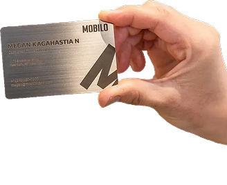
Match size, material, and finish to your brand and logistics requirements. Thicker stock reads as intentional, unusual shapes stand out at events, and matte finishes often photograph better for online profiles. But every custom spec has a distribution cost; test one variable at a time.
9. Make It Easy to Replicate
Create templates and a single source of truth for assets. When we rolled out standardized card templates across a 60-person sales team over six weeks, production time fell from days to minutes, and visual inconsistencies dropped dramatically. Automate exports and approvals to prevent local edits from fracturing the brand.
10. Communicate effectively
Match language to your brand persona and sector. Use a short, active voice, no jargon or long lines. If your industry requires formality, keep salutations and titles crisp; if you trade on approachability, a conversational line or microcopy can invite replies.
11. Consider Adding White Spaces and QR Codes
White space guides the eye and leaves room for notes, while a QR code or NFC link provides instant access to a richer, personalized landing page. Place a single, clearly labeled code and explain its outcome so the recipient trusts the action.
12. Craft a Clear Positioning Statement
A one-line positioning statement turns curiosity into clarity. It should be short enough to scan, precise enough to orient, and distinct enough to separate you from a dozen other cards on a table.
13. Proofread, Proofread, Proofread
Spend as long on proofreading as you do on design choices. A single misspelled name or broken link erases credibility instantly. Build a two-person signoff and a final pre-press checklist before any print run.
Related Reading
- How to Put Linkedin on Business Card
- How to Share Linkedin QR Code
- How to Add Instagram QR Code to Business Card
- QR Code Instead of Business Card
- QR Code Size on Business Card
- How to Scan QR Code on Iphone
- Aztec Code vs QR Code
- How QR Codes Work
- QR Code Analytics
- Linkedin QR Code Business Card
- How to Create Vcard
What To Avoid When Designing a Business Card

Bad cards don't just look amateur; they erase momentum. When information is hard to scan, printing errors show, or the visual voice is inconsistent, recipients either toss the card or hesitate to act; both outcomes kill pipelines and credibility.
What Common Mistakes Make a Card Ineffective?
Clutter and competing elements steal attention. Too many icons, multiple CTAs, layered patterns, and several social handles distract the eye, increasing the time it takes someone to act.
That hunting behavior matters because 39% of people would choose not to do business with someone who has a 'cheap-looking' business card, according to a 2025 study, which shows how poor presentation directly translates into lost commercial opportunity.
Do Borders Actually Cause Real Problems in Production?
Yes. Borders highlight even small cutting shifts, turning a clean sheet into an uneven, amateur product. Printers work to a bleed and safety margin; any visible border accentuates registration errors and increases waste in bulk runs. If you want consistent results, design to bleed and avoid visible borders so production tolerances do not compromise credibility.
How Does Typography Fail in Real Use?
This problem appears across conference booths and one-on-one introductions. Decorative typefaces that read well at 72pt on-screen collapse at 8–9pt in print.
Legibility depends on x-height, stroke contrast, and tracking at small sizes, not on how 'clever' a font looks. Reserve display fonts for logos, select robust text faces for contact details, and test at final printed scale under fluorescent lighting to catch surprises.
Why Do Too Many Design Elements Backfire?
A noisy card imposes cognitive load, causing recipients to postpone action. Visual competition also reduces recall; a single clear element anchored to a name or logo increases the odds someone remembers you.
Think of a crowded card like a storefront with too many signs; none of them get noticed because nothing guides the eye. Use one dominant visual cue and eliminate anything that does not serve the primary follow-up action.
Which Type of Business Card Fits Your Role and Why?
If you sell to corporate buyers, prioritize restrained design that signals predictability and trust. If you sell creative services, a bolder tactile finish or die-cut can reinforce identity, but expect higher production costs and distribution friction.
Unique shapes or specialty inks help with memory. They complicate storage, wallet fit, and bulk mailing logistics. Choose based on the intersection of brand signal, recipient expectations, and practical distribution constraints.
How Should You Choose Materials and Finishes Without Making Bad Tradeoffs?
Select materials that support the card's functionality, not just its appearance. Heavy stock that resists bending communicates permanence, while matte or soft-touch coatings reduce glare and improve photography for profile pages.
Avoid finishes that obscure printed text or interfere with scanning technologies. Order a physical proof, handle it, fold it, and photograph it under standard lighting; that simple checklist prevents costly rollouts that underdeliver.
What Makes Low-Quality Printing So Damaging, and How Do You Catch It Before a Big Run?
The failure mode is subtle at the proof stage and brutal in bulk. Poor color conversion, weak registration, ink pooling, or thin stock all translate to a cheap-feeling artifact in a recipient's hand.
Request a press sheet proof, confirm CMYK or Pantone mappings, inspect edge trimming, and test any specialty varnish or foil under both phone flash and office lighting. The fastest fix is a one-off run before committing to large volumes.
How Do Confusing Layouts Reduce Follow-Up and Brand Recognition?
When hierarchy fails, the eye wanders, and the call to act is unclear. Group contact blocks, align to a baseline grid, and use consistent alignment and spacing to create a readable path. Inconsistent branding across employee cards creates a recognition gap.
Recipients may later connect a card to your company, which fragments brand memory and slows follow-up. The operational failure mode to watch for is decentralized ordering without governance; it produces many acceptable cards, but no single, searchable brand signal.
Book a Demo Today and Get your First 25 Cards Free (Worth $950)
If you want to transform your team's networking and capture the leads that too often slip through the cracks, we should consider Mobilo, which can deliver up to 10x more leads at events.
Join over 59,000 companies using smart digital business cards that auto-exchange contacts, enrich and score prospects against your ICP, and push clean records into your CRM, and book a demo to claim your first 25 cards free, worth $950, because when 90% of business contacts never make it into your CRM, keeping paper cards is a cost you can no longer accept.
Related Reading
- Static vs Dynamic QR Code
- How to Put a QR Code on a Business Card
- RFID vs QR Code
- How to Track QR Codes
- Is QR Code Generator Safe
- How Much Does a QR Code Cost
- QR Code Accessibility
- QR Code Lead Generation
- Business Card Ideas With QR Code
- Dynamic QR Code Example

.avif)

