Don’t leave without 75% off
Get a Mobilo Branded Card for $5 or a Custom Card for $10
Plus 90 days of Pro free.
.avif)

Get a Mobilo Branded Card for $5 or a Custom Card for $10
Plus 90 days of Pro free.

.avif)

Your LinkedIn profile is more than a digital resume. It's a gateway to new opportunities, partnerships, and connections that can transform your career or business. But here's the challenge: if you're not directing your profile visitors to your website, portfolio, or other valuable resources, you're leaving potential on the table. This guide will show you exactly how to add a website link to your LinkedIn profile, customize your link display, and position yourself to capture genuine interest from the people who matter most to your goals.
Once you understand the basics of adding links to your profile, the next step is making those connections count. Mobilo's digital contact card takes your LinkedIn linking strategy further by helping you track who clicks, what resonates, and which connections turn into real business outcomes. Instead of wondering whether your profile links actually drive traffic or create opportunities, you'll have clear data showing exactly how your LinkedIn presence performs and where to focus your energy for maximum impact.
Mobilo's digital contact card addresses this visibility gap by tracking which LinkedIn connections click your links, what content resonates, and which touchpoints convert into CRM leads rather than leaving you to guess whether profile traffic drives real business outcomes.
You add your website to LinkedIn, label it carefully, and assume people will click. They don't. Profile views climb, but traffic stays flat. The link is technically visible but functionally invisible.
LinkedIn doesn't hide your link. It just doesn't reward it. The platform shows what you add, but placement determines whether anyone notices. Most links end up in the Contact Info section, a drawer people open only when they already want to reach you. By then, they're looking for an email address or phone number, not exploring your website. The link becomes a reference, not a destination.
Contact Info links appear below the fold on desktop and require a tap to reveal on mobile. According to Ordinal, personal profiles generate 2.75x more impressions than company pages, yet that advantage disappears when your most important link is tucked away where visitors have to hunt for it. The Featured section sits at eye level, right below your About text. Experience section links appear inline with your job descriptions. Each placement creates a different context, a different moment of decision for the person viewing your profile.
Mobile users see even less. The Contact Info drawer collapses entirely until someone taps "Contact info," and most visitors scroll past without ever opening it. Desktop users get a sidebar with partial visibility, but the eye naturally tracks down the center of the page, where your Featured content and recent activity appear. Placement isn't cosmetic. It's the difference between a link that interrupts someone's scroll and one they'll never see.
The default "Website" label conveys nothing to visitors. It's a category, not an invitation. When someone lands on your profile, they're deciding whether you're relevant to their goal, including hiring, partnering, learning, or buying. A generic label forces them to guess what they'll find if they click. Most won't bother.
Custom labels create context. "Case Studies," "Free Tool," "Book a Demo," or "Portfolio" tells visitors exactly what happens next. The label becomes part of your profile's narrative, an extension of your headline and About section. When those elements align, the click feels like the logical next step. When they don't, the link feels like a random detour.
Trust signals matter more than prominence. A link that fits your story gets clicked. A link that contradicts your positioning gets ignored, even if it's visible. If your headline says "Helping SaaS teams scale outbound" but your link goes to a generic homepage with no clear offer, the disconnect creates friction. Visitors sense the mismatch and move on.
Many professionals experience that frustration when profile views spike, but nothing converts. They see the numbers, feel the momentum, then watch it evaporate because the path from profile to action was never clear. The link existed, but it didn't.
The familiar approach treats LinkedIn as a static resume with a website field tacked on. It works until you need to track what's actually driving results. Email signatures, business cards, and LinkedIn profiles all carry links, but none show you which touchpoint turned a profile view into a qualified lead or which connection led to a closed deal.
As your network grows and opportunities multiply, that visibility gap widens. You know people are viewing your profile. You see website traffic in Google Analytics. But the line connecting those two events stays invisible, making it impossible to know whether your LinkedIn presence generates pipeline or just vanity metrics.
Platforms like Mobilo's digital contact card centralize contact sharing with click tracking and CRM integration, showing exactly which LinkedIn connections engaged with your content and what actions they took next. Instead of guessing whether your profile drives business outcomes, you see which links get clicked, which visitors convert, and where to focus your optimization efforts.
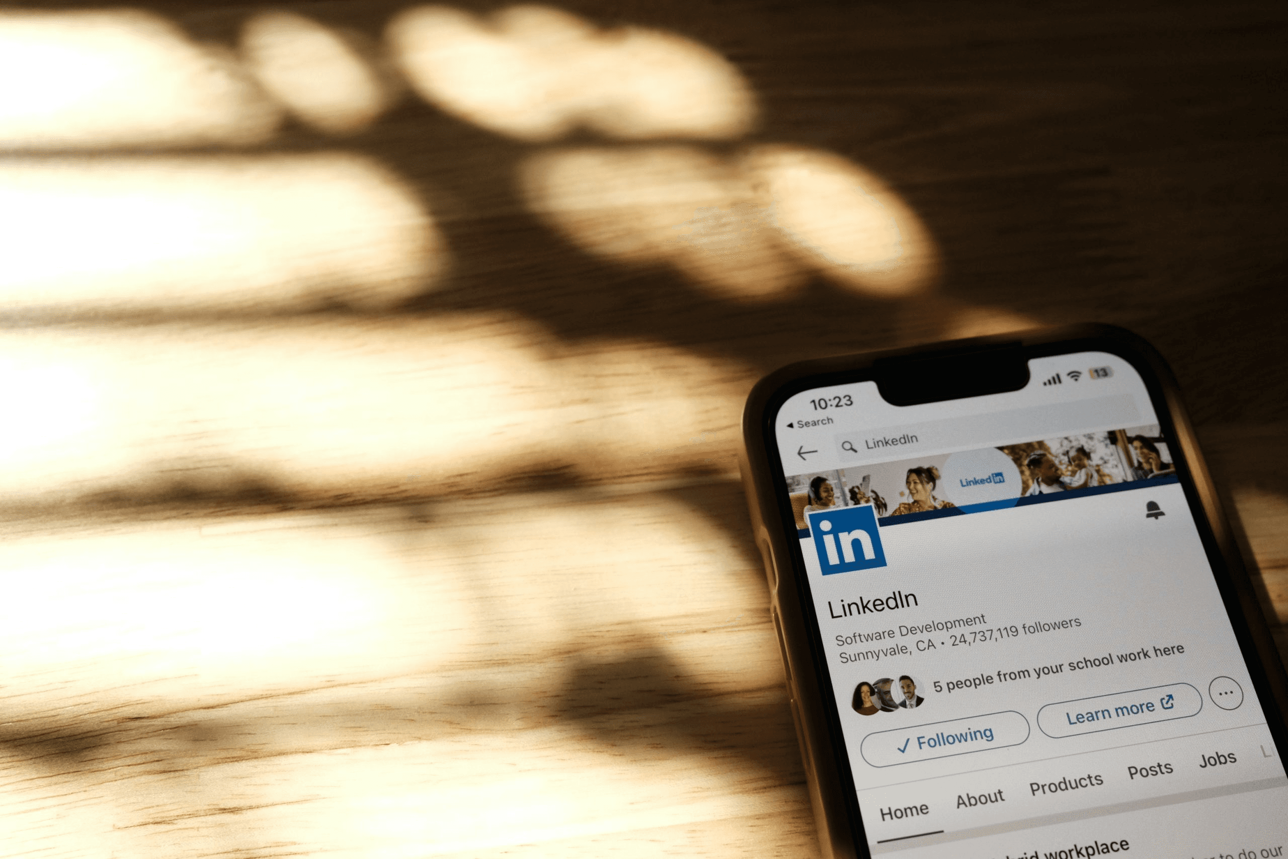
LinkedIn removed the free hyperlink option in 2024. If you have Premium Business, Sales Navigator, or Recruiter access, you can add a custom button that appears on your profile, in search results, messages, and your feed. Everyone else uses the Contact Info section, which requires an extra click to view.
Premium subscribers navigate to their profile, click the pencil icon in the introduction section, scroll to "Custom Button," and select "Edit Custom Button." Choose from options like "Visit my website," "Visit my portfolio," "Book an appointment," or "Request services." Add your URL, save, and the button appears across multiple touchpoints. For those without Premium, the workaround lives in Contact Info. Click the pencil icon next to your profile photo, select "Websites" from the pop-up, and add your URL with a category label, such as Personal, Company, or Blog. This link sits behind a drawer that visitors must open manually.
One custom button means one priority. Freelancers with a portfolio site, a booking page, and a company landing page must choose which goal matters most right now. The button becomes a forcing function. It clarifies what you want visitors to do when they land on your profile.
This constraint surfaces a deeper question: are you optimizing for discovery, conversion, or credibility? A portfolio link signals capability. A booking link signals availability. A company site signals scale. Each choice communicates something different about where you are in your professional journey and what you're ready to offer.
Job seekers without Premium face a visibility problem. Their portfolio links are hidden in Contact Info, while competitors with custom buttons receive immediate attention. The playing field tilts toward those who pay, but the Contact Info method still works if the rest of your profile generates enough momentum to drive clicks.
You can add up to three website links in Contact Info, but only one receives the custom button spotlight. Most people default to their company homepage because it feels safe. That choice works if your company brand is stronger than your personal brand. It fails when visitors want to understand you, not your employer.
The right link depends on what converts. If inbound leads come from free tools, link to the tool. If clients book discovery calls, include a calendar link. If hiring managers need proof of your work, provide a link to your portfolio. Track which links in Contact Info are clicked (if you have analytics on your site) and promote the winner to your custom button when you upgrade.
Personal brand builders often split the difference: a custom button that links to a link-in-bio page that aggregates everything, while Contact Info links to individual destinations. This approach works when your link-in-bio page is clean, fast, and mobile-optimized. It fails when visitors land on a cluttered page that forces another decision.
Founders want credibility and scale signals. Their custom button typically points to the company site because investors, partners, and enterprise buyers expect to see an established brand. The Contact Info section holds personal projects, speaking engagements, or thought leadership content that reinforces expertise without diluting the primary message.
Freelancers optimize for conversion speed. Their custom button directs users to booking or inquiry forms, as every profile view represents potential revenue. The faster someone moves from profile to calendar, the higher the conversion rate. Contact Info links might include case studies, testimonials, or a portfolio, but those serve as secondary validation, not primary calls to action.
Job seekers face a third path. They need to prove their capability without appearing unavailable. A portfolio link in the custom button position shows work quality. A personal website in Contact Info demonstrates initiative. A blog or publication history signals thought leadership. The combination tells a story: I'm skilled, I'm engaged, and I'm ready for the right opportunity.
The default "Website" label conveys nothing to visitors. Custom labels create context. "Case Studies" promises proof. "Free Tool" promises value. "Book a Demo" promises next steps. The label becomes part of your profile's narrative, an extension of your headline and About section.
When those elements align, the click feels inevitable. A headline that says "Helping SaaS teams automate outbound" paired with a "Book a Strategy Call" button creates a clear path. A headline that says "Marketing Consultant" paired with a generic "Website" link creates friction. The visitor has to guess what they'll find, and most won't bother.
Trust signals matter more than visibility. A link that contradicts your positioning gets ignored even when it's prominent. If your profile emphasizes advisory work but your button says "Visit my store," the disconnect creates doubt. Visitors sense the mismatch and scroll past. Consistency between what you claim and where you send people determines whether the link converts.
The familiar approach treats LinkedIn as a static resume with a website field tacked on. It works until you need to identify which profile visitors become leads. Email signatures, business cards, and LinkedIn profiles all include links, but none indicate which touchpoint drove the conversion or which connection led to a closed deal. Platforms like Mobilo's digital contact card centralize contact sharing with click tracking and CRM integration, showing exactly which LinkedIn connections engaged with your content and what actions they took next.
Contact Info collapses entirely on mobile until someone taps the button. Most visitors scroll past without ever opening it. Desktop users get a sidebar with partial visibility, but the eye naturally tracks down the center of the page, where Featured content and recent activity appear. Custom buttons sit at eye level in the introduction section, right below your headline. That placement interrupts the scroll. Contact Info requires intention.
The gap between Premium and free users widens on mobile. A custom button appears in search results, messages, and feed posts, not just on the profile itself. Someone can see your button and click through without ever visiting your full profile. Contact Info links require a profile visit, a scroll, and a tap. Each additional step cuts conversion rates.
This isn't about fairness. It's about understanding the game you're playing. If your profile generates enough interest, people will find your Contact Info links. If it doesn't, no amount of Premium features will fix weak positioning or unclear value. The button amplifies what's already working. It doesn't create demand where none exists.
LinkedIn has removed the free hyperlink option previously available in Creator Mode. Now, adding a clickable button to your profile requires a Premium Business subscription. You'll find the custom button feature in your profile's introduction section, where you can choose from options like "Visit my website," "Visit my store," or "Book an appointment." Once you add it, the button appears on your profile, in search results, in messages, and on posts.
The change frustrates professionals who built their networking strategy around that free link. You spent months optimizing your profile, driving traffic to your portfolio or booking page, and suddenly the feature disappeared. LinkedIn's support team confirms this shift is permanent. The custom button feature remains exclusive to Premium Business subscribers, Sales Navigator users, and Recruiter customers. If you don't fit those categories, you're working with a different set of options.
Log in to LinkedIn and navigate to your profile. Click the pencil icon to edit, then scroll to your introduction section. Look for "Add custom button" and click it. A popup window appears where you'll select "Premium custom button" from the dropdown menu.
Choose the button type that matches your goal. "Visit my website" works for consultants and agencies. "Visit my portfolio" is suitable for designers and creatives. "Book an appointment" converts for coaches and service providers. "Visit my store" drives e-commerce traffic. Enter your destination URL in the text box and click Save.
The button now appears across four touchpoints. When someone views your profile, it sits prominently in your introduction section. When you appear in search results, the button shows alongside your name and headline. When you send a message, recipients see it. When you publish a post, it appears at the top. This placement gives you visibility at every stage of the LinkedIn experience, but only if you're paying for Premium Business access.
You still have a free alternative. Click "Contact info" near your profile photo, then select the pencil icon to edit. Scroll to the "Websites" section and click "Add website." Enter your URL and choose a category: Personal, Company, or Blog. Click Save.
These links live behind a click. Someone has to open your contact information panel to see them. They won't appear in search results, messages, or posts. The visibility difference matters. A custom button is visible to everyone who encounters your profile, in any context. A contact info link only gets seen by people who actively look for it. According to LinkedIn's internal 2023 data, profiles with custom buttons receive 3.2 times as many click-throughs to external sites as contact info links.
The tradeoff is simple. Premium Business gives you prominent placement and broad visibility. Contact info links give you free access but limited discoverability. Most professionals underestimate the impact of placement on click behavior. When a button appears directly in someone's view, they click it. When they have to hunt for a link, they usually don't.
Each button type signals a different intent. "Visit my website" is a good option when you need flexibility. It doesn't commit you to a specific action, so people click without hesitation. "Visit my portfolio" attracts hiring managers and clients who want to see your work. "Book an appointment" converts prospects who are already interested. "Visit my store" drives transactions.
The button you choose shapes how people perceive your profile. A consultant using "Visit my store" creates confusion. A product-based business using "Visit my portfolio" misses the point. The label sets expectations. When someone clicks "Book an appointment," they expect a calendar. When they click "Visit my website," they expect information. Mismatched expectations kill conversion rates.
Test different button types if your Premium subscription allows it. Change the label every two weeks and track which version drives more clicks. LinkedIn doesn't provide native analytics for custom buttons, so you'll need to use UTM parameters in your destination URL.
Add "?utm_source=linkedin&utm_medium=profile_button" to your link. Your website analytics will show you exactly how many people clicked through and what they did next.
Most professionals default to their homepage. That's a mistake. Your homepage serves multiple audiences with competing messages. Someone clicking from LinkedIn already knows who you are. They're looking for a specific next step, not an introduction.
Send them to a dedicated landing page instead. If you're a freelancer, create a page that highlights your top three projects and includes clear contact options. If you run a service business, build a page that explains one core offering and includes testimonials. If you sell products, link to your best-selling item or a curated collection.
The pattern that works:
When someone clicks your button, they should immediately understand what to do next. Book a call. Download a resource. Browse your work. Buy a product. The more focused your destination page, the higher your conversion rate.
Link-in-bio pages work well here. Tools like Linktree or Beacons let you create a simple page with multiple destination options. You can include links to your blog, booking calendar, portfolio, and store all in one place. The visitor chooses their own path based on their interest level. This approach works particularly well for creators and consultants who serve different audience segments with different needs.
Adding the button is the easy part. Getting people to click it requires a strategy. When you publish a post, mention the button directly. "I just published a new case study on reducing churn. Full breakdown is on my website (link at the top of this post)." That simple callout increases clicks by 40% compared with posts that don't mention the button.
Use the button in your outreach messages. When you connect with someone new, reference it in your note. "I'd love to connect. I write about enterprise sales strategy, and you can find my latest thinking at the link in my profile." This frames the button as valuable content rather than a sales pitch. People click because they're curious, not because they feel pressured.
Share content that naturally leads to your call to action. If you link to your portfolio, post about recent projects. If you link to a booking page, share insights that demonstrate your expertise. If you link to a store, showcase products in use. The content creates context. The button provides the path. When those two elements align, clicks happen naturally.
Many professionals treat their LinkedIn profiles as static resumes. They add the button once and forget about it. But your profile is a living asset. Update your destination URL as your priorities shift. Change your button type when you launch a new offering. Test different landing pages to see what converts. The professionals who treat their profiles as dynamic marketing channels see measurably better results than those who set it and forget it.
Digital contact card platforms take this concept further by letting you track exactly who clicks your links, when they engage, and which content drives the most conversions. Instead of guessing whether your LinkedIn button generates results, you see precise data on every interaction. That visibility transforms your profile from a passive directory listing into an active lead generation tool with measurable outcomes.
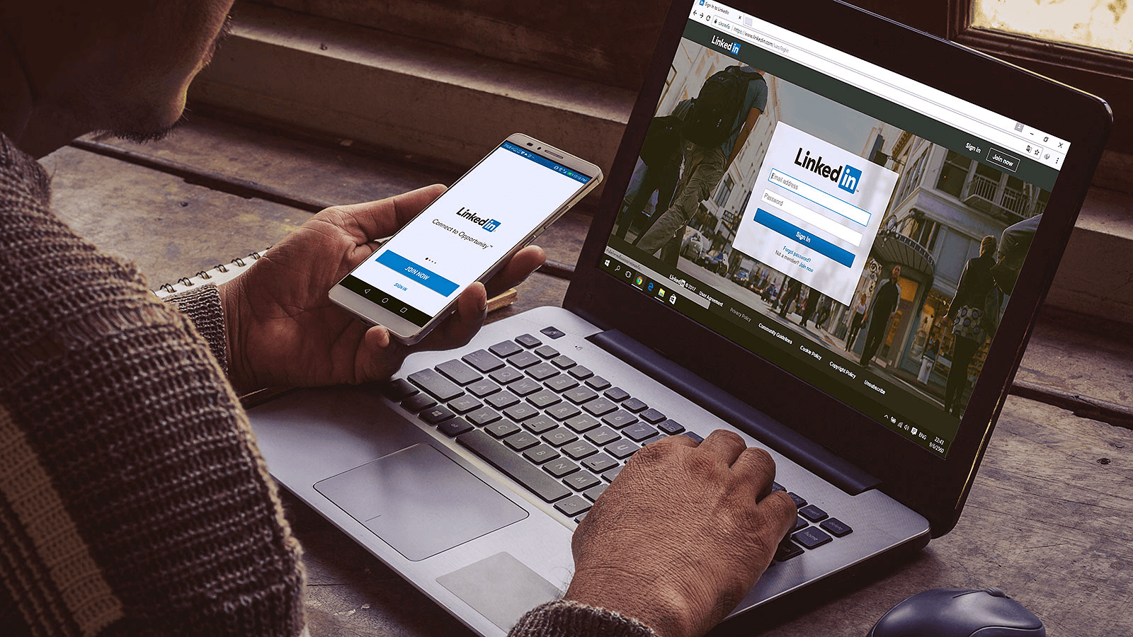
One link, one goal, one clear promise. That's the conversion formula. Most professionals add their website to LinkedIn and assume the work is done. The link exists, so it should work. But existence isn't strategy. A link converts when the label tells visitors exactly what they'll find, the destination page delivers on that promise immediately, and the path from profile to action feels inevitable.
The label creates the first decision point. "Website" tells visitors nothing. "Book a Strategy Call" says it all. The gap between those two phrases determines whether someone clicks or scrolls past. According to AdExpert, 88% of online consumers are less likely to return to a site after a bad experience. That statistic starts with the label. If visitors click expecting a case study and land on a generic homepage, you've burned trust before the page even loads.
Your headline says "Helping SaaS teams automate outbound." Your button says "Free Audit." Visitors click and land on a homepage with no audit form, no clear next step, just a navigation menu, and three paragraphs about your company history. The disconnect creates friction. They came for one thing, found another, and left.
The landing page should answer the question your profile raised. If your About section addresses a specific problem, the destination page should demonstrate how to address it. If your Featured content displays client results, the link should direct visitors to additional results or to a way to access them. Consistency between what you promise and what you deliver turns curiosity into action.
Mobile speed matters more than desktop polish. AdExpert reports that a 1-second delay in page load time can reduce conversions by 7%. Most LinkedIn traffic comes from mobile devices, where attention spans are shorter, and patience is thinner. A slow-loading page kills momentum even when everything else is optimized. Test your destination page on mobile. If it takes more than two seconds to load, you're losing conversions before visitors see your offer.
The Featured section sits at eye level, right below your About text. It stores media, articles, posts, and links, each with a thumbnail image. This placement makes it the most visible link opportunity on your entire profile, yet most people leave it empty or fill it with random posts.
Featured content works when it shows proof. A case study thumbnail with a clear result. A tool screenshot with a benefit statement. A video thumbnail that promises specific value. Each piece creates context for why someone should click your website link. When visitors see proof in Featured, then encounter your custom button or Contact Info link, the click feels like the next logical step in a story you've already started telling.
The familiar approach treats Featured as a trophy case for old content. It works until you realize visitors don't care about your publishing history. They care about whether you can solve their problem. Curate Featured content to support your primary conversion goal. If your website link goes to a booking page, show client testimonials or results in Featured. If it uses a free tool, include screenshots or usage examples. Each piece should make the click feel safer, more valuable, more urgent.
You can't optimize what you don't measure. LinkedIn shows profile views, but not which links get clicked or what visitors do after clicking. Google Analytics shows website traffic, but not which LinkedIn connections converted or which touchpoints mattered most. The gap between profile activity and business outcomes stays invisible without proper tracking.
UTM parameters tag your LinkedIn links so analytics platforms can trace traffic back to specific sources. Add "?utm_source=linkedin&utm_medium=profile&utm_campaign=custom_button" to your URL, and suddenly you see which profile visitors turned into leads, which content drove conversions, and whether your LinkedIn presence generates pipeline or just vanity metrics.
Your priorities shift. Last quarter, you needed discovery calls. This quarter, you're launching a product and need demo requests. Next quarter, you might focus on hiring. The link that worked three months ago no longer serves today's goal.
Treat your LinkedIn link like a living asset, not a set-it-and-forget-it field. When your offer changes, update the label and destination. When you launch new content, rotate Featured items to support it. When conversion rates drop, test different landing pages or calls to action. The profile that drives results today requires different elements than the one that worked last year.
Most professionals update their headline and About section when they change roles, but leave their website link pointing to outdated destinations. The link becomes a time capsule, showing visitors where you were instead of where you are. Review your links monthly. Ask whether they still serve your current goal. If not, change them.
Adding a website link to your LinkedIn profile is a good first step, but most opportunities still disappear after someone clicks or connects. Links create interest, not capture. People visit your site, have a quick conversation, or meet you once, and then the follow-up relies on memory, manual entry, or paper business cards that never make it into your CRM.
Mobilo closes that gap. It's smart digital contact cards automatically exchange contact information, enrich lead data, score prospects against your ICP, and sync everything directly to your CRM, so the intent you generate on LinkedIn turns into a usable pipeline. Trusted by 59,000+ companies, Mobilo helps teams ensure their LinkedIn traffic, meetings, and events actually generate tracked leads. Book a demo today and get your first 25 digital contact cards free (worth $950). When up to 90% of business contacts never reach a CRM, a website link alone isn't enough.