

.avif)


51 Excellent One Page Website Examples That Get It Right
On This Page
When someone clicks through to your site from Instagram, TikTok, or LinkedIn, they want immediate access to what they came for without having to navigate multiple pages. Single-page websites with scrolling layouts have become the preferred choice for creators, freelancers, and businesses who understand that simplicity converts. These streamlined designs capture attention quickly and guide visitors toward specific actions. The most effective examples combine clean aesthetics with strategic content placement that keeps users engaged from top to bottom.
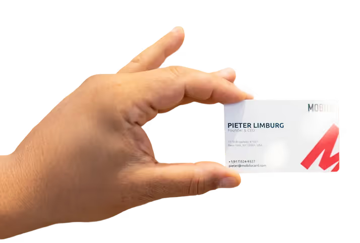
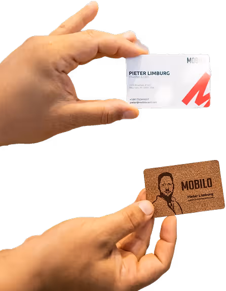
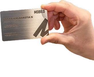
Building a focused online presence requires more than just good design principles. You need a platform that consolidates your most important information into one professional interface. Mobilo's digital contact card provides the perfect foundation for creating a streamlined hub that shares contact details, work samples, social profiles, and booking options in a clean, scrolling experience that drives real conversions.
Summary
- Single-page websites work when every element serves a clear purpose, but they fail catastrophically when treated as simpler versions of multi-page sites. The compression forces impossible tradeoffs between SEO focus, visual quality, load speed, and content depth. Teams discover too late that consolidating everything onto one URL eliminates the performance tracking, internal linking structure, and audience segmentation that make optimization possible on traditional sites.
- Google's 2023 page experience report shows sites loading in under 2.5 seconds rank significantly higher than slower competitors, yet single-page sites must load all content, images, scripts, and embedded media simultaneously. This creates the exact performance penalty search algorithms punish through Core Web Vitals rankings. The technical debt compounds strategic limitations, as 53% of users abandon websites that take longer than 3 seconds to load, according to industry research.
- Analytics blindspots turn optimization into guesswork on one-page sites. Traditional multi-page structures let you track performance section by section, identifying which pages convert at 8% versus which lose 60% of visitors. Single-page sites collapse all interactions into one data point, leaving teams unable to diagnose whether visitors bounce due to failed headlines, slow image loads, or simply never finding the target content before abandoning the search.
- The strongest one-page examples succeed through extreme discipline in color psychology, visual hierarchy, strategic CTA placement, and performance optimization. Sites like Cryptochange use dark backgrounds and structured tables to make complex financial data easier to scan. Built Things employs sensory design that communicates craftsmanship through wooden texture animation before visitors read a word. Momentum demonstrates that clarity beats creativity when relevance answers the question "how does this benefit me" immediately.
- Mobile responsiveness determines success or failure as mobile users now represent the majority of web traffic. Desktop visitors might tolerate long scrolling, but mobile users quickly abandon when faced with endless vertical content that blurs together on 6-inch screens. Poor mobile optimization doesn't just lose visitors; it actively punishes them for trying to engage on their preferred device with tiny text, stalled images over cellular connections, and forms that are frustrating to complete with touch input.
- Mobilo's digital contact card bridges the gap between optimized online lead capture and offline networking, where business cards get lost, and follow-up becomes manual work, routing every in-person contact exchange directly into existing CRM workflows with timestamps and conversation context intact.
Table of Contents
- Why Building a One Page Website Feels Risky
- What Happens When One Page Websites Are Done Wrong
- 51 Excellent One Page Website Examples That Get It Right
- Turn Your One Page Website Into a Lead Machine — Online and Offline
Why Building a One Page Website Feels Risky
The promise of simplicity becomes a dangerous trap. On a traditional multi-page site, you can fix a weak About page without affecting your pricing section. On a one-page site, everything exists in the same fragile ecosystem. One mistake in content hierarchy, load speed, or call-to-action placement compromises the entire experience.
🎯 Key Point: Unlike multi-page websites, where sections operate independently, one-page sites create interdependent systems where a single design flaw can cascade through your entire user journey.
"73% of users will leave a website if the content doesn't appear well-organized or takes too long to find what they're looking for." — HubSpot Research, 2023

⚠️ Warning: The all-or-nothing nature of one-page design means you can't incrementally improve problem areas—every change requires careful consideration of how it affects the complete user experience.
Why do teams underestimate one-page site complexity?
Most teams assume one-page sites require less work. The opposite is true. With one URL and one scroll path, every pixel must work harder. You're creating a complete narrative arc that introduces your brand, builds credibility, explains your offering, addresses concerns, and converts visitors without additional pages, all while reaching different audiences.
What impossible choices does compression create?
The compression creates impossible choices: do you prioritize SEO keywords for your main service or spread yourself thin ranking for three offerings? Do you load high-resolution portfolio images that slow the page, or compress them and risk appearing unprofessional? Do you write long-form content that builds trust but forces endless scrolling, or keep it short and leave questions unanswered? Each decision involves a tradeoff that dedicated pages would eliminate.
Why does navigation become a guessing game?
Finding what you need becomes difficult. A prospective customer lands on your page seeking pricing and scrolls past your hero section, testimonials, and feature breakdown, growing impatient with each swipe. Even with anchor links in a sticky menu, mobile users report the experience as tedious. They're hunting for one specific piece of information buried in a vertical maze.
How do different visitors need different pathways?
Different visitors need different pathways. Someone researching company culture requires different content than someone ready to buy. A vendor comparison needs specs and case studies. A support question needs fast contact options. A well-structured site creates distinct pathways for each journey, while a one-page site forces everyone through the same corridor, creating friction that drives them away.
What makes analytics tracking so difficult on single-page sites?
You can't fix what you can't see. Traditional sites let you track performance page by page: your Services page converts at 8% while your About page loses 60% of visitors. On a one-page site, analytics collapse into a single data point. You see that 70% of visitors leave after 15 seconds, but you don't know if they bounced because your headline failed, images loaded slowly, or they didn't find their target content.
How does this blindspot affect your optimization decisions?
This blindspot turns optimization into guessing. You might redesign your entire pricing section when visitors never scroll far enough to see it, or invest in better testimonials when the real problem is slow load times caused by an embedded video. Without detailed data showing where engagement drops and which sections drive action, you're making expensive changes based on hunches rather than evidence.
How does Google rank single-page websites?
Google ranks individual pages, not websites. Putting everything on a single URL means competing with one hand tied behind your back. A marketing agency with separate pages for SEO services, content marketing, and paid advertising can target distinct keyword clusters and rank for all three. A one-page site must choose which service to prioritize or risk spreading its focus too thin by attempting to rank for everything simultaneously.
What technical penalties affect single-page performance?
The technical penalties compound this problem. Loading all content, images, scripts, and embedded media simultaneously creates a slow experience that Google penalizes in Core Web Vitals rankings. According to Google's 2023 page experience report, sites that load in under 2.5 seconds rank higher than those that load more slowly. A single page carrying the weight of five separate pages starts from a disadvantaged position before content quality factors in.
Why does internal linking matter for SEO?
Internal linking becomes impossible. You can't spread page authority across your site or create topic clusters that demonstrate expertise and build semantic relationships between related content. Every ranking opportunity from site architecture is lost. Many teams discover this too late, after investing in design, content, and launch. The single URL that seemed elegant becomes a constraint that limits visibility and makes performance optimization nearly impossible.
Related Reading
- Best Link in Bio Tool
- What is Link in Bio
- How to Improve Linkedin Profile
- How To Build Personal Branding
- How to Add Portfolio to Linkedin
- How To Add Link To Tiktok Bio
- How to Add Instagram Link to Tiktok
- Where is Link in Bio on Instagram
- How to Add Link to Linkedin Post
- How to Add Website Link to Linkedin Profile
- Link in Bio Examples
- How To Add Link To Tiktok Bio
- How to Add Instagram Link to Tiktok
What Happens When One Page Websites Are Done Wrong
Your page loads, and within three seconds, half your visitors are gone. Not because they disliked your brand or found a better competitor, but because the experience itself pushed them away. Every structural mistake, design compromise, and content decision becomes a conversion barrier that visitors encounter immediately.

⚠️ Warning: Poor implementation can turn your one-page site from a conversion machine into a traffic repellent before visitors even scroll down.
"Within 3 seconds of page load, 50% of visitors will abandon a site due to poor user experience alone." — Web Performance Research, 2024
The difference between a one-page site that works and one that loses traffic comes down to execution discipline. Poor implementation pushes away the exact people you built the site to attract.
🔑 Takeaway: Every design choice and structural element either builds trust or creates friction — there's no neutral ground on a one-page website.

Why do visitors struggle with endless scrolling
Visitors arrive looking for one specific thing: pricing, contact information, portfolio samples, or service details. Instead, they encounter a vertical wall of content that forces them to hunt, scrolling past your mission statement, team photos, and client logos with growing frustration. Even with anchor navigation, mobile users report the experience as exhausting. They're searching for an exit, not exploring your story.
How does serving multiple audiences through one path create friction
The problem worsens when you serve many different visitor types through the same narrow path. Someone exploring company culture needs different content than someone ready to buy. Someone comparing vendors wants specifications and proof. Someone with a support question needs immediate contact options. Putting all these needs into one long scroll creates friction at every stage, with no clear breaks or visual hierarchy to distinguish which sections matter to each visitor.
Where Calls-to-Action Disappear
Most one-page sites place a single call to action at the bottom, assuming visitors will read the entire story before deciding what to do. However, not all visitors arrive ready to act. Some need to build trust first, others want to compare options, and many leave before reaching your footer. When your CTA gets buried under misaligned sections, you hide your conversion point. The visitor seeking pricing scrolls past testimonials, feature breakdowns, and company history before finding the "Get Started" button they were looking for upon landing. By then, they've already opened a competitor's site in another tab.
What happens when everything loads at once?
Loading everything at once creates the exact problem Google penalizes. Your hero section, portfolio gallery, embedded videos, testimonials, contact form, and footer all compete for bandwidth at the same time. Google reports that 53% of users abandon a website if it takes longer than three seconds to load. Spreading content across multiple URLs would reduce this burden, but a single page carries the full weight.
How do heavy graphics affect loading speed?
Heavy graphics worsen the problem. Full-screen background videos add four seconds to load time, and high-resolution portfolio images frustrate mobile users. You must choose between visual quality that builds trust and loading speed that retains visitors.
How does explaining multiple services dilute your positioning?
Explaining multiple services on one page weakens your positioning. Your roofing company wants to rank for "roof repair," "roof replacement," and "insurance claims assistance." Separate pages give each service focused messaging, dedicated keywords, and clear value propositions. On a one-page site, three competing paragraphs get lost in a cluttered middle section that visitors scroll past while searching for pricing.
What happens when your core message gets buried?
Your core message—why someone should choose you over alternatives—gets buried in noise. There's no room for depth that builds authority, case studies that prove capability, or addressing specific objections for different service lines. You end up with surface-level descriptions that fail to differentiate or convince. Teams managing lead generation through scattered methods face similar constraints: business cards get lost, contact details live in different systems, and follow-up becomes manual guesswork. Our digital contact card consolidates contact sharing into one automated flow, capturing every interaction and routing it directly into existing CRM workflows without manual data entry.
The Mobile Experience That Frustrates
Mobile users, who account for most web traffic, abandon websites that require excessive scrolling. On small 6-inch screens, sections blur together, making navigation effortful. Poor mobile responsiveness compounds every problem: text becomes illegible, images load slowly on cellular networks, and form interactions frustrate users. You're making mobile visitors regret using your site on their preferred device. But knowing what breaks is helpful only if you can see what works when you respect those limits.
Related Reading
- How to Add Linktree to Tiktok
- How To Add Linktree To Instagram
- How To Add A Link To Instagram Story
- How To Add Link To Instagram Profile
- Personal Landing Page Examples
- Graphic Design Portfolio Websites
- Personal Portfolio Website Design Examples
- Small Business Bio Examples
- Best Photography Portfolio Websites
- Instagram Landing Page Examples
51 Excellent One Page Website Examples That Get It Right
The best one-page websites guide visitors through a clear journey, reduce decision fatigue, and make taking action feel natural. Each example below demonstrates a specific principle you can apply to your own site, whether you're launching a product, building a portfolio, or promoting an event.

🎯 Key Point: Successful one-page sites eliminate navigation confusion by presenting everything visitors need in a single, focused experience.
"One-page websites can increase conversion rates by up to 37% compared to multi-page alternatives by reducing friction in the user journey." — UX Design Institute, 2023
💡 Tip: Study how each example balances visual appeal with functional design—the most effective sites prioritize user goals over flashy elements that distract from the primary call-to-action.
1. HoneyBee
This single-page website demonstrates how colour, texture, and typography create unified brand experiences. The palette draws directly from honey itself (warm golds, soft ambers, natural browns), establishing an instant visual connection before readers engage with the copy.
Why it works
Every design element reinforces that human health depends on environmental health. The minimalist layout focuses attention on the product while the colour scheme carries the emotional weight.
Key takeaway
Choose a colour palette that creates immediate connections with your product or service, letting visual elements communicate your message before words do.
2. Emotion Theater in New York
Parallax scrolling adds depth to this theater group's website, mirroring the eerie atmosphere of live performance. Large images paired with text introduce the company's aesthetic and philosophical approach.
Why it works
The white background represents stillness: the blank canvas from which creative work emerges. As you scroll, images and text reveal identity without overwhelming viewers.
Key takeaway
Use white space strategically. It provides breathing room, strengthening the impact of the content.
3. Cryptochange
The colour palette (deep blues, cool grays, bright accents) signals finance and cryptocurrency. Light fonts against dark backgrounds emphasize text, while tonal variation separates headings from body copy.
Why it works
Tables and graphs create structure, making numerical data easier to scan. Finance audiences prioritize clarity and organisation.
Key takeaway
When presenting complex data, prioritize readability through contrast and hierarchy so your audience grasps information at a glance.
4. CRE8TIVE REVOLUTIONS
A white background with black text and orange accents focuses attention on structure and content. Though the page has multiple sections (solutions, about, testimonials, programs), it remains uncluttered because text-heavy areas use button lists to organize information.
Why it works
Limited imagery keeps navigation clear, while the single "book a call" CTA appears strategically to reduce decision paralysis.
Key takeaway
When sharing substantial information, organisation matters more than decoration. Use lists, clear section breaks, and consistent formatting to keep your content readable.
5. Built Things
The menu contains four main items: learn more about the company, what they do, who does it, and how to contact them. The animation mimics wooden surfaces, creating a hands-on feeling that reinforces the company's focus on physical craftsmanship.
Why it works
Every part has a purpose. The design avoids unnecessary decoration while hands-on animation strengthens the brand message.
Key takeaway
Less is more when every part is intentional. Remove things ruthlessly until only essentials remain.
6. Jon Phillips
This example displays basic information, personality, and social media buttons that blend smoothly with the design. The portfolio is located elsewhere, keeping this landing page focused on making a strong first impression.
Why it works
It proves that effectiveness doesn't require complexity. The clean design demonstrates the designer's skill.
Key takeaway
A well-designed, simple page outperforms a poorly designed, complex one. Start minimal and add only what serves your goal.
7. The Art of Texture
A short film answers visitor questions before they ask them. Captions appear on hover, adding context without cluttering the visual experience.
Why it works
Video showcases artistry and talent more effectively than text. Interactive captions provide additional information for visitors seeking deeper learning without disrupting the visual experience.
Key takeaway
When your work is visual, show it. Use video or high-quality images as your primary communication method, with text as support.
8. Momentum
This app landing page demonstrates good organization. Every design element and word choice connects directly to the main value proposition, helping visitors quickly understand the benefits and download the app.
Why it works
The page answers "how does this benefit me?" immediately, with nothing obstructing the download path.
Key takeaway
Being relevant is more important than being creative. Every element should answer: "Why should I care?"
9. Kim Gardner
Clean and simple, this one-pager shares links to multiple projects without overwhelming visitors. Social buttons at the bottom provide easy access to more information.
Why it works
It respects visitor attention by providing enough information to decide whether to explore further, without requiring them to review everything upfront.
Key takeaway
Give visitors clear next steps. Not everyone needs all your information at once; some need only to know where to find more.
10. Plentific
The "how it works" animation video effectively communicates the service. In the testimonials section, images enlarge slightly on hover, drawing attention without requiring a click.
Why it works
The hover effect creates subtle interactivity that feels responsive and alive.
Key takeaway
Micro-interactions (hover effects, subtle animations) make static pages feel dynamic and engaging. Use them sparingly for maximum impact.
11. Make Your Money Matter
Vivid imagery engages visitors immediately, explaining what happens to their money when they deposit it in a bank while maintaining focus on the main message.
Why it works
Visual storytelling simplifies complex financial concepts and guides visitors toward the next step.
Key takeaway
Use visuals to simplify complex topics. A good illustration can replace paragraphs of explanation.
12. Treehouse
Pictures and descriptions alternate throughout the page, creating a balanced rhythm as you scroll.
Why it works
This pattern prevents monotony while making information digestible—your eye knows where to find each type of content.
Key takeaway
Establish a visual pattern and maintain it. Consistency helps visitors process information faster.
13. James O'Connell
This designer keeps the portfolio off the main page, maintaining a clean, simple space. Visitors see the essentials and a hint of personality, with social buttons that let them explore further.
Why it works
The restraint demonstrates creative confidence. The design signals the designer's approach to work.
Key takeaway
Sometimes what you leave out matters more than what you include.
14. Typetalk
Simple and responsive, with bright colours, clear product descriptions, and animation effects that maintain engagement without overwhelming users.
Why it works
Animations guide attention and add interest without distracting from the product message. Colour creates energy while structure maintains organisation.
Key takeaway
Animation should make things easier to understand, not replace clear information. Use motion to guide people's gaze, not just to look impressive.
15. Hourly
Bold typography and mild animation combine with a consistent three-colour palette to create a neat, well-organised appearance. The limited colour scheme unifies all elements and prevents visual confusion.
Key takeaway
Choose three main colours and stick to them. Consistency creates coherence, which builds trust.
16. Upstate Laundromat
Blue, grey-blue, white, and carmine create an effective colour palette. The banner photograph, with its soft bokeh, represents purification and gentleness. Text blocks, icons, buttons, and the logo are positioned for intuitive navigation.
Why it works
Thoughtful design transforms everyday services like laundry into meaningful experiences.
Key takeaway
Your industry doesn't determine your design quality. Boost any service through intentional visual choices.
17. Coppé – MILK
This Japanese music event organizer uses a minimalist black-and-white colour palette to create a modern, stylish image. The simple design lets event details and booking information stand out without visual competition.
Why it works
The restrained design lets the event details and booking information stand out. Nothing competes for attention.
Key takeaway
Black-and-white colour palettes work when you want your content to be the star: remove colour to add focus.
18. Genesis
There is no block separation here. Content flows naturally as you scroll, inviting you to keep reading through the entire story. The smooth flow creates narrative momentum: you keep scrolling because there is no visual stopping point. When telling a story, remove artificial breaks and let the narrative pull visitors through the page naturally.
Why it works
The seamless flow creates narrative momentum. You keep scrolling because there's no visual stopping point.
Key takeaway
When telling a story, remove artificial breaks. Let the narrative pull visitors through the page naturally.
19. The Rafael. The Julian
This property website features an engaging illustration in the top-right corner, with windows that light up on hover. It provides comprehensive information about planning, amenities, and the neighbourhood.
Why it works
The interactive illustration enhances the page while keeping focus on the main information.
Key takeaway
Small interactive details create memorable moments. One thoughtful animation outweighs a dozen generic ones.
20. ENJOY
Graphic and motion design work together with parallax effects and element animations to create a futuristic aesthetic. The effects feel purposeful rather than overdone.
Why it works
The design aligns with the brand's forward-thinking positioning, with visual effects that reinforce rather than replace the message.
Key takeaway
Match your design approach to your brand positioning.
21. Halo
Animation and parallax effects guide visitors toward desired actions without overcomplicating the experience.
Why it works
Every animation has a purpose: it directs attention to the next step in the journey.
Key takeaway
Use animation to guide visitors toward conversion, not to impress them. Every effect should serve a purpose.
22. Dave Gamache
Like Jon Phillips' approach, this landing page includes specialty, location, social buttons, and an email field. The design demonstrates the designer's capabilities.
Why it works
The design is the portfolio. You understand the designer's style immediately without clicking through project galleries.
Key takeaway
For creative professionals, your landing page is your first portfolio piece.
23. MyLakeMap
High-resolution background images, subtle parallax scrolling, readable fonts, clear menus, and thoughtfully placed graphics create a clean, well-organized page that communicates sustainable, environmentally conscious fishing.
Why it works
Every design choice reinforces the sustainability message, with clarity and organization mirroring the company's values.
Key takeaway
Your design should reflect your values. If you prioritise sustainability, your site should feel clean and purposeful.
24. Elon's Toilet
This awareness campaign combines a scroll-up rocket animation with a clear call to get tested for colon cancer, using a countdown and a strong call to action.
Why it works
The creative approach celebrates Elon Musk's 50th birthday while raising cancer awareness, making a serious message memorable. The scroll-up mechanic is unexpected and engaging.
Key takeaway
Serious messages don't require serious design. Creative approaches make important topics easier to understand and relate to.
25. Bugatti Smartwatches
Video backgrounds and GIFs showcase the product. Branded visuals lead to an Indiegogo call to action, with an FAQ section that builds buyer confidence.
Why it works
The brand leverages its luxury car reputation to enter a new product category. Video demonstrates features more effectively than static images.
Key takeaway
Leverage your existing brand reputation when launching new products. Video is essential for physical products that need demonstration.
26. Mama Joyce Peppa Sauce
Bold typography and a simple colour palette create immediate impact. As you scroll, the sauce bottle moves from left to right, making content easier to access. An animated cursor prompts purchase.
Why it works
The quirky personality shines through without compromising functionality, and the animated cursor is memorable without being annoying.
Key takeaway
Personality and conversion can coexist. Let your brand's voice come through in design choices, not just copy.
27. Daniel Schuh Originals
A minimalist approach with a neutral colour palette and smooth scrolling. Each section flows naturally into the next, covering products, about information, image gallery, sustainability details, and contact information.
Why it works
The page stays uncluttered with smooth transitions and consistent design throughout.
Key takeaway
Smooth transitions matter more than flashy effects.
28. Sawdust Art Festival
A striking hero image, event details, and ticket CTA appear immediately. Below, you'll find event information, featured artists, and an Instagram feed, with multiple CTA buttons positioned throughout.
Why it works
Repeated CTAs catch visitors at different decision-making stages, ensuring the button is available when they're ready to buy.
Key takeaway
Place CTAs strategically throughout your page, as different visitors convert at different points.
29. Ljubicic Tennis Academy
A full-width background video showcases facilities with clear section transitions and labels. The cursor displays a tennis ball icon that expands when hovering over clickable elements.
Why it works
The custom cursor matches the brand without distraction, while the video immediately communicates facility quality.
Key takeaway
Custom cursor designs reinforce branding when subtle and functional; don't sacrifice usability for creativity.
30. Hareesh Live
This UI/UX designer's portfolio combines text, information, screenshot visuals, and an FAQ section.
Why it works
The design matches audience needs—writers and authors value clarity and straightforward information over flashy visuals.
Key takeaway
Design for your audience, not for design awards.
What matters is whether your target users find it effective.
31. Lucibelle Paris
A product video that plays automatically demonstrates the Ove beauty mask in action. As you scroll, different features and benefits appear on screen. Customer testimonials precede the price, building trust.
Why it works
Social proof precedes the call to action, so visitors already believe the product works before being asked to buy.
Key takeaway
Build confidence before asking for commitment.
32. No-Code Conf
Section-triggered navigation links let you access information without scrolling. Clean, colorful visual blocks organize content, with registration CTAs prominently displayed.
Why it works
The "Why Attend" section uses click-to-reveal navigation, allowing users to control their experience.
Key takeaway
Give visitors control. Not everyone wants to consume information in the same order.
33. The Beyond
An immersive hero section sets the tone for this festival website. The event schedule, lineup, FAQ section, and contact form address common questions about travel, tickets, and event details while capturing visitor interest.
Why it works
The FAQ prevents repetitive support questions by addressing concerns upfront, while high-quality photos build excitement and anticipation.
Key takeaway
Anticipate questions and answer them before they're asked. FAQs are conversion tools.
34. Jords+Co
A clean, modern look pairs with direct words like "Become the obvious choice." The site focuses on B2B tech branding and web conversions through simple anchor-link navigation.
Why it works
The simplicity creates a confidence-inspiring blank slate for clients to consider their transformation, while the authoritative tone builds trust.
Key takeaway
For B2B services, confidence matters more than creativity. Design should signal competence and reliability.
35. Seth Hampton's Portfolio
Designed by Adam Fox, this portfolio uses a lively colour scheme that reflects the actor's personality. Primary colours and rectangular shapes evoke Piet Mondrian's work, creating a modern, artistic feel.
Why it works
Clear sections (About, Gallery, Press, Contact) help visitors learn about Seth's story and easily find his talent and calls to action.
Key takeaway
Let your personality come through in your design choices. Colour and layout communicate your character before readers engage with your content.
36. Amsterdam Chemistry Innovation Day (ACID)
A clean, two-tone colour palette and sans-serif typography create a professional yet approachable look. Interactive details—hover effects, parallax scrolling, and spinning crystals—add visual energy to what could be a dry academic event.
Why it works
The dynamic design adds energy to what could be a dry academic event. The professional-yet-approachable aesthetic matches the networking focus.
Key takeaway
Professional doesn't mean boring. Use subtle animation to add energy without sacrificing credibility.
37. PrimeLINK
This single-page site for cryptocurrency and Web3 designers features a sleek design, clear section breaks, and concise service descriptions. A blue-and-beige colour scheme enhances scannability.
Why it works
Client logos provide social proof. Service summaries in large bubbles ("P&L analysis," "Quick setup") convey value at a glance. Subtle animations maintain visual interest without distraction.
Key takeaway
For technical services, clarity beats cleverness. Make it easy to understand what you do and who you've served.
38. Micro Interactions
This Webflow library uses a high-contrast black-and-yellow colour scheme that makes "Get Lifetime Access" CTAs impossible to miss.
Why it works
Parallax effects highlight key moments, such as the scrolling CTA list and the testimonial wall. Transparent pricing appears after the value is established.
Key takeaway
High contrast creates urgency. Use it strategically on your most important elements.
39. Dropbox Dash x McLaren
This case study combines striking visuals with storytelling about McLaren's Formula One collaboration. Animated UI cards and scroll-triggered animations showcase creative approaches while prioritising performance and speed.
Why it works
The design mirrors the client's identity by demonstrating speed and performance through the site's behaviour rather than merely describing them.
Key takeaway
Make your site's performance demonstrate your capabilities. Show, don't tell.
40. DesignCraft
Jennifer J. designed this site using bright, high-contrast colours and playful circular shapes to convey the brand's identity.
Why it works
The page displays services first, then turnaround time, and finally customer testimonials. A sticky menu appears only when scrolling up, enabling easy navigation without obstruction.
Key takeaway
A menu that stays at the top should appear only when needed, not constantly. Show your main content in full screen first, then reveal the menu on request.
41. Master Gorgeous UI Design
Pablo Stanley's course page demonstrates design skills through playful emojis, generous white space, and hover animations.
Why it works
Design blocks outline what students will learn near a major CTA. Testimonials from students and industry professionals build credibility.
Key takeaway
For educational products, show what people will get and proof near your call to action. People buy results, not features.
42. Hyper
The site opens with a platform mockup highlighting speed, savings, and efficiency, set against a dark, grayscale background with planets, creating a futuristic aesthetic.
Why it works
A sticky menu with "Schedule a demo" and "Get started" buttons keeps conversion paths accessible at any scroll point, reinforcing the product's positioning.
Key takeaway
Enable conversions at any moment—don't assume visitors will scroll to the bottom before deciding.
43. Atoms
This habit-tracking app landing page uses a warm, cream-coloured palette that mirrors the Atomic Habits book cover, with a smartphone mockup displaying the app and a gold CTA button.
Why it works
The design lets readers see the product without being overwhelmed by information. CTA buttons link directly to app stores.
Key takeaway
For apps, show the interface immediately so visitors can envision using your product.
44. Cook Collective
Bold typography and a striking tagline ("Shared kitchen by food industry people, for food industry people") immediately convey the brand's purpose.
Why it works
The simple orange-and-black color scheme keeps everything cohesive. The CTA to book a tour appears strategically to encourage the next step.
Key takeaway
A strong tagline can do the work of paragraphs. Get your positioning right, then let design amplify it.
45. Screen Studio
This SaaS landing page uses a black, minimal, professional design with a hero section that features "Beautiful screen recordings in minutes" and a clear free-trial call to action.
Why it works
A dynamic embedded video demonstrates the software in action, while the one-page layout efficiently covers testimonials, pricing, and features.
Key takeaway
For software products, showing how they work beats describing them. Demonstrate the product in action, then provide supporting details.
46. Neverland
This creative experience agency website is immersive and engaging. Every detail matters, from the cursor (a simple black dot matching the brand) to the parallax effects and animations that guide visitors through the content.
Why it works
The design guides visitors through a deliberate storytelling experience via scrolling, supported by an expandable right-hand navigation menu.
Key takeaway
When you have a story to tell, guide visitors through it purposefully. Not every site needs random-access navigation.
47. ONCE - Writebook
This site serves writers and authors with clear, direct information. Screenshots illustrate the text, and a FAQ section addresses common questions.
Why it works
The design is clean and focuses on the most important information. A sticky, bookmark-style CTA continuously prompts users to take action.
Key takeaway
Give your audience the amount of information they expect. Readers want real, useful content; provide it.
48. Artone Studio
This creative studio portfolio uses sliders and pop-ups to let visitors explore project details without leaving the page. A carousel gallery displays high-resolution images of services in action.
Why it works
Interactive elements sustain engagement while animations and design showcase the studio's expertise. Features-to-benefits copy communicates value effectively.
Key takeaway
Interactivity keeps visitors engaged longer and lets them explore at their own pace.
49. Apple Plug
This product-focused design mirrors the original Apple website, creating familiarity and trust. The clean layout uses large imagery to showcase the product, with navigation via scrolling or the top menu.
Why it works
The writing gets straight to the point, focusing on what the product does and how it helps you. A newsletter signup provides a clear next step for interested visitors.
Key takeaway
When your design resembles well-known brands, it can help people trust you immediately if your product relates to those brands.
50. We Ain't Plastic
Full-screen visuals and black-and-white design create an immersive, professional portfolio experience. Icons highlight the artist's strengths and services.
Why it works
The "Work" section expands projects into full-page displays on the same page, showcasing skills while adding surprise and delight through an interactive approach.
Key takeaway
Make exploration rewarding by giving visitors reasons to click and discover more.
51. Pillowtalk
This private journaling app beta launch site uses engaging visuals and a pastel colour scheme for effective brand messaging. The top section features changing photos with shimmering, wavy hero text.
Why it works
Each feature includes visuals that match the brand. A rolling carousel of user testimonials adds credibility, while every image reinforces the feeling of relaxation and calm that the app promises.
Key takeaway
Visual consistency matters more than visual complexity. Every image should reinforce your core message. Most of these sites share a common thread: they eliminate friction, guide attention, and make conversion feel natural. Platforms like digital contact card apply this philosophy to professional networking, creating streamlined profiles that let contacts save your information, follow your social channels, and reach out through their preferred method. The principle is identical: remove obstacles between interest and action. But a beautiful one-page site is only half the equation when it sits idle between in-person meetings.
Related Reading
- Bio Site vs Linktree
- Linktree Alternatives
- Shorby Vs Linktree
- Linkinbio vs Linktree
- Linktree vs Carrd
- Beacons vs Linktree
- Beacons vs Stan Store
- Milkshake vs Linktree
- Taplink vs Linktree
Turn Your One Page Website Into a Lead Machine — Online and Offline
Your one-page site converts visitors from search, social, and referrals. But most leads come from offline conversations: someone meets you at a conference, you hand them a business card they lose it before the week ends. This gap between your optimized digital presence and offline networking is where qualified prospects disappear. Most professionals treat online and offline lead capture as separate systems. Your website has analytics, tracking pixels, and CRM integration, while in-person interactions rely on manual follow-up, scattered contact details, and hope. Half your lead generation effort operates in the dark, with no data on who you met, what they cared about, or when to follow up.
🎯 Key Point: The handoff between real-world networking and digital follow-up is where most qualified leads disappear—often within 72 hours of initial contact. The pattern repeats at every event: collect business cards, promise to connect, then spend hours manually entering contact information into your CRM. By the time you follow up three days later, the conversation has gone cold. Your optimized one-page website sits ready to convert, but the handoff from real-world interaction to digital follow-up breaks down.

⚠️ Warning: Manual contact entry delays mean you're following up when prospects have already engaged with competitors who responded faster.
"72% of leads go cold when there's more than a 24-hour delay between initial contact and first follow-up communication." — Sales Response Research, 2023
Mobilo closes that gap by treating in-person contact exchange the same way your website treats visitor tracking. Tap your digital business card against someone's phone, and their contact details flow directly into your CRM with timestamps, location data, and conversation notes. Lead scoring happens automatically based on information captured during the interaction. Your follow-up email arrives while the conversation remains fresh, linking them to your one-page site where the conversion process continues without friction.

Over 59,000 companies use this approach because it eliminates the manual work that causes leads to go cold. Every meaningful conversation becomes a tracked interaction. The sales rep who met fifty people doesn't spend Sunday night typing contact details into spreadsheets. The marketing manager sees which booth conversations turned into qualified leads.

💡 Tip: Book a demo and get your first 25 Mobilo cards free (worth $950). Your one-page website already converts visitors who find you online. Make sure the people you meet in person get the same optimized experience from first contact to closed deal.


