

.avif)

40+ Best Photography Portfolio Websites to Model Yours After
On This Page
Photography deserves more than a forgotten folder on someone's phone. A photographer's portfolio website often creates the first impression potential clients have of their work, and in a crowded market, that first impression needs to be flawless. The best photography portfolio websites combine stunning visual presentation with smart functionality to attract clients and showcase work professionally.
While studying top portfolio sites provides inspiration for layouts and galleries, connecting with clients requires more than beautiful images on a screen. When someone admires photography work at an event or exhibition, photographers need a seamless way to share their portfolio and contact information instantly, turning genuine interest into client relationships with digital contact card technology that eliminates awkward business card exchanges.
Summary
- Photography portfolios fail when they showcase mixed work instead of targeted expertise that speaks to specific client needs. Even technically excellent images won't convert if they don't answer the one question potential clients ask: "Can this person create exactly what I need?" Scattered portfolios signal scattered focus, and clients hire confidence, not potential.
- The ideal portfolio contains 15 to 20 carefully curated pieces, based on research into portfolio best practices. This constraint forces clarity and eliminates the common mistake of asking clients to figure out what you're actually good at. When you present 50 images across mixed genres, you're doing work the photographer should have already done, and most clients simply won't invest that effort.
- Production value separates work that gets shared in creative director meetings from work that gets polite rejection. It's not about expensive gear but visible evidence of intentional craft, from how light wraps around subjects to whether styling feels cohesive or haphazard. Commercial clients obsess over these details because their reputations depend on partnering with photographers who operate at their standard.
- Memorable portfolios create a single, sharp impression that someone can describe in one sentence after closing the tab. When your portfolio jumps between genres, styles, and quality levels, viewers remember confusion rather than competence. The photographers who get remembered and recommended make pattern recognition effortless through consistent visual style and subject matter.
- Portfolio traffic converts to inquiries only when the path from interest to action requires zero effort. Most photographers lose opportunities not because their work wasn't strong enough, but because reaching out felt like work, with potential clients required to hunt for contact information or remember to send an email later. Each extra step creates a decision point where interest dies.
- Mobilo's digital contact card addresses this by letting potential clients tap once to save contact details, view the full portfolio, or schedule calls directly, syncing their information to your CRM with timestamps so you can follow up within hours while interest remains warm.
Why a Weak Portfolio Holds Your Photography Back
Your portfolio fails not because your photos are bad, but because they don't match what ideal clients need. When prospects seeking high-end commercial work encounter a mix of personal projects, small-budget shoots, and technically solid but forgettable images, they leave—not doubting your skill, but unable to see themselves in your work.

🎯 Key Point: Your portfolio should be a mirror that reflects your ideal client's vision back to them, not a showcase of everything you've ever shot.
"73% of potential clients decide whether to hire a photographer within the first 10 seconds of viewing their portfolio." — Professional Photographers Association, 2023

⚠️ Warning: A misaligned portfolio is the fastest way to repel high-paying clients who can't immediately see how your work solves their specific problems.
What separates good work from work that converts?
Photographers build portfolios around what looks good, not what looks good in books. They include images because the lighting was tricky or the composition balanced, without considering whether those photos communicate the specific value that paying clients need. The gap between "good work" and "work that converts" is where most photography careers stall.
The Wrong Photos Problem
You might have 50 strong images in your portfolio. Brutally Honest Microstock's 2025 year-end review mentions a portfolio with 32,413 images, but volume doesn't solve the targeting problem. If you want to shoot automotive campaigns but your portfolio leads with lifestyle portraits and landscape work, car brands won't see you as a specialist. Even car shots buried in your portfolio won't be discovered.
Your portfolio works as a filter: it attracts the clients you want and pushes away the ones you don't. When someone visits your site, they're asking, "Can this person create what I need?" If the answer requires scrolling or guessing, you've lost them. They're comparing you against photographers whose portfolios say "I do exactly this, at the highest level." Mixed work signals scattered focus. Clients hire confidence. When your portfolio mixes genres, styles, and production quality, you ask them to imagine how your work might serve their needs. They want proof, not possibility.
What does production value actually mean in photography?
Production value isn't about expensive gear or exotic locations. It's the visible evidence of intentional craft. Two photographers can shoot the same subject with similar equipment and deliver different results. One image feels polished, thoughtful, and complete; the other feels competent but ordinary.
How do clients recognize high production value?
The difference shows up in details most people can't name, but everyone can feel: how light wraps around a product, whether styling feels cohesive, whether composition guides your eye, whether color grading enhances mood, or whether itlooks like a preset. These elements separate work shared in creative director Slack channels from work that receives a polite "thanks, we'll be in touch."
Why do commercial clients obsess over production value?
Commercial clients care about production value because their reputations depend on it. A food brand launching a premium product line cannot use rushed or generic photography. An architecture firm pitching luxury developments needs images that match the sophistication of the developments they're selling. Inattention to these details signals that you don't meet their standards.
Why do most photographers struggle with targeting
Most photographers skip the hardest question: who do I want to work with, and what do they need to see? Without that answer, portfolios become museums of past work rather than tools for future clients. You include the wedding because the couple loved it, the product shot because the lighting was challenging, and the portrait because it won a local award. None of that matters if it doesn't speak to your target clients.
How do you research what target clients actually want?
Research what your target clients hire for. Study the portfolios of photographers already working with brands you want. Notice what's missing from your work compared to theirs. This isn't about copying their style—it's about understanding the visual language and production standards that matter in that market. If every successful automotive photographer shows cars in motion with complex lighting setups and you're showing still shots in parking lots, the gap is clear.
What makes a portfolio instantly bookable
Your portfolio should make one thing crystal clear: this is what I do, this is the level I work at, and if you need this, I'm the person to call. A focused portfolio of 15 exceptional, targeted images will book more work than 100 mixed shots. When potential clients visit your portfolio, they're qualifying. Making it easy for them to say yes means showing exactly what they came to find, executed at a level that eliminates doubt. That's how digital tools like Mobilo help photographers connect their portfolio to real opportunities. The gap between "impressed" and "hired" collapses when the path forward is instant. But showing the right work at the right level is only half the equation. What makes someone remember your portfolio after they close the tab?
Related Reading
- Best Link in Bio Tool
- What is Link in Bio
- How to Improve Linkedin Profile
- How To Build Personal Branding
- How to Add Portfolio to Linkedin
- How To Add Link To Tiktok Bio
- How to Add Instagram Link to Tiktok
- Where is Link in Bio on Instagram
- How to Add Link to Linkedin Post
- How to Add Website Link to Linkedin Profile
- Link in Bio Examples
- How To Add Link To Tiktok Bio
- How to Add Instagram Link to Tiktok
What Makes a Portfolio Memorable — and Why It Matters
Poor presentation actively convinces potential clients you're not the right choice, even when your technical skills exceed those of competitors they hire. A visually disorganized site, inconsistent image quality, or confusing navigation signals that you don't operate at the needed level. The decision happens in seconds, often before they've seen your best work.

🎯 Key Point: Your portfolio's visual presentation carries more weight than your actual skills during the initial client evaluation.
"The decision happens in seconds, often before they've seen your best work." — First impressions in digital portfolios are formed within moments of landing on the page.

⚠️ Warning: Even superior technical abilities won't overcome the negative impact of poor visual presentation and confusing user experience in your portfolio.
How does poor presentation eliminate opportunities?
When clients browse portfolios, they're eliminating choices, not conducting careful reviews. If your site loads slowly, displays images inconsistently, or buries your best work, you've made it easy for them to leave. They're comparing you to photographers whose sites look finished, intentional, and intuitive. The difference often isn't about the photography itself.
Why does curation matter more than quantity?
According to Pikd's analysis of portfolio best practices, the ideal portfolio contains 15 to 20 carefully chosen pieces. This constraint forces clarity. Showing 50 images across different work types asks clients to determine your strengths and fit. They won't. They'll hire someone who made the answer obvious.
What are the long-term consequences of weak presentation?
A weak portfolio doesn't cost you one opportunity; it shapes how people remember you when your name comes up later. If a creative director leaves unimpressed, they're unlikely to return when a relevant project appears months later.
Why do strong portfolios fail to generate inquiries?
People often redesign their websites only to find that conversions don't improve. The problem is that portfolios show what you made rather than what it did. A potential client looking at real estate photography doesn't want beautiful interiors alone; they want proof that those images sold properties faster or attracted premium buyers. Focusing on what you created instead of what it accomplished misses the emotional connection that drives hiring decisions.
What happens when technical competence doesn't translate to business results?
This frustration deepens when photographers see that their portfolio is strong yet still doesn't generate inquiries. The disconnect reveals a gap between technical skill and strategic presentation. Your work might be excellent, but if the site doesn't explain why that excellence matters to someone with a specific business problem, quality becomes irrelevant.
How do weak portfolios damage your professional reputation?
A poorly presented portfolio creates problems at every stage of client acquisition. When someone shares your link, that person forms an opinion in the first 10 seconds. If your site feels unprofessional or disorganized, the recommendation loses credibility, and the person who shared your work appears to have poor judgment, making them less likely to recommend you in the future.
Why do weak portfolios force you into inefficient marketing?
Each weak impression reduces referrals, repeat clients, and word-of-mouth growth. You end up relying entirely on cold outreach, which requires far more effort to generate results than someone with a strong portfolio can achieve through passive recommendations. When your portfolio can't convert the small percentage who actually look, the entire system breaks down.
How do weak portfolios limit access to high-value opportunities?
High-volume, high-paying clients work within tight professional networks. Once labeled as "not quite right" due to a weak portfolio, changing that perception becomes nearly impossible. They've already filled that mental slot with someone whose presentation matched their standards.
What creates a memorable first impression?
Memorable portfolios create a single, sharp impression. When someone closes the tab, they should describe what you do in one sentence: "The person who shoots moody automotive work with complex lighting setups." "The photographer who makes restaurant interiors feel intimate and lived-in." That clarity emerges when every image reinforces the same message. Consistency in visual style, production quality, and subject matter builds memory. When your portfolio jumps between genres, styles, and quality levels, viewers can't form a clear pattern—they remember confusion, not competence. Photographers who get remembered and recommended make pattern recognition effortless.
How do you convert interest into bookings?
Tools like digital contact card help photographers convert memorable impressions into action. After someone sees your portfolio and decides you're the right fit, the path to booking should require zero effort. When they can instantly save your contact details, view your full portfolio, or schedule a call without hunting for information, the gap between interest and commitment closes. Most photographers lose opportunities in that friction, not because their work wasn't strong enough, but because the next step wasn't clear. The question isn't whether your portfolio contains good work. It's whether someone can look at it once and immediately understand why they should hire you instead of the next person in their browser tabs. If that answer requires explanation, your presentation is failing.
Related Reading
- How to Add Linktree to Tiktok
- How To Add Linktree To Instagram
- How To Add A Link To Instagram Story
- How To Add Link To Instagram Profile
- Personal Landing Page Examples
- Graphic Design Portfolio Websites
- Personal Portfolio Website Design Examples
- Small Business Bio Examples
- One Page Website Examples
- Instagram Landing Page Examples
40+ Incredible Photography Portfolio Websites That Inspire
Real portfolios show what theory cannot teach. These examples demonstrate how photographers transform abstract ideas into working tools that help them book jobs, separated by specialty, so you can see how presentation changes across different clients and visual styles.
🎯 Key Point: Study portfolios in your specific photography niche to understand how successful photographers present their work to their target clients.
"The best photography portfolios don't just showcase technical skill—they demonstrate how photographers solve specific client problems through visual storytelling." — Photography Business Institute, 2024

💡 Pro Tip: Notice how each portfolio style reflects the expectations and aesthetic preferences of different client types, from corporate brands to individual portrait clients.
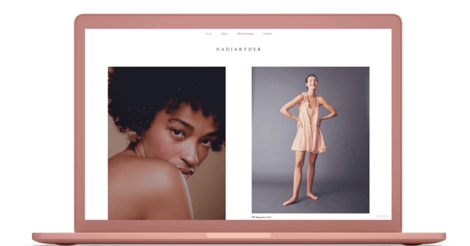
Portrait Photography Portfolio Examples
1. Shailendra Rana
Rana's portfolio demonstrates how international commercial work requires organized navigation. His site separates portrait, travel, and fashion projects into distinct categories with descriptive titles that provide context before viewers see images. The lightbox format allows clients to move through project stories without losing their place. Prominent social media integration and search functionality recognise that potential clients arrive from multiple touchpoints. His homepage grid uses subtle darkening effects on hover, a small interaction that confirms clickability without competing with the photography.
2. Lauren Keskinel
Keskinel's warm colour scheme creates an inviting atmosphere that matches her hands-on approach to portraiture. Simple navigation and a central brand logo direct attention to project categories organized by subject rather than by time. Her grid gallery presents subjects with clarity and depth without overwhelming viewers.
Lifestyle and Family Photography Portfolio Examples
3. Mimis Moments
VanCannon's homepage uses a three-column layout that combines a brand story with family photos and hover-zoom effects. An auto-scrolling widget displays services without requiring visitor interaction, ensuring no offerings are missed in the navigation menu. Detailed photo galleries and a services section with upfront pricing help potential clients decide before sending inquiry emails.
4. Amanda Rymers Photography
Rymers' simple approach provides ample white space with three navigation options: home, about, and client galleries. The client galleries feature lets you share photos, review them, deliver them, and sell prints in one place, streamlining the workflow for both photographer and client.
Newborn Photography Portfolio Examples
5. Pierre Debellot Photography
Debellot's background in sketching and graphic design shapes his minimalist portfolio. A hero slideshow immediately communicates his style, followed by a brief biography and grid display of projects. Separate pages detail packages and print options with specific costs, eliminating the "contact for pricing" barrier that drives potential clients away. Client testimonials on the "Kind Words" page add social proof without cluttering the main experience.
6. Emily Burke Photography
Burke's twelve years of experience show in a homepage slideshow that demonstrates range while maintaining stylistic consistency. The "Full Sessions" tab provides password-protected client galleries, while the "Book a Session" tab functions as an e-commerce page with add-to-cart functionality. This integration converts portfolio visits into bookings without requiring email exchanges.
Food Photography Portfolio Examples
7. Nikokusz
The grid-format gallery with clean white borders creates visual rhythm while keeping focus on individual images. Dedicated landing pages for "Photo" and "Motion graphics" demonstrate that food clients increasingly need both static and dynamic content. The contact page design, with an image on the left and a form on the right, reduces friction by making outreach feel balanced rather than transactional.
8. Anwita+Arun
This creative duo's "About" page prominently lists industries and high-profile clients, building trust through association. The homepage's four-quadrant structure represents distinct expertise areas (food, interiors, still life, illustration), letting visitors self-select their path rather than follow a predetermined order. The "BTS video" page provides workflow transparency, helping potential clients understand collaboration before committing.
Wedding Photography Portfolio Examples
9. Pedro Agostinho Cruz
Cruz's photojournalist background focuses on emotional moments rather than posed perfection. The homepage slideshow creates a celebratory feeling, with descriptive text that adds emotional depth. A classic image grid with hover text and colour animation provides context without requiring clicks into individual galleries. An Instagram feed extends the portfolio beyond curated work, demonstrating that Cruz is an active, working photographer.
10. William Lambelet
Lambelet's minimalist design features a central slideshow with a vertical navigation bar, mirroring the layout of a gallery presentation. Separate landing pages for black-and-white versus colour work acknowledge these as distinct aesthetic choices. An "Awards" page builds credibility through third-party validation, with testimonials and accompanying images that contextualize the praise.
Pet Photography Portfolio Examples
11. Carson French Photography
French's portfolio grid displays dogs, cats, and horses with minimal hover effects, allowing the subjects' personalities to stand out. Theater photography demonstrates technical range while maintaining clear focus on pet work. The biography notes graduation from Laney College's photography program and teaching assistant experience, establishing credentials that matter to clients investing in professional pet portraits.
12. Pawtrait Noir
Eiv's black-and-white scheme with a black background creates dramatic contrast, emphasizing a film noir look. The hero section features a striking dog image with a "Schedule" call to action, enabling visitors to move from interest to booking. A WhatsApp widget facilitates instant communication, recognizing that pet owners often make quick emotional decisions and value immediate responses.
Architecture and Interior Photography Portfolio Examples
13. Relja Ivanic
Ivanic's background as an architect-turned-photographer informs a clean, grid-style gallery with descriptive captions. His combined "About" and "Contact" page displays major client logos, including Microsoft, PwC, and Siemens, as well as work with architectural associations, establishing professional credibility that appeals to architecture firm clients.
14. Ankush Maria
Maria's homepage opens with a striking black-and-white interior image that immediately conveys his style. Navigation organises work into building interiors, fashion, people, and food, helping clients determine whether its range matches their needs. A dedicated "Client List" page displays brand logos, including Paytm, Air India, and McDonald's, and a "Testimonials" page provides customer success stories.
Commercial Photography Portfolio Examples
15. Ankur Chaturvedi
Chaturvedi's homepage features a changing image banner that responds to text hover interactions, highlighting four specialties: Commercial, Portraits, Corporate, and Travelogue. Selecting "Commercial" displays a banner image followed by a grid gallery with engaging hover animations, allowing visitors to explore categories through direct visual feedback.
Editorial Photography Portfolio Examples
16. David Carvajal
Carvajal's menu organizes work into ad campaigns, editorial, lifestyle, beauty, men, and women categories. The homepage slideshow alternates black-and-white and colour images, followed by a biography and a clear call to action. Email and Instagram icons appear in both the navigation and the footer, reducing friction for clients who prefer different communication channels.
17. Michael Cordey
Cordey's homepage features a slideshow of black-and-white photos that immediately captures attention. Below is a grid layout that zooms on hover. Black-and-white brand logos create visual consistency and build trust. The blog uses a classic grid displaying publication dates, titles, and "read more" buttons to encourage clicks. The portfolio doubles as an online store selling calendars and framed photos.
Photojournalism Portfolio Examples
18. Karel Prinsloo
Prinsloo's nearly 30 years of African photojournalism experience organize his portfolio by location (Africa, the Middle East, Europe) and include NGO work with organizations such as UNICEF. A dedicated video page with embedded YouTube videos provides multimedia storytelling. The simple grid with subtle hover animations lets impactful images speak for themselves.
19. Javad Parsa
Parsa's portfolio documents exiled Iranians around the world through a powerful homepage slideshow. A dedicated menu lets you explore this focused body of work in detail. Features in major publications like Time magazine demonstrate the work's reach and credibility. Video galleries with embedded YouTube content showcase stories, reflecting modern photojournalism's demands.
Black and White Photography Portfolio Examples
20. Andre Van Rensburg
Van Rensburg's black-and-white dancer photography features separate "Photo" and "Video" landing pages. The photo page displays a grid without hover animations, prioritising the work over interface design. The video page opens with a sticky, muted autoplay video followed by YouTube embeds that support slideshow viewing. The "About" page includes a Wikipedia call to action, establishing reputation through third-party documentation.
21. Alexoly
Alexoly's portfolio traces a journey from the USSR to America through black-and-white photography. The homepage features a horizontal slideshow of headshots capturing human emotion. The "Portfolio" page demonstrates skill in nude portraiture, with black backdrops and focused presentation that emphasise artistic expression and personal narrative over commercial versatility.
Sports Photography Portfolio Examples
22. Brother Jones
Don Jones' portfolio features a minimalist menu with a contact call to action on the right. The black backdrop directs attention to work samples in a random grid layout. Primary sports include basketball and rugby, with hover animations in colour. The "caninegallery" page dedicates space to women sports players, providing focused representation in male-dominated sports photography.
23. Shine Bright Photography
The homepage grid highlights horse racing and motorcycle racing, capturing speed and intensity. The "Events" page offers categorized photo collections organized through dropdown options for easy navigation. The "Client Galleries" page provides secure sharing for proofing and selection.
Nature Photography Portfolio Examples
24. Progress in Art
David Granger's portfolio combines a short biography with a nature photo slideshow in the hero section. The gallery is organised into landscape, nature, people, places, small art, and panorama categories. The online store offers fine art paper prints, metal prints, and premium gallery wraps.
25. Florent Baudy
Baudy's homepage features a still beach image with a newsletter sign-up call to action. The gallery uses dropdown menus to organize images by location and theme: Slovenia, mountains, seascape, and winter landscapes. The "Photography Projects" page displays personalized project titles such as "Orange Mountains" and "Tree Expression," each with grid views and engaging hover animations.
Fashion Photography Portfolio Examples
26. Tom Took That
Tom's Manchester-based portfolio displays natural fashion photography organized into "Studio" and "Location" galleries, helping clients quickly assess his style. His "Info" page features an Instagram feed, biography, client details, and a WhatsApp widget for direct contact.
Additional Standout Portfolios
27. Amy Lombard
Lombard's bright website features flash photography with colorful backdrops, stylish fonts, and GIFs that create memorable interactions, balancing personality with professionalism.
28. Elia Locardi
Locardi's travel photography portfolio uses SmugMug for professional image hosting with simple gallery management. A custom logo adds branding, while detailed technique explanations position him as both artist and educator.
29. Bryan Minear
Minear's website offers light and dark modes with dynamic gallery layouts that blend vertical and horizontal images. A quick links section streamlines image purchases by reducing friction between interest and transaction.
30. Stephen Wilkes
Wilkes' full-bleed portfolio showcases masterful creations that take 24 hours to make and months to edit. A photography blog can grow an audience and demonstrate that content strategy matters alongside portfolio presentation.
31. Phil Penman
Penman's fine-art street photography features elegant black-and-white aesthetics and sophisticated terminology, such as "viewing rooms" for galleries. A shopping bag tab streamlines the path from viewing to purchasing fine-art prints.
32. Taylor Pendleton
Pendleton's photographer, director, and filmmaker portfolio uses a clean white background, bold black copy, and modern fonts. Four menu tabs and a maximum of eight galleries create a clutter-free navigation experience.
33. Jovana Rikalo
Rikalo's portrait photography site features large auto-changing homepage images with smooth dropdown menus. A concise "About me" section helps visitors connect with her personality, while warm light tones and fountain-pen style fonts convey sophistication.
34. Brett Stanley
Stanley's underwater portrait photography creates magical images rarely found elsewhere. His expansive website features automatically flowing images, while a blog reveals the complexity behind his unique concepts.
35. Carianne Older
Older's film photography portfolio showcases Hollywood glow and celebrity work. A custom logo and camera cursor create visual distinction, while a simple design ensures visitors see the strongest work immediately.
36. TiBA
Brazilian photographer TiBA's documentary portfolio features rich red tones that enhance black-and-white frames. A striking self-portrait connects viewers to the artist and demonstrates a commitment to authentic storytelling.
37. Anup Shah
Shah's wildlife photography from the Serengeti and Maasai Mara features dramatic black-and-white frames, organized logically for effortless viewing and discovery.
38. Lizzie Mayson
Mayson's food photography employs various gallery layouts with a peach background and minimal styling. The clean aesthetic allows the work to speak without competing visual elements.
39. Christina Wilken Photography
Wilken's natural light photography for families, children, and pets features a simple design with white backgrounds that make photographs stand out.
40. David duChemin
duChemin's world and humanitarian assignment photography showcases nature's beauty above and below water. Hero images capture attention while numerous images organised into clear categories enable easy navigation.
41. Hoover Tung Photography
Tung's fashion, portrait, cityscape, and nature photography are displayed in a dynamic vertical grid with left sidebar navigation, accommodating varied aspect ratios while maintaining visual flow.
42. Felix Kunze
Kunze's portfolio captures the beauty and strength of people through a dynamic horizontal format organised by category. Extensive travel work demonstrates range while maintaining a consistent approach to human subjects.
43. Abhishek Bali
Bali's portrait and documentary photography have appeared in Vanity Fair, Financial Times, and Condé Nast Traveller. Gallery layout options display images creatively.
44. Pierre Debellot
Australian-based Debellot's family, children, and maternity photography prioritizes immediate impact through a large homepage slideshow and square grid of hero images before deeper exploration.
45. James Tye Photography
Built with Squarespace, Tye's portfolio features a full-screen homepage photo with a sticky footer containing a logo, navigation, and social media icons. Themed galleries, a blog, and a contact page with a short bio establish a personal connection.
46. This Wild Idea
This Squarespace portfolio uses a simple two-column homepage layout, with header navigation that includes portfolio and shop links for print purchases, and "About" positioned to the right for visual distinction.
47. Greg Ross
Ross's WordPress portfolio features a text-based logo centred at the header with split navigation. The clean design and black-and-white colour scheme allow the photography to stand out. A homepage slider provides an overview without requiring users to click.
48. Giles Clement
Clement's homepage features a centered title and a rotating full-screen background image with navigation. Interior pages display a traditional header with logo and menu, showing how homepages can prioritise impact while interior pages prioritise navigation.
49. Lorenzo Fanfani
Fanfani's minimalism captures attention through a straightforward layout with essential header elements. The homepage features photo pairs filling the screen with no spacing, creating an immersive experience. Clicking photos launches a full-screen slideshow with intuitive controls.
50. Calvin Pausania
Pausania uses dark mode to make photography stand out, pairing a dark background with contrasting fonts. A passing-clouds animation melts into the dark overlay, allowing captivating images to dominate.
51. Hilary O'Leary
O'Leary's "About me" section features a beautifully written biography conveying her passion for wildlife photography. "When I hold my camera to my face and look through the glass to see my subject gazing back at me, the world around me goes silent," she writes. This creates a closeness that photos alone cannot provide.
52. Emily Gustafson Photography
Gustafson uses her portfolio as a client-facing business tool, describing the types of photography she offers (portraits, couples, weddings, families), outlining pricing, and including an FAQ page. This information converts potential clients into paying customers while setting expectations for smoother photoshoots.
53. Jesaja Class Photography
Class's long homepage, filled with landscape images, feels like an Instagram feed you don't want to stop scrolling through. Dramatic views serve as section backgrounds, with overlays to improve visibility. Each section differs from the last, making users feel adventurous knowing another wonder awaits. A hamburger menu offers straightforward navigation.
54. Max Montgomery
Montgomery stretches his name across the top of the website in all caps in a modern sans serif font, strengthening the brand identity. His homepage features celebrity work, immediately capturing attention with high-profile collaborations. A "Photo Diaries" section shares personal favorites, offering an intimate space that reveals his world beyond professional assignments and demonstrates the breadth of his skills. Most photographers treat portfolios as archives rather than tools for future opportunities. When someone visits and is impressed by what they see, the gap between that moment and their reaching out determines whether interest converts to inquiry.
Related Reading
- Bio Site vs Linktree
- Linktree Alternatives
- Shorby Vs Linktree
- Linkinbio vs Linktree
- Linktree vs Carrd
- Beacons vs Linktree
- Beacons vs Stan Store
- Milkshake vs Linktree
- Taplink vs Linktree
Turn Portfolio Views Into Real Client Leads
A stunning portfolio gets attention, but what happens next determines whether you get paid. Business cards get lost. Instagram handles get mistyped. Emails never reach your CRM. Follow-ups never happen because friction between interest and action kills momentum.

🎯 Key Point: The gap between "impressed" and "hired" closes when you eliminate unnecessary steps. When someone decides you're the right photographer, the next action should require zero thought. Most photographers lose opportunities not because their work wasn't strong enough, but because reaching out felt like work. They made potential clients hunt for contact information, remember to email later, or manually save details. Each step is a decision point where interest dies.
"Each step is a decision point where interest dies." — The reality of client conversion friction
⚠️ Warning: Making potential clients work to contact you is the fastest way to lose business, even with an incredible portfolio.
Capture Leads While Interest Is Warm
Timing matters more than most photographers realize. When someone finishes scrolling through your portfolio, their interest peaks for about 90 seconds. After that, they close the tab and move on. If your contact method requires opening an email, typing your address, composing a message, and sending it, you've lost most of them. The effort feels small, but it's enough friction to turn "I should reach out" into "I'll do this later"—which becomes never. Most photographers treat contact exchange as if it happens automatically. But, impressed viewers compare you to photographers whose contact process is instant. When your competitor uses tools that let someone tap once to save contact details, view full portfolio access, or schedule a call directly, your email-only approach puts you at a disadvantage. This explains why portfolio traffic doesn't convert to inquiries.
Automate the Path from Interest to Conversation
The familiar approach of sharing an email address or Instagram handle breaks down as your portfolio traffic grows. Contact details get entered wrong, follow-up emails sit in drafts, and interested clients forget your name by the time they're ready to book. You can't track who viewed your work, when they showed interest, or whether they're still considering you. Solutions like Mobilo automate lead capture. Someone taps your digital card, and their contact details are synced directly to your CRM, including timestamp, location, and conversation notes. You can follow up within hours while interest is warm, not days later when they've booked someone else. Over 59,000 companies have replaced paper cards with digital solutions because follow-up closes the deal.
The difference between photographers who consistently book work and those who struggle often isn't portfolio quality: it's whether they've built a system that converts interest into conversations without requiring potential clients to do extra work. When your contact process is instant, you signal that working with you will be smooth, professional, and friction-free from the first interaction. Treating contact exchange as infrastructure rather than an afterthought is the upgrade that converts portfolio traffic into paid work. Book a demo and receive your first 25 Mobilo business cards free (worth $950). The gap between a great portfolio and a profitable photography business is smaller than you might expect.


