

.avif)

29 Instagram Landing Page Examples With High Conversions
On This Page
Every Instagram click represents a potential customer, but most landing pages fail to convert visitors into followers, subscribers, or buyers. The difference between success and failure often comes down to understanding what actually works. These 29 high-converting Instagram landing page examples provide proven templates and strategies that consistently turn casual clicks into meaningful results.
The most effective pages remove friction and make connecting effortless for visitors. Smart businesses recognize that static pages limit their potential, which is why many are switching to dynamic solutions that showcase their complete professional presence. When ready to transform Instagram clicks into lasting connections, Mobilo's digital contact card offers the perfect bridge between social media discovery and real business relationships.
Summary
- Most Instagram landing pages fail because they try to accomplish too much at once, rather than guiding visitors toward a single, clear action. According to Ian Francis, 82% of landing pages fail to convert visitors, which means the default outcome for most campaigns is wasted traffic. The disconnect happens when ads promise something specific, but landing pages deliver generic homepages, multiple competing calls to action, or forms that ask for too much information before visitors trust the brand.
- Broken messaging between Instagram ads and landing pages creates a poisoned feedback loop that damages campaign performance over time. When visitors leave within seconds, Meta's algorithm interprets this as a quality problem and reduces ad reach or increases costs to compensate for poor user experience. These compounds accumulate over time as the system learns from low-conversion patterns, making future campaigns harder and more expensive to fix, even after the landing page improves.
- Mobile optimization failures kill conversions before visitors see your offer. Instagram users browse on phones, and pages that load slowly, display incorrectly, or require excessive scrolling create immediate friction. Mobile users expect pages to load in under three seconds, and bounce rates above 70% indicate severe problems that stop visitors from acting even when they arrived with clear intent.
- High click-through rates mean nothing without conversion optimization. Paid Instagram ads charge per click regardless of what happens next, so a campaign generating 1,000 clicks at $2 each costs $2,000 whether those visitors convert or vanish. Competitors with optimized pages converting at 3 to 5% spend $40 to $66 per acquisition, while poorly optimized pages converting at 1% spend $200 for the same result, and that difference compounds as budgets drain faster.
- Trust signals reduce hesitation at the exact moment visitors decide whether to act. Pages without testimonials, customer logos, or recognizable trust badges make social media traffic assume risk because visitors don't yet know your brand. Simple elements like "Join 10,000+ professionals" counters or five-star review snippets answer the unspoken question of whether engagement is worth their time without requiring them to do any further research.
- Mobilo's digital contact card addresses this by centralizing contact sharing and lead capture in a single interface, turning profile visits into trackable CRM connections without requiring visitors to navigate multiple links or fill out traditional forms.
Why Do Most Instagram Landing Pages Fail?
Strong campaigns send traffic to pages that confuse, clutter, or try to do too much at once. Visitors arrive ready to take action, then leave within seconds because the page fails to deliver what the ad promised or guide them toward a single, clear action.
According to Ian Francis, 82% of landing pages fail to convert visitors. Most businesses invest heavily in Instagram ads only to lose traffic on the page itself.
"82% of landing pages fail to convert visitors into customers." — Ian Francis, 2024
🔑 Key Takeaway: Even successful Instagram campaigns become worthless when visitors land on pages that don't match their expectations or guide them to take action.
⚠️ Warning: Pouring more budget into ads won't fix a broken landing page—you'll simply lose potential customers faster.
The Disconnect Between Ad and Page
Consider clicking an ad that promises a free Instagram growth guide. The page loads to a basic homepage with navigation links, services, and a contact form, but no guide and no clear next step. You leave. That mismatch breaks trust immediately. The ad made a promise that the landing page did not keep. When messages don't align, visitors feel tricked and leave before reading further.
Too Much Information, Too Little Focus
A cluttered page overwhelms visitors instead of guiding them. Landing pages that showcase every product, feature, and possible call to action obscure the main message. Being clear matters more than trying to include everything. If someone cannot figure out what you're offering and why it matters within three seconds, they won't stay long enough to find out. The page should answer one question: what happens next?
Weak Calls to Action That Don't Direct
Unclear buttons like "Learn More" or "Click Here" make people hesitant because they don't explain what visitors are agreeing to. Strong CTAs remove ambiguity with specific language: "Download Your Free Guide," "Start Your 14-Day Trial," or "Get Instant Access" clarify the next step. CTAs that are hidden or unconvincing fail to guide user behaviour. If the button blends into the page or sits below the fold without context, visitors leave rather than scroll to find it.
Forms That Ask for Too Much
Long forms scare people off at the moment they're ready to convert. Every additional field increases friction. Asking for a phone number, company size, job title, and mailing address before someone can download a checklist feels invasive. Users hesitate to share personal details when they don't yet trust the brand. The more you ask upfront, the more reasons you give someone to abandon the process. Keep forms short and capture only what you need to follow up.
Missing Trust Signals
Pages without testimonials, reviews, or recognizable brand logos leave visitors uncertain. Social proof reduces doubt by demonstrating that others have used the service successfully. Trust signals include customer logos, case study snippets, star ratings, and counters like "Join 10,000+ professionals." These elements answer the unspoken question: "Is this worth my time?"
Broken Links and Technical Failures
Broken links frustrate users and signal carelessness. A CTA button that doesn't work or a form that throws an error interrupts conversion entirely. Visitors won't try to fix the problem; they'll leave. Small technical failures erode trust and suggest your product or service is equally unreliable.
The Testing Gap
Most businesses launch a landing page without testing headlines, CTA placement, form length, or layout. Without testing, you're guessing about what your audience prefers—assumptions rarely match real user behavior. Young Urban Project's Instagram post highlights that a 1 percent conversion rate is common for unoptimized pages. Testing reveals what drives action and increases this rate.
Why do mobile users abandon poorly optimized pages?
Instagram users browse on mobile devices. If your landing page loads slowly, displays poorly, or requires excessive scrolling, you've lost them. Mobile optimization is the primary experience for most of your traffic. Pages designed for desktop that shrink on mobile create problems: buttons become too small to tap, text becomes hard to read, and forms require zooming. Every extra step between arrival and conversion increases abandonment.
How does scattered traffic direction hurt conversions?
Many teams direct Instagram traffic to a generic homepage or a cluttered link tree. As campaigns grow, that approach fractures the experience: visitors land on pages with too many options, unclear next steps, and no connection to the ad they clicked. Platforms like Mobilo's digital contact card combine contact sharing and lead capture in a single, focused interface, reducing friction and converting profile visits into trackable connections without requiring visitors to navigate multiple links or forms.
No Clear Value Proposition
Visitors leave within seconds if they can't immediately understand what you're offering and why it matters. Your value proposition must be obvious at first glance. "Get more Instagram followers" is vague. "Download the exact 30-day content calendar that grew our account from 500 to 15,000 followers" is specific. Specificity creates clarity, and clarity drives action. But even when you fix the landing page itself, the damage may already be done.
Related Reading
- Best Link in Bio Tool
- What is Link in Bio
- How to Improve Linkedin Profile
- How To Build Personal Branding
- How to Add Portfolio to Linkedin
- How To Add Link To Tiktok Bio
- How to Add Instagram Link to Tiktok
- Where is Link in Bio on Instagram
- How to Add Link to Linkedin Post
- How to Add Website Link to Linkedin Profile
- Link in Bio Examples
- How To Add Link To Tiktok Bio
- How to Add Instagram Link to Tiktok
How a Bad Landing Page Compounds Instagram Marketing Problems
When an Instagram ad works well, but the landing page fails, every dollar you spend is wasted. High click-through rates mean nothing if visitors don't buy. The ad did its job. The page didn't. That gap doesn't lose a single sale—it breaks the feedback loop that determines whether your campaigns improve or fail.
🎯 Key Point: A successful Instagram ad paired with a failing landing page creates a broken conversion funnel that wastes your entire advertising budget, not just individual clicks. "The gap between ad performance and landing page conversion doesn't just lose one sale—it ruins the entire feedback loop that determines campaign success."

⚠️ Warning: This disconnect between your Instagram marketing and landing page performance creates a vicious cycle where you can't tell if your targeting is wrong or your page is broken, leading to wasted ad spend and poor optimization decisions.
How does poor landing page performance waste your ad budget?
Paid Instagram ads charge per click, not per conversion. A campaign generating 1,000 clicks at $2 each costs $2,000 regardless of whether those visitors convert or leave. If the landing page confuses them, loads slowly, or buries the call to action, that budget is wasted. According to Eureka Digital Marketing, running ads to landing pages that don't convert is a major mistake. The ad platform optimizes for engagement, not conversions. You pay for attention, then lose it because the page can't hold it.
What happens when your cost per acquisition spirals out of control?
High cost per acquisition follows. If only one in 100 visitors converts, you're spending $200 to acquire a single customer. Competitors with optimised pages convert at three to five percent, spending $40–$66 for the same result. That difference compounds across weeks and months, allowing their campaigns to grow while your budget depletes faster.
Broken Messaging Between Ad and Page
Instagram ads promise something specific: a free guide, discount, or solution to a named problem. When visitors land on a page that doesn't deliver that exact promise, trust breaks immediately. Seeing an ad for "10 Instagram growth hacks for coaches" then landing on a generic homepage trains the algorithm to send more wrong-fit visitors. Meta optimizes for engagement, not intent alignment. If your page can't convert the traffic your ad attracts, the platform assumes your targeting works and keeps sending similar users. Budget drains. Conversions stall.
How does Meta interpret high bounce rates?
When visitors leave within seconds, Meta flags this as a quality problem. The algorithm tracks not just clicks, but what happens after. Pages with high bounce rates and low session duration get marked as low-value destinations, reducing your ad reach or increasing costs over time.
Why do mobile users abandon pages quickly?
Mobile users expect pages to load in under three seconds. Slow, image-heavy landing pages cause visitors to leave before the content displays. Since Instagram traffic is mobile-first, unoptimized pages lose most of your audience.
What causes severe bounce rate problems?
Bounce rates above 70 percent indicate serious problems. Visitors arrive wanting to accomplish something but encounter obstacles: headlines that don't align with their search, forms that request excessive information, or pages that try to do too much at once. Each issue increases the likelihood that visitors will leave without converting.
Why do multiple calls to action confuse visitors?
Landing pages with multiple calls to action confuse visitors. "Buy Now," "Sign Up," "Contact Us," and "Learn More" compete for attention, and none wins. Visitors freeze, unsure which action to take, and leave without converting.
How does one clear goal remove ambiguity?
One clear goal per page removes confusion. If the ad promised a free guide, the page should offer it with a single form and a single button. Eliminate navigation menus, sidebar links, and secondary offers. Fulfill the promise and make the next step obvious.
Why do too many options increase cognitive load?
The more options you give people, the harder it is to choose. A visitor who clicked an ad doesn't yet trust your brand. Asking them to consider multiple paths overloads their decision-making, and they leave instead.
Why do visitors hesitate without trust signals?
Social media traffic arrives sceptical. Visitors don't know your brand and assume risk without proof that others have engaged successfully. Pages without testimonials, customer logos, or trust badges make conversion harder. Trust signals answer: "Is this worth my time?" A "Join 10,000+ professionals" counter or five-star review snippet reduces doubt.
How do generic landing pages reduce conversions?
Many teams send social media traffic to generic homepages or messy link trees. As campaigns scale, visitors land on pages with too many choices, unclear next steps, and no connection to the ad they clicked. Platforms like Mobilo's digital contact card combine contact sharing and lead capture into a single, focused interface. The digital contact card reduces friction and converts profile visits into trackable connections.
How do poor signals create negative momentum?
Low conversion rates create negative momentum that makes future campaigns harder to fix. Meta's algorithm learns from engagement patterns: if your landing page consistently fails to convert, the system assumes your offer or targeting is weak and adjusts delivery accordingly, showing your ads to fewer people or charging more to reach the same audience. This creates a poisoned feedback loop: bad landing pages generate low-quality signals, which reduce ad performance, increase cost per result, and pressure teams to cut budgets or pause campaigns before they have gathered sufficient data to optimize.
Why does recovery become so difficult?
Getting back on track becomes hard. Once an ad account accumulates weeks of poor conversion data, the algorithm's assumptions become fixed. Fixing the landing page helps, but the system still remembers past performance. New campaigns start at a disadvantage, testing costs more, and growth feels impossible.
What makes the difference between high and low converting pages?
When you click through an Instagram ad, the landing page decides whether you convert or bounce. The best examples remove confusion, reduce friction, and guide visitors toward a single clear action: no navigation menus that pull attention to the side, no competing offers that create decision paralysis.
29 Instagram Landing Page Examples That Actually Convert
When you click through an Instagram ad, the landing page determines whether you convert or bounce. The best examples eliminate confusion, reduce friction, and guide visitors toward a single clear action: no navigation menus that pull attention to the side, no competing offers that create decision paralysis. A focused path from curiosity to conversion.

The difference between a landing page that converts at 2% and one that hits 15% often comes down to strategic choices: how the headline connects to ad copy, whether the form asks for three fields or eight, and if the CTA button stands out. These measurable decisions either respect visitor intent or waste it.
🎯 Key Point: The 13% difference in conversion rates between average and high-performing landing pages stems from strategic design choices, not luck. Below are 47 real landing pages from brands that understand this. Each example includes what works, what creates friction, and what you could test to improve results. All teach how to turn Instagram traffic into leads, sales, or signups.
🔑 Takeaway: Every landing page decision either respects visitor intent or wastes your paid traffic.

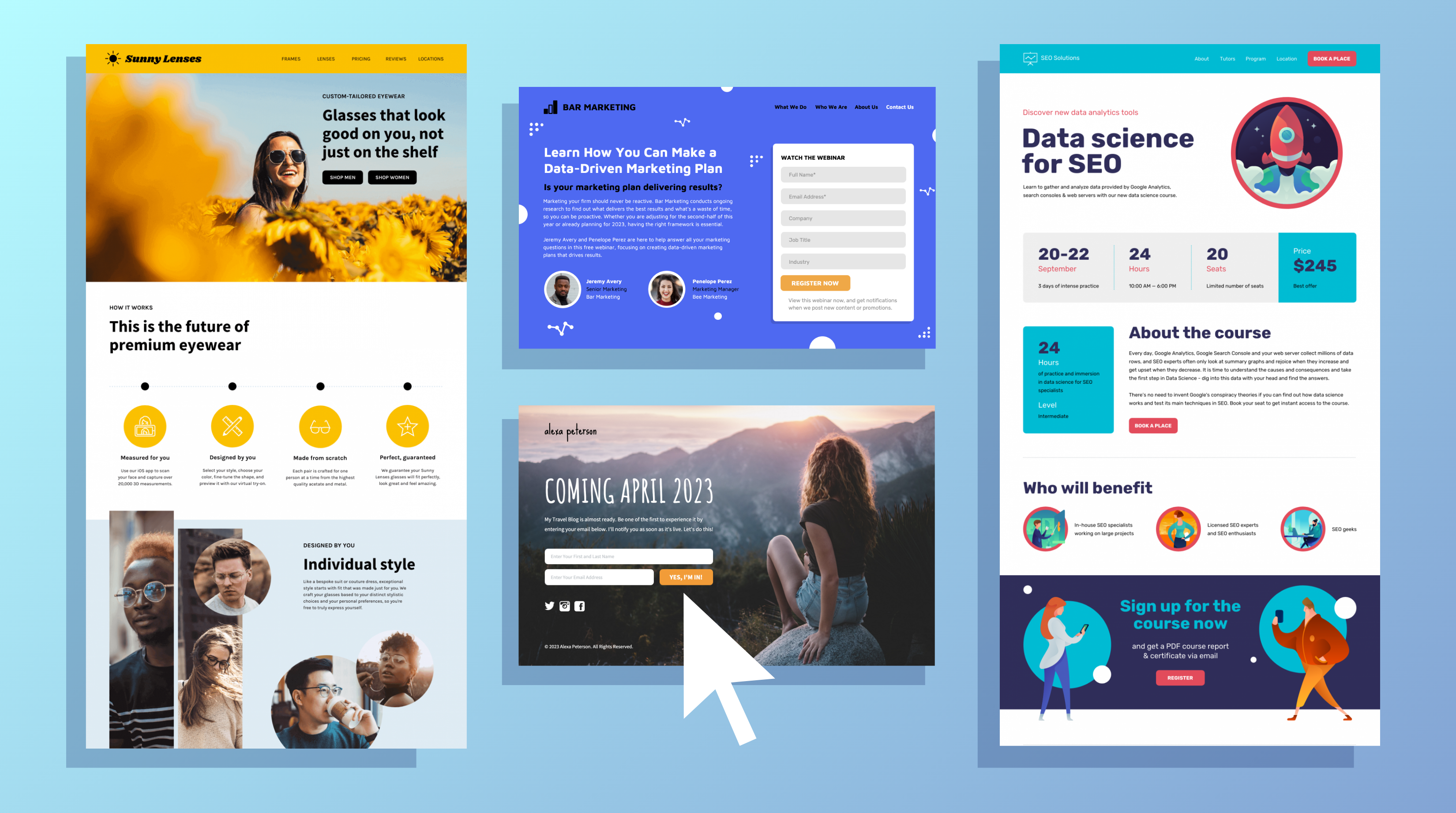
1. Wall Street Journal

The Wall Street Journal promotes newspaper subscriptions through Instagram ads that lead to a dedicated landing page. The page targets users responding to current events, specifically a new presidential administration, and offers multiple subscription options.
What this landing page does well
- The headline uses message matching with the ad, both referencing the new administration, to create emotional resonance
- An arrow visual cue points to the selected subscription plan, directing attention to detailed pricing information below
- Bulleted copy breaks down subscription benefits into scannable points that visitors can process quickly
- "ACT NOW" messaging creates urgency by linking the offer to the immediate need to stay informed
- Transparent pricing with visible discounts provides psychological reassurance about value
- Removing navigation links prevents exits without conversion or page closure
- "You can cancel anytime" language reduces commitment anxiety by assuring visitors they won't be locked into long-term contracts
A/B tests to run
- The linked Wall Street Journal logo reloads the page instead of navigating away, which misleads visitors expecting to reach the main website. Unlinking the logo entirely would eliminate this confusion.
- Multiple subscription options (3 delivery methods × 3 plan lengths) create decision paralysis on a single page. Test a click-through approach that presents options sequentially on separate pages.
- Landing pages with a single call to action can increase conversions by 371%, according to Salesgenie, suggesting that reducing the number of simultaneous choices could significantly improve results.
2. Lending Club

Lending Club uses Instagram to promote personal loans as a debt consolidation solution. The landing page targets users looking to save money by paying off high-interest debt with lower fixed-rate loans.
What this landing page does well
- A clipped credit card hero image conveys the emotional relief of escaping debt while visually representing the service
- The headline speaks directly to individual visitors and appeals to the desire to save money
- A low-friction form with minimal fields and a contrasting CTA button simplifies conversion, while "won't impact your credit score" text reduces anxiety
- Minimal text above the fold accelerates the path from landing to form submission
- BBB certification and trust badges establish credibility immediately
- Mobile optimization ensures the page displays properly for Instagram's predominantly mobile traffic
A/B tests to run
- The linked logo provides an exit path that doesn't result in conversion. Remove the link entirely.
- Split the headline into two parts: "Save thousands" as the main headline, with "Pay off your high interest debt with a low, fixed rate loan" as a supporting subheadline to improve hierarchy.
- Test reducing the number of form fields further or implementing a multi-step form to lower perceived friction.
3. Syracuse University

Syracuse University promotes its online MBA program through Instagram ads, leading to a landing page with a multi-step form. The page emphasizes their national ranking and program benefits.
What this landing page does well
- The multi-step form displays total steps and estimated completion time ("will only take a minute!"), setting clear expectations
- A secondary headline highlighting their No. 18 ranking establishes program credibility immediately
- Minimal text above the fold keeps visitors focused on the form and hero image
- Bulleted copy efficiently communicates the main advantages of the Syracuse Online MBA program
A/B tests to run
- The form headline "Learn More" lacks inspiration and benefit orientation. Test something like "Higher Education Starts Here" to create more emotional pull.
- Starting at "10% complete" makes the process feel longer than it is. Test beginning at 20% or 30%, or reduce the total number of steps.
- The page layout feels unbalanced with excessive white space. Test tightening the design to create better visual flow.
4. Acquisio
Acquisio runs Instagram ads promoting digital marketing webinars. The landing page features presenter information and details about what attendees will learn.
What this landing page does well:
- Perfect message matching between ad and landing page creates continuity and trust
- Presenter photos humanize the page and establish authority, though alignment could improve
- Minimal copy clearly outlines webinar learning objectives
- A simple form reduces conversion friction
A/B tests to run
- This isn't a true landing page but rather a website page with navigation and footer links that create multiple exit opportunities. Remove these elements to improve focus.
- The CTA button uses the same color as other page elements, reducing visibility. Test a contrasting color that stands out.
- Add images above the fold showing digital marketing in action, the mentioned ebook, or presenters during a webinar session to create visual interest.
5. Autopilot

Autopilot promotes a free marketing report through Instagram ads. The landing page features author credentials and a straightforward value proposition.
What this landing page does well
- Simple, direct copy above the fold eliminates confusion
- "Free" in the headline reduces cost anxiety immediately
- The landing page image matches the ad creative closely
- A two-field form with a contrasting CTA button encourages quick conversion
- The author bio section establishes Guy Marion's qualifications with a headshot that adds human appeal
- A hyperlinked CTA at the bottom redirects visitors back to the form above the fold
- Balanced use of white space and persuasive elements creates visual harmony
A/B tests to run
- The linked logo provides an exit to the Autopilot website without conversion. Remove the link.
- Test first-person CTA copy, like "Send Me the Report," to create a sense of personal investment in the action.
- The chat bubble in the bottom-right corner promotes a different offer when hovered, creating distraction. Remove it or ensure it reinforces the primary offer.
6. Influitive

Influitive tests different Instagram ad approaches, including adding a fake button CTA to the ad image itself. Their landing page promotes a content marketing ebook.
What this landing page does well:
- An arrow directional cue in a contrasting color guides eyes directly to the form
- The CTA button color stands out and matches the directional cue for visual consistency
- The ebook cover gives visitors a preview of what they're downloading
A/B tests to run
- The linked logo creates an exit opportunity before visitors evaluate the offer. Unlink it.
- Excessive text makes the page feel dense and reduces visual appeal. Condense copy and improve spacing around images.
- The form requires many fields, which may be appropriate for Sales Qualified Leads but creates friction for Instagram traffic. Test reducing required fields.
- Both the headline and the CTA copy lack personal language and benefits. Test first or second person ("Get My Copy" or "Send You the Guide") with clear value.
- The layout feels cramped with everything squeezed above the fold. Test redistributing elements to create better balance.
7. Washington State University

Washington State University promotes their online MBA program through Instagram ads emphasizing career advancement and national rankings.
What this landing page does well
- The unlinked Washington State University logo keeps visitors on the page
- The headline appeals to emotions and the desire to advance in business
- The multi-step form clearly displays three steps, reducing friction to start
- Highlighting their #27 ranking establishes program credibility
- Accreditation and ranking badges reinforce authority
- The hand in the hero image acts as a directional cue pointing toward the form and CTA button
A/B tests to run
- The CTA button lacks visual prominence and doesn't contrast with the page. Make it larger and use a more contrasting color.
- Test more specific CTA copy at each step: "Take Me to Step 2" and "Take Me to Step 3" would be more encouraging than generic "Continue" text.
- Footer links provide exit opportunities. Remove them to maintain focus.
- Copy speaks to a large group rather than individual visitors. Test rewriting with "you" and "your" to create a personal connection.
- The 2015 copyright date raises questions about whether the program information is up to date. Update to the current year.
8. WordStream

WordStream promotes a PPC checklist via Instagram ads, with excellent alignment between the ad creative and the landing page design.
What this landing page does well
- Expert alignment between ad and landing page, from images to copy
- Bulleted copy states exactly what visitors receive from the guide
- Second-person language ("you" and "your") speaks directly to visitors
- Natural page flow guides eyes from the headline to the hero image to scrolling for the form
- The hero image connects the "Save Money" text with green color for psychological reinforcement
- Efficient use of space without distractions
A/B tests to run:
- The 8-field form creates significant friction by requesting extensive information. Test whether the company name, phone number, and website are necessary for a checklist download.
- Multiple colors throughout the page increase cognitive load. Test simplifying the color scheme to improve processing speed.
9. Wealth Dynamics
Wealth Dynamics uses Instagram ads to promote a free entrepreneurship ebook with bonus video content.
What this landing page does well:
- Short page, copy, and form reduce friction across the board
- "Free" is emphasized to encourage downloads
- The 3-field form minimizes conversion barriers
- Video images at the bottom provide a bonus incentive beyond the ebook
A/B tests to run
- Header links create too many exit opportunities before visitors consider the offer. Remove them.
- The headline uses the second person but lacks excitement or a clear benefit. Test something like "Find Your Entrepreneurial Flow" to create emotional pull.
- The CTA button blends with the rest of the page despite being on-brand. Test a contrasting color.
- "Download" is a weak CTA. Test more compelling action verbs with benefits: "Get Your Genius Guide Now!"
- The pre-checked email updates checkbox is a deceptive way to build email lists. Uncheck it by default to build trust.
10. Flywheel

Flywheel promotes a free WordPress ebook through Instagram ads with strong visual alignment between the ad and the landing page.
What this landing page does well
- The hero image matches the ad perfectly
- "Free" in the headline draws attention and generates interest
- The static iPad along the side scrolls through different chapters as visitors move down the page, creating dynamic visual interest
- The above-the-fold CTA button uses an anchor tag to send visitors to the form below
- Customer testimonials with names and affiliations add trust and credibility
- Chapter-by-chapter summary teases content and builds anticipation for the download
- Balanced white space and persuasive elements create visual harmony
A/B tests to run
- Flywheel's logo above and below the fold links to other pages, creating exit opportunities. "Get Flywheel" at the bottom also acts as a competing CTA. Remove these links.
- "Download" is uninspiring CTA copy. Test more compelling action verbs with benefits included.
- The page headline simply repeats the ebook title. Test grabbing attention with an emotional appeal that the supporting copy already provides.
11. Grow

Grow uses Instagram ads to promote free software demos with form-focused landing page design.
What this landing page does well:
- An arrow acts as an explicit directional cue, sending the eyes to the form immediately
- The form is encapsulated with a blue-box outline that draws attention
- Hero images provide a glimpse inside the software interface
A/B tests to run
- The linked logo provides an exit to Grow's homepage. Remove the link.
- Each bullet point contains excessive text. Test more succinct copy to avoid overwhelming visitors.
- The page lacks natural flow, causing visitors to scan aimlessly. Test an F-pattern layout to guide visitors to the form more naturally.
- The arrow placement is illogical for how people scan landing pages. Test repositioning it from a subheadline or software image.
- "Submit" is rarely an effective CTA. Test more actionable phrases that visitors want to click.
12. True Dental Discounts

True Dental Discounts promotes discounted dental procedures through Instagram ads targeting mobile users concerned about dental costs.
What this landing page does well
- The phone number is a click-to-call, critical since Instagram traffic is predominantly mobile
- Bulleted copy is easy to digest and scan quickly
- "Affordable Dental Plans" speaks to emotional and psychological needs, offering clear benefits
- The smiling woman with great teeth works contextually for dental services while making direct eye contact
- The CTA button stands out with strong contrast
- Multi-step form design is clear and encouraging
A/B tests to run
- Test different hero images: a dentist with patients, a parent and child in a dental chair, or a nurse in a waiting room. Use gaze direction as a directional cue toward the form.
- "Continue" works as multi-step CTA copy but could be more inspiring. Test "Take Me to Step 2" to be more descriptive about what happens next.
- Add white space between bullet points and the form, and underneath the blue banner, to improve readability.
13. Bentley University

Bentley University promotes an MBA skills ebook through Instagram ads with mobile-first design considerations.
What this landing page does well
- Z-pattern design creates natural flow from headline to image to bulleted copy to form
- Short, bulleted copy makes scanning effortless
- Large certification badges establish trust immediately
- Excellent mobile alignment ensures proper display for Instagram's predominantly mobile traffic
- The checkbox beneath the form is not pre-checked, ensuring only genuinely interested visitors opt into additional content
A/B tests to run
- The Bentley University logo links to their newsletter page, creating an exit. Remove the link.
- Footer links distract from the ebook download goal. Remove them.
- "Download" is bland CTA copy. Test action verbs with more impact.
- The main headline simply states the book name. Test benefit-packed or solution-oriented alternatives like the question posed directly above it.
- The CTA button is currently the smallest element on the page. Make it larger and more prominent.
14. OptiMonk
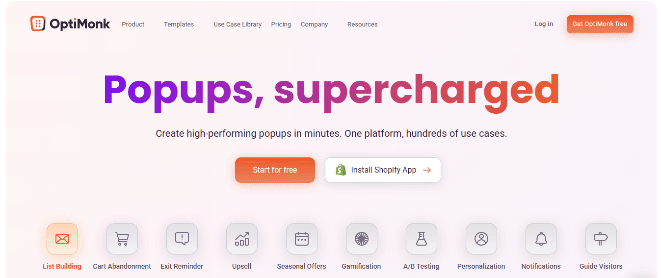
OptiMonk uses Instagram ads to promote a free business growth ebook, prominently featuring the author's credibility.
What this landing page does well
- The ad and landing page feature identical ebook images, creating a strong message match
- The big, bold headline promising to "Grow Your Business" is powerful while remaining concise
- The short form reduces friction for a simple ebook offer
- "FREE" in all-caps stands out and triggers an emotional response
- "About the Author" section with an image humanizes the page
- Iconography breaks down how the ebook improves websites into five simple bullets
A/B tests to run
- The CTA button matches the page's other elements rather than standing out with contrast. Test a more distinctive color.
- Body copy becomes overwhelming on mobile. Rearrange elements below the fold for a better mobile experience.
- CTA copy lacks persuasion. Test "Send Me the Free Ebook" to increase conversions.
- The page lacks white space, making everything feel squeezed together. Add breathing room to improve scannability.
15. Sovrn
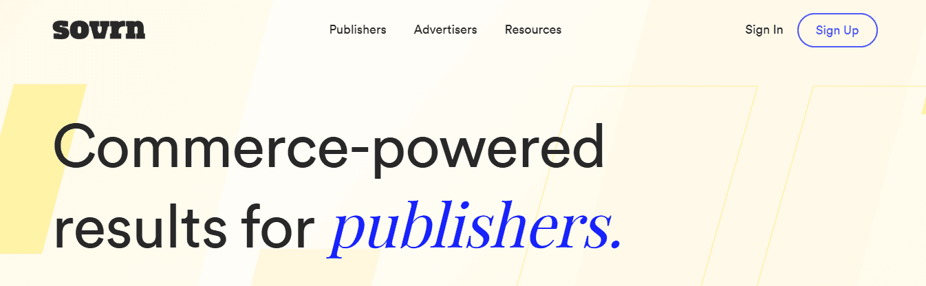
Sovrn promotes a Header Bidding ebook via Instagram ads with strong visual directional cues embedded in the background image.
What this landing page does well
- The yellow CTA button creates a strong contrast against the page
- Stairs and railings in the background image lead eyes toward the form, functioning as subtle directional cues
- Easy-to-read bullet points explicitly state learning outcomes and header bidding benefits
- explicitlyCustomer testimonials with images, titles, and companies use numbers and data for credibility
A/B tests to run
- The stairs metaphor for "climbing higher" is loose for ad bidding context. Test imagery with auction themes that connect more directly to the topic.
- Light spots in the background image make white text hard to read in places. Test darker backgrounds or different text colors.
- "Welcome to Sovrn!" text above the headline clutters the top section unnecessarily. Remove it.
- The CTA copy is small and uses white text on yellow, which is hard to read. Design a bigger button with better contrast.
16. Southern Methodist University

Southern Methodist University promotes its Master of Science program through Instagram ads with iconography-heavy landing page design.
What this landing page does well
- Iconography features stand out and attract immediate attention
- Trust indicators and privacy badges reassure visitors about information security
- The three-step form clearly communicates the process length
- The red CTA button grabs attention immediately
A/B tests to run
- The ad shows Lego blocks with "data is everywhere" messaging, but no connection exists to the landing page imagery. Create visual continuity.
- The headline for the "Download a Brochure" form lacks inspiration. Test benefit-driven language that gives visitors a compelling reason to continue.
- The headline is purely factual. Test motivational language that encourages form completion.
- The footer phone number isn't clickable on mobile devices, which accounts for most Instagram traffic. Make it click-to-call.
17. Future of Stocks
Future of Stocks promotes a free ebook through Instagram ads with strong visual alignment but minimal trust indicators.
What this landing page does well
- The hero image matches the Instagram ad exactly
- The large red CTA button creates immediate visual impact
- "Free" is used multiple times to reinforce the no-cost nature
A/B tests to run
- "Limited Time Offer" lacks specificity about duration. Add a countdown timer or definitive date to reinforce urgency.
- Test repositioning the headline directly above the book image with bullet points below for a more natural flow.
- The page lacks identity and trust signals. Add a logo, customer testimonial, or trust badges to establish legitimacy and reduce spam concerns.
18. FXCM
FXCM uses Instagram ads to promote a free Forex Trading guide with risk-free practice accounts as an additional incentive.
What this landing page does well
- The yellow button creates a strong contrast and ties to the headline
- The question headline engages visitors and encourages continued reading, connecting well with the form headline
- An open book as the hero image differentiates from typical book cover presentations
- "5 Things You'll Learn" provides quick, scannable wins with a secondary CTA button
- $50,000 of virtual money for risk-free practice reduces anxiety about providing contact information
- Award badges near the footer demonstrate FXCM's trustworthiness
A/B tests to run
- Multiple links throughout the page create numerous exit opportunities. Remove them to maintain focus.
- "Get Started" CTA copy could be more encouraging. Test "Start My Practice Account" for clarity.
- Remove the unnecessary footer section and relocate disclaimers to a separate linked page along with the privacy policy.
- The page isn't mobile-optimized. Above-the-fold text and long-form copy push the CTA significantly down on mobile devices, which account for most Instagram traffic.
19. WebinarNinja
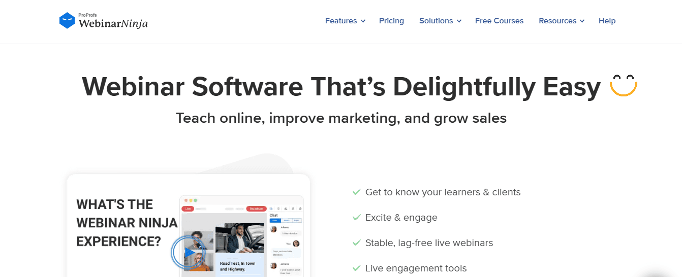
WebinarNinja promotes a free video course via Instagram ads, using a clean, simple landing page design.
What this landing page does well
- Powerful headline and subheadline offer something free with clear value
- The video host making eye contact engages visitors immediately
- A down arrow serves as a directional cue, encouraging scrolling
- The entire header image links to the form below
- A simple, two-step form is quick and easy to complete
- The bright green CTA button creates a strong contrast
- Everything above the fold is clean and simple, inviting continued evaluation
- Three tangible items clearly state what visitors receive when signing up
A/B tests to run
- Add a landing page video teasing the 14 full video training sessions to give visitors a preview of the course content.
- Eliminate footer links to reduce distractions and maintain focus on the video course.
20. 3P Creative
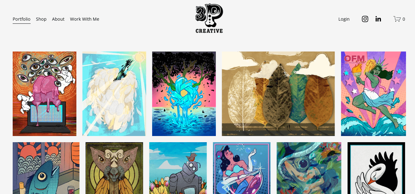
3P Creative promotes free on-demand webinars via Instagram ads, offering multiple contact options.
What this landing page does well
- The headline immediately sets expectations by clarifying that the webinar is on-demand, not live
- Partner page and contact information establish trust and provide secondary conversion options
- Bulleted copy communicates webinar learning objectives clearly
- The short form enables quick conversion
- Three blog email content options give visitors a choice without requiring a subscription
- Click-to-call phone number provides an even faster contact method than form completion
A/B tests to run
- The linked 3P Creative Group logo creates an exit opportunity. Remove the link.
- Social links in both the header and the footer distract from conversion. Move them to the thank you page.
- The large image block with text feels overwhelming and slightly out of place. Separate the image from the text and position it as a hero image.
- The CTA button is barely noticeable, with a thin outline in the page's color. Make the entire button green with white text for visibility.
- "Register" is weak CTA copy. Use more descriptive, personalized language with benefits.
- Bold the secondary headline and form headline to help them stand out as primary scanning points.
- The footer image links to another landing page, which distracts from the content. Remove the link.
- The 2016 copyright suggests outdated information. Update to the current year.
21. Black Milk Clothing

Black Milk Clothing uses a shoppable Instagram feed approach, with the landing page serving as a visual catalog of promotions and user-generated content. The page includes an email opt-in to capture prospective shoppers' information.
What this landing page does well
- Shoppable feed makes selling on Instagram seamless and intuitive
- A mix of promotional content and user-generated content builds social proof
- Email opt-in captures leads for future marketing
- Discount pop-up for first-time visitors creates immediate incentive
A/B tests to run
- Test whether the discount pop-up increases conversions or creates friction. Pop-ups remain controversial despite their popularity in e-commerce.
- Test different grid layouts or featured product placements to guide visitors toward specific items.
22. Hyke

Hyke promotes their money-saving tool through Instagram ads with benefit-focused messaging and clear pricing.
What this landing page does well
- The page positions Hyke as helpful by highlighting the money saved without unnecessary complexity
- Social proof and testimonials build credibility
- Crystal clear pricing eliminates confusion
- The purple CTA is impossible to miss
A/B tests to run
- Test different headline variations emphasizing specific dollar amounts saved
- Test simplifying testimonials to highlight the most compelling data points
23. Four Seasons
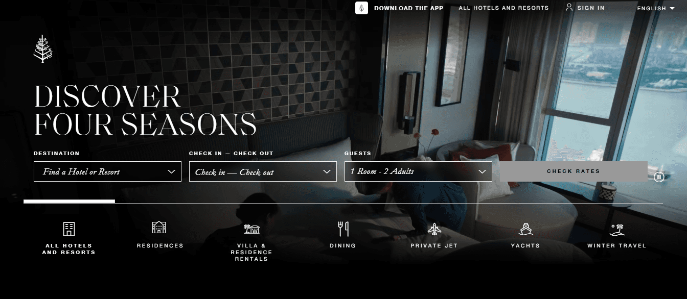
Four Seasons uses Instagram ads to promote luxury travel experiences with a minimalist, style-focused landing page design.
What this landing page does well
- Minimalist design reflects luxury brand positioning
- Bold imagery creates emotional appeal
- Clear call-to-actions contrast with the rest of the page text
- Mobile-optimized layout ensures proper display
A/B tests to run
- Test adding urgency elements like limited availability or seasonal offers
- Test different hero images showcasing various properties or experiences
24. 42 Heilbronn

42 Heilbronn promotes coding courses through Instagram ads, with comprehensive landing page content that explains the program.
What this landing page does well
- The page displays well on both desktop and mobile devices
- Two identical CTA buttons eliminate confusion about next steps
- Multiple sections make content easily digestible
- A 2-minute video explains the school and process without requiring reading
- Testimonials in clickable boxes contain substantial information in minimal space
- Sliders in sections like the application process save page space
A/B tests to run
- The final section contains links redirecting outside the landing page, which can reduce conversion rates. Remove external links or move them to a thank-you page.
- Test whether video placement above the fold increases engagement
- Test simplifying the number of sections to reduce scroll depth
25. HubSpot

HubSpot promotes a free social media content calendar through Instagram ads with a clean, simple landing page design reflecting their inbound marketing expertise.
What this landing page does well
- Clean, simple ad creative clearly states the offer
- An equally clean landing page maintains visual consistency
- Graphics are simple and uncluttered
- The color scheme is minimal and focused
- "Download Now for Free" CTA is direct and benefit-oriented
- The page demonstrates HubSpot's own inbound marketing principles
A/B tests to run
- The form requests substantial information (name, email, phone, website, company details). For B2C landing pages, this may be excessive. Test reducing fields for top-of-funnel offers.
- Test whether the blog subscription checkbox increases or decreases primary offer conversions
26. Kapten & Son

Kapten & Son sells high-end watches and accessories through Instagram ads promoting limited-time sales.
What this landing page does well
- Time-sensitive scarcity builds urgency with "48 hour sale" messaging
- Large hero image showcases stylish products effectively
- Customer rating proves the quality of the sale items
- "Shop Now" button makes buying seamless
A/B tests to run
- Test adding a countdown timer to reinforce the 48-hour urgency
- Test different product arrangements or featured items
27. Fabletics
Fabletics promotes affordable activewear through Instagram ads, inviting visitors to take a style quiz for personalized recommendations.
What this landing page does well
- Intriguing hook about finding the perfect gear through a quiz
- Emphasis on special VIP offer builds excitement
- Strong social proof with over 1 million VIPs
- Clear direction to complete the quiz for custom results
A/B tests to run
- Test whether starting the quiz immediately on the landing page increases completion rates versus requiring a button click first
- Test different VIP benefit messaging to see what resonates most
28. AppSumo
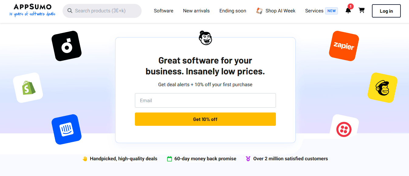
AppSumo offers exclusive SaaS tool deals via Instagram ads that promote discounted software with urgency messaging.
What this landing page does well:
- Scarcity builds urgency to claim the deal
- Social proof shows deal popularity
- Price discount is highlighted directly in the CTA button
- Easy checkout accelerates purchase decisions
A/B tests to run
- Test different scarcity messaging (time-based vs. quantity-based)
- Test whether showing a full pricing breakdown above the fold increases trust
29. Anthropologie

Anthropologie promotes seasonal sales through Instagram ads with strong discount messaging and clear shopping pathways.
What this landing page does well
- Headline grabs attention with huge discount percentages
- "Shop Now" button guides visitors smoothly to deals
- Sitewide language builds urgency
- Strong social proof elements throughout
A/B tests to run
- Test whether category-specific landing pages convert better than general sale pages
- Test different hero images showcasing products versus lifestyle imagery
When Instagram visitors land on a page that respects their time and intent, conversion becomes natural rather than forced. The examples above prove that clarity, focus, and strategic friction reduction matter more than clever design or aggressive persuasion tactics. Most brands already have the tools to build pages like these. The question is whether they'll prioritize the visitor's experience over their own desire to showcase everything at once. But knowing what works is only half the equation—the other half is what happens after someone converts.
Related Reading
- How to Add Linktree to Tiktok
- How To Add Linktree To Instagram
- How To Add A Link To Instagram Story
- How To Add Link To Instagram Profile
- Personal Landing Page Examples
- Graphic Design Portfolio Websites
- Personal Portfolio Website Design Examples
- One Page Website Examples
- Best Photography Portfolio Websites
- Instagram Landing Page Examples
Make Every Instagram Landing Page Visitor Count with Mobilo
The page brought them in. Now you need to keep them. You've optimized your landing page and traffic flows, but most visitors leave without sharing contact details. Every anonymous click represents a lost opportunity to nurture, follow up, or convert. Traditional forms demand too much effort, and visitors rarely commit unless the value feels immediate and easy.
💡 Tip: The average landing page conversion rate is only 2-3%, meaning 97-98% of your Instagram traffic leaves without taking action. Mobilo transforms that moment of interest into captured contact information. Our digital business cards let visitors share their details instantly via NFC tap, QR code scan, or link click—no typing or form fields required. Data syncs directly to your CRM, enriches profiles with engagement data, and triggers automated follow-up sequences.
"59,000+ companies are already using digital business cards to capture leads that traditional forms miss, turning every interaction into measurable pipeline growth."
🎯 Key Point: This is how 59,000+ companies turn engagement into measurable growth. Every Instagram profile visit, landing page interaction, and event conversation becomes a qualified lead with full contact details, behavioral data, and CRM integration already complete. You're building a pipeline that feeds directly into sales and marketing workflows without manual data entry or follow-up delays.
Book a demo and see how Mobilo turns your Instagram traffic into actionable leads. Plus, claim your first 25 cards free (worth $950).
Related Reading


