

.avif)

How to Add a Link to an Instagram Story and Drive Real Traffic
On This Page
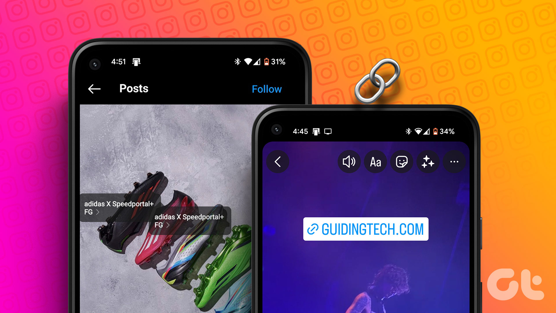
Instagram Stories vanish after 24 hours, but the traffic they generate doesn't have to disappear with them. If you've ever posted a story and wished you could send viewers to a specific destination, your website, a product page, or a landing page, you already know the frustration of limited linking options. This guide will show you exactly how to add a link to an Instagram story, covering the requirements, steps, and strategies that turn casual viewers into engaged visitors who click and convert.
Whether you're promoting your business, sharing content, or building your personal brand, tools like Mobilo's digital contact card can amplify your Instagram story linking strategy. Instead of sending followers to a generic profile or forcing them to hunt for information, you can direct them to a smart, customizable landing page that houses all your important links in one place.
Summary
- Instagram Stories generate 15-25% higher engagement than regular feed posts, according to Sked Social, but that engagement advantage disappears when conversion barriers are hidden in plain sight. The real problems aren't content quality or visual design.
- Overly polished content disrupts the Instagram Story experience because viewers expect casual, authentic posts in this format. The Guardian found that realistic Stories perform better than heavily edited ones because they match viewer expectations.
- Generic calls to action kill conversion rates because viewers need context before they commit to swiping up. Instagram's default "See More" text provides almost no information about what happens next. Specific CTAs, such as "Shop 30% off winter collection," outperform vague calls to action, such as "Learn more," because they remove guesswork.
- Message matching between your story and landing page is critical for conversion. Whatever you promise in your story must align exactly with what viewers see when they arrive at your destination page. When the message or visual tone shifts between the story and the landing page, viewers feel misled, and that broken trust instantly kills conversions.
- Instagram reports that 70% of users watch Stories with sound on, which means 30% watch silently. That's nearly a third of your audience missing key details if you only communicate them through voiceover or background music. Text overlays ensure silent viewers get the same information as everyone else.
Mobilo's digital contact card applies the same conversion principles to in-person networking that successful Instagram Stories use online: it removes friction by enabling one-tap contact information exchange, syncing directly to CRM systems, and ensuring every handshake becomes a trackable lead rather than a forgotten paper card.
What's Really Stopping Your Instagram Stories From Converting
You're already posting product links, sharing behind-the-scenes content, and adding swipe-up CTAs. The mechanics are in place. But if sales aren't materializing, the problem isn't your content quality. It's strategic. Most creators assume low story conversions signal poor visuals or weak messaging, but the real culprits are conversion barriers hiding in plain sight: unclear value propositions, mismatched expectations, and friction points that lead viewers to exit before taking action.
Engaging, Non-Generic Social Media Content
Consider two common failures. A product promotion story flashes "SALE!" with a swipe-up link, but viewers don't know what's on sale, how much they'll save, or why they should act now. There's no urgency, no specificity, just a generic nudge that blends into the noise of every other brand shouting for attention.
Master the Click Architecture
You've given them the solution right there in the story sequence. Why would they swipe up? The link becomes an afterthought, not a destination. The link itself is the easiest part. Instagram's interface makes adding one simple. What drives clicks is the strategic architecture around that link:
- The curiosity gap you create
- The urgency you build
- The alignment between what you promise and what you deliver.
According to Sked Social, Instagram Stories have a 15-25% higher engagement rate than regular feed posts. That engagement advantage exists, but only when you treat Stories as conversion tools, not just content distribution channels.
Content That's Too Polished Disrupts the Experience
Stories evolved as the casual counterweight to the perfectly curated Instagram feed. When the main feed became a gallery of avocado toast arranged just so, Stories became the place people expected to find looser, more authentic content. Overly slick videos look out of place here. They disrupt the natural flow as viewers scroll through stories from friends, influencers, and brands. When your content looks too much like a traditional ad, it stands out awkwardly, and viewers skip it reflexively.
Realism Over Polish
Live-action videos outperform heavily produced graphic content for exactly this reason. The Guardian found that realistic Stories perform better than heavily edited ones because they match viewer expectations for the format. Even when you're promoting products, you don't want your Stories to scream "advertisement." That visual mismatch triggers an immediate skip.
Embrace Native Interactivity
Keep Stories casual to embrace the platform's interactive, "in-the-moment" rhythm. By using native features such as stickers and polls, you prioritize authenticity over a stiff production. This unpolished approach, mirrored by brands like Bon Appétit, builds trust and enables ongoing creative experimentation.
Align Tone With Platform
If your brand identity is composed and formal, your Stories should reflect that. The New Yorker's Instagram Stories maintain the editorial tone of their other content because that consistency is part of their brand promise. The key isn't to be universally casual. It's to stay on brand while respecting the platform's expectation for authenticity.
Stories That are Too Laid-Back Confuse Your Audience
You just read that Stories should be casual, and now I'm saying they can be too casual. That contradiction is real. Think of it like showing up to a job interview. "Be yourself" doesn't mean wearing sweatpants and not preparing. It means authentic within the context.
Instant Brand Recognition
A consistent visual identity is vital for instant brand recognition. Followers make split-second decisions to watch or skip your content based on whether they recognize it. By signaling your identity immediately, you capture attention and build the familiarity necessary to turn casual viewers into loyal followers.
Pre-Post Quality Check
Preview your Stories before posting, even when you want them to feel spontaneous. Check for blurriness, awkward cropping, typos. Small groups without professional photographers can still produce sharp content using smartphones and basic editing tools. Following Instagram's design specs for Stories (1080 x 1920 pixels, 9:16 aspect ratio) ensures your visuals look crisp, not pixelated or stretched. The balance between polished and casual isn't about production value. It's about intentionality. Your Stories should look like they belong on the platform while clearly representing your brand. That middle ground is where conversions happen.
Your CTA Doesn't Give Viewers Enough Context
You've nailed the visual balance. Your Stories look authentic and on-brand. But viewers still aren't swiping up. The next likely culprit: your call to action lacks clarity. Without an obvious CTA, viewers scroll past without realizing you want them to take action.
Ambiguity Kills Action
Instagram's default "See More" text at the bottom of Stories provides almost no information. Swipe up to do what, exactly? Purchase the product shown? Read a blog post about it? Sign up for a waitlist? That ambiguity creates friction. When viewers have to guess what happens next, most don't bother finding out.
Clarity Over Cleverness
There's no profit to subtlety here. Make your CTA larger and more visible than the default text while maintaining your aesthetic. Apartment Therapy does this well, using custom text overlays that clearly state what viewers get when they swipe. Or use Instagram's library of GIFs and stickers designed specifically for this purpose. Search "swipe up" in the GIF library, and you'll find dozens of options that make the action obvious.
Specificity Over Generic CTAs
Specificity matters more than you think. "Shop now" is better than "See more," but "Shop 30% off winter collection" is better still. The more context you provide about what's on the other side of that swipe, the more likely viewers are to follow through. They need to know the action is worth their time before they commit to it.
The Landing Page Breaks the Promise
Your CTA is clear and compelling. Viewers swipe up. Then they close the page immediately without converting. This is where most story campaigns actually fail: at the landing page. Message matching is critical. Whatever you promise in your story must align exactly with what viewers see when they arrive at your landing page. If your story teases a product launch, the landing page needs to prominently feature that product, not bury it below the fold or redirect to a generic homepage. If your story offers 20% off, the discount must be immediately visible, not hidden behind a pop-up or buried in fine print. When the message or visual tone shifts between the story and the landing page, viewers feel misled. That broken trust kills conversions instantly.
Aesthetic Mirroring for Trust
The visual consistency matters as much as the message. Your landing page should mirror the tone and aesthetic of your Stories for a seamless experience. Essential oil brand Vitruvi excels at this. Their Stories and landing pages share the same clean, minimal design language and color palette. The transition feels natural rather than jarring. Viewers don't have to recalibrate or question whether they're in the right place.
Landing Page is the Conversion Hub
Many teams focus intensely on perfecting their Stories while treating the landing page as an afterthought. That's backwards. The story is just the invitation. The landing page is where conversion actually happens. If that experience feels disconnected or confusing, all your Story optimization becomes pointless.
Important Details are Buried or Missing Entirely
Even engaged followers who like your story might not understand its purpose if you haven't made the key information obvious. Is this a product reveal? A blog post? A longer video? When viewers have to guess, most won't click through to find out.
Eliminate the Guesswork
Mattress startup Endy shared Valentine's Day Stories about flowers. The first story in the sequence showed a bouquet with minimal context. From that single frame, it's impossible to guess what happens if you swipe up.
- A florist recommendation?
- Tips for choosing flowers?
The subsequent Stories clarified the offer, but many viewers probably skipped the sequence before reaching that clarity. When you're sharing an offer, be specific and urgent. "SALE!" might catch attention, but "ONE-DAY SALE ON NOW" creates immediate pressure to act. That specificity and time constraint dramatically increase click-through rates. Generic promotions blend into background noise. Specific, time-bound offers demand attention.
Silent Viewing is the Default
If your story includes video, don't rely on audio to communicate critical information. Instagram reports that 70% of users watch Stories with sound on, which means 30% watch silently. That's nearly a third of your audience missing key details if you only communicate them through voiceover or background music. Include text overlays with your offer and CTA so the silent viewers get the same information as everyone else.
You're Giving Away Too Much Information
The goal of your Stories is to create curiosity and drive viewers to your landing page. That means being selective about what you share. If you answer every question and provide every detail in the story sequence itself, you've eliminated the reason to click through.
Curb Story Overload
When followers see 20 Stories queued up in your sequence, they feel overwhelmed before they start. Most will skip the entire set rather than commit to watching that much content. You wouldn't deliver a presentation without practicing it or publish a blog post without editing. Apply that same discipline to your Stories. Plan them in advance. Ensure each one has a purpose and adds value without overwhelming viewers.
Define Story Quantity
There's no universal rule for how many Stories is too many. Some argue for a three-story limit. If you're sharing simple image Stories that are easy to scan, you can probably include more. But asking even your most engaged followers to watch a dozen 15-second videos in a row is unrealistic. Most will bail before reaching your CTA.
Master the Reveal
The strategic withholding of information creates the curiosity gap that drives clicks. Give viewers enough to understand the value of what you're offering, but not so much that they have no reason to learn more. That balance between revealing and concealing is what transforms passive viewers into active clickers.
Related Reading
- Best Link in Bio Tool
- What is Link in Bio
- How to Improve Linkedin Profile
- How To Build Personal Branding
- How to Add Portfolio to Linkedin
- How To Add Link To Tiktok Bio
- How to Add Instagram Link to Tiktok
- Where is Link in Bio on Instagram
- How to Add Link to Linkedin Post
- How to Add Website Link to Linkedin Profile
- Link in Bio Examples
- How To Add Link To Tiktok Bio
- How to Add Instagram Link to Tiktok
The Difference Between Adding a Link and Actually Converting Story Viewers

Adding a link to your Instagram Story is a mechanical task. Converting viewers who see that link into people who click it requires understanding what drives human behavior. The technical capability is available to everyone with 10,000+ followers or a verified account. What separates accounts that generate traffic from those that don't isn't access to the feature. It's the psychological architecture built around that link.
Most creators treat link placement as the finish line when it's actually the starting point. You've inserted the sticker, typed the URL, and published the story. Now what? Without strategic framing, that link remains passive as viewers scroll past. The conversion principles that determine whether someone clicks aren't about the link itself. They're about expectation management, visual hierarchy, timing, and trust.
The Link Destination Must Match What the Story Promises
Your story shows a product in use, creates intrigue around a specific feature, or teases a discount. The viewer swipes up. If the landing page shows something different (a generic homepage, an unrelated product, a form requesting information before revealing the offer), you've broken the implicit contract. That mismatch triggers immediate distrust.
Align Content With Destination
When you promise a tutorial on achieving a specific result and the link leads to a sales page instead, viewers feel manipulated. When your story highlights a limited-time offer, but the landing page shows regular pricing with no mention of the discount, they close the page. The gap between expectation and reality doesn't just kill that single conversion.
Eliminate Conversion Friction
Specificity in your story creates the expectation. If you show a blue jacket and say "swipe up to shop this look," the landing page needs to prominently feature that exact blue jacket, not direct viewers to a general outerwear category where they have to hunt for it. Every additional step between the swipe and the promised outcome increases abandonment rates exponentially.
Visual Design Should Draw Eyes Toward the Link Naturally
Instagram Stories move fast. Viewers make split-second decisions about where to look and whether to act. If your link sticker competes with busy backgrounds, multiple text overlays, or distracting visual elements, it becomes invisible. The human eye gravitates toward contrast and simplicity. When everything on screen demands attention, nothing gets it.
Optimize Sticker Placement
Position matters as much as design. Placing your link sticker in the bottom third of the screen aligns with natural thumb movement and the "swipe up" gesture viewers already understand. Burying it in a corner or positioning it where text overlays obscure it creates unnecessary friction. The easier you make the physical action, the more likely viewers are to complete it.
Maximize Visual Contrast
Color contrast amplifies visibility. A white link sticker is difficult to see on light backgrounds. A dark sticker vanishes on busy, shadowed images. Test your story preview before publishing. If you have to squint or search for the link sticker, your viewers will skip right past it. Make the action obvious, not a puzzle to solve.
Copy Framing Around the Link Creates Urgency or Curiosity
The default "See More" text Instagram provides does almost nothing to motivate action. It's generic and passive, offering viewers no reason to interrupt their scrolling. Custom text overlays that explain what happens next dramatically increase click-through rates. "Get 20% off ends tonight" creates time pressure. "See how this works" satisfies curiosity. "Grab your free guide" offers immediate value. The language you choose signals whether clicking is worth the effort. Vague phrases like "learn more" or "check it out" require viewers to guess at the benefit. Specific outcomes remove that guesswork. When someone knows exactly what they'll get by swiping up, the decision becomes easier.
Leverage Authentic Urgency
Urgency works because human psychology responds to scarcity and deadlines. "Limited spots available" or "Sale ends in 3 hours" trigger fear of missing out. But false urgency backfires. If you claim something is ending soon and viewers discover it's a permanent offer, you've damaged credibility. Use time constraints honestly or not at all.
Story Sequence Matters With Link Appearing After Value Is Delivered
Asking viewers to click before you've established value is like asking for a sale before demonstrating the product. The most effective story sequences build curiosity, deliver insight or entertainment, then offer the link as a natural next step. When the link appears too early, viewers haven't yet developed enough interest to act.
Structure for Storytelling
- Story 1 introduces a problem
- Story 2 hints at a solution
- Story 3 shows a quick win or result
- Story 4 presents the link with a clear context about what's on the other side.
This progression creates investment. By the time viewers reach the CTA, they've already decided they want more information.
Maintain Strategic Momentum
Placing links in the first story of a sequence assumes viewers already understand your value proposition. New followers don't have that context yet. Even engaged followers need a reminder of why they should care. The sequence builds momentum. Interrupting that momentum with a premature CTA wastes the attention you've earned.
Consistency Between Story Aesthetic and Landing Page Prevents Bounce
The transition from story to landing page should feel seamless, not jarring. When visual style, tone, or messaging shifts dramatically, viewers experience cognitive dissonance. They question whether they're in the right place or if they've been misled. That hesitation is often enough to trigger an immediate exit.
Harmonize Visual Assets
Color palette, font choices, image style, and even the language register should align across both environments. If your Stories use casual, conversational language and your landing page suddenly shifts to formal corporate speak, the disconnect creates friction. If your Stories feature bright, energetic visuals and your landing page is muted and minimal, the aesthetic whiplash confuses viewers.
Sync Interaction Context
Teams using digital business cards often face a similar challenge when networking. The initial contact happens in one context (a conference, a casual coffee meeting, a LinkedIn message), but the follow-up experience feels disconnected if the tools don't match the tone of that first interaction. Platforms like Mobilo solve this by ensuring contact sharing, follow-up automation, and CRM integration maintain consistent branding and messaging throughout the entire relationship journey. The same principle applies to Stories. Consistency builds trust. Disconnection breeds doubt.
One Scenario Showing the Conversion Gap
Picture a skincare brand with beautiful story content. The videos are well-lit, the product shots are clean, and the messaging is clear. They're promoting a new serum with a limited launch discount. The first story shows the product packaging with elegant text overlay: "Finally here." The second story shows someone applying the serum in soft focus. The third story announces "20% off launch special" with a link sticker.
Message Dilution on Generic Landing Pages
Viewers swipe up and land on the brand's homepage. The serum is featured, but below the fold. The 20% discount isn't visible anywhere. There's no urgency, no clear path to purchase, and no acknowledgment of the story viewers just watched. The homepage serves multiple purposes (brand story, product range, blog content), so the focused message from the story gets diluted.
Broken Expectations Kill Conversions
The link worked mechanically. The landing page loaded fine. But the conversion gap is obvious. The story created specific expectations (easy access to the serum, immediate visibility of the discount, a streamlined purchase path), but the landing page delivered a generic experience. Most viewers close the page within seconds. The brand wonders why its beautiful content isn't driving sales. The content isn't the problem. The conversion architecture is. The principles outlined here aren't optional refinements. They're the difference between links that generate traffic and links that generate results. Understanding them transforms how you approach every element of the setup process.
Related Reading
- How to Add Linktree to Tiktok
- How To Add Linktree To Instagram
- How To Add Link To Instagram Profile
- Personal Landing Page Examples
- Graphic Design Portfolio Websites
- Personal Portfolio Website Design Examples
- Small Business Bio Examples
- One Page Website Examples
- Best Photography Portfolio Websites
- Instagram Landing Page Examples
How to Add a Link to Instagram Story (Step-by-Step + Conversion Tips)

1. Access the Story Creator
Tap and hold your profile image in the upper left corner of your Instagram home screen or profile page. Select "Add to your story" and tap the camera icon. Alternatively, swipe right from your home screen to open the creator directly. Both paths lead to the same interface, so choose whichever feels more natural to your workflow.
Prioritize Content Speed
The speed of this access matters more than you'd think. When you spot something worth sharing in the moment (a product in action, a customer testimonial, a behind-the-scenes glimpse), the friction between idea and execution determines whether you capture it. The faster you can move from observation to story, the more authentic your content feels. That authenticity translates directly to engagement.
2. Select or Capture Your Content
Tap the Capture button at the bottom center to take a photo or video, or swipe up to choose existing media from your gallery. Once selected, your content fills the screen. You can resize or reposition it by pinching and dragging.
Master Visual Hierarchy
Consider visual hierarchy before finalizing placement. Where will the link sticker sit? Is there sufficient contrast in that area to make it stand out? If your image has busy patterns or text in the bottom third where most link stickers land, you're creating unnecessary competition for attention. Adjust your framing now rather than fighting it later.
3. Open the Sticker Menu
The sticker icon sits in the upper-right corner. It looks like a small square with a smile and a folded corner. Tap it to open your full sticker menu. This is where Instagram houses all interactive elements:
- Polls
- Questions
- Countdowns
- Links
Transform Static Broadcasts
According to Instagram, around 500 million users engage with Instagram Stories daily. That massive audience expects interactive elements. Stories without stickers feel static and one-directional. The link sticker transforms your story from broadcast to conversation from content to pathway, especially when you understand how to add a link sticker to your story and use it to guide viewers toward meaningful actions.
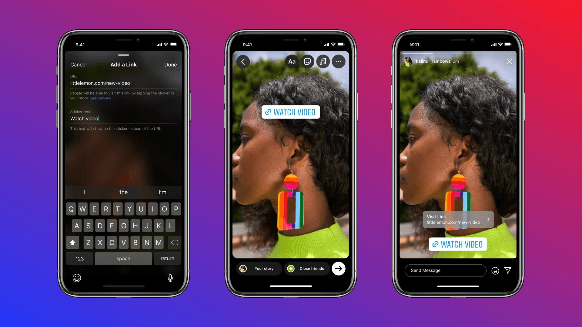
4. Select the Link Sticker
Choose the LINK sticker, recognizable by its chain-shaped graphic and bold text. If it's not immediately visible, search "link" in the search bar. The sticker appears instantly, ready for configuration.
Optimize Visual Credibility
This is where most people rush. They paste a URL and move on. But the next set of customization options determines whether your link looks professional or amateur, and whether it blends with your brand aesthetic or disrupts it. Slow down here. The extra 30 seconds you invest in customization multiplies your click-through rate.
5. Configure Your URL and Customize
When you select the link sticker, a URL field opens. Paste or type your destination link. Below this, you'll see "Customize sticker text" with a plus symbol. Without custom text, the sticker displays your domain name by default. That's rarely your best option.
Clarify the Destination
- Replace generic domain text with action-focused language that tells viewers exactly what happens next. "Shop now" is more effective than "yourstore.com" because it removes ambiguity. "Get details" is clearer than a URL. "Read more" promises value without leaving viewers to guess the destination.
- Tap "Done" in the upper-right corner once your URL and text are set. You can now customize the visual design.
- Tap the sticker to cycle through default color options.
- Press and hold to access a color picker that matches your story background or brand palette. Choose shades that create contrast, not camouflage. A link sticker that disappears into your background might as well not exist.
Enhance Visual Impact Through Layering
Text overlays enhance the visibility of your link sticker. Add bold, on-brand text above or beside the sticker to reinforce your CTA. If your sticker says "Shop now," your text overlay might add urgency: "Last 6 hours." The combination creates redundancy that helps, not hurts. Viewers scrolling quickly catch at least one element.
Elevate Brand Polish
Design custom graphics in Canva using your brand fonts and colors, then layer them over the tappable area. This approach works particularly well for product launches or event promotions where visual consistency across all marketing materials matters. The overlay transforms Instagram's standard sticker into something that feels uniquely yours. Experiment with placement beyond the default bottom-center position. Move and resize the sticker so it's prominent without covering key visual elements. Keep it clear of Instagram's UI buttons (the message field, reaction bar, profile avatar). Test different positions across several Stories to see what your specific audience responds to. Some brands find upper-third placement works better for their content style. Others discover that centering the sticker increases taps.
Replace Auto-Shortened URLs With Branded Links
Instagram automatically shortens long URLs, but those truncated strings look generic and slightly suspicious. Swap them for recognizable branded links using tools like Bitly. A URL that reads "yourbrand.co/spring-sale" signals professionalism and builds trust in ways "bit.ly/3xK9mP2" never will.
Drive Strategic Insights
Branded links also enable tracking that Instagram's native analytics can't provide. You can see exactly how many clicks each story generates, which times of day perform best, and which link text variations drive the most engagement. That data transforms guesswork into strategy.
Automate Professional Pipelines
Teams managing multiple networking touchpoints face similar challenges. A business card exchange at a conference creates one data point, but without systematic capture and follow-up, that connection stalls. Platforms like Mobilo solve this by turning every contact share into an automated workflow. The digital card captures the lead, triggers personalized follow-ups, and feeds data directly into your CRM. The same principle applies here: automation and tracking convert scattered efforts into measurable pipelines.
Apply These Link Sticker Strategies
New product launches benefit from Instagram Stories that show the product in context, paired with a link sticker driving traffic to dedicated product pages. The visual proof, combined with immediate access, removes friction between interest and purchase. Viewers see it, want it, and can buy it in three taps. Blog content shares require a different approach. Post an engaging excerpt or striking graphic from your article, then use the link to deliver the full piece. The story serves as a teaser, creating curiosity without satisfying it. You're demonstrating enough value to justify the full article. Exclusive discounts and limited-time offers thrive on urgency. Use bold sticker text such as "Claim your deal" or "Shop now," paired with countdown stickers to reinforce scarcity. The visual timer creates psychological pressure that generic "sale" announcements lack.
Streamline Event Conversion
Event RSVPs and ticket sales need clear, direct paths. Pair standout event photos or teaser videos with link stickers pointing to registration forms. Remove every possible barrier between interest and commitment. The easier you make it to say yes, the more people will. Hiring and recruiting benefit from Stories that showcase company culture, then link to open roles or application forms. Candidates get a feel for your environment before they even apply. That pre-qualification improves candidate quality while reducing time-to-hire.
Amplify Collaborative Reach
Partnership promotions amplify reach when both brands use link stickers to send viewers to each other's best content. This reciprocal approach doubles your audience exposure while building collaborative relationships that extend beyond single campaigns.
Test Sticker Positions and Copy Systematically
Your first link sticker placement probably won't be optimal. Your initial CTA text might not resonate. The color scheme you choose could blend in rather than stand out. That's expected. Conversion optimization happens through iteration, not inspiration. Run A/B tests on sticker position. Place it in the bottom third for one week, the upper third the next. Track click-through rates for each. Some audiences respond better to non-traditional placements that break their scrolling pattern. Others prefer the familiar bottom-center location.
Refine Call-to-Action Messaging
Test different CTA variations. "Shop now," "Get yours," and "See details" may seem like minor word changes, but they signal different actions and appeal to different mindsets. One emphasizes transaction, another ownership, and the third information gathering. Your specific audience will respond more strongly to one frame than the others.
Identify Engagement Patterns
Monitor performance through Bitly Analytics and Instagram Insights. Which Stories generate the most link clicks? What time of day sees the highest engagement? Which content types (product shots, behind-the-scenes, user-generated content) drive the most traffic? The patterns reveal what works for your unique audience, not what works in general.
Optimize Through Metrics
Adjust based on data, not assumptions. If upper-third placement consistently outperforms bottom-center placement, make it your default. If "Get details" drives more clicks than "Shop now," it indicates your audience prefers information before purchase. Listen to what the metrics are saying.
Build Testing Discipline
The goal isn't perfection on your first story. It's building a testing discipline that compounds over time. Each story becomes a small experiment. Each experiment generates data. Each data point refines your approach. Six months of systematic testing creates conversion advantages your competitors can't replicate because they're still guessing.
Take Your Conversion Strategy Beyond Instagram With Mobilo: Book Demo
You've mastered converting Instagram Story viewers into clicks. Now apply that same strategic thinking to your in-person connections. Most businesses lose the same prospects when networking moves offline. The optimized story links you've built capture online leads effectively, but what happens when someone hands you their business card at a conference or meets you at a coffee shop? According to Adobe research, 90% of business contacts collected in person never make it into company databases. That gap between your sophisticated online conversion funnel and your offline networking creates a blind spot where your highest-value relationships often begin.
Bridge Digital Precision
Teams using platforms like Mobilo close that gap by treating in-person interactions with the same precision as their Instagram strategy delivers online. One tap automatically exchanges contact information, enriches lead data in real time, scores prospects against ideal customer profiles, and syncs directly with CRM systems without manual entry.
Scale Offline Conversions
Every handshake becomes a trackable, actionable lead. Think of it as your offline link sticker: one tap, instant conversion, zero leads lost to forgotten paper cards. Over 59,000 companies now use this approach because the conversion principles you've applied to Stories (remove friction, maintain consistency, track everything, optimize continuously) work just as powerfully face-to-face. Book a demo today and get your first 25 digital contact cards free (worth $950). In a world where you've perfected your online conversion architecture, your offline networking deserves the same level of strategic execution.
Related Reading
- Bio Site vs Linktree
- Linktree Alternatives
- Shorby Vs Linktree
- Linkinbio vs Linktree
- Linktree vs Carrd
- Beacons vs Linktree
- Beacons vs Stan Store
- Milkshake vs Linktree
- Taplink vs Linktree


