

.avif)

17 High-Converting Personal Landing Page Examples to Model
On This Page
You've got seconds to make an impression when someone clicks through to your page. Whether you're a freelancer, entrepreneur, or creator, your personal landing page serves as your digital handshake, and the difference between a visitor bouncing away or becoming a valuable connection often comes down to smart design choices. This article breaks down proven personal landing page examples that convert, showing you exactly what works and why, so you can build a page that captures attention and drives real engagement.
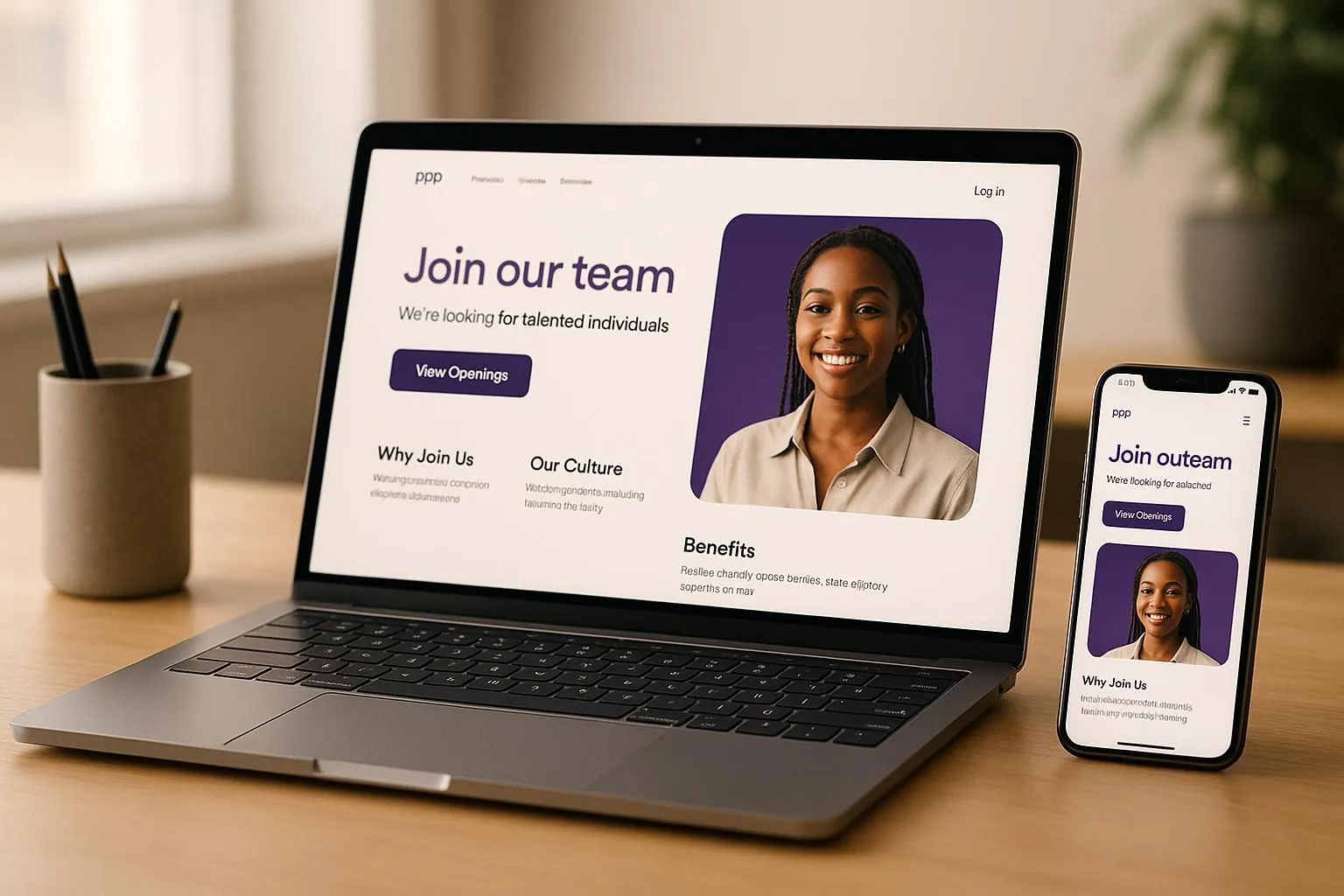
The best personal landing page examples share common elements: clear calls to action, compelling visuals, and streamlined information that guides visitors toward a specific goal. Mobilo's digital contact card solution simplifies the process by providing a professional platform to showcase your work, share your contact details, and direct traffic exactly where you want it to go. Instead of juggling multiple tools or coding from scratch, you get a clean, mobile-optimized landing page that turns profile visits into meaningful business relationships.
Summary
- Most personal landing pages underperform because they try to do too much at once, functioning more like digital brochures than conversion tools. With 86% of visitors leaving within 10 seconds, unclear messaging quickly drives away potential opportunities.
- A weak value proposition is often the core problem, especially when headlines rely on generic titles instead of specific outcomes. Clear, measurable results immediately communicate relevance and make you more memorable.
- Conversion friction further reduces performance through long forms, multiple navigation links, and competing calls to action. Pages with a single focused action convert significantly better because they remove distractions and make the next step obvious.
- Technical issues, such as slow load times and poor mobile optimization, also drive visitors away before they engage. Since many users view pages on their phones right after networking or referrals, speed and responsiveness directly affect results.
- A lack of social proof and targeted positioning weakens credibility and trust. Without clear evidence and alignment with the audience, even qualified visitors struggle to see why they should choose you.
Upgrade your presence with a digital contact card from Mobilo that delivers a fast, mobile-optimized profile built for clarity and action. Make every scan count by sharing a focused experience that turns interest into real opportunities.
Why Your Personal Landing Page Isn't Getting Results
Your landing page fails because it tries to be everything at once. You're showing a portfolio, listing every service, sharing your bio, embedding your resume, and asking people to connect on six platforms. The result is a digital brochure that no one reads, and fewer people act on. According to The Branx, 86% of visitors leave a landing page within 10 seconds, and when your page forces people to hunt for what matters, you've already lost them.
Your Value Proposition Isn't Clear
The first five seconds determine whether someone stays or leaves. If your headline reads "Marketing Professional | Strategist | Creative Thinker" or "Helping businesses grow through innovative solutions," you've said nothing specific enough to matter. Generic descriptors don't communicate value because they don't answer the question every visitor asks immediately: what can you do for me right now?
Lead With Measurable Outcomes
Benefit-driven copy names the problem you solve and the outcome you deliver. Instead of "Experienced consultant with 10+ years in digital transformation," try "I help mid-market retailers cut checkout abandonment by 30% in 90 days." The difference is specificity. One describes credentials, the other promises a measurable result. When someone lands on your page after meeting you at a conference or scanning your card, they need to confirm in seconds that you're worth following up with. Vague positioning makes that impossible.
Make Your Core Offer Instantly Clear
Most people bury their core offer beneath layers of background, philosophy, and process explanation. They assume visitors will read three paragraphs to discover what they actually do. They won't. The headline and subheadline need to deliver your entire pitch in under 15 words combined. Everything else on the page should reinforce that single promise, not dilute it with alternative messages.
You're Asking For Too Much, Too Soon
Friction kills momentum. You've worked to get someone interested enough to click, and then you present a form requesting their full name, company size, job title, phone number, email, industry, revenue bracket, and how they heard about you. Even genuinely interested people hesitate when the ask feels disproportionate to the value offered. A free consultation isn't worth ten fields of personal data.
Minimize Friction in Forms
Every additional form field reduces conversions. If you're offering a portfolio review, an email address is enough. If someone wants your pricing guide, name, and email, suffice. Asking for company revenue before they've seen your work signals that you're qualifying them before they've qualified you. That imbalance creates distrust. People abandon forms not because they're uninterested, but because the request feels invasive or premature.
Focus on One Clear Action
The same principle applies to navigation. If your page links to your blog, LinkedIn, Instagram, portfolio, speaking page, podcast, and newsletter signup, you've given people seven ways to leave without taking your primary action. Optimizely reports that landing pages with a single call to action can increase conversions by 371%. More options feel helpful but actually fragment attention. Decide what one thing you want someone to do, then remove everything that competes with it.
Your Page Loads Too Slowly
Speed isn't a technical nicety. It's a credibility signal. When your page takes four seconds to load because you've embedded high-resolution images, autoplay videos, and third-party widgets, more than half your visitors leave before seeing anything. They don't wait to judge your content; the delay already tells them you don't respect their time.
Speed Matters More on Mobile
Mobile users are even less patient. They often view your page while in transit, over inconsistent connections, with limited data plans. A desktop page that loads acceptably can become unusable on mobile if images aren't compressed or scripts aren't optimized. When someone scans your digital card at an event and immediately tries to view your profile, a slow load means they'll move on to the next conversation before your page finishes rendering.
Technical Discipline Drives Performance
Optimization isn't about stripping your page bare. It's about technical discipline: compressing images without losing quality, lazy-loading elements below the fold, minimizing redirects, using browser caching. These fixes are invisible to visitors but dramatically affect whether they stay long enough to see your message. Tools like digital business card platforms handle this automatically, delivering fast-loading, mobile-optimized pages without requiring you to manage hosting, compression, or performance monitoring.
You're Not Targeting the Right Audience
High traffic means nothing if those visitors aren't potential clients, collaborators, or referral sources. You might get hundreds of clicks from a viral post, but if they're curious strangers rather than qualified prospects, your conversion rate stays near zero. The problem isn't volume but alignment between who arrives and what you're offering.
Match Message to Audience
Targeting starts before someone reaches your page. If you're sharing your link in contexts where your offer doesn't match audience needs, you're generating empty traffic. A freelance designer sharing their landing page in a forum for enterprise procurement officers will see visits but no meaningful engagement. The message and the audience must match; otherwise, the page won't perform, no matter how well it's designed.
Attract by Filtering Clearly
This also means your page needs to filter, not just attract. If you work exclusively with Series A SaaS companies, your page should make that clear immediately. Specificity repels the wrong people and attracts the right ones. Trying to appeal broadly by remaining vague ensures no one feels you're speaking directly to them. Qualified traffic converts because visitors recognize themselves in your positioning and see their problem in your solution.
Your CTA Isn't Compelling
"Submit." "Click here." "Learn more." These phrases request action without providing a reason. They're placeholders that communicate nothing about what happens next or why someone should bother. A call to action needs to be a promise: what you'll get, how quickly, and why it matters.
Make CTAs Specific and Persuasive
Compare "Download my guide" with "Get the 5-step checklist I use to close enterprise deals in 30 days." The second version specifies the format, value, proof of effectiveness, and timeline. It provides enough information for someone to decide whether to accept it. The first version asks them to trust blindly that whatever you're offering is worth their email address.
Design and Placement Amplify CTAs
Placement and design matter as much as copy. A text link buried in a paragraph performs worse than a button placed in white space with contrasting color. CTAs need visual weight and strategic positioning. Placing your primary action above the fold and repeating it after your credibility section increases the likelihood that someone sees it when they're ready to act. Making your CTA look like a button rather than a link can boost clicks by up to 45% because buttons signal interactivity more clearly than underlined text.
Your Page Lacks Social Proof
Claims without evidence feel like marketing. "I deliver results" means nothing compared to "I helped 12 B2B companies increase qualified leads by an average of 40% in Q1 2024." Testimonials, case study snippets, recognizable client logos, and specific outcomes turn abstract promises into tangible proof.
Show Evidence to Reduce Risk
People hesitate when they can't verify that you've done what you say you can do. If your landing page shows no evidence that others have trusted you and succeeded, visitors assume the risk is theirs alone. Social proof transfers some of that risk by showing that others made the same decision and didn't regret it. Even a single strong testimonial with a full name, title, and company creates more trust than a page full of self-description.
Use Any Credible Validation
Proof doesn't have to mean famous clients or massive metrics. If you're early in your career, a detailed testimonial from a satisfied client carries more weight than vague claims about your potential. If you've spoken at conferences, show the event logos. If you've published work, link to it. If you've collaborated with respected professionals, mention them. Any third-party validation helps visitors feel less alone in their decision to engage with you.
Your Design is Hurting, Not Helping
Design isn't decoration. It's a system for directing attention and making information accessible. When your page uses low contrast text, cluttered layouts, or competing visual elements, people can't find what matters. Their eyes skip around looking for structure, fail to find it, and leave.
Establish Visual Hierarchy
Good design creates a clear visual hierarchy. The most important element (usually your headline and value proposition) should dominate visually. Secondary information should be smaller but still readable. Tertiary details belong in less prominent positions. When everything competes for attention equally, nothing wins. White space isn't wasted space; it's breathing room that lets important elements stand out.
Prioritize Mobile-First Design
Mobile design requires a different approach than desktop design. A three-column layout that looks balanced on a monitor becomes a cramped vertical scroll on a phone. Text that's readable at desktop size becomes tiny and unclickable on mobile. Navigation that works with a mouse fails with touch targets too small for fingers. Most people now access landing pages on mobile devices first, so if your page isn't designed mobile-first, you're optimizing for the minority experience and frustrating the majority.
You Haven't Optimized for Mobile Users
More people will view your landing page on a phone than on a computer. If your page displays a desktop layout shrunk to fit a small screen, users will pinch, zoom, scroll horizontally, and eventually give up. Mobile optimization isn't optional anymore; it should be the default experience you design for.
Mobile Friction Leads to Abandonment
Non-responsive pages fail in specific ways on mobile: buttons become too small to tap accurately, text requires zooming to read, forms demand excessive scrolling, and images load slowly or break layouts. Each friction point increases the likelihood that someone will abandon the page. Mobile users are often on the move, distracted, or time-pressed. They have even less patience for poor usability than desktop users.
Mobile-Optimized Platforms Solve the Problem
Platforms such as digital contact card solutions automatically handle mobile optimization, delivering pages that adapt to screen size, load quickly over cellular connections, and maintain usability across devices. Instead of managing responsive design yourself or relying on your website builder to handle it properly, you get a mobile-first experience by default. When someone scans your NFC card or QR code at a networking event, they see a fast-loading, touch-optimized page designed for immediate engagement, not a desktop site squeezed onto a phone screen.
Related Reading
- Best Link in Bio Tool
- What is Link in Bio
- How to Improve Linkedin Profile
- How To Build Personal Branding
- How to Add Portfolio to Linkedin
- How To Add Link To Tiktok Bio
- How to Add Instagram Link to Tiktok
- Where is Link in Bio on Instagram
- How to Add Link to Linkedin Post
- How to Add Website Link to Linkedin Profile
- Link in Bio Examples
- How To Add Link To Tiktok Bio
- How to Add Instagram Link to Tiktok
What You're Losing With a Generic Personal Presence
A weak landing page not only fails to convert visitors. It actively costs you money, relationships, and opportunities you'll never see. Every person who lands on your page and leaves represents a wasted acquisition cost, whether they came from paid ads, organic search, or a referral. The invisible nature of this loss makes it dangerous. You don't get notifications about the consulting client who visited your page twice and hired someone else, or the potential collaborator who couldn't figure out what you actually do.
The Math of Continuous Bleeding
Consider the baseline. According to Contentful, companies that excel at personalization generate 40% more revenue from those activities than average players. When your landing page treats every visitor identically, offering the same generic message to enterprise buyers and solopreneurs alike, you're leaving that revenue gap open. With 100,000 monthly visitors and $50 profit per conversion, every 1% improvement in conversion rate equals $50,000 in additional annual profit. That's not aspirational math. That's the quantifiable cost of mediocrity compounding month after month.
Understand Conversion Benchmarks
The median landing page converts at 6.6%. If 1,000 people visit your page, roughly 933 leave without taking action. Each of those departures represents a decision point where someone evaluated your offer and found it insufficient. Some left because your value proposition wasn't clear. Others bounced due to slow load times or confusing navigation. Many simply couldn't determine whether you solved their specific problem. The outcome is identical: traffic that costs you time, effort, or money to acquire produces zero return.
What Gets Poisoned Beyond the Immediate Loss
Poor page performance creates downstream damage that extends far beyond missed conversions. When visitors arrive and immediately leave, that behavior sends quality signals to advertising platforms. High bounce rates and low engagement signal to algorithms that your page doesn't meet user intent. The system responds by reducing your ad reach or increasing your cost per click. You're not just losing the conversion from that visitor. You're degrading the performance of every future dollar you spend driving traffic to that page.
Poor Pages Hurt Organic Performance
The same dynamic plays out in organic search. Search engines measure how users interact with your page after clicking through from the results. If people consistently return to search results within seconds, that signals your page didn't answer their query. Your rankings decline, reducing the volume of free traffic you receive. A weak landing page doesn't stay within its boundaries. It infects the channels feeding it, making acquisition more expensive and less effective over time.
Authority Depends on Clear Presentation
Most professionals underestimate the impact of landing page quality on their authority positioning. You might be exceptionally qualified, with a decade of specialized experience and a track record of measurable results. But if your landing page presents that expertise through generic language, cluttered design, or vague positioning, visitors can't distinguish you from someone half as capable with a better presentation. The authority gap isn't about your actual competence. It's about the delta between what you can deliver and what your page communicates.
The Compounding Invisibility of Missed Introductions
Every month you operate with a weak landing page is another month of lost opportunity. Potential clients who visit and leave don't just represent lost sales. They represent lost relationships that would have generated referrals, introductions, and repeat business over the years. A single consulting engagement might be worth $15,000 initially, but the relationship value over five years, including referrals and expanded scope, could easily reach $150,000. When your page fails to convert that initial inquiry, you're not losing a project. You're losing a decade of compounding relationship value.
Online Presence Opens Doors
Speaking engagements, podcast interviews, and conference invitations often start with someone discovering you online and evaluating whether you're credible enough to feature. If your landing page doesn't immediately demonstrate expertise and authority, you'll be passed over in favor of someone who presents better, regardless of your relative qualifications. These visibility opportunities have exponential value. A single conference talk can generate dozens of qualified leads and establish you as a recognized voice in your field. Your landing page is the gatekeeper to everything.
Digital Presence Signals Professionalism
Collaborations and partnerships follow the same pattern. When someone considers whether to bring you into a project, recommend you to their network, or co-create something together, they evaluate your digital presence as a proxy for professionalism. A generic page signals that you don't take your positioning seriously. It suggests you might approach client work with the same lack of attention to detail. Fair or not, people make these judgments in seconds. The collaborator who could have opened doors to enterprise accounts moves on to someone whose online presence matches their level of rigor.
When Friction Becomes a Filter You Didn't Choose
Forms that request excessive information cause abandonment at the moment someone is ready to engage. You've successfully communicated value, built interest, and prompted action. Then you present a form demanding job title, company size, budget range, timeline, and three paragraphs explaining their needs. The friction isn't just annoying. It's a credibility test you're failing. It signals to visitors that you prioritize data collection over making it easy to connect.
Landing Pages Unlock Visibility Opportunities
Every additional field reduces form completion rates. The difference between asking for email alone versus email plus five other fields can cut conversions in half. You're trading immediate relationship-building for data you can gather later, once trust is established. That trade rarely pays off. The visitor who had scheduled a call after providing only their email address instead closes the tab when confronted with a lengthy form.
Digital Presence Influences Collaborations
Navigation links compete with your primary call to action. When your page offers paths to your blog, portfolio, LinkedIn profile, newsletter, and podcast alongside your main conversion goal, you're asking visitors to choose between seven actions. Most choose none. They scan the options, feel overwhelmed by the decision, and leave. Platforms like [digital contact card](https://www.mobilocard.com/) solve this by presenting a single, focused profile optimized for immediate action, eliminating the navigation sprawl that dilutes conversion intent.
The Authority Tax on Every Interaction
Generic positioning makes you forgettable. When your headline could apply to thousands of other professionals in your field, visitors have no reason to remember you specifically. They might appreciate your general competence, but they can't recall what makes you different when they're ready to hire or refer someone. Specificity creates memory hooks. "I help SaaS companies reduce churn" is forgettable. "I've helped 23 B2B SaaS companies cut churn by an average of 34% in 90 days using behavioral cohort analysis" is memorable because it's concrete.
Forgettable Positioning Resets Trust
The forgettability compounds over time. Someone might visit your page three times over six months, each time during a moment of potential need. If your page doesn't create a distinct impression, those three exposures produce no cumulative effect. They're starting from zero each time, unable to build on previous familiarity. Strong positioning creates recognition. Weak positioning creates repeated introductions to the same stranger.
Lack of Personalization Drives Frustration
According to Sepire, 76% of consumers get frustrated when personalization doesn't occur. When your landing page shows identical content to a Fortune 500 executive and a startup founder, both feel you're not speaking to them specifically. The enterprise buyer sees no evidence that you understand their procurement process, compliance requirements, or scale challenges. The startup founder sees no acknowledgment of their budget constraints, speed requirements, or scrappy execution style. Both leave feeling you're not quite right for their situation, even if you've successfully served both segments before.
What Mobile Failure Actually Costs
More than half of your visitors view your page on mobile devices. If your page loads slowly, requires pinch-zooming to read text, or presents buttons too small to tap accurately, you've lost them before they see your message. Mobile users are often viewing your page at the highest point of intent, immediately after meeting you at an event or receiving a referral. They're standing in a conference hallway or sitting in a coffee shop, ready to act immediately if your page makes it easy. Slow load times or poor mobile design transform that hot lead into a missed opportunity.
Mobile Users Decide Fast
The context of mobile viewing demands different optimization than desktop. Someone viewing your page on their phone likely has limited time, partial attention, and no patience for complexity. They need to understand your value and take action within 30 seconds. Desktop users might tolerate longer exploration, but mobile users operate in interrupt-driven environments. Your page needs to deliver its core message and conversion path instantly, or they're gone.
Optimization Requires Clear Outcomes
But fixing mobile responsiveness and load speed only addresses technical execution. The deeper problem remains that most landing pages fail because they're not built around a specific, measurable outcome. They're digital resumes hoping someone finds them interesting enough to reach out. That passive approach guarantees you'll continue to miss opportunities to professionals who understand conversion optimization as a competitive advantage.
Related Reading
- How to Add Linktree to Tiktok
- How To Add Linktree To Instagram
- How To Add A Link To Instagram Story
- How To Add Link To Instagram Profile
- Graphic Design Portfolio Websites
- Personal Portfolio Website Design Examples
- Small Business Bio Examples
- One Page Website Examples
- Best Photography Portfolio Websites
- Instagram Landing Page Examples
17 High-Converting Personal Landing Page Examples to Model
These examples work because they're built around specific conversion goals, not aesthetic trends. Each demonstrates a learnable pattern you can adapt: minimalist portfolios that prioritize speed and clarity, interactive experiences that demonstrate technical capability, content-first designs that nurture through value delivery, and focused lead-capture pages that remove every obstacle between interest and action. What matters isn't copying their visual style but understanding why each element exists and what outcome it's optimized to produce.
1. Matthew Williams Portfolio

- Style: Minimalist personal branding
- Focus: Letting portfolio work dominate without distraction
- Standout Element: Monochromatic palette with strategic accent colors
- Best For: Creative professionals in design, development, and digital fields
The power here is restraint. A clean layout with generous white space forces attention onto project thumbnails and case study details. Animated text transitions add subtle motion without competing for focus. The hero section establishes identity and expertise in five seconds, answering the visitor's immediate question: "What do you do, and why should I care?"
Universal Principles
Fast load times improve every landing page. Clear value propositions work across industries. Mobile responsiveness is non-negotiable.
Context-Specific Elements
Monochromatic schemes suit creative fields but might feel cold for consultants or coaches. Large portfolio thumbnails work when visual work is your product; they're less relevant for service providers whose deliverables aren't photogenic.
Implementation Priorities
Start with typography hierarchy. Your headline, subheadings, and body text need distinct visual weight. Compress images aggressively without losing quality. Test your page on a three-year-old phone over a mediocre connection, because that's closer to reality than your desktop experience. Place one clear call to action above the fold, then repeat it after your credibility section.
2. Bruno Simon's 3D Interactive Portfolio

- Style: Gamified interactive experience
- Focus: Demo WebGL and Three.js expertise through the medium itself
- Standout Element: Navigable 3D environment with physics-based car control
- Best For: Frontend developers, creative technologists, game designers
This works because it proves capability through experience rather than claims. Visitors drive through a low-poly landscape discovering projects, skills, and easter eggs. The interaction itself becomes the portfolio piece, showing technical mastery in real time. It won Awwwards and FWA recognition, then inspired countless interactive resume experiments.
Universal Principles
Demonstrating skills through the product itself builds credibility faster than descriptions. Memorable experiences generate word-of-mouth sharing. Engagement time correlates with conversion likelihood.
Context-Specific Elements
Resource-intensive 3D graphics require powerful devices and fast connections. The learning curve for non-traditional navigation frustrates some users. This approach suits technical roles where the medium matches the message; it would feel gimmicky for accountants or lawyers.
Implementation Priorities
Provide a fallback 2D version for devices that can't handle 3D rendering. Include clear instructions for navigation within the first five seconds. Optimize 3D assets ruthlessly; polygon count matters more than texture resolution. Test on mid-range Android devices, not just new iPhones. Make contact information and key projects accessible without requiring full exploration of the environment.
3. Brittany Chiang's Developer Portfolio
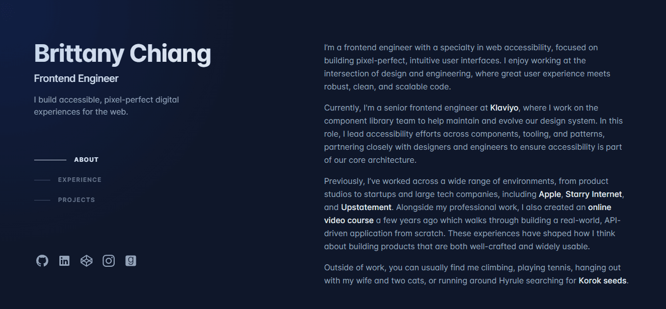
- Style: Code-editor-inspired developer aesthetic
- Focus: Technical credibility through familiar visual language
- Standout Element: Dark theme with syntax highlighting color palette
- Best For: Software engineers, frontend developers, technical roles
This became one of the most cloned portfolio templates because it speaks fluently to technical recruiters and hiring managers. The dark theme with accent colors mirrors VS Code and Sublime Text, creating immediate familiarity. Side navigation with active-state indicators provides a clear wayfinding experience. Project cards display technology stacks and GitHub links, enabling visitors to verify claims through code.
Universal Principles
Speaking your audience's visual language builds instant rapport. Clear navigation reduces cognitive load. Linking to verifiable work (GitHub, live demos) converts skepticism into trust.
Context-Specific Elements
The code-centric aesthetic resonates with technical audiences but might alienate non-technical stakeholders. Dark themes work well for developer portfolios but may feel too informal for corporate consulting. The template's popularity creates differentiation challenges; you need meaningful personalization to stand out.
Implementation Priorities
Customize the color scheme beyond the defaults. Every project card needs three elements: what you built, the technologies you used, and a link to see it in action. Keep animations subtle; one smooth transition beats five competing effects. Highlight technologies relevant to your target roles, not every framework you've touched once. Make the GitHub link prominent; technical evaluators will check your code quality.
4. Rafael Caferati's Interactive Resume
- Style: Dashboard-style data visualization
- Focus: Quantifying skills and experience through interactive charts
- Standout Element: Skill percentage indicators with hover interactions
- Best For: UX designers, data visualization specialists, product managers
This transforms the traditional resume into an explorable interface. Interactive skill charts show proficiency levels, timeline visualizations map career progression, and achievement badges gamify credentials. The format works because it demonstrates UX thinking through its presentation.
Universal Principles
Visualizing data makes abstract skills concrete. Interactive elements increase time on page. Quantification (years of experience, project count, skill levels) provides specific evaluation criteria.
Context-Specific Elements
Percentage-based skill indicators work well for technical competencies but feel reductive for nuanced capabilities such as writing or strategy. The dashboard aesthetic suits digital roles but might appear too casual for traditional industries. Maintaining accurate visualizations requires regular updates as skills evolve.
Implementation Priorities
Be honest about skill-level percentages; inflated numbers damage credibility when tested. Provide context for every data point (five years of React experience means something different at a startup versus an enterprise). Ensure interactions serve a purpose beyond novelty. Include a downloadable PDF resume for recruiters who prefer traditional formats. Test the experience with non-technical users; if your mother can't navigate it, simplify.
5. Sean Halpin's Illustrative Portfolio

- Style: Custom illustration-driven narrative
- Focus: Showcasing illustration skills through the page design itself
- Standout Element: Scroll-triggered animations revealing illustrated scenes
- Best For: Illustrators, graphic designers, creative directors
The page is the portfolio. Custom-drawn scenes integrate with scroll position, revealing new details as visitors move down the page. Parallax effects add depth without overwhelming. A consistent color palette and strategic white space prevent visual chaos. This works because it demonstrates capability through execution; you're not reading about illustration skill, you're experiencing it.
Universal Principles
Demonstrating expertise through the medium itself is more convincing than describing it. Scroll-triggered reveals encourage exploration. Cohesive visual language strengthens brand recognition.
Context-Specific Elements
Illustration-heavy pages risk slow loading without aggressive optimization. The approach works for visual creatives but would distract from content for writers or consultants. Requires substantial upfront investment in custom graphics. Style changes demand complete redesigns rather than incremental updates.
Implementation Priorities
Create illustrations as separate SVG components for independent animation control. Compress ruthlessly; beautiful illustrations that take six seconds to load defeat their purpose. Ensure illustrations complement, rather than overshadow, the project work and case studies. Maintain visual consistency across all illustrated elements. Consider the narrative arc as users scroll; each reveal should feel like story progression, not random decoration.
6. Dejan Markovic's Split-Screen Portfolio
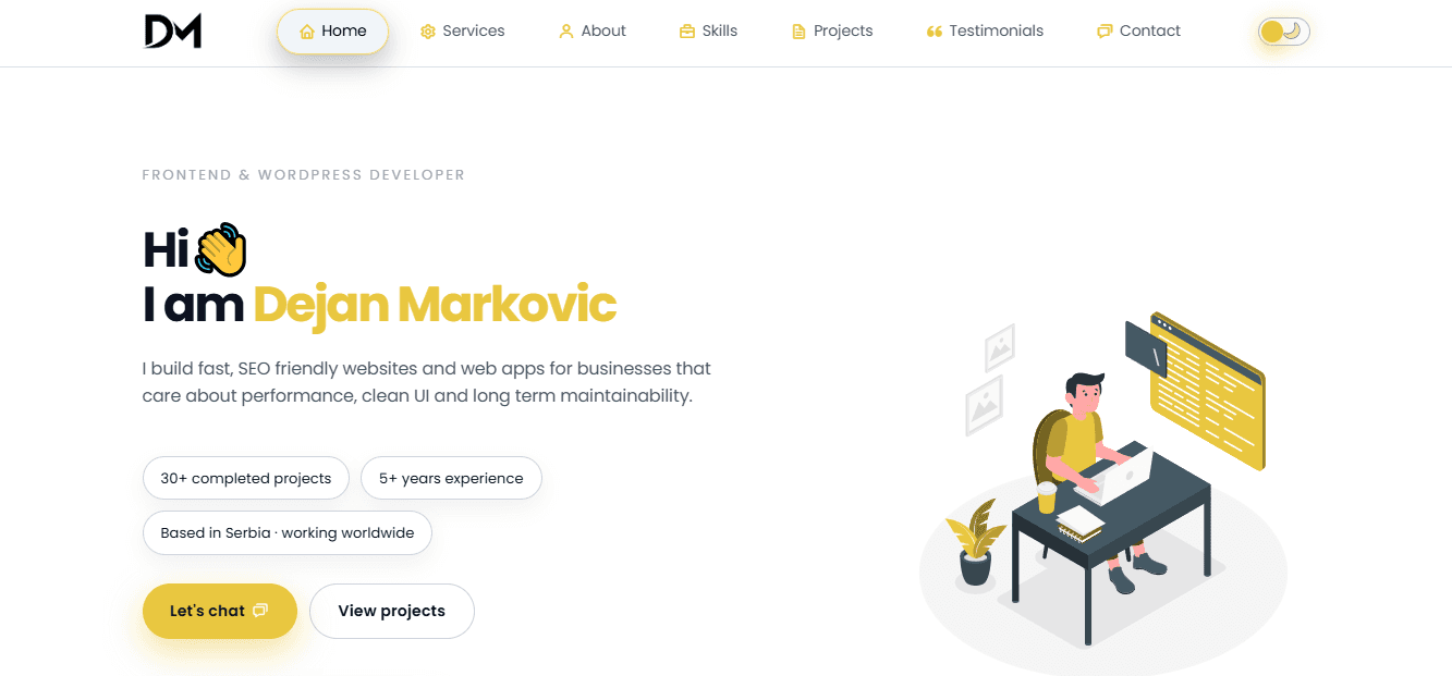
- Style: Vertical split-screen with fixed and scrolling sections
- Focus: Simultaneous navigation and content presentation
- Standout Element: Contrasting color palettes dividing the screen
- Best For: Designers, agencies, professionals with diverse project portfolios
This layout creates clear content separation. One side holds fixed navigation, contact details, or a brief introduction. The other side scrolls through portfolio work, project details, or case studies. Bold typography and strategic negative space ensure both sections are readable without crowding.
Universal Principles
Visual separation clarifies different content types. Simultaneous access to navigation and content reduces clicks. Contrast draws attention to key elements.
Context-Specific Elements
Responsive implementation requires careful planning; split screens become stacked layouts on mobile. Limited content width per section constrains layout options for complex projects. Visual balance is delicate; two competing sections can fragment attention rather than organize it. Works best with moderate content volume; extensive portfolios might need traditional layouts.
Implementation Priorities
Use contrasting colors that create distinction without visual clash. Decide which content stays fixed and which scrolls based on what visitors need constant access to. Maintain a consistent vertical rhythm on both sides to maintain visual balance. Test thoroughly on tablets where the transition from split to stacked happens. Plan mobile navigation carefully; fixed sidebars become problematic on small screens.
7. Pascal Van Gemert's Resume-Focused Landing Page
- Style: Web-enhanced traditional resume structure
- Focus: Familiar information hierarchy with interactive enhancements
- Standout Element: Progress bars visualizing skill proficiency
- Best For: Corporate professionals, job seekers, traditional industries
This bridges the gap between the expected resume format and web capabilities. The structure follows conventional resume sections (experience, education, skills) but adds progress bars for skill levels, timeline visualizations for career progression, and embedded testimonials. According to MarketingSherpa, 68% of B2B businesses use landing pages to generate new sales leads and drive future conversions, making this format both an immediate evaluation tool and a lead-capture mechanism.
Universal Principles
Familiar formats reduce cognitive load. Visual enhancements make information more digestible. Downloadable versions accommodate different recruiter preferences.
Context-Specific Elements
The structured format limits creative expression, and visual designers may feel constrained. Information density risks overwhelming visitors if not carefully curated. Common format makes differentiation challenging as adoption increases. Formal structure might feel stiff for creative or startup environments.
Implementation Priorities
Focus on the most relevant experience and skills for target roles; comprehensiveness matters less than relevance. Use charts and graphs to quantify accomplishments wherever possible. Ensure mobile responsiveness; many recruiters review candidates on phones. Include testimonials or recommendations for social proof. Offer both PDF and Word document downloads for maximum compatibility. Make contact information prominent; if someone wants to reach you, don't make them hunt.
8. Robby Leonardi's Interactive Gameified Portfolio
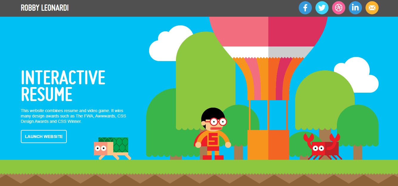
- Style: Side-scrolling platformer game interface
- Focus: Gamifying resume navigation through playable character control
- Standout Element: Game levels representing different career sections
- Best For: Game designers, creative technologists, interactive media professionals
This transforms portfolio browsing into gameplay. Visitors control a character through side-scrolling levels, each representing different professional sections (skills, experience, projects, awards). Interactive elements respond to user input, achievement-style presentations showcase recognition, and pixel art creates nostalgic appeal. It won the FWA Site of the Day award and inspired numerous interactive portfolio experiments.
Universal Principles
Memorable experiences generate sharing and word-of-mouth. High engagement correlates with conversion. Demonstrating technical skill through the medium itself builds credibility.
Context-Specific Elements
Significant technical expertise and development time required. May appear too informal for corporate or traditional professional contexts. Game mechanics can distract from the portfolio content if not carefully balanced. Accessibility for users with disabilities requires thoughtful implementation. Performance issues on older devices or slower connections.
Implementation Priorities
Provide alternative navigation options to support accessibility and user preferences. Include clear instructions for game interaction within first five seconds. Keep core mechanics simple and intuitive; complexity frustrates rather than impresses. Ensure important information (contact details, key projects) is accessible without completing the entire game. Test extensively across devices and connection speeds; what works smoothly on your development machine might lag on typical user hardware.
9. Salt & Straw

- Style: E-commerce lead capture with immediate incentive
- Focus: Newsletter subscription driving first purchase
- Standout Element: 10% discount for email signup
- Best For: E-commerce brands, subscription services, product-based businesses
The visual is simple and appetite-driven: ice cream scoops surrounded by fresh berries. The value exchange is explicit: provide your email, receive 10% off your first order, plus updates on new flavors and partner shop coupons. This works because the incentive is immediate and relevant. You're not asking for trust in future value; you're offering tangible benefit right now.
Universal Principles
Clear value exchange increases conversion. Visual appeal works for food and beverage. Immediate discounts overcome first-purchase hesitation.
Context-Specific Elements
Discount-driven acquisition can attract price-sensitive customers with low lifetime value. Works best for products with strong repeat purchase potential. The simplicity suits single-product-category businesses but might feel insufficient for complex offerings.
Implementation Priorities
Make the discount prominent and the terms clear (no hidden conditions that breed resentment). Use high-quality product photography that triggers desire. Keep the form minimal (email only, maybe zip code for location-based offers). Set clear expectations for email frequency; no one wants a daily promotional bombardment. Track not just signup conversion but subsequent purchase conversion to measure true ROI.
10. Herb & Wood
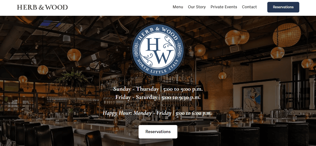
- Style: Single-purpose event booking funnel
- Focus: Private event inquiries for San Diego venue
- Standout Element: Banner announcing venue location and purpose
- Best For: Venues, event spaces, location-based services
This page has one job: capture private event inquiries for a San Diego venue. The banner immediately establishes what and where: "Herb & Wood is a stylish and versatile event space in San Diego." One action is possible: click the Private Events link. No menu exploration, no blog posts, no distraction. Advertising and SEO funnel traffic with specific intent, and the page matches that intent exactly.
Universal Principles
Message-to-market match increases conversion. Removing competing actions focuses attention. Geographic specificity filters unqualified traffic.
Context-Specific Elements
Single-purpose pages work for high-intent searches but miss broader discovery traffic. Location specificity is essential for venues but irrelevant for digital services. The simplicity suits straightforward offerings but undersells complex capabilities.
Implementation Priorities
Ensure your advertising and SEO target the exact intent this page serves; mismatched traffic produces high bounce rates. Make the single action obvious through size, color, and placement. Include just enough information to qualify interest (capacity, amenities, pricing range) without overwhelming the reader. Add social proof (past event photos, testimonials) to build credibility. Provide clear next steps after the click (form, calendar booking, phone call).
11. REI Co-op

- Style: Multi-path shopping funnel with urgency triggers
- Focus: Immediate purchase across product categories
- Standout Element: Carousel of promotional messages with consistent "shop now" CTAs
- Best For: Retail, e-commerce, multi-category product businesses
The carousel rotates through messages, but each one leads to a shopping offer: "Shop now," "Save 40% by shopping now," or "Get a $25 gift card for shopping now." Links to the nearest physical store and ten merchandise categories provide paths, but all roads lead to purchase. This works because it acknowledges different entry points (urgency shoppers, category browsers, local store seekers) while maintaining a singular conversion focus.
Universal Principles
Multiple entry points serve different visitor intents. Urgency messaging (limited-time discounts, bonus offers) accelerates decision-making. Consistent CTAs across varied messages reinforce primary action.
Context-Specific Elements
Carousel effectiveness is debated; some users never see beyond the first slide. Works for established brands with existing purchase intent but might overwhelm new visitors. The promotional focus suits retail but could feel aggressive for services or B2B.
Implementation Priorities
If using a carousel, make navigation controls obvious and auto-rotation slow enough to read. Ensure the first slide conveys your strongest message, as many visitors won't see the others. Test whether a static hero with single strong offer outperforms rotating messages. Make category links clear and logically organized. Track which entry points convert best and optimize accordingly.
12. St. Jude's Children's Research Hospital

- Style: Story-driven donation funnel
- Focus: Monthly giving through emotional connection
- Standout Element: Featured stories of children helped by the hospital
- Best For: Nonprofits, cause-based organizations, mission-driven brands
This inspires monthly giving through stories of successful childhood cancer treatment. The landing page links to emotive narratives showing real impact. It works because it transforms abstract charity into concrete human outcomes. You're not donating to an institution; you're helping specific children whose stories you've connected with.
Universal Principles
Emotional storytelling drives action more effectively than statistics. Showing impact converts skepticism into trust. Recurring donation asks work better after emotional investment.
Context-Specific Elements
Story-driven approaches require ongoing content creation (new stories, updates, outcomes). Works powerfully for causes with visible human impact but less effectively for abstract missions. Privacy considerations limit the amount of personal information that can be shared.
Implementation Priorities
Feature real stories with permission and appropriate privacy protection. Show outcomes, not just needs; people want to join success, not just alleviate suffering. Make the donation process frictionless (saved payment methods, one-click recurring setup). Offer multiple giving levels with clear impact descriptions (your $50 monthly donation provides X). Follow up with impact updates to reduce donor regret and increase retention.
13. Philosophy
- Style: Dual-category product showcase
- Focus: Repeated shopping opportunities through strategic layout
- Standout Element: Skincare and fragrance sections alternating as you scroll
- Best For: Beauty brands, lifestyle products, dual-category businesses
The page is organized around two product categories: skincare and fragrances. Scanning gives two immediate shopping opportunities. Scrolling reveals two more, then two more. Even "just browsing" behavior encounters constant conversion paths. This works because it respects different visitor intents (targeted shoppers versus explorers) while ensuring both encounter purchase opportunities.
Universal Principles
Repeated CTAs capture visitors at different decision points. Category organization helps browsers find relevant products. Visual rhythm (alternating sections) maintains engagement during scrolling.
Context-Specific Elements
Works for businesses with clear product divisions but might fragment focus for single-category offerings. The repetition suits established brands, where visitors already understand the product; new brands need more education before prompting purchase.
Implementation Priorities
Ensure category divisions are meaningful to customers, not just internal organization. Use high-quality imagery that clearly showcases products. Make each section self-contained; visitors might enter mid-scroll through search or ads. Test whether the alternating pattern outperforms grouped categories. Track which product types convert better and adjust visual prominence accordingly.
14. Copyblogger
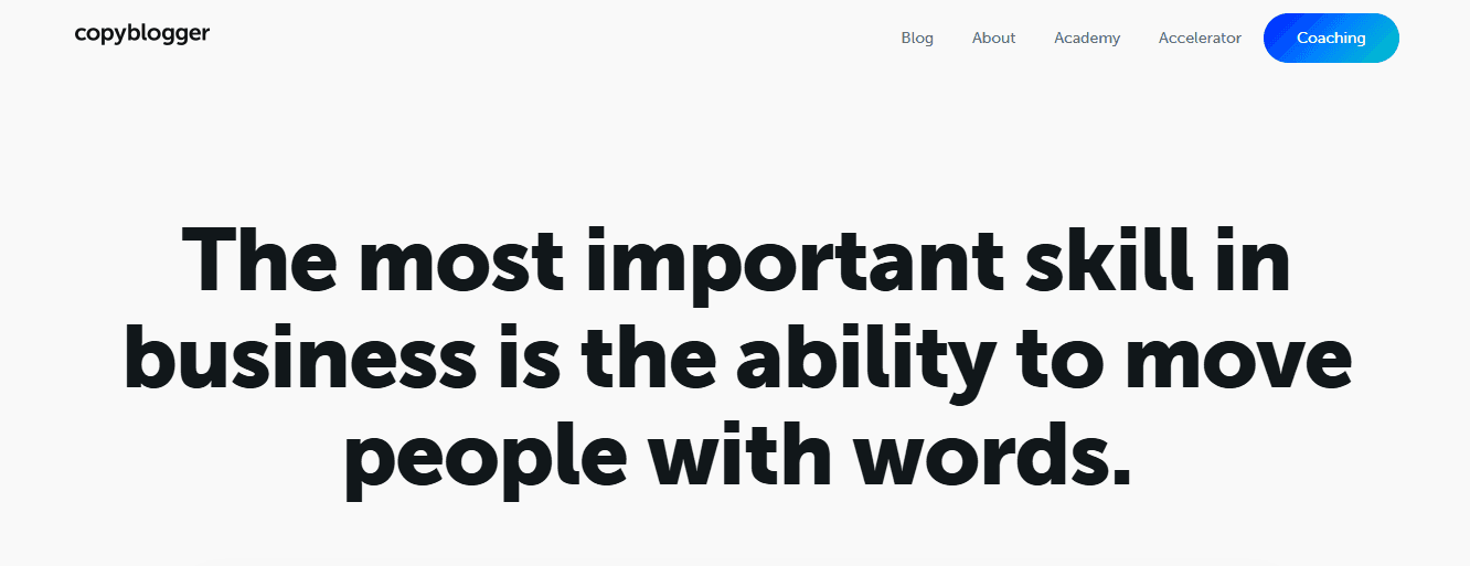
- Style: Content-first blog-as-homepage
- Focus: Immediate article consumption with embedded email capture
- Standout Element: Email CTA within natural content flow
- Best For: Writers, marketers, educators, thought leadership brands
Copyblogger uses its blog as its homepage to encourage visitors to consume content immediately. The minimalist design prioritizes readability over imagery. The layout is distraction-free with clear fonts. A prominent CTA offers a free email series at the top and repeats it at the bottom for visitors who scroll. This works because it matches visitor intent: people arrive seeking marketing insights, not product pitches. Value delivery comes first; the conversion ask comes after trust is established.
Universal Principles
Content-first approaches build authority before asking for commitment. Email capture works better after a value demonstration. Minimizing distractions increases content engagement.
Context-Specific Elements
Works for businesses where content is the product (education, training, consulting) but less effective for physical products or immediate-need services. Requires consistent content production to maintain value. The approach suits top-of-funnel awareness but needs separate pages for conversion-ready visitors.
Implementation Priorities
Make your best content immediately visible; first impressions determine whether visitors explore further. Place email signup prominently but not intrusively. Offer a specific lead magnet (email series, guide, template) rather than a generic newsletter signup. Ensure content quality justifies the ask; mediocre articles don't earn email addresses. Track which content pieces drive the most signups, and create more of the same.
15. Tobias Ahlin
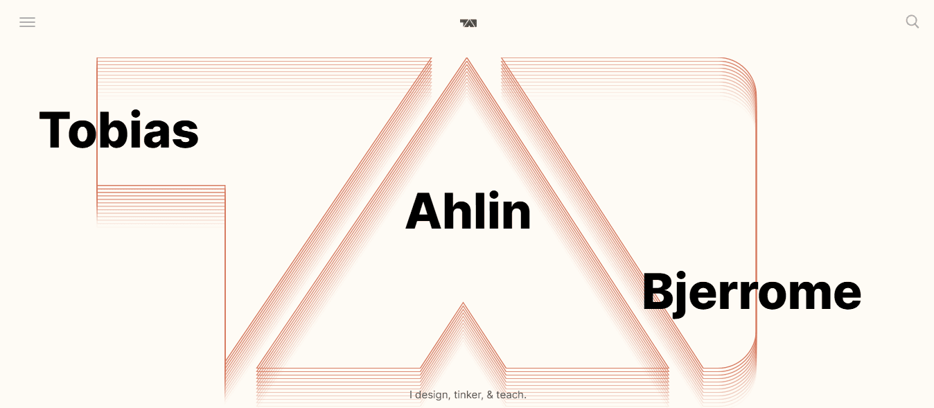
- Style: Combined portfolio and blog
- Focus: Showcasing projects alongside thought leadership content
- Standout Element: Integrated project and blog sections on a single page
- Best For: Developers, designers, freelancers, independent consultants
The top section features recent blog posts with clear "read more" buttons. Scrolling reveals projects, recent work, and contact methods. This combination works because it serves multiple visitor intents: potential clients evaluating expertise through projects, peers seeking insights through blog content, and recruiters assessing both capability and thought leadership.
Universal Principles
Multiple content types are evaluated against different criteria. Blog content demonstrates expertise beyond portfolio work. Clear section divisions help visitors quickly find relevant information.
Context-Specific Elements
Maintaining both portfolio and blog requires ongoing effort. Works best for professionals whose thought leadership enhances credibility (consultants, senior practitioners) rather than for pure execution roles. The combined approach can dilute focus if sections compete rather than complement one another.
Implementation Priorities
Ensure blog content aligns with your professional expertise; random topics dilute your positioning. Keep project showcases current; outdated work suggests inactivity. Make contact information equally prominent in both sections. Use consistent visual language across portfolio and blog sections. Test whether visitors engage more with projects or content and adjust prominence accordingly.
16. The Recipe Critic

- Style: Category-organized food blog
- Focus: Easy recipe browsing by meal type
- Standout Element: Recipe categories (breakfast, dinner, salads, slow cooker) with central opt-in form
- Best For: Recipe creators, niche lifestyle bloggers, how-to content sites
The design offers clear sections for different meal types, helping visitors find relevant recipes immediately. A large call to action in the center encourages free recipe signups. The page includes search functionality and social media follow buttons. This works because it reflects how people actually use recipe sites: they arrive with specific needs (quick dinner ideas, slow-cooker meals) and want immediate answers, not brand storytelling.
Universal Principles
Category-based navigation serves intent-driven visitors. Central opt-in forms capture emails from engaged browsers. Search functionality acknowledges that categories can't anticipate every need.
Context-Specific Elements
Works for content libraries with clear organizational logic, but is less effective for narrative-driven or sequential content. The approach suits practical how-to content more than opinion or analysis. Requires substantial content volume to justify category divisions.
Implementation Priorities
Organize categories by user intent, not by your content creation process. Make the opt-in offer specific and valuable (e.g., your best recipes, meal-planning guides, seasonal collections). Ensure search works well; it's often the most-used navigation element. Use high-quality food photography; recipe quality is judged by appearance first. Track which categories drive the most engagement and email signups.
17. Dan Flying Solo
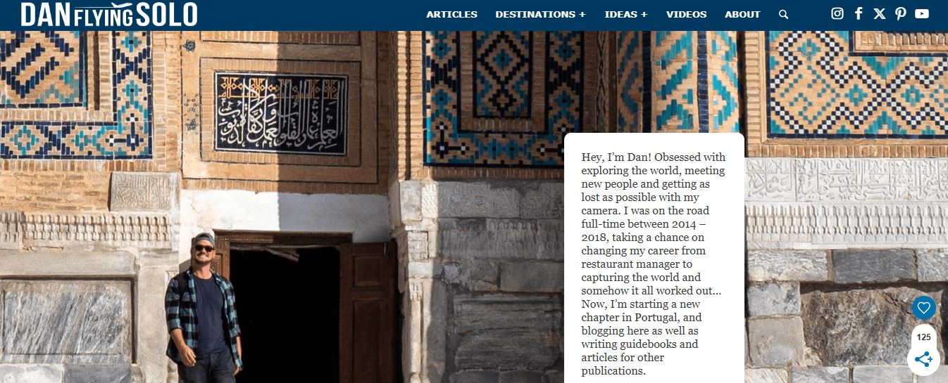
- Style: Travel blog with multimedia integration
- Focus: Personal travel stories and destination guides
- Standout Element: Embedded YouTube videos alongside written content
- Best For: Solo travelers, content creators, personal brand builders
The header establishes Dan's focus, such as topics covered, places visited, and personal travel philosophy. Scrolling reveals the latest blog posts, each with a prominent "read more" button. YouTube videos embed directly on the page, creating cross-platform engagement. This works because it meets audiences where they are; some prefer reading detailed guides, others want quick video overviews. The integration grows both platforms simultaneously.
Universal Principles
Multimedia content serves different consumption preferences. Personal branding is built on a consistent voice across formats. Cross-platform integration compounds audience growth.
Context-Specific Elements
Maintaining multiple content formats requires significant production effort. Works for personality-driven brands but is less effective for purely informational content. Video embedding can slow page load times if not properly optimized.
Implementation Priorities
Ensure videos load efficiently (e.g., via lazy loading and appropriate compression). Make written content strong enough to stand alone; videos should enhance, not replace, written value. Use consistent branding across blog and video content. Include clear calls to action for both platforms (subscribe to the blog and YouTube). Track which content format drives more engagement and adjust production accordingly.
Related Reading
- Bio Site vs Linktree
- Linktree Alternatives
- Shorby Vs Linktree
- Linkinbio vs Linktree
- Linktree vs Carrd
- Beacons vs Linktree
- Beacons vs Stan Store
- Milkshake vs Linktree
- Taplink vs Linktree
Your Landing Page Works Online, What About Every In-Person Opportunity?
You've optimized your digital presence to convert visitors into opportunities. But most business relationships still begin face-to-face. Conferences, client meetings, industry events, chance encounters at coffee shops. You hand someone a paper card, they pocket it with a dozen others, and 90% never make it into your CRM. You're losing the same opportunities in person that you just fixed online.
Paper Cards Create Dead Ends
The gap isn't about effort. You show up, you network, you collect cards. The problem is that paper cards are information dead ends. They require manual data entry, they get lost, and they provide zero insight into whether that connection matters. You have no idea whether the VP you met at the conference visited your site, what they reviewed, or whether they match your ideal customer profile. The contact exists in a vacuum until you manually decide to follow up, by which point the moment has passed.
No Visibility After the Handshake
Mobilo transforms in-person networking the way great landing pages transform digital presence. Over 59,000 companies use Mobilo's smart digital contact cards to automatically exchange information, enrich lead data, score prospects against their ICP, and sync directly to their CRM. No manual data entry, no lost cards, no forgettable handoffs. When someone taps your card or scans your QR code, their information and behavioral data are transmitted to your system. You know they visited, what they viewed, and how qualified they are before you write a single follow-up email.
Outperform Competitors With Systematic Networking
Your competitors are still transcribing business cards into spreadsheets three days after an event, trying to remember which conversations mattered. You're generating 10x more leads because every contact automatically becomes a trackable, scorable opportunity. The intelligence you built into your online presence now extends to every handshake, every booth conversation, every introduction.
Take the Next Step
Book a demo today and get your first 25 digital contact cards free (worth $950). You've already learned that being memorable and systematic wins. Apply that same logic in every interaction you have with people.


