.avif)


13 Vertical Business Card Designs for a More Memorable Brand
On This Page
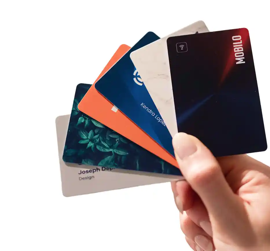
A business card is often the first physical item someone takes from a professional, and a portrait-style layout changes how people hold it, read it, and remember it. Vertical business card designs stand out in a stack of horizontal cards, making them a practical choice for anyone who wants their brand and contact details to leave a stronger impression.
A well-designed card works even harder when it connects to something digital. Mobilo's digital business card lets professionals share contact information instantly, track follow-ups, and update details without reprinting, pairing naturally with a vertical card to keep connections alive long after a meeting ends.
Summary
- Portrait orientation interrupts a deeply familiar pattern. Most professionals default to horizontal cards because that's what printers offer as a standard template, and that uniformity makes vertical cards visually distinct before a single word is read. The moment of mild surprise when someone receives a portrait-format card creates a brief window of attention, but design quality determines whether that attention converts into a lasting impression. According to UPrinting, 39% of people would choose not to do business with a company if its card looked cheap, which means the format raises expectations that execution either meets or fails to meet.
- Visual hierarchy drives recall more than any single design element. In a vertical layout, the eye naturally travels top to bottom, which gives designers a predictable reading path to engineer deliberately. Name, company, and contact details can be sequenced in a structured flow that guides attention rather than leaving the reader to hunt for information. Cards that skip this step often look visually balanced but convey nothing in a clear order, making them easy to forget even when the design itself is attractive.
- Whitespace is consistently underused in business card design, and the cost shows up in readability under real-world conditions. Most cards are glanced at in motion, during a handshake, or in a jacket pocket moments after a conversation ends. Research from Wave Connect found that business cards with a unique design or finish are 10 times more likely to be kept, and that distinctiveness almost always comes from restraint rather than adding more content. Filling every available inch of a card signals insecurity rather than thoroughness, while confident use of empty space makes key information easier to scan in under three seconds.
- The physical properties of a card communicate brand quality before any text is processed. Tactile finishes like soft-touch laminate, foil stamping, and debossing create sensory experiences that the brain encodes more durably than visual information alone. Rounded corners signal approachability, while sharp edges communicate formality and precision. These are not decorative choices. They are functional signals about the brand's personality, and choosing a finish that contradicts the brand's actual positioning sends a mixed message that readers notice even when they cannot articulate why something feels off.
- QR codes on business cards work well when the destination is optimized for the context. A code that links to a mobile-ready portfolio or contact page removes friction from the follow-up process entirely, turning a physical card exchange into an instant digital connection. The failure mode is common and avoidable: links to slow-loading PDFs, generic homepages, or broken pages undermine the advantage the format provides. The code is only as useful as what it points to, and that destination needs to be tested on an actual mobile device before cards go to print.
- Design consistency across a team's cards matters more than any individual card's visual quality. When each team member improvises their own version of a company card, typography, color, and layout decisions diverge in ways that undermine the brand's unified presence. Research from UPrinting shows that business cards with a unique design or finish are 10 times more likely to be kept, but that advantage disappears when no two cards from the same organization look like they belong together. Brand governance at the card level, with approved palettes, type standards, and layout guidelines applied consistently, is what separates teams that project a coherent identity from those that leave brand perception to chance.
- Mobilo's digital business card addresses this by connecting the physical card exchange directly to CRM workflows, so that contact information captured at events automatically flows into a pipeline rather than sitting in a drawer waiting for manual entry.
Why Vertical Business Card Designs Stand Out (When Done Right)
Most business cards follow the same horizontal format: name on the left, logo on the right. The layout has become invisible, so familiar that the brain processes and discards it before conscious attention registers. Horizontal orientation is the default, and defaults don't get remembered.

The difference gets someone to look once. Design determines whether they remember you after the conversation ends. Simply rotating a card 90 degrees produces a different-looking card that performs exactly like every other forgettable card. Orientation alone is not a strategy — it's a starting point that still demands intentional, memorable design to deliver results.
"The layout has become invisible — difference gets someone to look once, but design determines whether they remember you after the conversation ends."
💡 Tip: Don't mistake a vertical flip for a design upgrade. Rotating your card without rethinking the layout, hierarchy, and visual identity is a missed opportunity — not a differentiator.
- Standard Horizontal: Feels familiar and expected, but suffers from low memorability as it easily blends into a stack of other cards.
- Vertical (poor design): Attempts to be different, but wastes the novelty due to uninspired execution.
- Vertical (strong design): Creates an unexpected, striking first impression that uses "pattern interrupt" to ensure your card is remembered for its substance.
Vertical business cards interrupt that pattern. Portrait orientation is far less common, so the eye notices it before the brain categorizes it. That moment of mild surprise is a legitimate design advantage, but only if what follows is worth remembering. The orientation earns the glance; the design, hierarchy, and content earn the memory.
🎯 Key Point: Portrait orientation creates a pattern interrupt—a brief moment of surprise that buys extra attention. Use that window wisely.
⚠️ Warning: A vertical card with weak design wastes its one advantage. If the layout is cluttered, the typography is generic, or the hierarchy is unclear, the novelty disappears instantly, leaving you with a card that's awkward to hold.

Does rotating a card 90 degrees actually make it more effective?
Rotating a card 90 degrees does not automatically make it work better. A vertical card with poor visual hierarchy, cluttered contact information, and no clear focal point remains forgettable in a different orientation. According to the UPrinting Blog, 39% of people would choose not to do business with a company if their card looked cheap, meaning the format you choose sets expectations that your execution either meets or fails to deliver on.
The design principles that make a vertical card work are the same ones that make any card work: clear visual hierarchy, intentional whitespace, readable typography, and brand consistency. With a taller, narrower canvas, your eye naturally moves from top to bottom rather than left to right. This vertical flow can guide attention in a deliberate sequence, leading from your logo to your name to your contact details in a structured path—provided the layout is built with that flow in mind.
How does brand consistency affect whether a vertical card gets kept?
Most teams default to whatever template their printer offers. Teams that treat card design as part of their broader brand identity—with consistent typography, approved color palettes, and layout standards applied across every card—project a unified presence that individual freelancers cannot replicate. Research from UPrinting shows that business cards with a unique design or finish are 10 times more likely to be kept, meaning design decisions made at the brand governance level directly impact whether your team's cards survive past the first week of a prospect's inbox clear-out.
Standing out is the entry point, not the destination. The goal is to be remembered accurately: the right name, the right context, the right feeling about your brand. A vertical card designed with discipline earns that outcome. One designed purely for novelty loses its novelty the moment it gets thrown away.
Related Reading
- Business Card Ideas
- Matte Vs Uncoated Business Cards
- Types Of Business Cards
- Business Card Psychology
- What Should Be On A Business Card
- How to Make a Professional Business Card
- Rounded Corner Business Cards
- Minimalist Business Cards
- Business Card Paper Weight
- Business Card Colors
13 Vertical Business Card Design Ideas That Actually Work
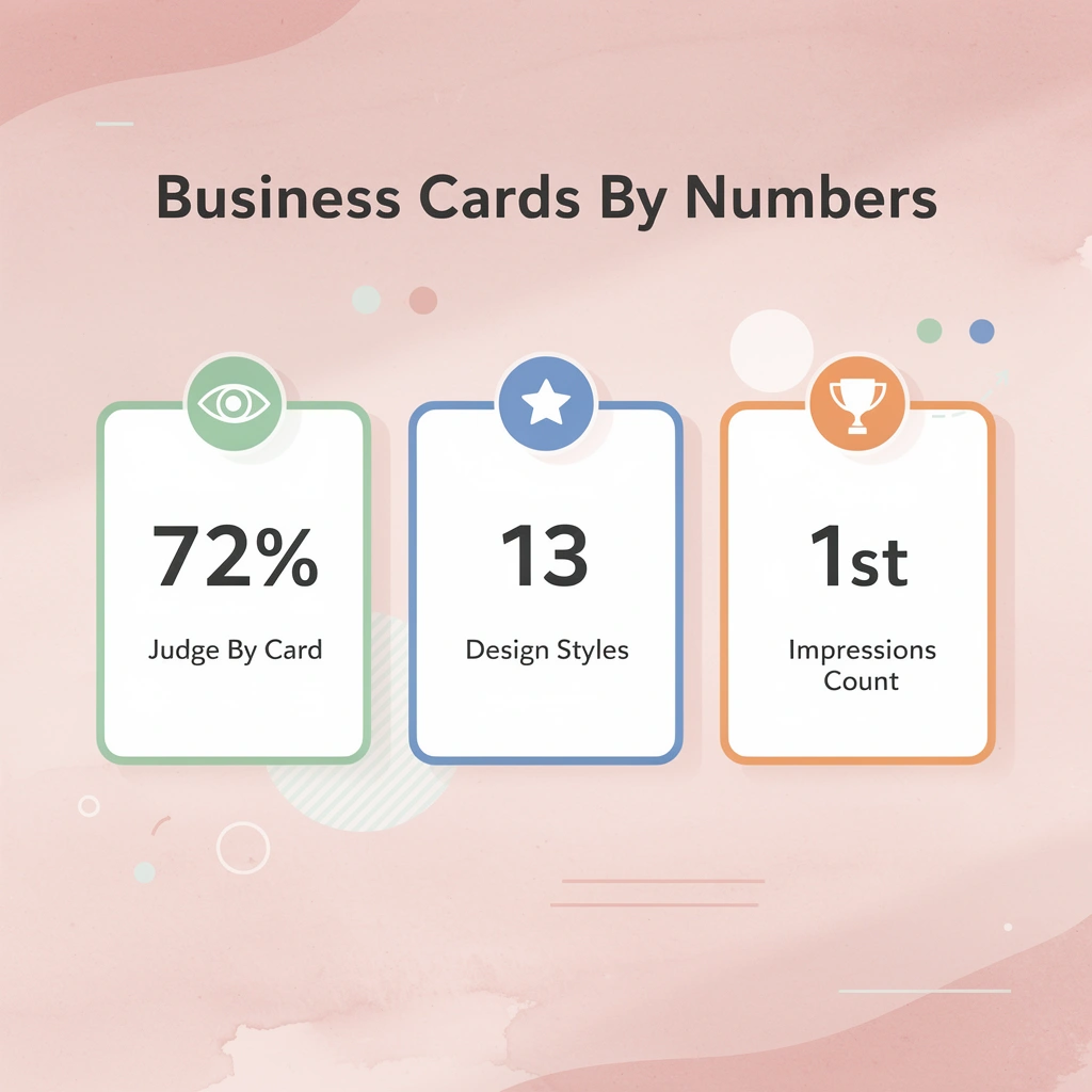
A business card that gets a second look comes from intentional choices, not luck. According to Wave Connect, 72% of people judge a company or person based on how their business card looks, meaning every design choice signals something about your standards before you've spoken.
"72% of people judge a company or person based on the quality of their business card design." — Wave Connect
🔑 Takeaway: That 72% figure means nearly 3 out of 4 people form opinions about your professionalism and credibility before you speak.
💡 Tip: Treat every design element—typography, finish, layout—as a deliberate signal of your brand standards, not an afterthought.
The thirteen styles below each have a reason they work, a type of reader they're made for, and a failure mode worth knowing before you decide.
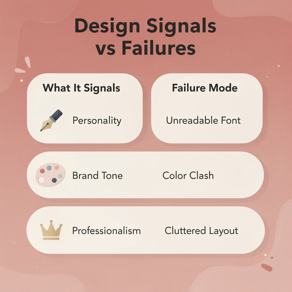
- Typography: Signals personality and tone; using hard-to-read fonts causes you to lose potential contacts instantly.
- Color Palette: Communicates brand identity; using too many colors creates visual noise that distracts from your information.
- Finish: Dictates perceived quality; choosing the wrong finish can undermine the professionalism of your entire brand.
- Layout Orientation: Reflects modernity and intent; misaligned content kills your first impression before the prospect even reads your name.
⚠️ Warning: Skipping the failure mode analysis for any style is exactly how well-intentioned cards end up in the trash — knowing what can go wrong is just as critical as knowing what works.
1. Minimalist Typography
Design
Clean sans-serif or serif fonts, ample whitespace, one or two type sizes, no decorative elements.
Best for
Consultants, lawyers, architects, financial advisors, and anyone whose credibility depends on precision and restraint.
Why does it work psychologically?
Large, confident typography creates a stronger visual anchor than cluttered layouts. Names printed in bold, well-spaced type are recalled faster after networking events because the brain doesn't have to work to find them. Minimalism signals confidence: a card that doesn't try too hard tells readers the person behind it doesn't need to.
What to avoid
Don't confuse minimalism with emptiness. A card without hierarchy, where name and phone number carry equal weight, loses the reader. Every minimalist card needs one dominant element to anchor focus.
2. Split-Color Layouts
Design
The card face divides horizontally or vertically into two distinct color blocks, with contact information in one zone and name or logo in the other.
Best for
Brands with strong color identity, real estate agents, marketing professionals, and sales teams where brand recall matters.
Why does it work psychologically?
Color contrast creates a natural reading boundary, guiding the eye from the dominant block to the secondary one in a predictable sequence. This lets you control the order in which information is absorbed. A vertical top-to-bottom split reinforces natural reading direction.
What to avoid
Colors that fight with each other instead of working together. If both halves appear equally important, your eye gets stuck. One block should be the dominant color, and the other should support it.
3. Full-Bleed Photography
Design
A high-resolution image covers the entire card face, with text overlaid using contrast-aware typography.
Best for
Photographers, real estate agents, hospitality professionals, and any brand where visual proof of work is the fastest argument.
Why does it work psychologically?
A full-bleed image bypasses abstraction. Instead of describing what you do, you show it. The card becomes a portfolio sample, much harder to discard than a name and phone number on white stock.
What to avoid
Low-resolution images or photos with busy midtones that render text unreadable. The image must serve the text, not compete with it.
4. Luxury Black Cards
Design
Matte or soft-touch black stock with white or gold typography, often paired with spot UV, foil, or debossing.
Best for
Premium service providers, wealth management firms, luxury real estate, executive coaches, and any brand where the physical object must communicate exclusivity before conversation begins.
Why does it work psychologically?
Black cards convey premium quality through tactile and visual cues before anyone reads a word. The weight of the stock, texture of the finish, and color restraint all signal the same message: this person doesn't cut corners. That perception transfers to the brand.
What to avoid
Overcrowding the layout. Luxury black cards with too many elements look desperate rather than exclusive. Power comes from what you leave out.
5. QR-Focused Layouts
Design
A large, well-positioned QR code serves as the visual center with minimal supporting text, linking to a digital profile, portfolio, or contact page.
Best for
Tech professionals, event marketers, recruiters, and teams managing high-volume networking that requires fast, easy information transfer.
Why does it work psychologically
A QR code transforms the card from a static object into a live gateway to information. It recognizes that the real value lies not in the card itself, but in what the card points to. For people comfortable scanning, it removes friction between meeting someone and saving their details.
Most teams print generic URLs or LinkedIn links on QR cards, losing tracking data and follow-up opportunities. Digital business cards like Mobilo connect physical card scans directly to CRM workflows, converting event conversations into pipeline entries without manual data entry.
What to avoid
QR codes that link to broken pages, generic homepages, or slow-loading PDFs. The code is only as good as its destination. If the destination isn't mobile-optimized, the design has failed.
6. Bold Logo-First Cards
Design
The brand logo occupies the main space on the card, typically the top half, with contact details positioned below in a smaller area.
Best for
Established brands with high logo recognition, franchise operators, and team members who represent a company rather than an individual personal brand.
Why does it work psychologically
A bold logo-first layout identifies the organization before the viewer reads a name. For teams deploying cards at scale, this structure enforces brand consistency by embedding hierarchy into the design itself.
What to avoid
Using a logo-first layout when the logo isn't strong enough to carry the weight. A small, complex, or unfamiliar logo at the top of a card wastes space that the name could occupy.
7. Modern Geometric Cards
Design
Angular shapes, triangles, hexagons, or intersecting lines are used as structural design elements in two or three colors.
Best for
Architecture firms, product designers, engineers, and tech brands where precision and structural thinking define the brand identity.
Why does it work psychologically?
Geometric patterns signal systematic thinking, precision, and intention. In vertical format, geometric elements guide the eye along the card's natural top-to-bottom axis without relying on typography alone.
What to avoid
Geometry for its own sake. Every line and angle should frame content, create contrast, or guide attention. If it does none of those things, remove it.
8. Creative Agency Layouts
Design
Unconventional grid structures, mixed-type weights, unexpected color combinations, or experimental use of negative space. The card functions as a creative brief.
Best for
Design studios, advertising agencies, brand consultancies, and creative professionals whose cards demonstrate their capabilities.
Why does it work psychologically?
For creative professionals, the card is the pitch. A normal layout signals normal thinking—the opposite of what a creative agency wants to show. An unexpected layout creates curiosity, the first step toward conversation.
What to avoid
Creativity that compromises readability. A card where the name or phone number is difficult to locate prioritizes the designer's vision over the recipient's needs. The best creative cards are surprising and immediately functional.
9. Premium Foil Designs
Design
Metallic foil stamping applied to key elements (typically the name, logo, or a decorative line) on dark or textured stock.
Best for
Event professionals, luxury brands, wedding planners, and anyone whose audience equates physical beauty with service quality.
Why does it work psychologically?
Foil catches light in ways printed ink cannot, creating a moment of physical delight when the card is handled. The brain stores sensory experiences more strongly than visual ones, making foil cards more memorable and more likely to be recalled when the recipient needs your services.
What to avoid
Using foil for less important information, like email addresses, diminishes its impact. Reserve foil for the most important element, usually the name or logo, and let everything else recede into the background.
10. Edgy Cards
Design
High contrast, dark themes, bold typography, raw textures, and deliberately provocative copy that leverages discomfort as a brand signal.
Best for
Tattoo artists, streetwear brands, musicians, nightlife professionals, and any brand whose audience rejects convention.
Why does it work psychologically?
Edgy design automatically filters the right people. A card that makes a corporate recruiter uncomfortable signals your culture to the right audience before conversation begins. The discomfort is intentional.
What to avoid
Using edgy design for brands that aren't edgy. A financial advisor with a skull motif creates confusion rather than boldness. Edgy cards work only when the brand matches the signal the card sends.
11. Bright and Colorful Cards
Design
Bright color palettes, bold color blocking, or gradient fills that make the card eye-catching.
Best for
Children's brands, wellness professionals, event planners, food and beverage businesses, and any brand where energy and approachability are core values.
Why does it work psychologically?
Color is processed before text, giving bright cards an advantage at the moment of exchange. Warm colors like orange and yellow create approachability and optimism, while bold blues and greens communicate energy and confidence. The color does emotional work that copy cannot.
What to avoid
Brightness without contrast. A yellow card with white text is invisible. Color choices must be tested against readability; a card that cannot be read will not be used.
12. Rounded Corner Cards
Design
Standard card dimensions with corners cut to a smooth radius, ranging from subtle to dramatically rounded.
Best for
Consumer brands, lifestyle professionals, wellness coaches, and any brand seeking an approachable rather than authoritative tone.
Why does it work psychologically?
Sharp corners signal formality and rigidity; rounded corners signal softness and approachability. Physical shape communicates brand personality before design is processed. In a stack of standard cards, rounded corners create a tactile distinction that makes the cards easier to locate by touch.
What to avoid
Rounded corners on brands that communicate precision or authority. A law firm with dramatically rounded corners sends a mixed signal. The corner radius should match the brand's emotional register, not contradict it.
13. Monochromatic Cards
Design
A single color used across the entire card in varying tones, tints, and shades, with typography differentiated by weight and size rather than color contrast.
Best for
Sophisticated personal brands, luxury service providers, and professionals who want to communicate depth and cohesion without relying on contrast.
Why does it work psychologically?
Monochromatic design demonstrates restraint and confidence. Sophistication emerges from tonal variation, where shadows, highlights, and midtones create dimension without introducing a second color. According to VistaPrint's Business Card Trends report, 39% of people would not do business with a company using cheap-looking cards, and monochromatic design, when executed well, conveys the opposite.
What to avoid
Insufficient contrast between text and background within the same color family. Cards using a single color require careful attention to ensure readability, as no contrasting color can rescue lost elements. Test every text element against its background before printing.
Related Reading
- Should I Put My Picture On My Business Card
- Photography Business Cards Examples
- Horizontal vs Vertical Business Cards
- Business Card Examples For Owners
- How To Put an Instagram Handle on a Business Card
- Esthetician Business Card Ideas
- Photography Business Cards Examples
- Back Of Business Card Ideas
- Business Card Details
- Business Card Requirements
- Business Card Dimensions
How to Design a Vertical Business Card People Actually Keep
How well something is done determines whether a card gets kept in a pocket or photographed, shared, and looked back at weeks later. Each design choice you make is critical — from typography and layout to color and finish — because every detail signals whether your card is worth holding onto.
"A business card is often the first physical impression of your brand — how it's designed determines whether it ends up in a drawer or a trash can." — Design Industry Insight
- Typography: Avoid clutter and hard-to-read fonts; use a clean, intentional hierarchy to guide the eye.
- Layout: Eliminate random placement; use a structured, scannable flow that highlights key information.
- Color: Steer clear of clashing palettes; use an on-brand, purposeful palette to reinforce your identity.
- Finish: Skip standard, flimsy paper; opt for textured or matte finishes to create a tactile, memorable experience.
💡 Tip: Every single element on your vertical business card should serve a clear purpose — if it doesn't add value, it's taking up prime real estate.
⚠️ Warning: Neglecting print quality or material choice is the most common mistake designers make — a stunning layout printed on cheap cardstock will still end up in the bin.
Start with hierarchy, not aesthetics
Before choosing color or font, decide what the reader should see first. In vertical layouts, the eye enters at the top, so your most important element—name, company mark, or defining phrase—should be placed there with clear visual weight. Everything else ranks below in order of importance, not preference. Skipping this step produces balanced-looking cards that communicate nothing.
Choose orientation with purpose, then commit
Once hierarchy is set, orientation locks in your spatial logic. A vertical card gives you a narrow column, limiting horizontal space and forcing every element to earn its place on the vertical axis. This constraint is useful: it eliminates noise and ensures that only elements that serve your established hierarchy belong on the card.
Why is whitespace doing more work than you think?
Whitespace reduces visual competition, making key information easier to scan in under three seconds. Most cards are glanced at in motion, during a handshake, at a crowded event booth, or in a jacket pocket moments after a conversation ends. Putting more content on a card doesn't demonstrate thoroughness; it signals a lack of confidence. The cards that capture attention are confident enough to leave room.
What happens when teams treat card space like a slide deck?
Most teams fill card space the way they approach slide decks, resulting in designs that feel complete but read as chaos under pressure. According to Wave Connect's Business Card Statistics, business cards with a unique design or finish are 10 times more likely to be kept—and uniqueness comes from restraint, not addition. For teams managing card design across multiple employees, digital business cards enforce whitespace and hierarchy standards at scale, ensuring that every team member's card reflects a consistent, disciplined visual identity.
Position the contact information where the hand holds the card
Contact details belong in the lower third of a vertical card, where your thumb naturally rests when holding it in portrait orientation. Keep your phone number, email, and digital touchpoint left-aligned or centered with sufficient margin to prevent text from disappearing into the border. According to VistaPrint's Business Card Trends 2026 report, 39% of people choose not to do business with a company if their card looks cheap—and nothing signals cheapness faster than contact information that's hard to find or read.
What should a CTA on a business card actually do?
A call to action on a business card is not a tagline. It's a specific, easy next step: a QR code that opens a portfolio, a URL that leads to a booking page, or a single verb that tells the reader what to do next. Place it between your contact block and the visual midpoint of the card, where the eye naturally pauses before moving to the bottom.
Why should you always test your card before you print?
Before printing, test every text element against its background in actual printed form, not on screen. Screens emit light; paper reflects it. What appears sharp at 100% zoom on a monitor can become gray mush on uncoated card stock.
What happens after someone picks up your card is where most professionals leave serious opportunity on the table.
Related Reading
- Plumbing Business Cards Examples
- HVAC Business Cards Examples
- Unique Business Card Ideas
- Artist Business Cards Examples
- Therapist Business Cards Examples
- How To Put Social Media On Business Card
- Best Real Estate Business Cards
Turn a Memorable Business Card Into More Qualified Leads
A well-designed vertical card earns its place in someone's pocket, but most professionals lose track after that. The contact sits in a drawer, follow-up never comes, and the opportunity expires before it ever has a chance.
"A business card without a follow-up system is just a piece of paper waiting to be forgotten." — Networking Industry Insight
💡 Tip: The value of a business card isn't the card itself: it's the system behind it that turns a handshake into a qualified lead.
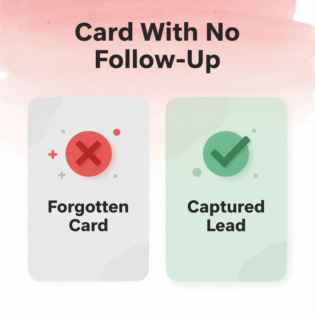
Most teams rely on manual contact entry after networking events, which delays leads, leaves them incomplete, or causes them to be forgotten before reaching a CRM. Our digital business card automatically captures contact information, enriches each lead, and syncs directly with your pipeline when shared. You'll receive your first 25 Mobilo digital business cards free (a $950 value).
- Data Capture: Paper cards demand manual entry; Mobilo captures contacts automatically and error-free.
- Lead Quality: Paper cards risk data loss; Mobilo ensures you get enriched, complete lead details every time.
- Workflow: Paper cards are disconnected; Mobilo syncs lead information directly into your active sales pipeline.
- Accuracy: Paper cards are static and quickly outdated; Mobilo keeps your profile live and always current.
- Longevity: Paper cards are easily forgotten; Mobilo keeps you connected to the lead long after the initial conversation.
⚠️ Warning: Every day you rely on manual entry after a networking event, you risk losing qualified leads to delays, errors, and missed follow-ups.
Create your first digital business card in about 5 minutes with a live profile and QR code that can be added to your design. Every card you hand out leads to an up-to-date contact page instead of static information that goes stale. With more than 59,000 companies already using Mobilo, you can replace paper cards with a networking tool that works long after the conversation ends.
🎯 Key Point: With 59,000+ companies already making the switch, Mobilo isn't just a better business card — it's the networking standard for teams serious about converting connections into pipeline.