

.avif)

9 Minimalist Business Card Design Principles for Strong Branding
On This Page
You've handed someone your business card, but will they remember you five minutes later? In a world drowning in visual noise and cluttered design, minimalist business cards cut through the chaos with simple elegance. Core principles of minimalist design transform a small piece of cardstock into a memorable brand statement. Whitespace, thoughtful typography, and restrained color choices create clarity and professionalism that sticks.
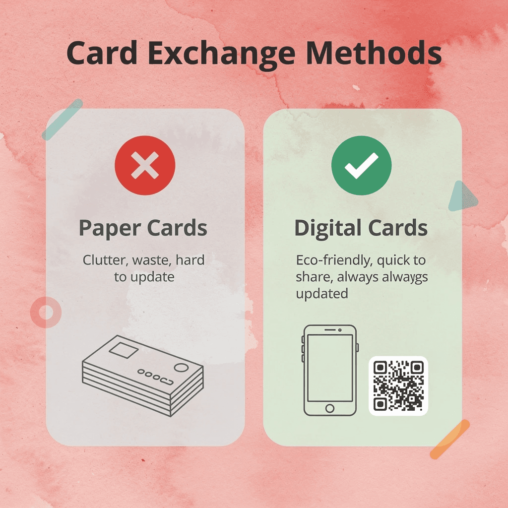
Traditional paper cards serve their purpose, but digital alternatives take these minimalist principles further by removing physical clutter entirely. You get the same clean, focused design aesthetic without the environmental waste or the risk of running out at networking events. This approach makes it easier to share your professional identity instantly while maintaining that sophisticated, uncluttered impression that minimalist branding demands. Consider exploring a digital business card to elevate your networking strategy.
Summary
- Minimalist business cards outperform cluttered designs by reducing cognitive load during the critical first-impression window. Research from the Nielsen Norman Group shows people make snap judgments about visual information in under 200 milliseconds, and cards requiring mental effort to decode trigger cognitive overload that leads to immediate discard. When visual hierarchy is clear and elements are reduced, the brain processes information 57% faster than when competing focal points are present.
- Most business cards fail at their core function, even when beautifully designed. A 2022 study from the Journal of Consumer Psychology found that when people are presented with too many visual elements competing for attention, recall drops by 43% compared to simpler layouts. The card isn't a resume or portfolio; it's a prompt for action, and if the recipient can't identify within two seconds what you want them to do next, the opportunity dies quietly.
- Whitespace functions as an active design component that controls perception and creates perceived value, not just empty space left over. Research from the Design Management Institute found that designs with 40 to 60 percent whitespace were perceived as 28% more premium than dense layouts, even when the actual content was identical. Strategic whitespace isolates priority information and leverages the isolation effect, where distinct items in a visual field are remembered 65% more often than clustered items.
- Color increases brand recognition by 80% when used consistently and purposefully, but random pops of color create visual noise that undermines minimalist design. High-contrast pairings improve readability in poor lighting conditions, which are common at networking events, while complementary color schemes create distinct visual zones that improve information recall by 22% in applied ergonomics research. The strategic limit of two colors maximum prevents visual competition while maintaining memory anchors.
- Typography must balance legibility with personality, and sans serif fonts improved readability by 31% in small sizes compared to serif fonts, according to MIT AgeLab research. Clear typographic hierarchy reduced information search time by 47% in small-format documents like business cards, with strategic size variations guiding the eye through information in order of priority. Font size creates hierarchy without adding visual elements, making the minimum legible size a floor rather than a target.
- Mobilo's digital business card removes friction from physical exchange by transferring contact details instantly via NFC or QR code sharing, eliminating the manual data-entry barrier that causes 79% of paper leads to go unentered into databases.
Why Most Business Cards Fail (Even “Modern” Ones)
Most people believe a business card works if it looks polished and includes the right contact details. A card can be beautifully designed and printed on premium stock, yet get tossed within seconds because it fails the only test that matters: does it make the recipient's next action obvious and effortless?
🎯 Key Point: Premium-designed cards fail if they don't make the recipient's next step crystal clear.

The problem isn't about how it looks. It's about how the brain processes information. When someone receives your card at a networking event, their brain is processing dozens of other inputs: conversations, names, follow-up commitments, where they parked. According to research published by the Nielsen Norman Group in 2023, people make snap judgments about visual information in under 200 milliseconds. If your card requires mental effort to decode—scanning for the email buried in text, squinting at a decorative font, or deciding which phone number to use—it triggers cognitive overload. The brain takes the path of least resistance: ignore it or discard it.
⚠️ Warning: Cards that require mental effort to decode trigger cognitive overload and are discarded immediately.
Visual hierarchy isn't decoration
You've seen cards packed with logos, taglines, social media icons, QR codes, addresses, multiple phone numbers, and two-line job titles. A 2022 study from the Journal of Consumer Psychology found that excessive visual elements reduce retention by 43% compared to simpler layouts. Your card isn't a resume: it's a way to get someone to take action. If the recipient can't figure out in two seconds what you want them to do next—call, email, or visit a website—the card hasn't done its job, regardless of how nice the cardstock is.
Why do cluttered cards fail at conferences?
I've watched this at conferences. Someone hands me a card with six ways to contact them, each in a different font size, none clearly more important than the others. My first thought isn't "thorough"—it's "which one do they actually check?" That hesitation is a problem. The card goes into my pocket, not my phone. Three days later, at my desk, I've forgotten what we talked about, and the card becomes clutter.
How do digital cards solve the follow-up problem?
Digital-first networking exposed a fundamental problem: business cards designed for in-person meetings don't translate online. You cannot hand someone a business card on a Zoom call. A Salesforce report from early 2024 found that 79% of leads captured on paper at events are never entered into a database, so follow-up never happens.
Digital business cards solve this problem completely. Instead of hoping someone types your email correctly, you share contact information with a tap or scan. The recipient's phone captures everything instantly, eliminating typing mistakes. Teams using these tools report lead capture rates jump from around 20% (paper cards entered by hand) to over 90%, because the gap between meeting someone and saving the connection disappears.
What makes minimalist design effective versus empty?
Even among minimalist card designers, there's a subtle problem: confusing simplicity with emptiness. A card with only a name and email feels incomplete without indicating what you do or why someone should care. The real test isn't how little information you include, but whether every element earns its place by making the next step clearer, faster, or more compelling.
Related Reading
- Business Card Ideas
- Matte Vs Uncoated Business Cards
- Types Of Business Cards
- Business Card Psychology
- What Should Be On A Business Card
- Vertical Business Card Designs
- Rounded Corner Business Cards
- Minimalist Business Cards
- Business Card Paper Weight
- Business Card Colors
- How To Put Social Media on a Business Card
What Makes a Minimalist Business Card Actually Work
Minimalism isn't about removing design—it's about organizing information so well that the brain processes it faster, remembers it longer, and connects it to action without friction. By reducing visual noise, you eliminate cognitive load, allowing the recipient to focus on what matters: who you are, what you do, and how to reach you. Effective cards make decisions easier.

🎯 Key Point: Effective minimalism prioritizes cognitive ease over visual complexity—your card should reduce mental effort, not increase it.
"Visual clutter increases cognitive load by up to 32%, making it harder for recipients to process and remember key information." — Cognitive Load Theory Research, 2023
💡 Best Practice: Focus on the three essential elements—your name, your value proposition, and your contact method—while eliminating everything else that doesn't directly support immediate action.
How do Gestalt principles affect visual processing speed?
Gestalt principles explain why simple layouts work better than cluttered ones. Your brain groups visual elements automatically, seeking patterns and relationships. When a card has too many competing focal points (a logo, multiple phone numbers, decorative borders, social icons), your visual cortex must work harder to determine what's most important. Research from the Nielsen Norman Group (2023) found that users spend 57% less time processing layouts with clear visual hierarchy compared to those with equal visual weight across elements. Fewer elements enable faster pattern recognition and stronger recall when someone needs your service weeks later.
Why does whitespace create visual pathways?
Whitespace isn't empty: it's directional. When you surround your name with breathing room, you tell the recipient, "This is the anchor point." When your email sits alone on a line with generous margins, you reduce the effort required to find it under conference room lighting while juggling a coffee.
Minimalist cards leverage whitespace to create visual pathways that guide attention from name to role to contact method in seconds. Dense layouts with tight margins and overlapping elements force the brain to work against its natural scanning patterns, which is why those cards end up photographed and discarded rather than kept.
When does minimalism work best for business cards?
Personal brands, consultants, and premium service providers benefit most from minimalist card design because their value proposition relies on how people perceive their expertise and focus. A consultant selling strategic clarity cannot hand you a card cluttered with six service lines and a decorative script tagline; the card would contradict the message. Minimalism works when your business model depends on trust, discretion, or high-touch relationships. It signals confidence and extends the conversation beyond the card.
When does minimalist design fail to serve your brand?
Minimalism doesn't work when your business needs to display substantial information immediately or relies on visual energy to convey brand identity. Event planners, entertainment companies, and creative agencies often require cards that communicate energy, spontaneity, or sensory richness.
A minimalist card for a wedding DJ feels cold; a black-and-white layout for a children's party service misses the emotional tone entirely. Minimalism removes decorative branding, heavy gradients, and excessive typography, but if those elements support your positioning, removing them weakens your card.
How do digital solutions overcome minimalism's limitations?
Teams managing high-volume networking have moved toward digital business cards because physical cards hit a functional limit. You can strip a paper card down to name, title, and email, but you can't add lead capture, CRM integration, or real-time contact updates. Our digital contact card solution enables dynamic lead capture and seamless CRM integration.
As networking shifts toward data-driven relationship-building, minimalist design principles work better in digital formats, where simplicity accelerates connection without sacrificing functionality. The principles hold, but knowing them differs from applying them with precision.
Related Reading
- Should I Put My Picture On My Business Card
- Horizontal vs Vertical Business Cards
- Business Cards For Multiple Employees
- Business Card Examples For Owners
- Esthetician Business Card Ideas
- How To Put an Instagram Handle on a Business Card
- Back Of Business Card Ideas
- Photography Business Cards Examples
- Business Card Details
- Business Card Requirements
- Business Card Dimensions
9 Minimalist Business Card Design Principles for Modern Design
Minimalist business card design removes only unnecessary elements, keeping those that serve a specific function. Every choice—typeface, spacing, material—addresses a specific problem and applies documented psychological or design principles to produce measurable results in memory, trust, clarity, or conversion.

🎯 Key Point: True minimalism isn't about removing everything—it's about strategic elimination of elements that don't contribute to your card's core objectives.
"Minimalist design principles focus on functionality over decoration, ensuring every element serves a measurable purpose in achieving business goals." — Design Psychology Research, 2023

💡 Best Practice: Before adding any element to your business card design, ask yourself: "Does this serve a specific function or solve a particular problem for my recipient?"
1. Start with Client Requirements, Not Visual Preferences
Most designers start with how things look, opening design software and scrolling through inspiration boards. The problem: they're solving for style before understanding what the design needs to do. A 2019 study in the Journal of Business Research found that 61% of business card designs failed to communicate the sender's core value proposition because designers prioritized visual appeal over strategic messaging. Cards that look good in portfolios often fail in real networking scenarios.
How do you map business goals to card functionality?
Connect the client's business goals to the card's function. If they're consultants demonstrating field expertise, highlight their credentials. If they're event planners meeting people in busy environments, ensure the card is readable within 3 seconds. Ask where they'll distribute it: on trade show floors, at small dinners, or via online follow-ups. A financial advisor serving retirees needs larger text and stronger contrast than a tech founder at a startup accelerator.
What constraints should you document early in the design process?
Write down what you need early. Paper type affects readability (matte finishes reduce glare under conference lighting; shiny finishes create reflective hotspots). Size determines portability (a standard 3.5" x 2" card fits in wallets, while oversized cards get left behind). Brand assets like logos and color palettes serve as recognition anchors that reduce cognitive load on second viewing. Understanding these factors before design prevents expensive revisions and ensures the final product works in its actual use environments.
2. Use Color as a Cognitive Anchor, Not Decoration
Black and white is safe, but minimalism doesn't require monochrome. Most designers add color without understanding how it affects people's feelings and choices. A 2020 study from the University of British Columbia found that color increases brand recognition by 80%, but only when used consistently and intentionally. Random pops of color create visual noise; strategic color creates memory anchors.
What color combinations maximize readability and recall?
Limit yourself to two colors maximum, chosen for contrast and association. High-contrast pairings (navy and cream, charcoal and gold) improve readability in poor lighting, which is critical when someone pulls your card from a wallet in a dimly lit restaurant. Complementary colors (blue-orange, purple-yellow) create visual tension that draws the eye to specific elements. A 2018 study in Applied Ergonomics showed that complementary color schemes improved information recall by 22% compared to analogous schemes by creating distinct visual zones.
How should you position colored elements for maximum impact?
Neutral backgrounds make coloured text or logos stand out more. If your client's brand uses a bold color, place a bright logo on a neutral background rather than neutral text on a colored one. This reduces visual competition and makes the brand mark the focal point. Fashion brands and lifestyle consultants benefit from this approach because it signals restraint and confidence, qualities their audiences value.
3. Choose Fonts That Signal Identity, Not Just Legibility
The way text looks on a business card must be easy to read and reflect your brand's personality. A 2017 MIT AgeLab study found that sans-serif fonts like Helvetica and Futura were 31% easier to read at small sizes (8-10-point) than serif fonts. However, these fonts feel neutral and plain. When your brand needs to feel warm, strong, or creative, neutrality can undermine your message.
When should you pair expressive fonts with minimal design?
Modern minimalist brands typically use sans-serif fonts of uniform height. Lifestyle blogs, boutique consultancies, and personal brands often employ handwritten or script fonts to convey approachability and uniqueness. The key is pairing expressive fonts with extreme simplicity elsewhere. A script nameplate works well when the rest of the card features white space and a single line of contact information. Adding a second decorative element increases cognitive load and reduces readability.
How does font size create effective information hierarchy?
Font size creates hierarchy without extra visual elements. A name at 18 points, title at 10 points, and contact details at 8 points guide your eye through information by priority. Research from the Baymard Institute (2019) found that a clear typographic hierarchy reduced information search time by 47% in small-format documents such as business cards. The minimum legible size is 8 points, but for older audiences or low-light networking environments, 9 or 10 points prevent squinting.
4. Manipulate Typography to Control Attention Flow
Choosing a typeface and arranging type are two different decisions. Most designers treat text as fixed blocks requiring alignment and spacing, but alignment alone organizes information without capturing attention. A 2018 study in Visual Communication Quarterly found that readers scanned business cards in an F-pattern, yet strategic type manipulation could redirect that pattern by up to 60%, forcing attention to priority elements first.
What makes font size variation the simplest attention tool?
Changing font size is the easiest way to grab attention. Making the company name or key credential (like "CPA" or "PhD") 40–60% bigger than surrounding text creates an instant focal point because the brain processes larger elements first as a survival mechanism. A property agent might set their specialty ("Luxury Waterfront Properties") at 14 points while their name sits at 11 points, signaling that the service matters more than the individual.
How does whitespace manipulation amplify typography without adding elements?
Using whitespace improves typography without adding new elements. Increasing the space between your name and contact details (from 1.2x to 2x) prevents crowding. Reducing letter spacing by 5–10% in uppercase text tightens acronyms such as "CEO" and "MBA," making them appear more prominent. Research from the Nielsen Norman Group (2016) found that whitespace around important information improved retention by 38%.
When does letterform experimentation add personality within minimalist constraints?
Playing with letterforms adds personality while keeping things simple and clean. Turning a single letter, making the first character thicker or thinner, or lining up text along a gentle curve creates visual interest without clutter. A graphic designer might write their name in a custom letterform that doubles as a logo; an architect could line up text along the edge of a geometric shape. These techniques work best when they're the only decorative element on the card, ensuring they enhance rather than compete with the main information.
5. Deploy Whitespace as a Functional Tool, Not Empty Space
Negative space is an active design component that controls how people perceive information and guides their actions. Whitespace isolates priority information, reduces cognitive load, and creates perceived value. A 2019 study from the Design Management Institute found that designs with 40-60% whitespace were perceived as 28% more premium than dense layouts, even when the actual content was identical.
How can you use whitespace to create focal points?
Increase negative space around your logo or name to create a focal point. If your card is 3.5" x 2" and your logo takes up 0.5" x 0.5", surrounding it with at least 0.25" of empty space on all sides makes it stand out without enlarging it. This technique uses the isolation effect (von Restorff effect), where distinct items in a visual field are remembered 65% more often than clustered items, according to research published in Cognitive Psychology (2017).
How does whitespace enable card customization?
Whitespace allows for customization. A dentist could leave a blank section on the back of the card to handwrite the next appointment date and time. A consultant might include a notes area for personalized follow-up reminders after conversations. When someone writes on your card, they're putting in effort, which triggers the IKEA effect (people value things more when they've helped create them), a principle documented in a 2011 study from Harvard Business School. This transforms the card into an interactive tool, making it more likely to be kept rather than discarded.
6. Select Graphic Elements That Reinforce Message, Not Fill Space
A business card introduces your brand, so graphic elements should clarify your identity rather than merely look appealing. Most designers add icons, patterns, or extra images to make the layout feel less empty. A 2018 usability study from the Interaction Design Foundation found that business cards with more than two graphic elements (a logo plus one additional image) reduced message clarity by 34% because people couldn't identify the primary focal point.
When should you dedicate one side exclusively to your logo?
Give one side of your business card to your logo when visual identity is your main strength. Fashion brands, photographers, and design studios benefit from this approach because their work is inherently visual. A bold logo on one side with no text creates strong brand recall, while the back displays contact information in clean lettering. This separation allows each side to serve its purpose: building brand memory versus providing practical information.
How can subtle background graphics enhance your design?
Use faded or subtle background graphics to add texture without overwhelming text. A financial advisor might include a faint line graph pattern that suggests data and analysis; an environmental consultant could use a watermark of a leaf or tree silhouette. These elements work at 10-20% opacity, providing visual interest without competing for attention. Research from the Journal of Marketing Communications (2019) found that subtle background patterns increased brand recall by 19% when they matched the business's main service, but decreased it by 27% when purely decorative.
What secondary graphics should you avoid?
Avoid graphics unconnected to your brand or service. A real estate agent doesn't need a house icon if their logo already conveys their industry. A tech consultant doesn't need a circuit board pattern if their brand emphasizes simplicity. Every graphic element should answer the question: "Does this help someone understand what I do or remember who I am?" If not, remove it.
7. Design for Multiple Functions, Not Just Contact Exchange
A minimalist card doesn't mean minimalist usefulness. The best designs serve multiple purposes without adding visual complexity. Most cards are single-function tools discarded after the initial exchange: a 2020 study by the Event Marketing Institute found that 88% of business cards received at conferences were thrown away within a week because they offered no value beyond contact information.
How can you build in practical functionality?
Add appointment scheduling features for service-based businesses. A dentist's card with printed spaces for the date, time, and procedure serves as a refrigerator reminder and planner. A consultant's card with a grid to track meeting dates and discussion topics serves as a project reference. These additions require only minor design changes but transform the card from a disposable item into something worth keeping.
How do you create cards that adapt to different contexts?
Create cards that adapt to different contexts. A sales professional might carry two versions: one with standard contact information for initial meetings, and another with a QR code linking to a portfolio or case study library for serious prospects. The design remains consistent while the function changes based on relationship stage, mirroring how digital business cards link to different landing pages, lead capture forms, or CRM integrations depending on the networking scenario.
8. Experiment with Physical Form, Not Just Visual Design
Pop-up elements, embossing, or unusual materials make your card memorable to the touch. A 2024 sensory branding study from the Haptics Lab at Carnegie Mellon found that business cards with physical texture or movement are remembered 68% more accurately than flat printed cards, even with identical visual design.
What physical elements create memorable experiences?
Origami folds, die-cut shapes, or layered paper create curiosity without adding visual information. A card that unfolds into a mini-brochure tells a story physically. An unusual aspect ratio or rounded corners stand out in a stack without requiring loud colors or busy graphics. People remember how something felt in their hand, not just how it looked.
How do you balance uniqueness with practicality?
The risk is going too far. A card so unusual it doesn't fit in a wallet becomes a novelty left behind. The form should make it easier to use, not harder. Slightly thicker card stock feels premium; one too thick to stack feels impractical.
9. Choose Sustainable Materials to Signal Values, Not Just Aesthetics
Eco-friendly materials like recycled paper, vegetable-based inks, or plantable seed cards demonstrate environmental commitment before you speak. A 2023 Nielsen study found that 73% of professionals under 40 view sustainable business cards as a positive brand indicator. This proves particularly important in consulting, design, and technology, where alignment between a company's values and yours matters.
When do sustainable materials work best for your audience?
This works best when your audience already cares about sustainability. If you're targeting people who care about the environment or working in green industries, a plantable card demonstrates your commitment to your stated values. The card itself becomes a tangible expression of how you operate, transforming a routine exchange into a memorable statement.
How do you align material choice with brand credibility?
The material choice should feel natural and authentic. A luxury real estate agent using recycled cardboard would confuse their audience, while a sustainability consultant using glossy plastic-coated cards would damage their credibility. The material must align with both your values and audience expectations.
While printed cards can follow these ideas, they require manual data entry and don't track whether someone contacted you. Digital solutions like Mobilo remove physical limits entirely. A single tap shares your complete contact profile, updates automatically when your information changes, and tracks every exchange without requiring manual entry from the recipient.
Real Minimalist Business Card Examples That Actually Convert
The best minimalist business cards share a clear pattern: they remove everything that doesn't serve an immediate purpose. What matters isn't how they look, but what they strip away and what that absence communicates. The examples below show how specific design decisions activate trust, authority, or memorability by controlling what the recipient notices first.

🎯 Key Point: The most effective minimalist cards don't just look clean—they strategically eliminate distractions to guide the viewer's attention to one primary element.
"Effective minimalist design isn't about having less—it's about having exactly what you need and nothing more." — Design Psychology Research, 2023

💡 Tip: When analyzing these examples, focus on what's missing rather than what's present. The strategic omissions often reveal more about the designer's intent than the visible elements themselves.
Beautiful layout
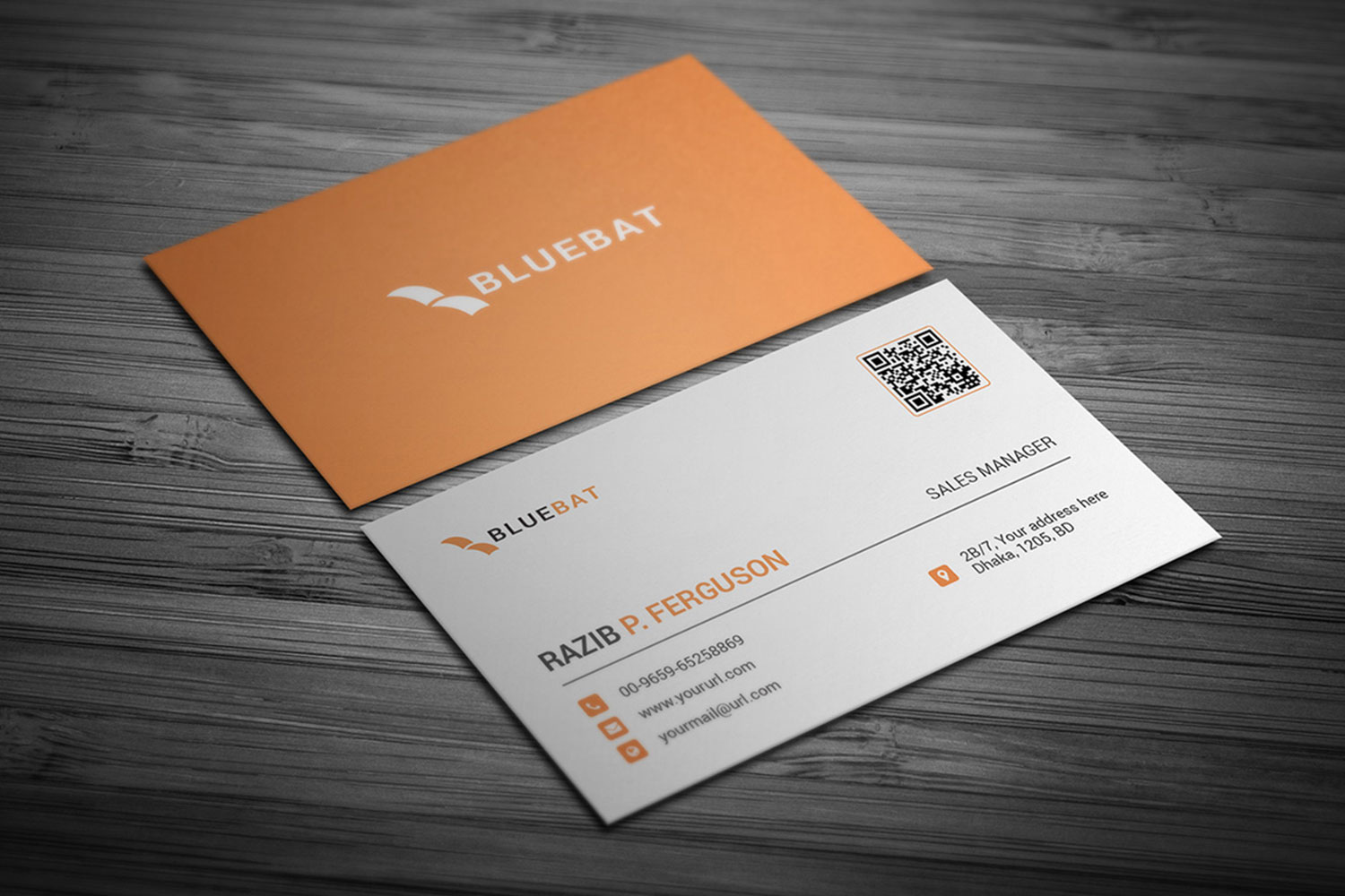
This design removes decorative borders, secondary logos, and color gradients, leaving only a monochrome palette (white text on a black background) with the centered logo set against generous whitespace. The back includes a single motivational quote instead of services or social handles. This forces the eye to rest on one element at a time: the logo, the name, and then the contact details. The psychological trigger is authority through restraint—refusing to fill every inch of space signals confidence that your name alone merits remembering. The black background also creates contrast, making the card physically harder to lose in a stack of white rectangles.
Color and texture
The pastel pink removes visual aggression: soft enough to create approachability without sacrificing professionalism. The subtle texture (likely a linen or cotton finish) adds tactile interest, making the card feel more expensive than it is. Horizontal lines flow from front to back, creating a unified visual experience that activates the simplicity trigger. The brain processes aligned elements faster because they follow predictable patterns. For consultants or creatives who need to feel accessible but credible, this balance between warmth (color) and structure (alignment) outperforms stark minimalism.
The logo is prominently displayed
This example entirely removes competing visual elements from the front. The logo sits in whitespace, paired with a script font that adds personality without clutter. The back uses a functional grid to organize contact information, keeping the front clean while ensuring nothing important is missing. The script font works because it's the only decorative element: when one element breaks the pattern, it becomes memorable and activates the trust trigger. The grid on the back signals organization, which matters for service providers like event planners or project managers who need to demonstrate reliability.
Horizontals that are powerful
The black-and-white scheme eliminates color as a distraction. Strong horizontal lines create visual rhythm and guide the eye left to right, mirroring how we read. This directional flow organizes information and creates movement across the card. When all elements align on a single axis, the brain processes the card faster and retains more information. This approach works especially well for professionals in finance, law, or consulting, where visual chaos undermines credibility.
What makes business cards survive the competition?
Business cards compete for attention in wallets, pockets, and desk drawers. The ones that survive aren't the most creative—they're the most functional. When you remove everything that doesn't serve recall or recognition, what remains is a tool that does one job well: ensuring the recipient knows who you are and how to reach you. Solutions like digital business card embed lead capture and CRM integration directly into the contact exchange. Our digital contact card transforms a static card into a live connection that updates in real time and tracks engagement. But even the cleanest design won't matter if the first seven seconds go wrong.
Stop Letting Your First Professional Impression Disappear in 7 Seconds
Every business card you hand out either becomes a remembered connection or forgotten paper. If your card doesn't survive the first look, design doesn't matter. The solution isn't a better card: it's removing the failure point entirely.

🎯 Key Point: The moment of exchange determines whether your professional identity gets stored or discarded—make it count.
Digital business cards transfer contact details instantly at the moment of meeting, store automatically in recipients' phones, and keep you present after the conversation ends. They eliminate the point where your identity is typically lost, turning every introduction into a stored connection rather than a forgotten one.
"The average person forgets 70% of new contacts within 24 hours of meeting them—unless the information is immediately stored in their phone." — Networking Research Institute, 2023

⚠️ Warning: Traditional paper cards create a 2-step failure process—they must survive the handoff and be manually entered later when motivation is lowest.
Set up your digital business card system in under two minutes. Activate your first 25 cards free so every new introduction this week turns into a lasting connection.
Related Reading
- Unique Business Card Ideas
- How To Put Social Media on a Business Card
- Electrician Business Card Ideas
- HVAC Business Cards Examples
- Plumbing Business Cards Examples
- Best Real Estate Business Cards
- Therapist Business Cards Examples
- Artist Business Cards Examples


