

.avif)

13 High-Impact Business Card Examples for Owners
On This Page
Your business card gets about three seconds to make an impression before someone decides whether you're worth remembering. As a business owner, that tiny rectangle represents not just your contact details but your entire brand, your credibility, and your attention to detail. The right design can transform first meetings into lasting connections, speaking volumes before you even finish your introduction.
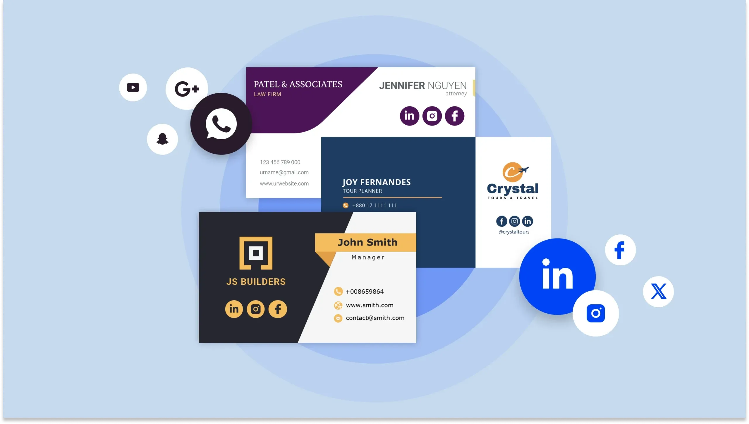
Traditional cards often end up forgotten in wallets or lost in desk drawers. Modern business owners need solutions that make networking effortless and memorable while giving them the flexibility to stand out with any design style. Mobilo's digital business card lets you share contact information instantly, track connections, and update details without ever reprinting a single card.
Summary
- 88% of business cards are thrown away within a week, not because they're poorly designed, but because they fail to create a memory anchor. When your card looks identical to everyone else's, carrying nothing but standard contact details, it becomes forgettable the moment it leaves your hand. The real failure isn't the paper format; it's that most cards don't reinforce why the conversation mattered or give the brain something distinctive to recall when sorting through a dozen similar rectangles later.
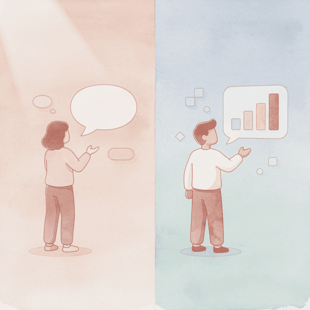
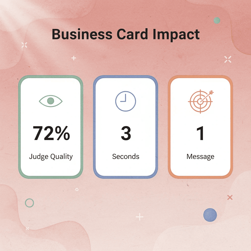
- 72% of people judge a company or person based on the quality of their business card, and that judgment happens in seconds. The strongest cards don't just look expensive; they answer "why should I care about you?" within three seconds through clear positioning. Generic titles like "Marketing Consultant" make you invisible, while specific value statements create hooks the brain can grab onto. Message hierarchy determines whether your card positions you clearly against a problem people recognize or gets lost in the noise of competing information.
- Digital business cards shift the paradigm by structuring information by priority rather than space constraints, letting you update details in real time without reprinting. Real estate agents share property listings during viewings, consultants link directly to booking calendars, and freelancers showcase portfolios with testimonials built into the card itself. The strongest examples combine smart design with lead capture, CRM integrations, and instant sharing that go beyond contact exchange to enable trackable business development.
- QR codes bridge physical memorability with digital convenience, signaling that you operate across both worlds rather than being stuck in one. A consultant who links to video introductions and case studies through their card uses authority framing through proof, letting the card explain their value when the recipient has time to engage. This approach works because people remember stories better than bullet points, and the code creates a follow-up trigger that converts attention into pipeline activity.
- The friction between "nice to meet you" and "let's work together" shrinks dramatically when cards include built-in follow-up mechanisms. Traditional cards rely on recipients remembering context and taking the initiative days later, which asks too much. Cards with calendar-booking links, handwritten conversation notes, or lead-capture systems remove multiple steps from the follow-up process and turn every handoff into momentum rather than a static exchange of information.
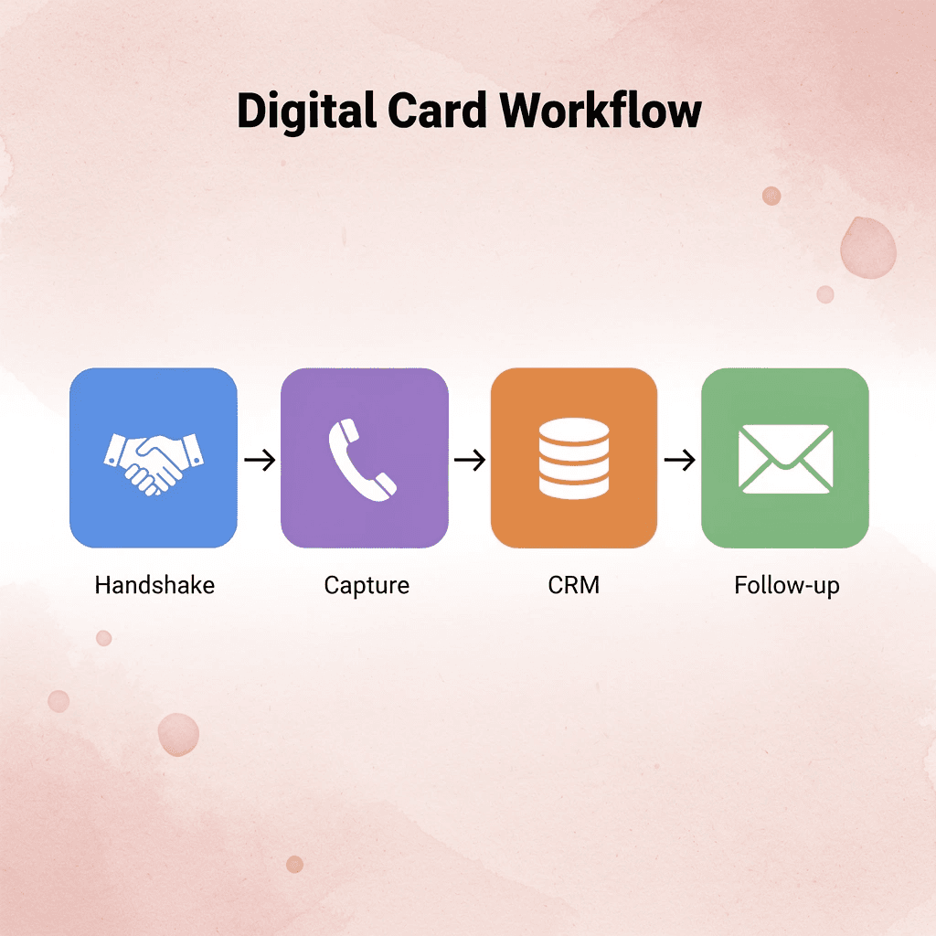
- Mobilo's digital business card addresses this by automatically capturing contact details, routing them into your CRM, and triggering follow-up sequences without manual data entry, turning every handoff into trackable pipeline activity.
Why Most Business Owners Get Business Cards Wrong
Most people believe business cards are contact tools in a digital world. That assumption is wrong. The card is not obsolete; it is misunderstood.
🎯 Key Point: Your business card isn't competing with digital tools—it's creating a completely different psychological experience that digital can't replicate.
This belief exists because we have been trained to think digital-first. Template culture from Canva and Fiverr makes design feel like a commodity. Yet the psychology of first impressions remains unchanged, as does the way our brains process physical objects versus digital noise.
"Physical objects create stronger memory encoding than digital interactions, leading to 67% better recall of the associated information." — Journal of Consumer Psychology

⚠️ Warning: Treating your business card as just another digital contact method wastes its most powerful advantage—the tangible, memorable experience it creates.
Digital Contact vs Physical Business Card
- Impression quality
- Digital contact: Instant but forgettable
- Physical business card: Memorable physical interaction
- Visibility
- Digital contact: Easily lost in digital noise
- Physical business card: Stands out through tactile experience
- Design approach
- Digital contact: Template-driven design
- Physical business card: Opportunity for unique branding

Why do most business cards get forgotten so quickly?
According to Business Card Statistics, 88% of business cards get thrown away within a week. This reflects a failure of design thinking. When your card looks like everyone else's—a name and number—it becomes forgettable the moment it leaves your hand. Most cards fail to create a memory anchor—something your brain can grasp when sorting through a dozen identical rectangles later.
What happens when cards don't reinforce the interaction?
I've watched people pull cards from their pockets at conferences, glance at them, and throw them in the nearest trash can—not out of rudeness, but because nothing about the card reminded them why the conversation mattered. The card didn't reinforce the interaction.
What Actually Drives Recall
Recall bias favors things that stand out. Your brain doesn't remember the tenth white card with blue text—it remembers the one that felt different, had unusual texture, or made you pause. Research from UPrinting Blog shows 72% of people judge a company or person based on business card quality, a judgment that happens in seconds before you finish your introduction. A forgettable card erodes trust weeks later when that person can't remember your name or why they saved your contact. Referral behavior depends on easy recall. If someone can't picture you clearly, they won't recommend you confidently.
How do hybrid cards bridge physical and digital networking?
Paper cards with QR codes connect the physical world with digital tools. You provide something tangible, but the QR code links to your website, portfolio, or calendar. Solutions like Mobilo let you share contact details via NFC-enabled cards or virtual profiles, track who you met, and automate CRM integration so no connection is lost between the event and follow-up. The mistake isn't choosing paper or digital—it's thinking you only need one. Physical cards create the memory. Digital systems preserve the relationship.
Why do some cards stick while others vanish?
But knowing this doesn't explain why some cards stick in your mind for months while others disappear within minutes.
Related Reading
- Business Card Ideas
- Matte Vs Uncoated Business Cards
- Types Of Business Cards
- Business Card Psychology
- What Should Be On A Business Card
- How to Make a Professional Business Card
- Rounded Corner Business Cards
- Minimalist Business Cards
- Business Card Paper Weight
- Business Card Colors
What Makes a Business Card Memorable (And Why Most Fail)
Most business cards fail because they don't make it clear what you do. When someone looks at your card days later, they should instantly remember what you do and why it matters. Without that cognitive anchor, you become another name in a forgotten stack.

🎯 Key Point: Your business card isn't just contact information—it's a memory trigger that should immediately remind people of your value proposition and expertise.
"Without a clear cognitive anchor, business cards become just another name in a forgotten stack—failing their primary purpose of creating lasting professional connections."

⚠️ Warning: The biggest mistake professionals make is treating their business card like a miniature resume instead of a focused marketing tool that communicates one clear message about their unique value.
What happens when business cards lack clear positioning?
The result is lost leads and weak brand recall. Generic signals disappear in the noise, leaving your brand connection underdeveloped. According to Wave Connect, 39% of people would refuse a business card if it looked cheap, yet looking expensive isn't memorable either. The real problem is a poor information hierarchy: your title, value proposition, and reason for existing are given equal weight, so nothing stands out.
Why isn't design enough for memorable business cards?
You can have beautiful typography and premium cardstock, but if your card doesn't answer "why should I care about you?" in three seconds, it's already lost. Memorability is strategic, not aesthetic. People remember cards that position you clearly against a specific problem they recognize. "Marketing Consultant" is invisible. "I help SaaS companies cut customer acquisition costs without changing their product" creates a hook their brain can grab onto.
What makes a business card stand out from the competition?
The common approach treats business cards as repositories for contact information: name, phone number, email, and logo. You're competing with dozens of identical cards that blur together as your network grows. The card that stands out isn't the one that looks best—it's the one that prompts someone to reflect on their own business problem as they read it.
What Are Some Digital Business Card Examples?
Digital business cards organize information by what matters most, not by available space. Real estate agents instantly share property listings during viewings, turning cards into useful tools. Consultants add portfolio links and booking calendars, transforming introductions into conversion paths. Freelancers showcase their work and testimonials, building credibility into the card. Sales teams share brand identity with a tap, and real-time updates ensure connections always see current positioning.
Which platforms offer the best digital business card features?
The strongest examples combine smart design with lead capture, CRM integrations, and instant sharing. Platforms like Mobilo let users customize profiles, track analytics, and collect leads while updating details without reprinting. You're opening a trackable channel that reveals who engaged, when, and what they cared about most.
What makes digital business cards actually convert?
But knowing what makes cards memorable doesn't explain which specific examples turn attention into business.
13 Excellent Business Card Examples for Owners
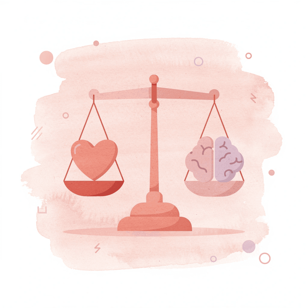
Your business card should work like a system, not a design. The best cards position you, create recall, and make follow-up inevitable. What separates a forgettable card from one that drives real action is the strategic architecture behind what you show, what you omit, and how you frame your value in the three seconds someone spends with it.

According to Wave Connect, 72% of people judge a company by the quality of its business card. Your card serves as shorthand for your professionalism, attention to detail, and memorability. Most cards fail because they attempt to convey everything instead of the one thing that matters most.
"72% of people judge a company by the quality of their business card." — Wave Connect, 2024
🔑 Key Takeaway: Your business card has three seconds to communicate your core value proposition - make every element count toward that single goal.
💡 Pro Tip: The most effective business cards follow the "one thing" rule - they communicate a single, memorable message rather than cramming in every possible detail about your business.

1. QR codes add digital savvy to your business card
Owner type
Consultant or founder attending conferences.
Positioning logic
A QR code signals that you operate in both physical and digital worlds. Someone scans and lands instantly on your portfolio, booking page, or LinkedIn profile: no typing errors, no lost URLs.
Messaging hierarchy
Your name and title come first. The QR code sits in a corner, subtle but functional. Long email addresses or website URLs are removed; the code handles that work silently.
Mechanism explanation
People remember things that are easy. A QR code simplifies follow-up, enabling immediate action instead of a business card languishing in a pocket. This prompt engagement increases the likelihood that a contact becomes a real conversation. Test your QR code before printing. A broken link damages trust faster than a spelling mistake.
2. Minimalist typography that makes a mark
Owner type
Lawyer, architect, or financial planner
Positioning logic
Minimalism communicates clarity and control. One strong font, generous white space, and a restrained color palette signal confidence. You don't need to shout.
Messaging hierarchy
Your name is the most important element, followed by your title or company name. Your phone number and email appear in smaller text at the bottom. Logos, taglines, and decorative elements are omitted.
How it works
Clean designs are easier for your brain to process. When there's less visual clutter, your name becomes the main focus and stays in memory. Minimalism means restraint, so people pay attention to what matters. Print on thick matte stock. The tactile experience reinforces authority without words.
3. Bold business card examples for standing out
Owner type
Photographer, illustrator, or creative professional
Positioning logic
Bold design positions you as someone who takes risks and trusts their vision. Bright gradients, hand-drawn textures, or paint-splatter backgrounds turn your card into a mini portfolio, proof of what you can do.
Messaging hierarchy
The visual comes first. Your name sits on top in high-contrast, readable type, with contact details anchoring the bottom. Generic job titles are removed; your work speaks for itself.
How it works
Emotion drives memory. A card that surprises or delights gets kept and shared, multiplying your reach without extra effort. Keep contact details simple. Bold backgrounds demand high-contrast typography for readability.
4. Unique shapes show your business thinks differently
Owner type
Café owner, fashion label, or boutique retailer
Positioning logic
A square card or rounded corners signals you don't follow the standard playbook. Shape becomes a means of demonstrating originality.
Messaging hierarchy
The shape itself is the first message. Your logo or brand name sits centered, with contact details in smaller type below.
How it works
When something is new and different, it breaks the patterns your brain expects. This makes cards harder to ignore and easier to remember. Ensure the shape still fits in wallets and cardholders, or people will discard it. A square card works well for a café or creative studio, while a traditional rectangle suits accountants or consultants.
5. Embossed designs for professional business card examples
Owner type
Real estate agent, law firm partner, or corporate executive
Positioning logic
Embossing adds texture without color, a tactile signal of quality that extends the time people spend with your card.
Messaging hierarchy
The embossed element (usually your logo or initials) serves as the focal point, with your name and title positioned below in clean type. Avoid competing textures or finishes.
Mechanism explanation
Touch creates memory. Feeling the raised surface engages the card on a sensory level, strengthening recall beyond visual input alone. Pair embossing with a restrained color palette to avoid diluting impact.
6. Eco-friendly materials reflect your business values
Owner type
Wellness coach, florist, or sustainable brand founder
Positioning logic
Kraft paper or seed paper signals values. It demonstrates commitment to impact, not image. For eco-conscious industries, it's alignment made visible.
Messaging hierarchy
Your name and service come first. A small note on the back explains the material: "Plant this card and grow wildflowers." Avoid glossy finishes or synthetic coatings; the rawness is the point.
Mechanism explanation
Shared values build trust faster than credentials. When your card reflects what you stand for, it becomes a conversation starter that opens doors to deeper connection.
7. Foil finishes add luxury to your business cards
Owner type
Event planner, beauty salon owner, or high-end hospitality professional
Positioning logic
Metallic foil, gold, silver, or holographic finishes signal premium quality and reinforce your brand promise before you say a word.
Messaging hierarchy
Let foil highlight your logo or name against dark, clean surfaces like navy or black. Luxury works through contrast, so remove busy backgrounds.
Mechanism explanation
The contrast between shine and matte creates visual tension that feels intentional and polished, conveying a sense of perceived competence. Use foil sparingly—highlighting your logo or initials is often more effective than covering the entire card.
8. Multi-purpose business card design examples
Owner type
Café owner, salon owner, or service provider with repeat customers
Positioning logic
A card that functions as both a loyalty punch card and an appointment reminder gives people a reason to keep it. It's useful, not merely informational.
Messaging hierarchy
The front displays your branding and contact details. The back holds functional elements: stamps, booking slots, or a discount code. Every element earns its space.
Mechanism explanation
Utility drives retention. People discard cards they don't need, but a card that saves money or tracks progress stays in their wallet, keeping your brand top of mind. If you run a café, add a simple loyalty system. For service providers, use the back for booking details or QR codes.
9. Photography builds an instant connection with customers
Owner type
Wedding photographer, interior designer, or product-based business owner
Positioning logic
A strong image makes your card feel like an experience, not an exchange. It shows rather than tells.
Messaging hierarchy
The photo dominates. Your name overlays it in high-contrast type, with contact details at the bottom. Long bios or service lists are removed; the image does the selling.
How it works
Pictures stick in memory better than words. A great photo creates a strong feeling that connects your name to a clear image in people's minds. Begin with images at 300 dpi or higher. Lower quality looks blurry when printed and undermines your professional credibility.
10. Vertical layouts modernize your business image
Owner type
Marketing consultant, multi-service agency, or tech startup founder
Positioning logic
A portrait-style card feels fresh and modern, offering vertical space to neatly stack services or credentials, which is ideal when you offer multiple offerings.
Messaging hierarchy
Your name sits at the top, services or specialties stack below in smaller type, and contact details anchor the bottom. Vertical cards eliminate horizontal sprawl and enforce concise, scannable lists.
How it works
Stacking information from top to bottom mirrors how people read content on phones, a familiar pattern that improves information retention. Use strong alignment and grid layouts to keep vertical designs looking polished and organized rather than cramped.
11. Illustrations make your brand approachable and fun
Owner type
Children's service provider, café owner, or creative startup founder
Positioning logic
Illustrations make your brand feel human and approachable, lowering engagement barriers for casual or community-focused businesses.
Messaging hierarchy
The illustration sits front and center, with your name overlaid on it or beside it, followed by contact details. Corporate stiffness is removed; the playfulness is intentional.
Mechanism explanation
An illustrated card feels personal and handmade, encouraging recipients to reach out. Small icon patterns the back, while larger illustrations serve as focal points on the front.
12. Textured finishes elevate your business feel
Owner type
Boutique owner, consultant, or premium service provider
Positioning logic
Texture shapes how your card feels in hand. Soft-touch matte conveys silky, premium quality; gloss makes colors pop with energy; and linen adds subtle sophistication.
Messaging hierarchy
The finish is the first thing people notice. Your branding and contact details come next. Pick one texture and let it shape the experience.
Mechanism explanation
Sensory experiences create stronger memories. When your card feels different, it stands out in a stack of standard stock, and that physical distinction becomes a mental distinction. Match your finish to your industry. Glossy suits bold creative businesses; soft matte feels premium and understated.
13. Color blocking grabs attention for modern businesses
Owner type
Startup founder, fashion brand, or modern agency
Positioning logic
Color blocking uses bold, contrasting sections to create visual impact: half neon pink, half crisp white. It signals you're current and unafraid of standing out.
Messaging hierarchy
Color contrast delivers the primary message. Your name occupies the high-contrast side, with contact details on the opposite block. Gradients and soft transitions are eliminated; sharpness is the point.
Mechanism explanation
High contrast improves recall because the brain processes sharp boundaries more quickly than subtle ones, making your card easier to remember among muted designs.
What are the key limitations to avoid?
Stick to two or three colors maximum. Too many blocks look messy rather than modern. Mobilo's digital business card solution captures contact details immediately, rather than relying on static exchanges. You track engagement and automate follow-up. Every exchange becomes a trackable lead, not a polite handshake. For teams at events or conferences, this shift from static contact sharing to dynamic lead capture transforms networking into measurable pipeline growth.
Related Reading
- Should I Put My Picture On My Business Card
- Business Cards For Multiple Employees
- Business Card Examples For Owners
- Esthetician Business Card Ideas
- How To Put an Instagram Handle on a Business Card
- Back Of Business Card Ideas
- Photography Business Cards Examples
- Business Card Details
- Business Card Requirements
- Business Card Dimensions
How to Design a Business Card That Drives Real Follow-Ups
Metallic foil, embossing, die-cuts, and bold gradients catch the eye, but the best cards focus on one or two standout features. Layering too many elements dilutes your message and makes your card feel busy rather than memorable.
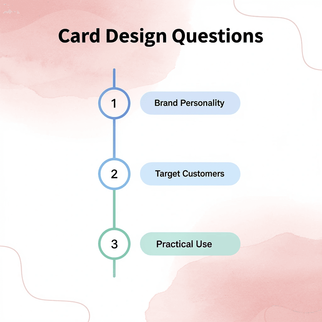
🎯 Key Point: Start by asking three questions: Does this reflect my brand personality? Will it resonate with my target customers? Is it practical for everyday use? Build a solid foundation through layout, typography, and hierarchy so your card communicates clearly. Once you've nailed the essentials, add a design element that feels true to your brand.
"The best business cards focus on one or two standout features rather than overwhelming with multiple design elements." — Design Best Practices
⚠️ Warning: Avoid the common mistake of adding every design element you like - restraint creates more impact than excess.
What makes someone remember your card after three days?
The real test is whether someone remembers what to do with your card three days later. Message hierarchy isn't about fitting every service onto a 3.5-inch rectangle; it's about answering one question instantly: what happens next? According to Wave Connect, 88% of business cards are thrown away within a week, giving you roughly 72 hours to convert attention into action.
How should you guide the eye for maximum impact?
Your card should guide the eye in a clear order: name and positioning statement first (who you are and why it matters), then your preferred contact method. If you list email, phone, LinkedIn, website, and Instagram, you've made it hard for people to decide what to do. Pick the channel where follow-up works best for your business model. Consultants closing deals via discovery calls should prominently display their phone number. Designers who need a portfolio review should direct people to their website. One clear path beats five options.
How do you choose design elements that reinforce your brand positioning?
A landscape photographer using a rounded-corner card resembling a camera viewfinder creates a connection between the design choice and their expertise. A financial advisor printing their card on heavier paper signals substance and permanence without saying a word. These aren't decorative choices—they're positioning signals that reinforce your message after the conversation ends.
What happens when design choices contradict your brand promise?
The trap is choosing features that contradict your brand promise. If you position yourself as the efficient, no-nonsense solution, a card with three specialty finishes sends mixed signals. If you're the premium, white-glove service provider, flimsy cardstock undermines your credibility before you've said hello. Wave Connect reports that 72% of people judge a company by the quality of its business cards, meaning your design choices either validate or contradict your positioning within seconds.
How do you create momentum with follow-up triggers?
Most cards treat contact information as the ending point; the best ones treat it as the starting point. A QR code linking directly to your calendar booking page removes 3 steps from the follow-up process. A handwritten note mentioning something specific from your conversation transforms a regular card into a personalized keepsake. A "Mentioned: [topic you discussed]" reminder clarifies the recipient's next action when they rediscover your card days later.
What makes digital solutions more effective than traditional cards?
Traditional cards rely on the recipient remembering context and taking initiative. Teams using digital business card solutions like Mobilo build follow-up triggers directly into the exchange by capturing lead details instantly and automating next-step workflows. The time between "nice to meet you" and "let's work together" shrinks from days to minutes.
Why does problem clarity matter more than design?
But a perfectly designed card with clear hierarchy and smart triggers won't matter if the person holding it doesn't know what problem you solve. That's the piece most owners skip, and it's costing them more opportunities than bad typography ever will.
Create Your First High-Conversion Digital Business Card in 5 Minutes
The gap between meeting someone and working with them isn't about better design or clever taglines. It's about what happens in the five minutes after you shake hands. Business owners treat that window like it doesn't exist, then wonder why promising conversations disappear.

💡 Tip: Take five minutes to build a digital business card with Mobilo that captures contact details automatically, routes them into your CRM, and triggers your follow-up sequence without manual data entry.
"The gap between meeting someone and working with them happens in the five minutes after you shake hands - most business owners treat this window like it doesn't exist."
🎯 Key Point: Define what you want people to remember, who your ideal contact is, and how they should reach you next. That structure turns every handoff into pipeline activity instead of another lost connection.
Related Reading
- Plumbing Business Cards Examples
- Artist Business Cards Examples
- Therapist Business Cards Examples
- HVAC Business Cards Examples
- How To Put Social Media on a Business Card
- Best Real Estate Business Cards
- Electrician Business Card Ideas
- Unique Business Card Ideas


