

.avif)

What Are the Essential Modern Business Card Requirements?
On This Page
A business card does more than share contact details — it signals professionalism and leaves a lasting impression in seconds. Getting the business card requirements right, from layout and typography to card stock and finish, determines whether someone keeps the card or discards it. Every element carries weight, and understanding what modern standards demand helps professionals present themselves with confidence.
Even a well-designed physical card has practical limits: it can be lost, damaged, or forgotten in a pocket. Pairing it with a digital business card from Mobilo ensures contact information, social profiles, and key links stay accessible with a single tap, so no connection is ever lost to a misplaced card.
Summary
- Business cards carry more perceptual weight than most professionals realize. According to Wave Connect's business card statistics, 72% of people judge a company or individual by the quality of their business card before a single word is exchanged. That means design choices like font size, card stock, and layout serve as trust signals rather than aesthetic preferences.
- Every element on a business card should pass one filter: does this help someone identify, trust, or contact me? When designers treat cards as a space to fill rather than a decision shortcut, the result is noise. The most effective cards limit contact information to the channels the cardholder actually uses, because that specificity communicates how someone works, not just where to find them.
- Not every element is required for every professional. A physical address belongs on a card when location is part of the value proposition, such as a medical practice or retail storefront, but it distracts on a remote consultant's card. Social media handles follow the same logic: only include a profile if it actively demonstrates expertise or advances the relationship, not simply because the account exists.
- Visual quality affects business outcomes in measurable ways. VistaPrint's research found that cards featuring a photo have a 15% higher response rate than those without, reinforcing the role of cards in recognition and recall. Separately, 39% of people report that they would avoid doing business with a company whose card looked cheap, meaning that a pixelated QR code or a misaligned logo carries real commercial consequences.
- QR codes are most effective when they point somewhere purposeful. A link to a generic homepage wastes the intent of someone scanning mid-conversation. When a QR code routes to a post-meeting landing page or feeds contact data into a CRM workflow, the card moves from passive object to active pipeline tool, a distinction that compounds across large teams handing out cards at scale.
- Business card information becomes outdated faster than most teams account for. When job titles change, contact details shift, or new team members join, printed cards create a lag between what is circulating and what is accurate, a gap that affects both first impressions and follow-up reliability.
- Mobilo's digital business card addresses this by letting teams update contact information instantly across every card in circulation and by connecting each new contact exchange directly to CRM and lead capture workflows.
What Are the Essential Modern Business Card Requirements?
A business card's main job is helping someone remember who you are and making it easy for them to take the next step, not simply showing contact information.
💡 Tip: Think of your business card as a mini ambassador for your brand. It should compel action, not inform.
"A business card's true purpose is not to store data—it's to spark a connection and make the next step impossible to ignore."

After a conference or client meeting, most cards are forgotten by Tuesday. The ones that stick communicate identity clearly, build trust, and make the next action obvious. That is the standard every element on your card should meet.
🎯 Key Point: Every single element on your card — from typography to contact details — must earn its place by serving one of three goals: clarity, trust, or action.
⚠️ Warning: A card that only lists your name and number is a missed opportunity — without a clear identity signal, you're instantly forgettable.
Here are the standard requirements for an effective business card:
- Name & Title: Must be instantly clear and memorable to establish who you are.
- Contact Details: Needs to be easy to act on immediately to facilitate the next step.
- Brand Identity: Must communicate credibility at a glance to build trust.
- Visual Design: Needs to be distinctive and on-brand to reinforce your identity.
Does this help someone identify, trust, or contact me?
That single question is the filter: Does this help someone identify, trust, or contact me? Every design decision, piece of information, and visual choice should pass through it. According to Wave Connect's Business Card Statistics, 72% of people judge a company or person based on the quality of their business card. The card communicates something before anyone reads a single word.
What four categories should every business card cover?
Four categories emerge naturally. Identity covers your name, job title, and organization. Contact covers the specific channels through which you want to be reached. A brand covers the visual and verbal signals that tell someone what kind of professional they are dealing with. Action covers elements that provide a clear next step—such as a website URL, social handle, or QR code.
Why does listing every contact channel hurt more than it helps?
Most professionals list everything they can fit: phone number, multiple email addresses, fax lines, every social platform. But a card that forces recipients to sort through noise has already failed. A digital business card solves this by surfacing the most relevant contact details for a given context without physical constraints.
How does strategy separate a card that works from one that simply exists?
Not every business needs every element. A freelance designer and a regional sales director have different identity priorities, preferred contact channels, and desired actions. Strategy separates a card that works from one that merely exists.
Related Reading
- Business Card Ideas
- Matte Vs Uncoated Business Cards
- Types Of Business Cards
- Business Card Psychology
- What Should Be On A Business Card
- How to Make a Professional Business Card
- Rounded Corner Business Cards
- Minimalist Business Cards
- Business Card Paper Weight
- Business Card Colors
Which Business Card Elements Are Required and Which Are Optional?
Every business card needs to answer one question: what action should this card create? That answer determines which elements belong on the card and which ones add noise. Think of each element as a job to assign, not a field to fill in.
"Every element on your business card should earn its place — if it doesn't drive an action, it's just clutter." — Business Card Design Best Practices
🎯 Key Point: Before adding any element to your card, ask: Does this drive the action I want? If the answer is no, leave it off.
Here is the breakdown of business card elements by necessity:
- Name & Title: Establishes identity (Required).
- Phone / Email: Enables direct contact (Required).
- Website / URL: Extends the conversation online (Recommended).
- Logo / Brand: Builds visual recognition (Recommended).
- Social Handles: Supports ongoing engagement (Optional).
- QR Code: Bridges print to digital (Optional).High
- Design: From generic templates to custom, on-brand layouts.
- Information: Moving beyond basic contact details to include a role, value proposition, and digital links (social/QR).
- Material: Upgrading from standard flimsy paper to premium textures or finishes.
- Recall factor: Shifting from low-impact to high-retention engagement.
💡 Tip: Start with only the required elements, then add optional ones only if they serve a clear, specific action — never just to fill space.

Your Name and Title
Your name is non-negotiable. Your title, however, is conditional. A senior enterprise sales director needs their title to show authority and set the conversation context. A freelance consultant with a recognizable personal brand might drop it entirely, letting their work speak instead. The title exists to reduce friction: if it doesn't do that for your audience, it earns no space.
Contact Channels
Phone numbers, email addresses, and websites serve different purposes. Your phone number enables immediate contact for situations requiring quick answers and direct conversation. Email is suitable for non-urgent matters and ongoing correspondence. Your website lets people learn what you offer before deciding to proceed. The problem arises when you include all three by default, though most people will use only one. According to Wave Connect's Business Card Statistics, 39% of people would not do business with a company that has a cheap-looking card—wasted space signals inattention to detail.
Logo, Address, and QR Code
A company logo helps people recognize your business and builds trust. Solo workers with strong personal brands often benefit from clean, simple text designs rather than generic logo templates. A physical address matters for location-dependent businesses such as law offices, doctors' offices, or banks, but online businesses and freelancers can omit it.
Why is the QR code the most underused element on business cards?
The QR code is one of the most underused parts of business cards. It connects the physical card to digital actions: saving contact information, visiting portfolio pages, and filling out lead capture forms. Static printed cards create a problem when phone numbers change or campaigns end, rendering the QR destination outdated. Our digital business card solves this by updating the destination in real time, ensuring the physical card never becomes obsolete.
Social Media Handles
Social handles are optional by default and required only when the platform is part of your professional identity. Include LinkedIn for B2B roles where buyers research before responding. A creative professional who builds their audience on Instagram should include it. Listing three or four handles signals that no one made a decision. Wave Connect's Business Card Statistics note that 72% of people judge a company or person based on the quality of their business card, and that judgment extends to whether the card looks considered or hastily assembled.
Photo: The Element Nobody Agrees On
A photo is the most debated element in business card design, but the debate usually misses the point. Photos work when recognition matters—specifically in high-volume networking environments where a face helps recipients remember the conversation. Research from VistaPrint shows business cards with photos see a 15% higher response rate than those without. In formal corporate or enterprise contexts, however, a photo can feel misaligned with the brand. The decision should be driven by context, not convention. Knowing which elements belong on your card is only half the equation. The card that works hardest keeps performing long after it leaves your hand.
Related Reading
- Should I Put My Picture On My Business Card
- Photography Business Cards Examples
- Horizontal vs Vertical Business Cards
- Business Card Examples For Owners
- How To Put an Instagram Handle on a Business Card
- Esthetician Business Card Ideas
- Photography Business Cards Examples
- Back Of Business Card Ideas
- Business Card Details
- Business Card Requirements
- Business Card Dimensions
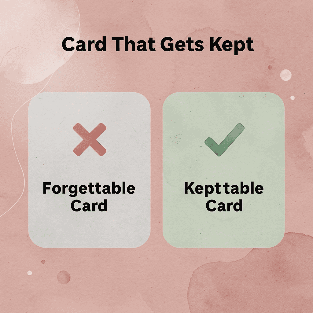
How to Build a Business Card That Gets Kept Instead of Thrown Away
Meeting basic requirements gets you in the room. A card with your name, number, and email technically works — but the difference between one that earns a second glance and one that lands in recycling comes down to design choices most people overlook.
💡 Tip: Think of your business card not as contact information, but as a first impression in physical form — one that either earns a place in someone's wallet or gets tossed by Friday.
- Design: From generic templates to custom, on-brand layouts.
- Information: Moving beyond basic contact details to include a role, value proposition, and digital links (social/QR).
- Material: Upgrading from standard flimsy paper to premium textures or finishes.
- Recall factor: Shifting from low-impact to high-retention engagement.
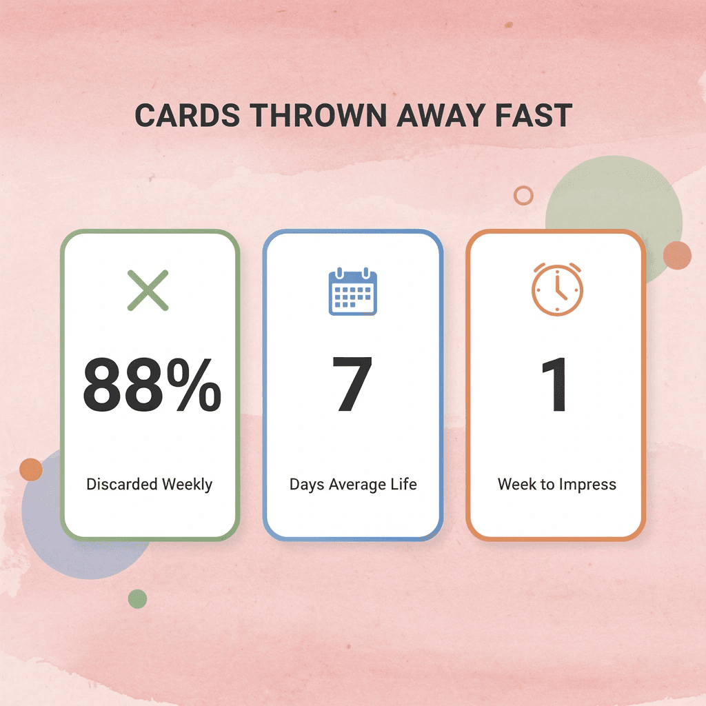
"88% of business cards are thrown away within a week — meaning the average card fails to create enough value to justify keeping." — Wave Connect's Business Card Statistics
According to Wave Connect's Business Card Statistics, 88% of business cards are thrown away within a week. The average card fails to create enough perceived value to justify keeping — which means standing out isn't a nice-to-have; it's essential.
⚠️ Warning: Don't assume a card with your contact details alone will do the work. If your card doesn't communicate why someone should reach out, it's already on its way to the bin.
🔑 Takeaway: The cards that get kept are the ones that feel worth keeping — through strong design, clear value, and a finish that makes someone think twice before throwing it away.
Why do most business cards fail to make an impression?
The failure point is usually not what is missing, but what is wrong: too much information, competing visual elements, unreadable fonts, or multiple conflicting calls to action. Each mistake stems from treating the card as a container for information rather than a communication tool. A container holds things. A communication tool makes choices. Tapzo's research found that 72% of people judge a company based on card quality, forming that judgment in half a second before reading a word. Weak visual hierarchy, crowded layout, or straining fonts signal that the person handing it over cannot make decisions under constraints, raising questions about their ability to manage a project or relationship.
How does a digital business card solve the problem of outdated information?
Most teams print standard designs in bulk, but this approach fails when roles change, phone numbers update, or staff relocate. Reprinting costs time and money, and outdated cards continue circulating. A digital business card solves this by letting administrators update contact details in real time across the entire team, ensuring every tap or scan shares accurate information without reprinting.
What principles separate a card that gets kept from one that gets discarded?
The principles below are usability decisions, each tied to a specific failure mode and a better path forward.
1. Find a template that reflects your brand's personality
Problem
Generic templates don't tell people anything specific about who you are or what you do. A card that could belong to anyone belongs to no one.
Why does it hurt usability?
People form opinions before reading a single word. When design mismatches the message—such as a simple architect using a busy, ornate template—it creates immediate confusion. Trust breaks down before it can build.
Better alternative
Choose a template that matches your brand's character. A modern interior designer builds credibility with clean lines and restrained color. A dog walker builds it with warmth, playfulness, and energy. Test your card by handing it to someone unfamiliar with your business and asking what they think you do. Their answer reveals whether your design matches your positioning.
Expected outcome
The card communicates your brand identity before the recipient reads your name, making the first impression intentional.
2. Find the right typeface
Problem
Fonts that are too small, too fancy, or mismatched with your existing brand materials make a card hard to read and look disjointed.
Why does it hurt usability?
Text below 8pt becomes difficult to read. When people struggle to find your phone number, they move on. Poor font choices signal inattention to detail, undermining the professionalism a business card should convey.
Better alternative
Use a minimum of 8pt for all text and 12pt or larger for your company name. If your website or marketing materials use a specific typeface, carry it onto the card. An etiquette coach earns credibility with elegant script; a software developer with clean, geometric sans-serif. The font conveys tone, not decoration.
Expected outcome
Every piece of information is easy to read at a glance, and the typeface reinforces the brand personality established across your other materials.
3. Settle on a size and shape
Problem
A standard rectangular card looks like every other card in a wallet or stack.
Why does it hurt usability?
Cards that all look the same blur together. Choosing an unusual shape without considering whether it fits a standard cardholder creates a card people discard for practical reasons.
Better alternative
Choose a format that balances brand expression with real-world usability. Square cards with rounded corners and a vertical orientation can set your card apart without sacrificing practicality. Ask "what fits my brand and survives the cardholder test?" rather than "what looks interesting?"
Expected outcome
Your card stands out in a stack while remaining easy to store, reference, and keep.
4. Organize your information
Problem
Weak visual hierarchy is one of the most common and damaging mistakes in business card design. When every piece of information carries equal visual weight, nothing stands out.
Why does it hurt usability?
Without a clear visual path, the eye wanders and misses important details. A card where your name, phone number, email address, and tagline all appear at the same size forces the reader to work harder, and most won't bother.
Better alternative
Follow a deliberate visual flow: logo first, then name, then secondary contact information like phone number, email, and website. Use size, weight, and white space to guide the eye. A single element's size or position can transform how the card reads.
Expected outcome
Recipients find the most important information immediately, and the card feels organized rather than like a data dump.
5. Think dual-purpose
Problem
Using only one side of a business card wastes half the available space and often leads to overcrowding on the front.
Why does it hurt usability?
When everything gets squeezed onto one side, the front becomes cluttered, and it's difficult to discern what's most important.
Better alternative
Use the back strategically. A restaurant can print a signature recipe. A handmade goods seller can use the card as a product tag. A service business can include an appointment reminder or a loyalty stamp. For most businesses, the back is ideal for a QR code or call to action, keeping the front clean and branding prominent.
Expected outcome
The card becomes more useful over time, lasting beyond the first meeting and increasing the likelihood that it gets kept rather than discarded.
6. Maximize your logo
Problem
Many business owners shrink the logo and relegate it to a corner or let it compete visually with text blocks.
Why does it hurt usability?
The logo is the most powerful visual anchor a brand has. When undersized or subordinate to contact details, brand recognition suffers, and the card appears generic rather than distinctive.
Better alternative
Give the logo prominent, intentional space. Consider dedicating one side of the card entirely to it so it becomes the first thing the eye lands on.
Expected outcome
Recipients instantly associate the card with your brand, and repeated exposure builds recognition over time.
7. Leave some white space
The instinct to fill every available inch of a business card feels efficient and thorough. It is neither.
Problem
Overcrowding is the most common business card mistake, often mistaken for diligence.
Why does it hurt usability?
When too many elements compete for attention simultaneously, none prevail. Readers become overwhelmed, skip details, and often discard the card entirely. Clutter signals an inability to prioritize, not thoroughness.
Better alternative
Embrace white space intentionally. Use both sides of the card to spread out content. Fewer elements mean each element carries more visual weight.
8. Add something special
Special finishes, foil accents, embossed gloss, and premium paper stock are signals, not vanity choices. Wave Connect reports that business cards with a unique design or quality material are 10 times more likely to be kept. The tactile experience creates a subconscious connection with brand quality. When the finish matches the brand, it earns its cost many times over. Most teams handle the physical card well, then lose the lead due to a lack of follow-up systems. Our digital business card solves this by capturing every exchange as a contact automatically routed into a CRM, eliminating manual data entry. The card initiates the workflow.
9. Include a call to action
A single, well-placed QR code on the back—linking to a website, offer, or mailing list—is more effective than multiple competing prompts. Multiple CTAs create decision paralysis. One clear next step creates momentum. Place the QR code on the back to avoid competing with the logo.
10. Proofread, then proofread again
A typo on a business card is a permanent embarrassment, printed in quantity and handed to every potential client until the box runs out. A professional copy editor can review the text quickly and inexpensively. The cost of skipping this step far exceeds the cost of doing it.
11. Keep it simple
Cognitive overload is the silent killer of otherwise well-designed cards. Minimalism is a functional decision. Limit elements to what is essential, increase white space, and let clarity carry the card. The message lands faster, and the recipient is more likely to act.
12. Consider your message
Before finalizing the design, ask: "What does this say about me when I am not in the room?" A law firm that uses cartoon fonts and neon colors contradicts the professional impression established in person. A freelance illustrator using plain white and black Arial undersells the work. The design should extend professional identity, not contradict or undersell it. The gap between a card that gets kept and one that gets discarded depends on whether each design decision was made with intention or by default.
A Simple Business Card Checklist Before You Print
Before printing, run your card through five quick questions. They take under two minutes and stop you from handing out something that works against you.
"A business card is often your first impression — and a flawed one can be your last." — Print Industry Best Practices
Here is your business card production checklist to ensure a professional result:
- Contact Info: Verify phone, email, and website; errors make you unreachable.
- Font Legibility: Maintain a minimum 8pt size; small text gets ignored.
- Brand Consistency: Align colors, logos, and style; builds trust and recognition.
- Bleed Area: Ensure at least a 3mm bleed; prevents awkward white edges.
- Print Proof: Conduct a physical test print; catches hidden errors before bulk printing.
💡 Tip: These five questions cost you nothing but two minutes — skipping them could cost you a full reprint and a missed opportunity.
⚠️ Warning: Never approve a final print without checking your card on both a screen and a physical proof — colors and spacing can look completely different in print.

Can someone identify your business in three seconds?
Cover up the name and logo, then ask a stranger what industry you work in. If they cannot answer quickly, your visual identity is not working. Your card's layout should answer "who" and "what" before anyone reads the contact information.
Is there one obvious contact method?
The failure point is usually too many options with equal visual weight. An email address, a phone number, a LinkedIn URL, and a website all set in the same font size force the reader to decide what matters, and most readers won't bother. Pick the one channel where you want to be reached, make it stand out, and let the others stay quiet below it.
Most teams list every contact detail, assuming more access points mean more connections. According to VistaPrint, 39% of people would choose not to do business with a company if their business card looked cheap, and a cluttered contact section reads as exactly that. Teams using digital business cards sidestep this problem: the card's landing page surfaces the right contact method based on context, while the physical card stays clean and focused.
Is your CTA clear?
A card without a call to action is merely a label. "Let's connect," a QR code that leads somewhere specific, or a single line telling the reader what to do next, all serve the same function: they give the card a job beyond sitting in a pocket. Without a CTA, your card won't generate results.
Is every element serving a purpose?
Thrown-away cards share a consistent pattern: decorative elements, taglines that repeat the logo, and social handles nobody will type by hand. Every element should build trust, prompt direct action, or confirm identity. If it does none of those three things, it does not belong.
Have you proofread every detail?
A transposed digit in a phone number or a misspelled domain name signals carelessness. Read every line backward, character by character, before approving a print run. Then have one other person do the same, since the brain that wrote the content will autocorrect its own errors. But a card that passes every pre-print check still faces one more test after it leaves your hand.
Design a Business Card That Keeps Working After the Handshake
A card that passes every design and print check but fails to move someone toward the next step has done nothing. The goal was never the card itself—it was the conversation, follow-up, and relationship that followed.
"A business card is only as valuable as the action it inspires—without a clear path to follow-up, even the most beautifully designed card becomes clutter in someone's pocket." — Business Networking Insight
💡 Tip: Before finalizing your card design, ask yourself: Does every element drive someone toward a specific next step? If not, redesign with intent.

Teams that treat their cards as a lead capture system rather than a print project consistently get more from every handshake. A digital business card like Mobilo closes the gap between a good first impression and a qualified pipeline entry, syncing contact data directly to your CRM, capturing richer lead details at the moment of exchange, and giving team managers visibility into which connections are actually converting.
🎯 Key Point: Treating your business card as a lead capture tool—not just a print asset—is what separates teams that build pipelines from teams that simply collect contacts.
Book a 5-minute Mobilo demo today and get your first 25 digital business cards free—a $950 value—giving your team a measurable way to turn every conversation into a trackable opportunity.
⚠️ Warning: Every day your team hands out static cards, it loses pipeline data. Don't let another handshake go untracked.
✅ Best Practice: Pair your Mobilo demo with a team audit of your current card strategy to identify exactly how many conversations are converting and where the follow-up gap exists.

Related Reading
- Best Real Estate Business Cards
- Artist Business Cards Examples
- HVAC Business Cards Examples
- Therapist Business Cards Examples
- How To Put Social Media On Business Card
- Plumbing Business Cards Examples
- Electrician Business Card Ideas
- Unique Business Card Ideas


