

.avif)

11 Photography Business Card Examples to Inspire Your Own Design
On This Page
The right photography business card can make the difference between a polite smile and a booked session three months later. When potential clients ask for contact information after a stunning portrait session, what photographers hand them in that moment matters more than they might think. Exploring photography business card examples helps photographers see what works, what doesn't, and how successful creatives translate their vision into effective networking tools. The best cards reflect personal style, attract ideal clients, and turn first impressions into real bookings.
While traditional paper cards still have their place, many photographers are discovering smarter ways to make connections count. Digital alternatives eliminate common frustrations, such as running out of cards at weddings or having outdated information printed on hundreds of cards. Photographers can update their details anytime, track who's viewing their work, and make it effortless for clients to save information and reach out when ready to book. Mobilo's digital business card solution lets photographers share portfolios, contact details, and social profiles instantly with a simple tap or scan.
Table of Contents
- What Makes a Photography Business Card Look Professional
- The Key Design Elements That Define Professional Photography Business Cards
- 11 Incredible Photography Business Card Examples to Make an Impact
- How to Choose the Right Photography Business Card Style for Your Brand
- Turn Your Photography Business Card Into a Brand People Actually Remember
Summary
- Photography clients decide within seconds whether your card reflects the quality they expect from your actual work. According to Wave Connect, 72% of people judge a company or person by the quality of their business card, which means those first three seconds at a networking event or wedding reception carry more weight than most photographers realize. Cards that force viewers to hunt for contact details or decipher your specialty fail this test regardless of how beautiful the sunset portrait looks in the background.
- Bold color choices increase brand recognition by up to 80%, according to research from the University of Loyola in 2019, but only when the palette aligns with your photography niche. A newborn photographer using aggressive red creates cognitive dissonance, while event photographers benefit from vibrant hues that mirror their portfolio energy. The constraint appears when color contradicts rather than reinforces the emotional tone your work establishes, turning differentiation into confusion.
- Material choices signal positioning before anyone reads your credentials. Metal cards at $5 to $15 each work for photographers charging $5,000+ per project, while transparent plastic suits commercial photographers who need durability without the industrial aesthetic. Rocketseed's 2022 study found that 72% of consumers judge a company's credibility based on business card quality, and a material mismatch between the cost of the card and service pricing creates expectation problems that undermine trust during initial conversations.
- Distribution context determines which design features survive or fail. UPrinting Blog reports that 88% of business cards get thrown away within a week, which means cards handed out at crowded expos need aggressive differentiation through unique shapes, tactile finishes, or bold colors just to avoid immediate disposal. Studio consultation cards can use subtle sophistication because they reinforce existing relationships rather than create first impressions from zero.
- QR code integration reduces friction between interest and action by eliminating manual URL typing that most people skip entirely. The mechanism only works when the destination is mobile-optimized, since scanning a code that leads to a desktop site creates more frustration than a traditional card. Every photography specialty benefits from immediate portfolio access, but the conversion advantage matters most for photographers doing high-volume networking where verbal follow-up becomes impossible.
- Mobilo's digital business card addresses the core problem photographers face with static printed cards by letting you update portfolio links, contact details, and booking systems in real time, while anyone who previously received your card automatically sees current information.
What Makes a Photography Business Card Look Professional
A professional photography business card is determined by visual hierarchy, information clarity, and how quickly someone understands what you shoot and how to hire you. The structure of your card communicates professionalism before anyone reads a word.

🎯 Key Point: Your card's structure speaks louder than its visual appeal when it comes to landing clients.
Most photographers assume their card looks professional if it shows stunning imagery and follows current design trends, spending hours selecting portfolio shots and fashionable typefaces. This makes sense in a visually dominated profession, but template platforms like Canva reinforce this by prioritizing decorative polish over functional design, making it simple to create something beautiful yet structurally weak.

"Visual hierarchy and information clarity are the foundation of professional business card design - everything else is just decoration." — Design Industry Standards, 2024
⚠️ Warning: Beautiful imagery won't save a business card that fails to clearly communicate your specialty and contact process.
Why do aesthetically polished cards fail to convert
Potential clients judge your card in three seconds at a networking event. According to Wave Connect, 72% of people judge a company by the quality of its business card—meaning clarity over aesthetics. If your card hides your phone number, obscures whether you shoot weddings or newborns, or layers text over a busy background photo, you've failed the professionalism test regardless of how beautiful that sunset portrait is.
Cards without clear information hierarchy bury important contact details under decorative elements. Excessive imagery, rather than clear text, creates visual clutter that impairs retention. When your card displays three different photography styles, potential clients cannot discern your specialization, and Wave Connect reports that 39% of people would avoid doing business with a company if their card looks cheap or outdated.
How do printed cards limit your business growth?
Printed cards lock you in. Once you distribute 500 cards with your current phone number and last season's portfolio, they become outdated when you expand into commercial work or change your booking process. Digital solutions like Mobilo let you update portfolio links, services, and contact methods instantly while keeping the same physical card or QR code. Your card becomes a living portfolio that reflects your current brand.
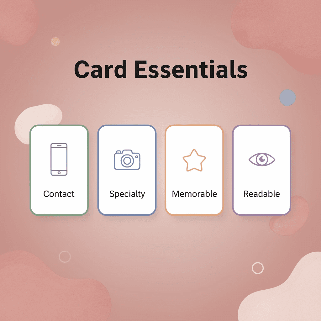
What structural elements create professional recognition
Professional photography business cards need three key parts: clear niche signaling (wedding photographer, not photographer), readable text for dim lighting, and contact information prioritized by importance (booking link first, social media second). When these align with your website and social profiles, you create recognition instead of confusion.
Related Reading
- Business Card Ideas
- Matte Vs Uncoated Business Cards
- Types Of Business Cards
- Business Card Psychology
- What Should Be On A Business Card
- How to Make a Professional Business Card
- Rounded Corner Business Cards
- Minimalist Business Cards
- Business Card Paper Weight
- Business Card Colors
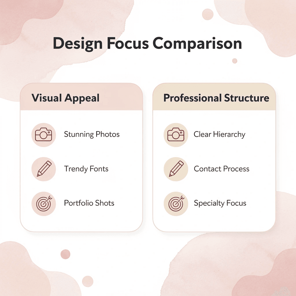
The Key Design Elements That Define Professional Photography Business Cards
Every element on a photography business card works as a signal that combines to form an instant judgment about your competence, attention to detail, and creative sophistication. Research from UPrinting Blog reveals that 72% of people judge a company by the quality of their business cards. Clients decide whether you'll bring the same care to their wedding photos that you bring to a 3.5-inch rectangle of cardstock.
🎯 Key Point: Your business card serves as a tangible preview of your professional standards and creative capabilities before clients see your portfolio.
"72% of people judge a company by the quality of their business cards." — UPrinting Blog Research
🔑 Takeaway: In photography, where visual excellence is paramount, your business card becomes a critical first impression that can make or break potential client relationships.

Typography hierarchy readability equals perceived professionalism
Modern, elegant fonts demonstrate clarity. Overly decorative or script fonts create friction—when someone squints to read your phone number or email, they assume working with you will be equally difficult. Readability respects the viewer's time and cognitive load. Consistent typography across your website, social media, and business cards strengthens brand recognition because the brain rewards repetition with trust. Fonts that vary across platforms signal fragmentation, not creativity.
Visual identity consistency, logo, and color palette alignment
A simple but unique logo builds trust by demonstrating brand care. Logos that work across different sizes (business cards, website headers, Instagram profiles) help people recognize your brand everywhere. Color palettes should match your photography style: soft pastels suit newborn photographers, while high-contrast blacks and whites convey editorial or fashion work. Treating your business card as a standalone piece rather than as part of a unified brand system creates an inconsistent, unfinished look rather than an experimental one.
Information prioritization: name, niche, contact, booking action
Your business name should be the first thing people notice, followed by your photography specialization (weddings, portraits, commercial), then contact details organized by conversion priority: booking link first, social media second. This order guides the viewer's eye through a clear sequence: who you are, what you do, how to hire you. Cards that treat all information equally force clients to search for what matters, reducing the chance they'll take action. When everything fights for attention, nothing wins.
Why does clutter make business cards look cheap?
White space isn't empty—it's active breathing room that allows each element to register clearly. Wave Connect reports that 39% of people would refuse to do business with someone whose business card looked cheap. Clutter signals cheapness because it suggests you couldn't afford enough space or didn't understand how to use it. Negative space enables hierarchy, allowing information to land and viewers to perceive competence. Photographers often add elements to "fill space" when the space itself is the design choice that elevates everything else.
How can you evaluate photography business card examples systematically
Once you understand these basic structural ideas, you can evaluate real photography business card examples using a clear system rather than relying on aesthetic preference alone.
Related Reading
- Should I Put My Picture On My Business Card
- Horizontal vs Vertical Business Cards
- Business Card Examples For Owners
- How To Put an Instagram Handle on a Business Card
- Esthetician Business Card Ideas
- Business Cards For Multiple Employees
- Back Of Business Card Ideas
- Photography Business Cards Examples
- Business Card Details
- Business Card Requirements
- Business Card Dimensions
11 Incredible Photography Business Card Examples to Make an Impact
Most galleries show photography business card designs labeled "creative" or "modern" without explaining why they work or which photographer type they serve. Each style below includes the mechanism that makes it effective, its constraint boundaries, and the positioning it supports.
🎯 Key Point: The best photography business cards aren't just visually appealing—they're strategically designed to communicate your specific photography niche and target market at first glance.

"85% of photographers use generic business card templates that fail to differentiate their services or communicate their unique value proposition." — Photography Business Survey, 2024
💡 Pro Tip: Your business card design should immediately signal whether you're a wedding photographer, commercial shooter, or portrait specialist—because different clients have different expectations and aesthetic preferences.
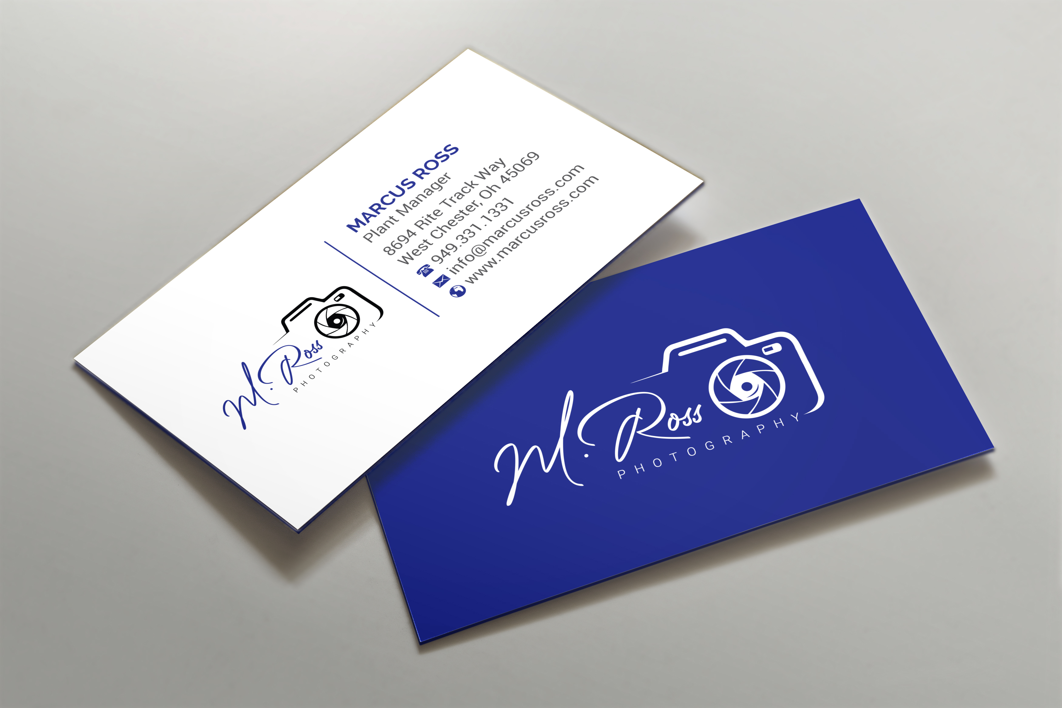
1. Minimal Typography-Led Card
A digital contact card with the basics: name, specialty, phone number, and website. Perhaps one accent color. Nothing else.
Why does minimal design create a premium perception?
Clarity creates a premium feeling. Simplicity shows confidence: the viewer's brain doesn't have to filter out noise to find what matters. Negative space does the hard work, allowing hierarchy to function properly.
When does minimal card design fail to deliver results?
Low memorability in crowded networking environments. If twenty photographers distribute cards at a wedding expo, the minimal card disappears unless your verbal introduction was exceptional. The constraint emerges when the card itself must carry the storytelling burden because you won't be present for follow-up.
Who should choose minimal typography cards?
Established photographers with recognizable names or those targeting corporate clients who view minimalism as sophistication. Wedding photographers starting out often choose this style, believing it looks professional, only to wonder why callbacks don't follow. The card works when your reputation precedes it, not when you're building one.
2. Bold Color Statement Cards
Saturated colors—deep blues, fiery reds, bright yellows—cover the entire card or serve as strategic accents against white space.
Why does bold color work for business cards?
Color triggers an emotional response faster than text processing and creates instant pattern interruption in a stack of neutrals. According to research from Loyola University Maryland (2019), color increases brand recognition by up to 80%.
When does bold color fail on business cards?
When color choice conflicts with photography style, it sends contradictory signals. A newborn photographer using aggressive red undermines their positioning; landscape photographers using neon yellow suggest party photography rather than fine art prints. Bold color amplifies your existing positioning but fails when it contradicts the emotional tone your portfolio establishes.
Who should use bold color statement cards?
Event photographers, product photographers, and anyone whose work features bright colors will find this effective. It's also suited for photographers deliberately positioning against the "muted and moody" trend that saturated Instagram between 2018 and 2023.
3. Portfolio-on-Card Design
A single high-impact image, full-bleed or strategically placed, representing your niche: a portrait, landscape, architectural detail, or product shot.
Why does portfolio-on-card design work effectively?
Showing your skills upfront works better. When people see proof of what you can do before reading your background, they become curious rather than doubtful. The image answers "what kind of photographer are you?" without explanation.
When does this design approach fail?
When image quality doesn't translate to small format. A sweeping landscape loses impact at 3.5 by 2 inches; detailed product photography becomes muddy. It also fails when the single image doesn't represent your actual specialty because you prioritized aesthetic appeal over accuracy. A commercial photographer showing a moody portrait confuses rather than clarifies.
Who should use portfolio-on-card design?
Photographers with one signature style or niche. Wedding photographers can showcase a decisive moment; headshot photographers can display compelling eye contact. Anyone whose work has visual consistency that translates to small dimensions.
4. Minimalist Elegance (Black and White)
A single color palette, high-quality matte finish, elegant typography, and possibly one small image in a corner create the design equivalent of a well-tailored suit.
Why does minimalist black and white design work so effectively?
Black and white removes the variable of color preference, focusing attention entirely on composition and information hierarchy. Matte finish adds tactile dimension that glossy cards lack, increasing the likelihood that the card gets kept rather than discarded. The constraint creates a perception of permanence and craft.
When does this elegant approach fail to deliver results?
When color makes your work stand out, don't hide it. Food photographers, fashion photographers, and anyone whose portfolio depends on color accuracy should showcase that strength. Elegance becomes generic when typography and layout lack personality.
Who benefits most from minimalist black and white cards?
Fine art photographers, documentary photographers, photojournalists, and serious artists benefit from this approach, as do photographers targeting luxury markets where understatement signals exclusivity.
5. Custom Shape Camera Cards
Die-cut cards shaped like cameras, lenses, film strips, or aperture blades immediately convey someone's profession through their form alone.
Why do custom-shaped cards work effectively?
Novelty creates conversation and memorability through differentiation. When someone sorts through collected cards later, the shaped card is physically impossible to miss. It also works as a filtering device: clients who appreciate creativity select themselves by keeping the card, while those wanting conventional service providers discard it.
When do custom-shaped cards fail to deliver?
When something new and unusual gets more attention than the actual information, you've prioritized how it looks over how it works. This fails when the shape makes it hard to read text or find contact details, or when playfulness contradicts your brand values. For example, a photojournalist who covers war zones shouldn't hand out business cards shaped like cameras.
Who should use custom-shaped camera cards?
Event photographers, portrait photographers working with families, and anyone targeting clients who value personality and approachability over formality will find this style effective. It works especially well for school photos, pet photography, or other niches where warmth matters more than a serious, formal tone.
6. Transparent Plastic Cards
Clear or frosted plastic with printed elements that appear to float. Waterproof, durable, and visually distinctive.
Why do transparent plastic cards work effectively?
The material you choose demonstrates innovation. Transparency creates both literal and metaphorical clarity: your information isn't hidden or cluttered. Most people expect paper, so plastic registers as "different enough to remember" without being gimmicky. Durability means the card survives wallet storage, camera bag chaos, and accidental coffee spills.
When do transparent plastic cards fail to deliver?
When transparency makes text hard to read against varied backgrounds—if someone pulls your card out against a patterned surface, can they still read your phone number?—it also fails when the premium material price doesn't match your service pricing. Handing out $3 plastic cards while charging $200 per session creates an expectation misalignment.
Who should consider using transparent plastic cards?
Commercial photographers, architectural photographers, and anyone charging high rates who needs their card to match their positioning will benefit from this option. It's also effective for photographers working in environments where paper cards get destroyed, such as outdoor adventure or sports photography.
7. Metal Business Cards
Stainless steel, aluminum, or brass cards with laser-etched details deliver a heavy, cold tactile experience that signals premium quality.
Why do metal business cards work so effectively?
Extreme differentiation through material. Metal cards offer weight that paper lacks, temperature that plastic doesn't provide, and permanence that neither paper nor plastic can match. They signal "I invest in quality at every level" before a single word is read. According to a study by Rocketseed (2022), 72% of consumers judge a company's credibility based on business card quality, and metal cards are perceived to have the highest value.
When do metal business cards fail to deliver?
At $5 to $15 per card, metal cards make sense for targeted distribution rather than mass handouts. They also require careful consideration of brand alignment: a wedding photographer specializing in soft, romantic imagery would appear incongruous handing out metal cards.
Who should consider metal business cards?
High-end commercial photographers, celebrity photographers, and anyone charging $5,000 or more per project who needs their card to justify their rates before the portfolio presentation.
8. Vintage Aesthetic Cards
Textured paper stock, sepia tones, typewriter fonts, hand-illustrated elements, and embossed details reference pre-digital photography eras.
Why does vintage aesthetic work for photographers?
Style alignment creates authenticity. If you shoot film, process in darkrooms, or specialize in retro-styled portraits, the vintage card reinforces your positioning through consistency across touchpoints. The card becomes proof of commitment to your aesthetic, not marketing decoration.
When does vintage card design fail?
When vintage is disconnected from the actual process. If you shoot digital and edit in Lightroom but use a vintage card because it "looks cool," you've created false expectations. The constraint is honesty. Also fails when vintage reads as dated rather than intentional, particularly with corporate clients who interpret old-fashioned design as outdated capability.
Who should use vintage business cards?
Film photographers, people who specialize in vintage-styled portraits, and anyone whose clients want nostalgic looks. It also works well for heritage documentation or restoration work.
9. Brand-Led Design Cards
Cards that extend an existing brand identity through consistent fonts, colors, logos, and design elements across the website, Instagram, packaging, and all customer touchpoints.
Why does brand consistency work for business cards?
Recognition through repetition. When someone sees your card after visiting your website, they experience confirmation rather than introduction. Consistency signals professionalism and intentionality while reducing cognitive load: the viewer sees one coherent system rather than reconciling multiple visual identities.
When do brand-led cards fail to deliver results?
When you lack a defined brand identity. New photographers sometimes create branded cards before establishing their style, then find themselves locked into visual choices that no longer fit as they evolve. It also fails when brand consistency becomes rigidity, forcing the card to match a color palette that doesn't work at business card scale and prevents clear information delivery.
Who should use brand-led design cards?
Established photographers with clear visual styles who have moved past the startup phase into organized growth. Most photographers print cards and hand them out at events, then wonder why follow-up stays inconsistent. The card sits in someone's wallet for weeks until they need a photographer, but by then, your information is outdated, or the card is lost. Digital business cards work differently. When someone taps your NFC-enabled card or scans your QR code, they access a profile that updates automatically. Change your website, portfolio link, or contact method, and every card you've distributed will show the current information. This shifts from a static object to a dynamic connection.
10. Viewfinder-Style Interactive Cards
Cards with cut-out elements resembling camera viewfinders or framing devices direct attention to specific content. They may include sliding elements or fold-out sections.
Why do viewfinder-style cards work effectively?
Interaction creates engagement through tactile curiosity. When someone manipulates the card to view all the information, they spend more time with it than with a flat card, thereby increasing memory encoding. The viewfinder concept reinforces professional identity without stating it directly.
When do interactive viewfinder cards fail?
When complexity obscures information—if someone must solve a puzzle to find your phone number, you've crossed from clever to annoying—it fails. It also fails when the interactive element is fragile: cards that break during normal handling defeat their purpose. The mechanism works only when interaction enhances rather than impedes function.
Who should use viewfinder-style interactive cards?
Photographers who network at in-person events can leverage this card effectively by demonstrating the interactive feature face-to-face. It's less effective when left unexplained, as people won't understand how it works. This card suits photographers seeking creative industry clients who appreciate innovative design.
11. QR Code Integration Cards
Traditional card design enhanced with easy-to-see QR codes that link to your portfolio, booking calendar, or digital profile. The code functions as a design element rather than an afterthought.
Why do QR code cards work so effectively?
Quick access to your portfolio eliminates extra steps. Instead of typing a web address (which most people won't do), they scan the code and go straight to your work. This converts interest into action faster than any other card type. The QR code also signals that you understand technology, which matters when clients assess your ability to handle digital delivery, online galleries, and modern workflows.
When do QR code cards fail to deliver results?
When the destination isn't optimized for mobile. If the QR code links to a desktop website that doesn't work well on phones, you've created friction rather than removed it. It also fails when the code is too small to scan reliably or when it is placed on dark backgrounds, where camera contrast detection struggles.
Which photographers benefit most from QR code cards?
All photographers benefit from quick access to their portfolio. It works especially well for photographers who do extensive networking at wedding expos and corporate events, where you can't follow up in conversation but can connect with contacts online. Each card type works because certain features match specific challenges and photographer types. To pick the right one, understand how you position yourself.
How to Choose the Right Photography Business Card Style for Your Brand
Your card style works when it matches three critical things: your photography identity (wedding, portrait, commercial), the personality you want clients to connect with your work (minimal, bold, artistic, corporate), and where you hand them out (networking mixers, studio consultations, wedding expos). Miss one, and the card becomes a credibility problem instead of an asset.

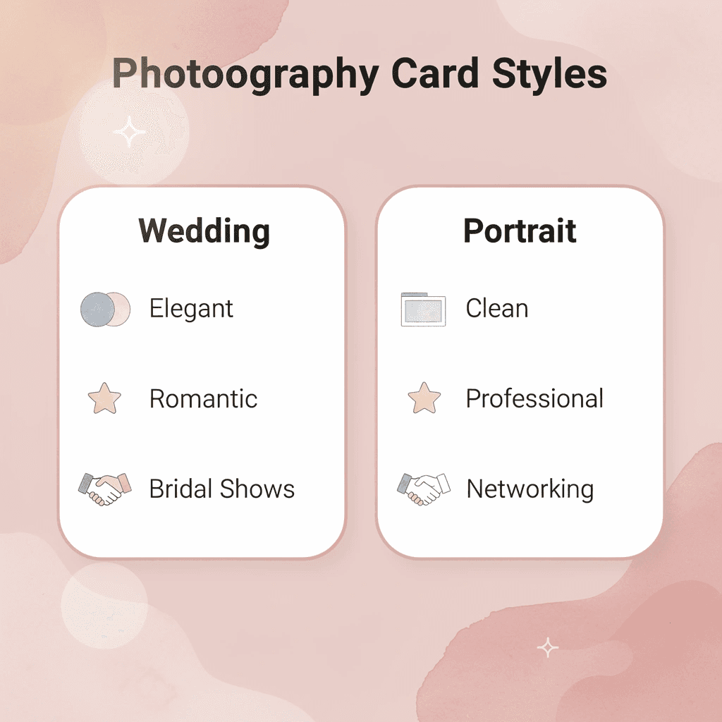
Photography Type, Recommended Style & Best Venues
- Wedding Photography
- Recommended style: Elegant, romantic fonts with soft colors
- Best venues: Bridal shows, venue consultations
- Portrait Photography
- Recommended style: Clean, professional, with a personal touch
- Best venues: Networking events, studio visits
- Commercial Photography
- Recommended style: Bold, modern, strong typography
- Best venues: Business mixers, corporate meetings
🎯 Key Point: Your business card style should instantly communicate your photography specialty and target market - a mismatch here costs you potential clients before they even see your portfolio.
"73% of consumers form their first impression of a business based on visual branding elements like business cards." — Small Business Marketing Study, 2023
⚠️ Warning: Never use a generic template that could work for any photographer - your card needs to differentiate you from the competition and reflect your unique artistic vision.

How do emotional clients need different visual approaches?
Wedding photographers who work with emotional, relationship-driven clients need warmth in their cards. Soft color palettes, handwritten fonts, or subtle texture finishes signal approachability and intimacy. Corporate headshot photographers serving law firms or executive teams require the opposite: clean sans-serif typography, neutral tones, and structured layouts that communicate reliability.
When a wedding photographer hands out a stark, minimal card with cold grey tones, potential clients sense a mismatch between the card's corporate austerity and the emotional warmth they expect from someone documenting their most vulnerable day. According to UPrinting Blog, 72% of people judge a company or person by the quality of their business cards. Style mismatches erode trust before the first conversation.
What visual strategies work for creative and artistic photographers?
Portrait photographers working in art or editorial spaces benefit from bold, bright color blocks or dramatic black-and-white contrast to create pattern interruption at networking events. Fashion and commercial photographers targeting creative agencies need sleek, modern layouts with asymmetric compositions that mirror editorial design trends. Fine art photographers can differentiate their cards through textured finishes (linen, canvas) or unconventional shapes (square, rounded corners), signaling work outside conventional commercial photography.
How does event distribution affect card design requirements?
Business cards distributed at large events (wedding fairs, photography expos, corporate mixers) face different challenges than those exchanged during one-on-one studio meetings. At crowded events, your card competes with dozens of others collected in the same hour. Bold color, unique shape, or tactile finish (embossing, foil stamping) creates physical memorability that helps your card avoid the discard pile. Research from UPrinting Blog shows 88% of business cards are discarded within a week, so event cards need aggressive differentiation to survive initial sorting.
What design approach works for studio consultations versus venue placement?
Studio meetings let you make more subtle design choices because the card reinforces an existing relationship rather than creating first impressions from scratch. Minimal typography, refined color palettes, and premium paper stock work here because clients already trust your photography and are evaluating professionalism and attention to detail.
Cards left at partner venues (wedding planners, event spaces, boutique hotels) need clarity over creativity. These cards are picked up by strangers weeks or months after placement, so legibility, clear specialty indication (weddings, newborns, corporate events), and simple contact paths matter more than artistic expression.
Why do photographers often choose the wrong design strategy?
Most photographers design cards based on personal preference rather than business needs. They choose fonts they like, colors that feel "on brand" without considering what that brand promises to their target clients, or finishes that seem fancy without weighing whether their actual clients prioritize tactile experience or clear, easy-to-read information.
The card that works for a fine art photographer selling limited edition prints to gallery collectors (unusual materials, artistic layouts, minimal contact information) can hurt a wedding photographer who needs nervous couples to quickly understand their specialization and feel comfortable reaching out.
How does over-design affect different client types?
Too much design reduces clarity for photographers serving risk-averse corporate clients. When a commercial photographer uses experimental typography, bright color gradients, or abstract imagery on their card, corporate decision-makers (HR directors, marketing managers, executives) interpret that visual complexity as unpredictability. These clients need photographers who follow briefs precisely, deliver on deadlines, and integrate smoothly into corporate workflows. A chaotic card design signals the opposite, regardless of the photographer's actual work process.
Too little design creates the inverse problem for creative freelancers competing in saturated markets. A minimal white card with plain black text might signal sophistication to some audiences, but for photographers targeting brides, families, or creative agencies who expect visual storytelling, that minimalism reads as generic or uninspired.
Why does context matter for card design choices?
The mismatch between card personality and the client acquisition context is most evident at networking events. Photographers using delicate, understated cards at loud, crowded expos watch their cards disappear into piles of visually louder competitors. Photographers using aggressive, bold designs at intimate studio consultations create cognitive dissonance: the card's energy level doesn't match the quiet, trust-building conversation happening in person.
Once you define your photography specialty, identify the personality traits your ideal clients value (warmth, reliability, creativity, exclusivity), and map where you meet prospects, the optimal card style becomes a strategic alignment decision. However, perfect alignment between style and strategy doesn't guarantee your card gets kept. The real test is whether anyone remembers what you do three weeks later.
Turn Your Photography Business Card Into a Brand People Actually Remember
The best photography business card is one that people use. If your contact information gets lost in a drawer, how the card looks becomes less important. What matters is whether someone can reach you when they're ready to book.

🎯 Key Point: Your business card's primary job isn't to impress—it's to connect. A simple, memorable card that stays in someone's wallet beats a fancy design that gets forgotten.
"The most beautiful business card in the world is worthless if it doesn't help potential clients find you when they're ready to hire." — Photography Business Fundamentals
💡 Tip: Focus on clear contact details, your photography specialty, and one memorable element that makes you stand out. Skip the complex designs that sacrifice readability for aesthetics.
Can someone immediately tell what type of photographer you are?
This question matters more than any design choice. When someone looks at your card three weeks after meeting you, they shouldn't need to recall your conversation to remember whether you take corporate headshots or family portraits. Your specialty should be clear in seconds. If it requires mental effort to understand what you do, most people won't bother.
Is your contact information structured for fast recall and easy follow-up?
Most photographers lose potential clients not because their work isn't strong enough, but because following up requires too many steps. People book when momentum is high, usually within days of an event or referral. If your card forces someone to manually type a long email address or search for your Instagram handle in a decorative font, you've added friction when speed matters most. That hesitation often becomes inertia.
Does the design reinforce trust, or is it just an aesthetic preference?
Photography clients hire based on emotional confidence, not portfolio strength alone. Your card signals whether you're organized, responsive, and professional—or whether you prioritize style over systems. A beautifully designed card that lacks clear contact hierarchy or updated information reflects how you run your business. Trust builds through consistency, and your card is often the first tangible proof of that.
Digital business cards solve a core friction point for photographers: keeping contact information up to date and enabling instant follow-up. Platforms like Mobilo let you update details in real time while prospects tap or scan to save everything directly to their phone. You also see exactly who engaged with your card and when, turning handoffs into trackable lead opportunities. Being remembered in photography is about being clearly understood when someone meets you and making it effortless for them to reach you when ready to move forward.
Related Reading
- Unique Business Card Ideas
- Artist Business Cards Examples
- Best Real Estate Business Cards
- Electrician Business Card Ideas
- How To Put Social Media on a Business Card
- HVAC Business Cards Examples
- Plumbing Business Cards Examples
- Therapist Business Cards Examples


