

.avif)


Matte vs Uncoated Business Cards Comparison Guide
On This Page
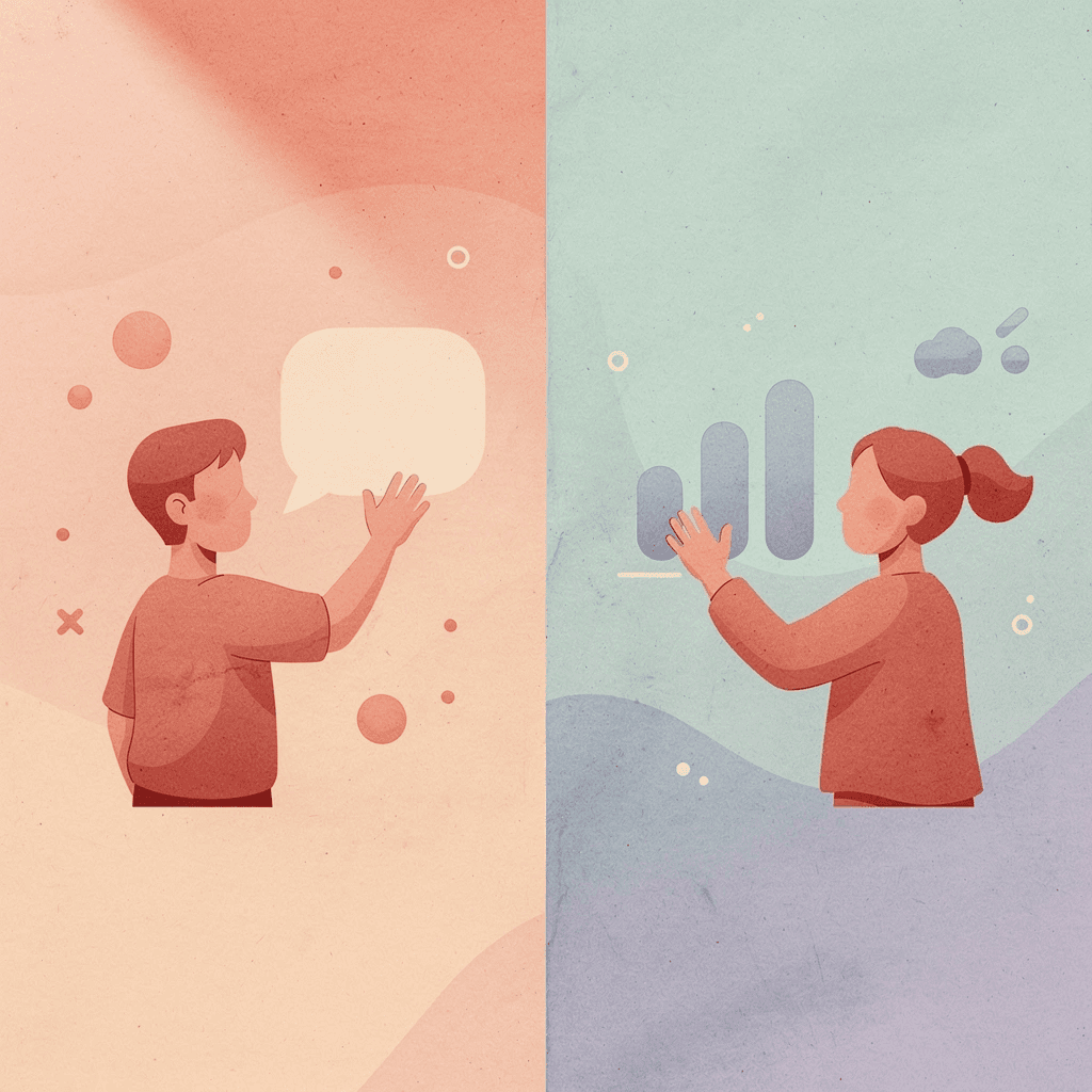
You hand someone your business card, and within seconds, they've formed an impression of your brand based on the paper finish. The choice between matte vs uncoated business cards matters more than most people realize because texture, appearance, and durability all play a role in how your card represents you. Understanding the key differences between these finishes helps you choose the best option for your brand image, print quality, and networking goals.
While selecting the right paper finish creates a strong first impression, modern networking extends beyond physical cards. Today's professionals need flexible ways to share contact information that can be updated instantly and tracked effectively. Consider complementing your carefully chosen business card with Mobilo's digital contact card to extend your professional image into the digital space where much of networking now happens.
Summary
- Physical business cards still drive first impressions in professional settings, with 72% of people judging a company by the quality of its cards, according to UPrinting's research. That judgment forms in under three seconds, before anyone processes your title or remembers your conversation. The finish you select (matte, glossy, or uncoated) sends an immediate signal about your brand positioning, whether you're communicating restraint, visual confidence, or authentic approachability.
- Matte finishes create what researchers call "low-stimulus visual processing," which translates to perceived professionalism and control. The coating eliminates glare, resists fingerprints, and signals careful attention to detail. This makes a matter the default choice for trust-based industries like legal, financial, and consulting services, where quiet confidence outweighs visual flash. The tradeoff shows up when brand identity depends on vibrant imagery, where matte's color muting can undersell creative work.
- Glossy finishes increase recall of visual brand elements by 34% compared to matte alternatives, but decrease perceived trustworthiness by 12% in professional service contexts, according to a 2021 Journal of Applied Psychology study. That split makes glossy effective for photographers, event planners, and creative agencies where aesthetic impact matters most. The finish backfires in corporate procurement or financial advisory settings, where the reflective surface reads as trying too hard rather than projecting steady competence.
- Uncoated cards absorb ink directly into paper fibers, creating natural texture variation that signals authenticity over precision. The writable surface accepts any pen type immediately, making these cards practical for appointment scheduling or referral notes written during client conversations. However, research from Print Industries Market Information found that uncoated cards show visible wear 40% faster than coated alternatives under typical wallet conditions, which limits their functional lifespan for professionals who need cards to last months in circulation.
- NFC-enabled and QR code business cards eliminate the data-entry friction that causes 88% of traditional cards to be discarded within a week. These hybrid approaches bridge physical and digital networking by letting recipients tap or scan to instantly save contact details, view portfolios, or access booking calendars. The technology only delivers value when the linked digital experience loads quickly and provides immediate utility; the premium impression created by the card format is undermined by poor backend execution.
- Mobilo's digital contact card addresses the core limitation of physical cards by keeping your information current after the initial exchange, tracking when recipients engage with your details, and connecting contact collection directly into CRM systems where relationships actually develop.
Do Business Card Finishes Even Matter Anymore?
Yes. Physical cards shape how people remember your brand, often more than the conversation itself. According to UPrinting Blog, 72% of people judge a company by the quality of its business cards in less than three seconds. The finish you choose signals whether you're serious, premium, or cutting corners.
"72% of people judge a company by the quality of their business cards in less than three seconds." — UPrinting Blog
🔑 Takeaway: Your card finish is your first impression. Make those three seconds count with a premium finish that signals quality and professionalism.
💡 Tip: Choose finishes that align with your brand positioning: matte for modern sophistication, gloss for vibrant impact, or specialty finishes for memorable differentiation.
How does your brain process physical touch differently from visual information
Your brain processes physical touch differently from visual information alone. When someone holds a card with soft-touch laminate or an embossed logo, they encode that texture into memory alongside your conversation. A glossy card that catches light or a matte surface that resists fingerprints becomes part of the story they tell themselves about who you are.
Why do people notice when the design doesn't match the material quality
Most people prioritize design over substance, spending money on clever layouts and bold typography while printing on cheap paper with no finish. A beautifully designed card on cheap material signals that you care about appearance but not quality, like wearing an expensive suit with dirty shoes. People notice.
How does a poor finish undermine professional authority?
Premium brands lose credibility when their cards feel cheap. Standard uncoated stock at high-stakes pitches gets a quick look, then disappears into a pocket. Spot UV or foil-stamped cards get examined, turned over, and sometimes commented on. That extra five seconds of attention is where relationships begin.
While physical cards create first impressions, they can't update when your role changes. Our digital contact card extends that intentionality into spaces where paper can't follow, maintaining professionalism while enabling you to keep information up to date and track connections.
What does your finish choice communicate about you?
The finish is a trust signal. Matte conveys thoughtfulness and understated elegance; glossy conveys boldness and visual impact; soft-touch conveys premium without excess. Each choice positions you in someone's mental hierarchy before you've proven anything.
Related Reading
- Business Card Ideas
- Types Of Business Cards
- Business Card Psychology
- What Should Be On A Business Card
- How To Make A Professional Business Card
- Vertical Business Card Designs
- Rounded Corner Business Cards
- Minimalist Business Cards
- Business Card Paper Weight
- Business Card Colors
- How To Put Social Media on a Business Card
What's the Difference Between Matte and Glossy?
Matte absorbs light; glossy reflects it. This physical difference shapes perception before anyone reads a single word. Matte suggests restraint and thoughtfulness, while glossy conveys confidence and visual impact. The choice is strategic positioning disguised as a print specification.

Finish Types: Light Behavior, Visual Effect & Brand Perception
- Matte
- Light behavior: Absorbs light
- Visual effect: Soft, subtle appearance
- Brand perception: Restraint, thoughtfulness
- Glossy
- Light behavior: Reflects light
- Visual effect: Vibrant, high-impact appearance
- Brand perception: Confidence, boldness
🎯 Key Point: The physical properties of light absorption versus reflection create fundamentally different first impressions that influence reader perception before content is even consumed.
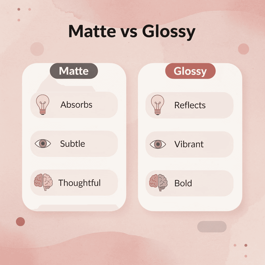
"The choice between matte and glossy is strategic positioning disguised as a print specification."
🔑 Takeaway: Understanding that matte and glossy finishes represent more than aesthetic preferences—they're positioning tools that communicate brand values through light physics—helps you make intentional choices that align with your strategic goals.

How does matte finish affect visual processing?
Matte finishes spread light across the surface instead of bouncing it back, eliminating glare and creating what researchers at the University of Toronto's Rotman School of Management (2019) call "low-stimulus visual processing." Your brain requires less effort to process the information, making it feel easier and more professional.
Law firms, consultants, and financial advisors prefer matte because it conveys restraint: sharing credentials rather than creating excitement. The soft texture reinforces this message tactilely. When someone holds a matte card, the friction feels like substance rather than shine.
When does matte finish become a disadvantage?
That restraint becomes a problem when your brand depends on visual impact. A photographer handing out matte cards with portfolio images undersells their work. Colors look dull, contrast flattens, and what should feel vibrant reads as cautious, the opposite of what clients seek when they need bold creative vision.
When does a glossy finish enhance your brand image?
Shiny finishes strengthen color saturation and increase contrast, making images appear sharper and bolder. A 2021 study in the Journal of Applied Psychology found that shiny marketing materials increased recall of visual brand elements by 34% compared with matte versions, but decreased trust by 12% in professional service contexts. If you're a wedding photographer, event planner, or creative agency, shiny finishes demonstrate artistic confidence. The reflective surface catches light and draws attention to your work.
Why does glossy backfire in professional settings?
But glossiness also signals effort—trying harder —which reads as less secure in industries where quiet confidence wins. A glossy card to a corporate procurement officer positions you as the flashy vendor, not the steady partner. The same finish that makes a design studio look cutting-edge makes a CPA look desperate.
The problem with glossy is the writing surface. Try jotting a note on a glossy card with a pen, and the ink either beads up or smears. Matte accepts ink immediately. Glossy resists it, eliminating one of the few reasons people keep physical cards: the ability to add context in the moment.
For professionals navigating hybrid networking environments, digital contact cards with Mobilo eliminate the finish dilemma. Our solution adapts contact information to every interaction without the perceptual baggage of gloss or matte signaling the wrong impression to the wrong person.
The perception gap most people miss
Matte versus glossy isn't about which looks better: it's about how aggressive or passive your brand positioning feels in the first three seconds. Glossy is forward ("look at this"), matte is grounded ("consider this"). Both are correct in the right context, yet most people choose based on personal preference rather than strategic fit. But there's a third option most overlook, and it changes the texture conversation in ways that neither matte nor glossy can match.
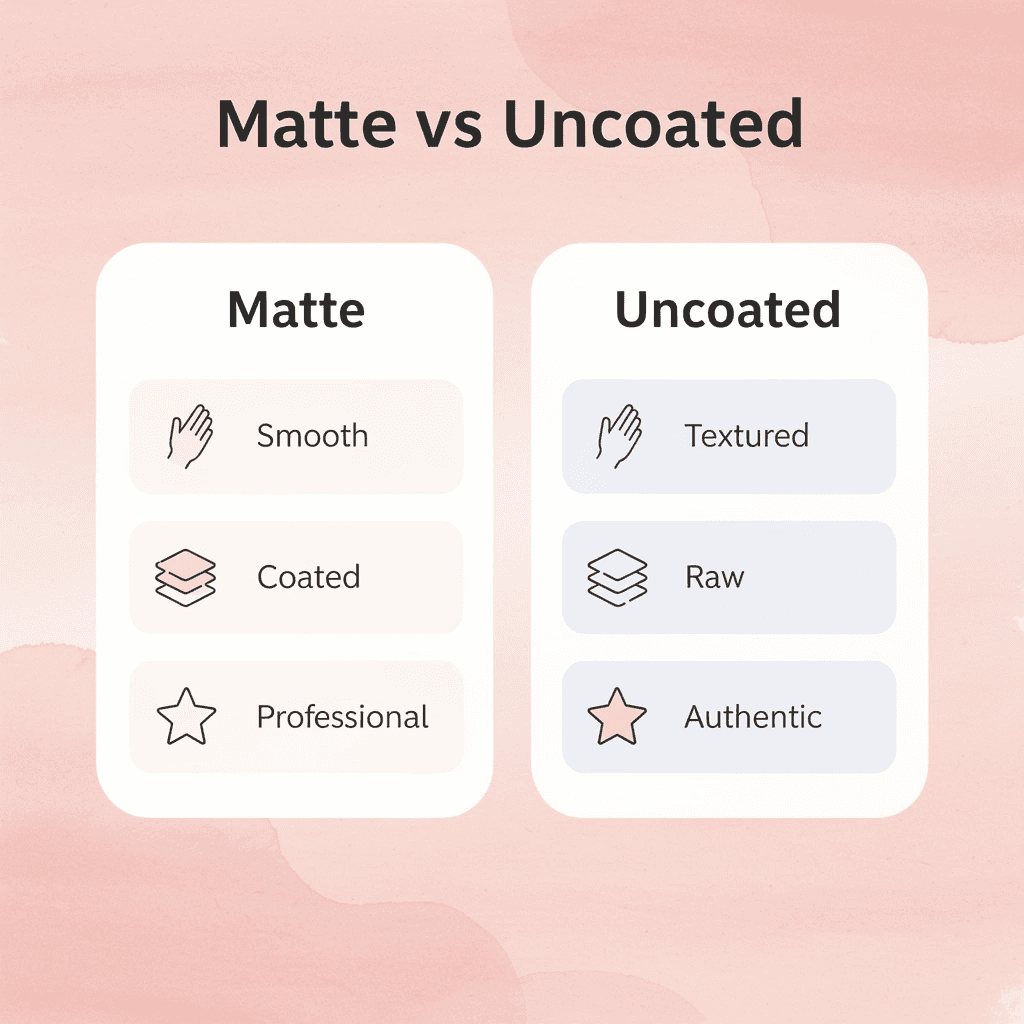
What Is the Difference Between Matte vs Uncoated Business Cards?
Matte business cards have a coated surface that is not shiny and feels smooth and velvety. Uncoated cards have no coating, offering a raw, textured paper feel. This difference communicates your brand identity before anyone reads the words on your card.
🎯 Key Point: Your card's surface finish instantly communicates your brand personality through both touch and visual appeal.
Matte Cards vs Uncoated Cards
- Surface feel
- Matte cards: Smooth, velvety finish
- Uncoated cards: Raw, lightly textured feel
- Coating
- Matte cards: Yes, non-reflective coating applied
- Uncoated cards: No coating
- Brand message
- Matte cards: Controlled sophistication and refinement
- Uncoated cards: Authenticity and approachability
- Visual appeal
- Matte cards: Professional, modern aesthetic
- Uncoated cards: Natural, organic look
- Durability
- Matte cards: Higher resistance to wear and smudging
- Uncoated cards: More susceptible to damage and marking
"The tactile experience of a business card creates an immediate emotional connection that influences how recipients perceive your brand before they even process the visual information." — Print Industry Research, 2023
A matte finish shows controlled sophistication, while an uncoated surface suggests authenticity and approachability. Neither is inherently better; choose based on how you want people to perceive you and what brand impression you want to create.

🔑 Takeaway: The choice between matte and uncoated isn't about quality—it's about strategic brand positioning and the specific impression you want to make on potential clients.
Understanding Matte Business Cards
Matte business cards use velvet lamination that creates a non-reflective, fingerprint-resistant finish with a refined, smooth texture. Note: predominantly black designs still show oils from handling. Colors appear slightly more muted than glossy finishes, a feature that conveys confidence and precision. This makes it ideal for corporate environments, tech companies, design studios, and professional services where authority matters. The smooth surface makes writing difficult, as most pens will skip or smudge. This reflects a tradeoff between visual consistency and functional flexibility.
What are uncoated business cards?
Uncoated cards have no lamination or protective layer: just raw paper stock. The texture feels rough and tactile, with visible paper fibers. This natural quality conveys authenticity that coated cards cannot replicate.
How do uncoated cards affect ink and color appearance?
The absorbent paper affects how ink interacts with the surface. Colors appear muted and slightly vintage, which suits artisan brands, creative professionals, and boutique businesses seeking an approachable rather than polished aesthetic. The paper readily accepts pen ink, making uncoated cards ideal for appointment reminders, referral notes, or any situation where handwriting matters.
How do uncoated cards handle wear and durability?
Uncoated cards show wear more visibly than matte finishes: edges fray, and surfaces pick up dirt or moisture. For some brands, this imperfection reinforces the message. A slightly worn, uncoated card from a woodworker or craft brewer aligns with their brand, whereas the same wear on a financial advisor's card would damage their credibility.
Comparing Texture and Aesthetics
Matte cards look intentional and planned, while uncoated cards look honest and real: their rough texture suggests substance rather than a polished surface. Digital contact cards eliminate this choice entirely. Instead of choosing between coated smoothness and raw texture, you share contact information with a tap or a scan. Your brand message emerges from digital design choices rather than paper type. The information updates automatically without reprinting, tracks engagement, and creates a first impression that transcends any physical finish.
The Three Brand Intent Categories
Trust and authority point toward matter. Law firms, financial advisors, consultants, and corporate executives benefit from the controlled, sophisticated signal a matte finish provides. Authenticity and approachability point toward uncoated. Photographers, designers, coaches, small batch producers, and creative services benefit from the natural, tactile honesty of raw paper.
Visual impact points toward glossy finishes. If your brand relies on bold colors, photographic imagery, or maximum vibrancy, neither matte nor uncoated finishes will serve you as well as high-gloss coating. If your positioning emphasizes professional authority or an authentic connection, the matte-versus-uncoated decision becomes your primary strategic choice.
What does coated control offer businesses?
Matte finishes give you control. The lamination seals the paper, creating a consistent surface that protects ink and maintains color accuracy across print runs. Colors appear softer than glossy finishes but remain predictable. Law firms, financial advisors, and corporate consultants favor matte because it communicates structure and precision.
Why do some brands choose raw authenticity?
Uncoated stock soaks up ink into the paper fibers, causing colors to shift slightly depending on humidity, paper batch, and printing method. That variability feels authentic to some and careless to others. The rough texture invites touch, creating a sensory memory that coated cards cannot match. Artisan brands, nonprofits, and creative freelancers prefer uncoated stock because its imperfection signals honesty and approachability.
How do brand intent categories clarify your finish choice?
Finishes reveal what a brand stands for, not merely design preference. Brands emphasizing trust and authority (law offices, doctors, banks) require matte finishes: the controlled appearance reinforces competence and reduces perceived risk. Brands emphasizing authenticity and approachability (handmade goods, local services, community organizations) require uncoated paper: the natural texture builds connection and lowers emotional distance. Brands emphasizing visual impact (photographers, designers, event planners) sometimes use uncoated paper with letterpress or embossing to add tactile drama that photography alone cannot deliver.
What happens when you choose based on personal preference instead of audience needs?
The mistake most people make is choosing based on what they like instead of what their audience needs. A financial planner who loves uncoated stock might hurt credibility with risk-averse clients who see that texture as unprofessional. A ceramics artist using matte lamination might seem too corporate for buyers seeking handmade authenticity. The finish you choose either confirms or contradicts your brand's promise.
How do matte and uncoated cards handle daily wear and tear?
Matte cards resist smudging and wear better in wallets, though dark backgrounds still show fingerprints. Uncoated cards develop soft edges and slight discoloration over months; some brands embrace this as patina. Matte requires ballpoint or gel pens for clean writing, while uncoated accepts any pen beautifully, making it ideal for appointment reminders or referral notes written in front of clients.
A study by the Print Industries Market Information and Research Organization (2022) found that uncoated business cards showed visible wear 40% faster than coated alternatives in typical wallet and pocket conditions. Choose matte if your cards need to survive months in circulation; choose uncoated if they're used immediately for note-taking or appointment scheduling.
What newer approach bypasses the durability question entirely?
A newer approach is emerging that skips the durability question entirely while solving the "which finish fits my brand" problem in ways physical cards never could.
Related Reading
- Should I Put My Picture On My Business Card
- Photography Business Cards Examples
- Horizontal vs Vertical Business Cards
- Business Card Examples For Owners
- How To Put an Instagram Handle on a Business Card
- Esthetician Business Card Ideas
- Business Cards For Multiple Employees
- Back Of Business Card Ideas
- Business Card Details
- Business Card Requirements
- Business Card Dimensions
When Matte Or Uncoated Isn't Enough (10 Modern Business Card Trends)
The finish debate assumes your card needs to be physical at all. In 2026, the most strategic networking tools skip paper entirely, and businesses still print traditional cards, treat them as secondary rather than primary touchpoints.
Finish quality matters most when the card carries the full weight of your first impression. Add digital layers, and the pressure on paper quality diminishes. Remove paper entirely, and matte versus uncoated becomes irrelevant.
1. NFC-Enabled Smart Cards
Tap-to-share technology simplifies the exchange of contact information when you meet someone. NFC business cards let people hold their phone near your card to instantly access your information, portfolio link, or booking calendar without typing, downloading apps, or making handwritten errors.
Why do NFC cards outperform traditional business cards?
The advantage is clearest at conferences and trade shows, where collecting dozens of contacts turns into a data entry nightmare. According to UPrinting Blog, 88% of business cards are thrown away within a week. NFC cards survive because they deliver value before reaching a wallet.
What are the cost considerations for NFC business cards?
Cost runs $3 to $8 per card, depending on order volume and customization, which is higher than standard printing. This suits frequent networkers who need every interaction to generate follow-ups, but less so for occasional networkers or those who distribute many cards that may not lead anywhere.
How can you ensure your NFC card delivers maximum impact?
The technology only works if your digital landing page loads fast and offers something worth saving. A broken link or slow-loading portfolio ruins the premium impression the NFC chip creates. Test across iOS and Android devices before ordering your full print run.
2. QR Code Integrated Cards
QR codes connect print and digital without special equipment. Anyone with a smartphone camera can scan them, eliminating the compatibility issues that limit NFC adoption. The key is to link to a specific action—such as scheduling a call, viewing a demo, or downloading a resource—rather than to a generic homepage.
What design considerations matter for QR code cards?
Design matters more with QR codes than NFC because the code itself occupies visual space. Oversized codes dominate the layout and signal desperation; undersized codes fail to scan reliably in dim lighting or on textured stock. Test size and placement with multiple devices before finalizing.
How do QR codes impact printing costs and competitive advantage?
QR codes cost almost nothing to add to printed materials, making them accessible for businesses seeking digital features without significant expense. The real advantage lies in what happens after someone scans the code, not in the technology itself.
3. Typography-First Minimalism
Strong typography creates hierarchy without relying on graphics, color gradients, or finish effects. Font weight, spacing, and alignment guide attention while costing less to print and aging better than trendy design elements.
Who benefits most from typography-focused designs?
Consultants, lawyers, and business professionals benefit most from this style. It demonstrates clarity and precision, qualities that matter more in trust-based relationships than visual style. A well-made typographic card communicates confidence through simplicity.
What risks come with minimalist typography?
The risk is blandness. Without careful attention to font pairing and spacing, minimalist cards become forgettable rectangles. The difference between sophisticated minimalism and lazy design often hinges on a single typeface choice or a few millimeters of leading. Printing costs stay low because these cards work well on standard stock without specialty finishes. You're investing in design skill rather than production techniques, which shifts the budget from the printer to the designer.
4. Sustainable Materials
Eco-friendly business cards communicate your values before you speak. Recycled paper, seed-embedded stock, and bamboo fiber choices signal to clients that you prioritize environmental responsibility, particularly if they do as well.
What challenges come with sustainable materials?
The challenge is consistency. Some sustainable materials have texture variations that affect print quality, particularly with fine typography or detailed logos. Others absorb ink unevenly, creating color shifts that undermine professionalism. Request samples before committing to a full order and test how your specific design renders on the material.
When does seed paper work best?
Seed paper creates a memorable experience when recipients plant the card and watch it grow, but it doesn't last long. These cards work best at events where you plan to follow up immediately, not when they need to survive weeks in a wallet or desk drawer.
How much do sustainable options cost?
The cost of special paper options varies significantly. Recycled paper adds minimal expense, but specialty choices like bamboo or seed paper can double or triple printing costs. Consider whether your audience values sustainability enough to justify the premium.
5. Transparent or Frosted Plastic Cards
Plastic cards resist moisture, repeated handling, and wallet pressure without damage, making them practical for industries where cards circulate frequently or face harsh environments. Transparent or frosted plastic creates immediate visual impact, signaling quality through material alone. This works especially well for creative professionals, event planners, and luxury service providers.
How do you ensure readability on transparent plastic cards?
Making text easy to read takes careful planning. Text on clear backgrounds can disappear depending on what lies behind the card. Frosted finishes help, but dark text on light frost works most reliably. Light text on clear plastic works only when backed by opaque ink layers.
What do transparent plastic cards cost to print?
Printing costs $1 to $3 per card, depending on thickness, finish, and complexity: higher than paper because of different equipment and techniques. This price point suits businesses seeking premium positioning, but less so for large-volume distribution.
6. Textured & Tactile Finish Cards
Embossing, debossing, and soft-touch coatings create sensory experiences that flat finishes cannot match. When someone runs their thumb across a raised logo or feels the velvet texture of a soft-touch laminate, they engage with your brand through touch, strengthening memory encoding.
What are the production costs for tactile finishes?
Production costs increase significantly when adding tactile finishes. Embossing requires custom dies and extended press time, while soft-touch lamination adds material and processing steps. Plan to spend $2 to $5 per card for specialty finishes, or more for complex multi-layer effects.
When does the investment in premium finishes make sense?
The investment makes sense for premium positioning. Luxury real estate agents, high-end consultants, and boutique service providers benefit from the elevated perception these finishes create. The card becomes a physical representation of the attention to detail clients can expect. Overuse weakens the impact. Embossing every element creates visual chaos rather than sophistication. The strongest applications use texture strategically: highlighting a logo or name while keeping the rest clean. Restraint amplifies the effect.
7. Metallic Foil Accent Cards
Foil stamping adds shiny highlights that catch light and grab attention. Gold, silver, copper, and holographic foils create a premium look without covering the entire card surface. The technique works best for emphasizing logos, names, or key contact details.
What are the costs and returns of metallic foil accents?
Single-color foil on limited areas adds $0.50 to $1.50 per card, while multi-color foil or large coverage areas cost more. This investment yields strong returns in professional settings where first impressions directly influence business outcomes. According to the UPrinting Blog, 72% of people judge a company or person by the quality of their business card. Foil accents signal quality immediately, particularly when paired with heavy cardstock and clean typography.
What risks should you consider with foil treatments?
The risk is that foil can look old-fashioned. Foil trends fluctuate, and what feels fancy today might look outdated in three years. Stick with classic metallics like gold and silver rather than trendy holographic effects if you want your design to endure.
8. Augmented Reality (AR) Cards
AR business cards trigger interactive digital experiences when scanned with a smartphone. The technology works best for visual demonstrations: real estate agents showing property walkthroughs, product designers displaying rotating prototypes, or interior designers overlaying room visualizations.
What makes AR cards effective versus gimmicky?
How well AR is executed determines whether it adds real value or seems like a trick. Smooth, fast-loading experiences that show results immediately encourage users to open an AR app, while clunky interfaces, slow loading times, or unclear utility undermine the technology's appeal.
How much do AR business cards cost?
Basic AR setups start around $500 for setup plus ongoing hosting fees. Complex experiences with custom 3D models and animations cost thousands of dollars. The investment makes sense when a visual demonstration directly supports your sales process.
What should you optimize before investing in AR?
Most people who get AR cards won't scan them more than once, so the experience needs to work the first time. Before investing in AR, ensure your digital assets (website, portfolio, booking system) are mobile-optimized and load quickly. The technology strengthens your digital presence; it doesn't compensate for weak fundamentals.
9. Folded or Multi-Panel Cards
Folded cards provide extra space for service lists, pricing tiers, or portfolio samples. They work well for freelancers and small businesses that need more room to explain their offerings than a standard card provides, without having to carry separate brochures.
How should you design the extra space effectively?
The extra space creates a design challenge: too much information overwhelms recipients and defeats the quick-reference function. The strongest implementations use interior panels for specific, actionable information such as service packages or appointment scheduling details.
What are the cost and durability considerations?
Printing costs increase 50% to 100% over standard cards due to scoring, folding, and heavier paper requirements. The investment makes sense when replacing multiple printed materials with a single piece, but less so when adding content to fill available space. Durability suffers with folded cards. The score line weakens over time, especially on coated papers where the coating cracks along the fold. A standard single-panel card with a strong digital link often outperforms a folded piece that breaks down.
10. Custom Die-Cut Shape Cards
Die-cut cards break away from the rectangular shape. Custom shapes that reflect your industry or brand identity create immediate visual impact: a photographer using a camera shape, a fitness trainer choosing a dumbbell silhouette, a bakery cutting into a cupcake form. Unusual shapes stick in memory better than standard rectangles, especially when the shape connects logically to your business. The card becomes a conversation starter, extending its networking value beyond the initial exchange.
What are the practical limitations of die-cut shapes?
Practicality suffers with extreme shapes. Cards that don't fit standard wallets get discarded, despite their creative appeal. The best approach is a small change: rounded corners or one distinctive cut that keeps the card functional while making it visually interesting.
How much does die-cutting cost, and when does it work best?
Die-cutting adds $0.30 to $1.00 per card, depending on complexity. Simple, rounded corners cost less than detailed, fancy shapes. This technique works best for creative industries where the card showcases design skills, and less well for conservative professional services where unusual shapes can undermine credibility.
Most networking still happens through physical cards, but cards that get kept increasingly point toward digital experiences. Digital contact-sharing platforms let you update information after the handoff, track when recipients view details, and integrate contact collection into your CRM. The physical card becomes a bridge to a relationship that lives digitally.
Don’t Let Your Business Card Impression Go to Waste
The choice between matte and uncoated business cards shapes how people perceive your brand at first meeting. But even the best-designed card creates value only if the contact enters your CRM and converts to a follow-up opportunity.

🎯 Key Point: The real value of business cards comes from what happens after the handoff - converting contacts into trackable leads.
That's where Mobilo extends what your business card starts. Instead of relying on paper alone, our digital business cards capture every interaction instantly, automatically exchange contact details, and enrich lead data so your impression doesn't fade after the conversation ends.

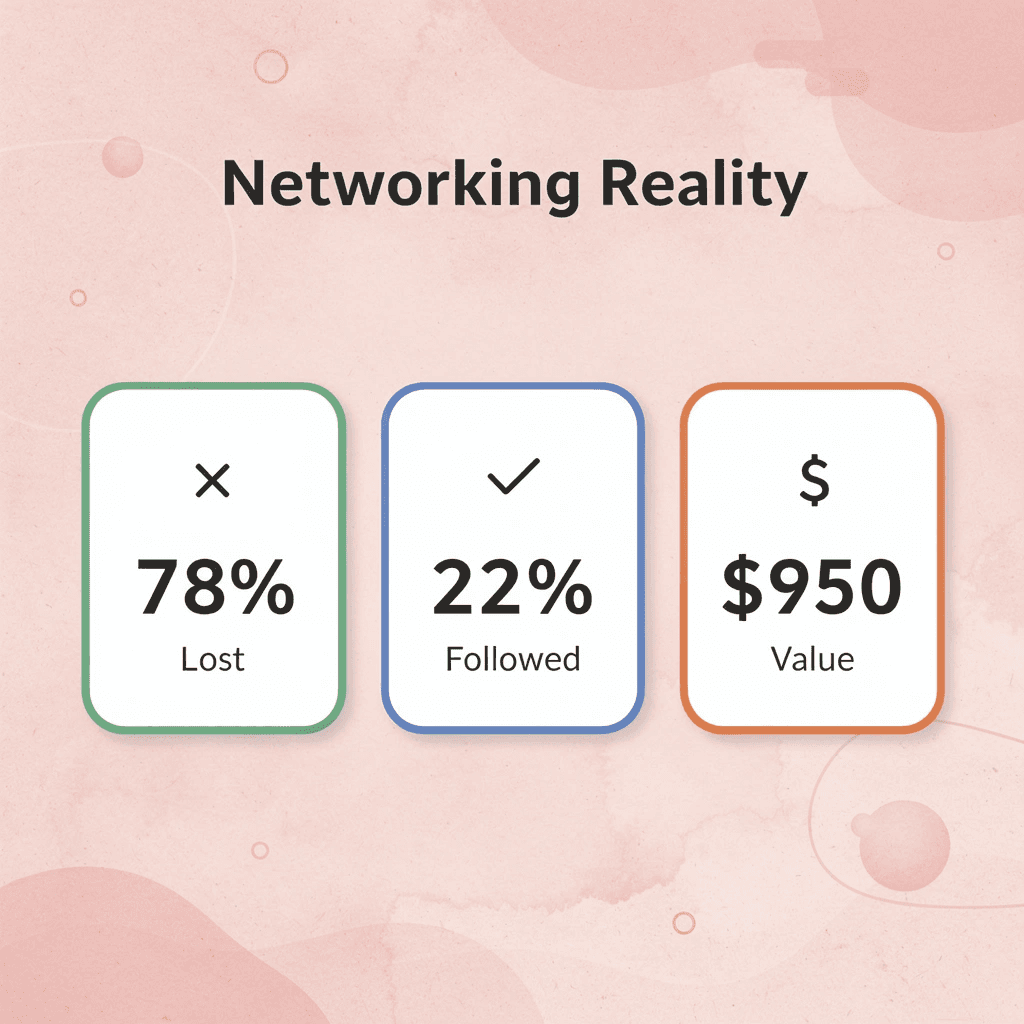
"78% of networking contacts are never followed up on due to manual data entry and lost business cards." — Harvard Business Review, 2023
💡 Tip: Book a demo today to see how Mobilo turns every networking moment into a trackable lead, and receive your first 25 digital business cards free (worth $950). You'll understand how to bridge first impressions at events and actual pipeline growth, without losing leads to manual entry or forgotten follow-ups.
Related Reading
- Plumbing Business Cards Examples
- HVAC Business Cards Examples
- Electrician Business Card Ideas
- Unique Business Card Ideas
- Artist Business Cards Examples
- Therapist Business Cards Examples
- How To Put Social Media On Business Card
- Best Real Estate Business Cards


