

.avif)

What Are the Most Important Business Card Details in 2026?
On This Page
The details printed on a business card do more than share contact information. They shape how recipients perceive a professional and determine whether a follow-up ever happens. In 2026, getting those details right means knowing which elements to include, how to present a brand clearly, and which digital features genuinely support professional networking.
A name, job title, phone number, email address, and company logo remain the foundation, but modern networking demands more than static print. QR codes, social media profiles, and website links have become standard expectations for professionals who want to stay connected after the first meeting. For those ready to move beyond the limitations of paper, a digital business card from Mobilo makes it easy to share every key detail in a single tap.
Summary
- Business cards fail far more often than most professionals realize, and the cause is rarely aesthetic. According to Wave Connect's Business Card Statistics, 88% of business cards are thrown away within a week of being received. The root issue is not poor design but a failure to communicate relevance, leaving recipients with no clear reason to follow up.
- First impressions from a business card carry more weight than many people assume. The same research found that 72% of people judge a company or person by the quality of their business card, and that judgment occurs in under three seconds. Every element on a card either builds credibility or quietly undermines it before a single conversation begins.
- Clarity of message consistently outperforms visual sophistication. A card earns its place when it answers four questions at a glance: who you are, what you do, how to reach you, and why you are worth remembering. When any one of those answers is missing or buried, the card fails its primary function regardless of how well it is designed.
- Contact details carry implicit signals about how a business operates. A domain-matched email, a clean URL without unnecessary prefixes, and social handles tied to active profiles all communicate organizational seriousness. Including contact channels that go unmonitored is worse than leaving them off entirely, because an unanswered contact point reads as disorganization.
- QR codes and NFC technology have shifted from novelty to standard expectation. QR code adoption in the United States grew by over 750% between 2018 and 2022, according to Statista, meaning scanning is now instinctive for most audiences. Pairing a QR code with a physical card extends the interaction beyond the moment of exchange and opens additional touchpoints for follow-up.
- Brand consistency across a team is harder to maintain than it appears when card production is decentralized. When a prospect receives two cards from the same company with different logos, mismatched fonts, or inconsistent contact formats, the inconsistency registers as a credibility gap even if the recipient cannot identify exactly why.
- Mobilo's digital business card addresses this by standardizing contact fields and branding across an entire team while feeding each shared contact directly into a CRM, making follow-up trackable rather than dependent on memory or manual entry.
Why Do So Many Business Cards End Up in the Trash?
You've handed out the cards, done the networking, and then silence follows. Most business cards fail not because of poor design, but because they never give recipients a clear reason to act.
"Most business cards fail not because of poor design — they fail because they never gave recipients a clear reason to act." — Core Insight
⚠️ Warning: Handing out cards without a compelling call-to-action is the #1 reason your networking efforts go cold.
💡 Tip: Every business card should answer one critical question for the recipient — "Why should I reach out?" Without that answer, even the most beautifully designed card ends up in the trash.
- Thrown away: Lacks a compelling reason for the recipient to act.
- Forgotten: Fails to provide an immediate follow-up trigger.
- Actually used: Driven by a clear, effective call-to-action.

The numbers tell a hard story
According to Wave Connect's Business Card Statistics, 88% of business cards get thrown away within a week of being received. This reveals a messaging problem: cards that fail to communicate a clear reason to call are discarded as clutter. The consequences add up fast: lost networking opportunities, missed referrals, wasted print runs, and first impressions that disappear within 48 hours. The gap between handing someone a card and getting a response isn't a distribution problem—it's a relevance problem.
Why does the belief that professional design equals results keep the cycle going?
Many people believe that a professional-looking card will be kept. This belief persists because design trends are visible and measurable, while communication effectiveness is not. You can see a beautiful card; you cannot easily tell whether it clearly conveys your value. So businesses optimize for paper stock, typography, and logo placement, producing cards that look impressive in print preview but convey little substance in real-world contexts.
What four questions does a card need to answer at a glance?
People keep business cards that answer four questions at a glance: who you are, what you do, how to reach you, and why you're worth remembering. When any of those answers is missing or hard to find, the card fails its purpose. A clear message sells, not technical superiority.
What is the hidden cost of treating a business card as a branding exercise?
Most teams treat the business card as a branding exercise rather than a contact-and-conversion tool. The hidden cost appears in leads that went cold, referrals that never materialized, and follow-ups that never occurred because recipients couldn't remember who you were or why it mattered. Teams using a digital business card approach this differently: they treat every card share as a structured data point that feeds directly into a CRM, making follow-up automatic rather than accidental. But knowing why cards fail is only the beginning of the real question.
Related Reading
- Business Card Ideas
- Matte Vs Uncoated Business Cards
- Types Of Business Cards
- Business Card Psychology
- What Should Be On A Business Card
- How to Make a Professional Business Card
- Rounded Corner Business Cards
- Minimalist Business Cards
- Business Card Paper Weight
- Business Card Colors
What Business Card Details Should You Always Include?
Every business card communicates something about how seriously you take your work. Each detail you include should have a good reason to be there — because every element is either earning its place or wasting valuable space.
💡 Tip: Before printing, audit every line on your card. If you can't explain why it's there, cut it. Intentional design signals professional credibility before you say a single word.
- Full Name & Title: Establishes identity and professional authority.
- Phone & Email: Communicates accessibility and responsiveness.
- Website/LinkedIn: Provides credibility and deeper context.
- Logo & Branding: Signals professionalism and boosts brand recognition.
- Clean Layout: Demonstrates attention to detail and organized thinking.

"72% of people judge a company or person based on the quality of their business card" — Wave Connect's Business Card Statistics
According to Wave Connect's Business Card Statistics, 72% of people judge a company or person based on the quality of their business card. That's a credibility decision made in under three seconds. Every element either strengthens that credibility or slowly weakens it — there is no neutral ground.
🔑 Takeaway: With 72% of first impressions tied directly to card quality, your business card isn't just contact info — it's a silent pitch. Weak design or missing details can cost you trust before the conversation even begins.
⚠️ Warning: Don't treat your business card as an afterthought. A poorly chosen font, missing contact details, or low-quality print can signal carelessness — undermining the professional image you've worked hard to build.
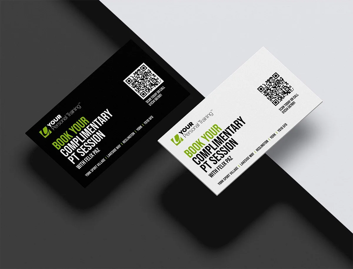
1. Logo
Your logo is the fastest signal your brand can send, working before the brain processes language. A high-resolution image of at least 300 dpi is required for print; below that, edges blur and signal carelessness. White space around a logo isn't wasted space; it's breathing room that makes everything feel intentional.
Common mistake
Forcing the logo to fill the card to signal importance. A cramped logo signals the opposite.
2. Company Name
Your company name should be the largest text on the card. Spell it out fully: "Complete Financial Solutions" tells a story, while "CFS" makes the recipient do unnecessary homework. Abbreviations create friction with strangers.
3. Tagline
If your business name doesn't immediately explain what you do, a tagline closes that gap. Stratton Design's "Website design and hosting" exemplifies this: honest, specific, and economical. A tagline isn't required, but if your name is abstract or industry-specific, three to five words can determine whether someone keeps your card or discards it. Most teams put everything they want to say on the front of a card, creating a cluttered design with no clear hierarchy. Keep the front logo, company name, and tagline. Save practical details for the back. This structure matches how people actually pay attention.
4. Full Name and Job Title
Your name creates a human connection; your title creates a memory anchor. People remember "the sustainability consultant" more easily than a name heard once. Include both, lined up so the eye moves naturally from one to the other. For client-facing roles, a headshot adds another way for people to remember you.
5. Professional Email Address
A professional email is the easiest way to follow up after an event: it's low-pressure, asynchronous, and works across time zones. A personal Gmail or outdated ISP address signals disorganization. Use an email that matches your domain; this detail carries significant weight in how prospects judge your professionalism. Many professionals list every available contact channel, assuming that more options signal accessibility. What it actually signals is an unclear communication strategy. Include only channels you monitor consistently, as an unmonitored contact detail is worse than none.
6. Phone Number
Only include a phone number if you answer it or reliably return calls. If you prefer email, make the phone number less noticeable by using a smaller font size and placing it lower on the page. These design choices signal your priorities: a number at the bottom of the page indicates it is there because it is expected, not because you want people to call.
7. Website URL
Remove the "http://" prefix entirely—it adds visual clutter without providing useful information. Ensure the URL is clean and easy to read, matching how your website actually works. If your card uses one color scheme and your website uses another, that mismatch creates a trust problem.
8. Physical Address or QR Code
A physical address belongs on your card only if foot traffic matters to your business. For digital-first operations, use that space for a QR code linking to a contact form, portfolio, or calendar. QR code adoption in the US grew over 750% between 2018 and 2022, according to Statista, making scanning a natural habit for most audiences. Pair a QR code with an NFC chip to turn your card into an interactive touchpoint that extends the conversation beyond the physical card. Digital business card platforms standardize every field across a team while allowing individual personalization, so brand consistency is built into the system rather than left to memory.
9. Social Media Handles
Only include social media handles when the platform is actively used and matters to your audience. An inactive LinkedIn profile or personal Instagram account undermines credibility. One strong, active profile outweighs four dormant handles.
Related Reading
- Should I Put My Picture On My Business Card
- Photography Business Cards Examples
- Horizontal vs Vertical Business Cards
- Business Card Examples For Owners
- How To Put an Instagram Handle on a Business Card
- Esthetician Business Card Ideas
- Photography Business Cards Examples
- Back Of Business Card Ideas
- Business Card Details
- Business Card Requirements
- Business Card Dimensions
Which Business Card Details Should You Leave Off?
More information feels like it has more value. It doesn't. A business card isn't a résumé — it's a signal. When that signal is crowded with unnecessary details, it stops working completely.
"A business card isn't a résumé — it's a signal. Crowd that signal, and it stops working completely."
⚠️ Warning: Adding more contact details, social handles, or credentials doesn't make your card look more professional — it makes it look cluttered and desperate. Less is always more.
- Multiple phone numbers: Causes confusion; makes it unclear how best to reach you.
- Every social media handle: Distracts from your primary goal and dilutes your call to action.
- Full mailing address: Wastes valuable space with outdated information.
- Fax number: Implies your business is not technologically current.
- Irrelevant job titles: Dilutes your core brand message and professional focus.
💡 Tip: Before printing, ask yourself — does every single detail on this card serve a clear, intentional purpose? If the answer is anything other than a confident yes, cut it.
🎯 Key Point: The most effective business cards don't include everything — they include only what drives the next action you want someone to take.

Why does too much information make a business card less effective?
Cognitive science calls this cognitive load. When your working memory becomes overloaded, you understand more slowly, remember less, and your brain defaults to discarding the card. A card with six contact fields, two logos, a tagline, and a certification row conveys noise rather than thoroughness. According to Wave Connect's Business Card Statistics, 72% of people judge a company or person by business card quality, which is measured by clarity of intention rather than the quantity of information.
What gets added and why it backfires
The failure point is usually good intentions meeting bad editing. Here's where that pattern shows up most often and what to do instead.
Multiple phone numbers.
People add an office line, a mobile, and sometimes a direct extension to seem accessible. What recipients experience is decision paralysis. When given three numbers, most people choose none. Pick the one line where you want to be reached. One number is an invitation. Three numbers are a puzzle.
Every social media handle you own
A LinkedIn profile with active professional content earns its place on a card. A personal Instagram, a dormant Twitter account, or a Facebook page last updated during a different career phase does not. Each irrelevant handle weakens the importance of the one that matters. If it doesn't advance a professional conversation, it goes.
Low-value certifications and credentials
A credential that directly builds trust with your audience differs from one that merely proves course completion. If your audience doesn't immediately recognise the certification, it reads as filler. A long credential string below your name reduces font size and obscures what matters: who you are and how to reach you.
Long taglines and generic slogans
"Delivering excellence since 1998" tells a recipient nothing actionable. A tagline earns its space only when it communicates a specific outcome or audience in plain language. If it doesn't pass that test, the space is more valuable empty.
Personal information and outdated contact methods
A home address on a business card is both a privacy risk and a poor professional signal. A fax number communicates the same message as a rotary phone on your desk. These details undermine credibility and raise questions about whether your other contact information is current.
How does overcrowding a card affect how others judge your business?
Most professionals print a card once and treat it as fixed, which works until the phone number changes, the title shifts, or the email domain updates after a company rebrand. At that point, the card actively misleads. A digital business card eliminates that problem: contact details update in real time, and every interaction feeds directly into a CRM without manual entry. Wave Connect reports that 39% of people choose not to do business with a company if their business card looks cheap or poorly considered. Overcrowding a card reads as poor judgment rather than thoroughness. It signals that you haven't decided what matters most. Knowing what to remove gets you to a clean card. But cleanliness alone doesn't make a card worth keeping.
How Can You Design a Business Card People Actually Keep?
A card worth keeping tells the right message to the right person at the right time — when they need to feel truly recognized. That means using what you know, not just having the information.
"A business card is not just contact information — it's a first impression that either earns a place in someone's wallet or finds its way to the trash." — Design & Branding Insight
💡 Tip: The most effective business cards combine intentional design, a clear message, and a personal touch that makes the recipient feel seen — not just sold to.
⚠️ Warning: A card loaded with every detail you own — social handles, multiple emails, fax numbers — sends the wrong signal. Less is more when it comes to keeping attention and earning a lasting impression.

Why should you start with your goal, not your design software?
The failure point is usually this: professionals open a design tool before defining what the card needs to accomplish. A card for a freelance photographer has a different hierarchy than one for a corporate attorney. The photographer needs a visual identity signal and a portfolio link; the attorney needs a name, title, firm, and direct phone number. The goal determines the details, and the details determine the design.
How do you apply the goal to your layout and typography?
Set your primary goal first—whether to prompt a call, drive a website visit, or be remembered by name and role. Then select only contact details that serve that goal. Apply the 60-30-10 rule: 60% white space, 30% text, 10% design elements. This ratio determines readability and comprehension. Build your typographic hierarchy with the name at 14-18pt, the company at 12-14pt, and the contact details at 10-12pt, using a clean sans-serif like Helvetica or Arial. Every element must serve your defined goal.
Does card orientation actually affect how you're perceived?
Card orientation is a practical decision, not a stylistic one. Horizontal cards fit in wallets without friction, while vertical cards stand out visually but rotate awkwardly during handoffs. In creative industries, vertical orientation signals intentional design sensibility. In finance or law, it can be read as unconventional in a context where convention signals reliability. Know your industry's visual norms before deciding.
Should you use a QR code or print a URL on your card?
When choosing between QR codes and printed URLs, a long URL printed at 10pt is almost never typed by a recipient. A QR code takes up less space, preserves white space, and prompts immediate action or none at all. According to Wave Connect's Business Card Statistics, 88% of business cards are thrown away within a week of being received. A QR code linking to something useful is the fastest way to convert a handshake into a next step.
What happens after the card changes hands?
Most professionals treat the card as the end of the interaction. The smarter approach treats it as the beginning of a trackable one. Teams using digital business cards alongside physical cards find that contact details feed directly into CRM workflows without manual data entry, converting a single conversation into a timestamped lead with follow-up context attached.
Before you print, answer these four questions
Print errors are permanent. Backgrounds that don't extend to the bleed line leave white borders. Text placed outside the safety line gets cut. Content in the trim area disappears. Wave Connect's research shows that 72% of people judge a company based on business card quality, and a card with a sliced-off phone number or pale, unintended border communicates carelessness before a word is read. Check your file against the bleed, safety, and trim specifications before approving anything for print.
Before printing your business cards, ask
- Can someone tell me what I do in 3 seconds?
- Is there one obvious way to contact me?
- Is every detail on this card necessary?
- Would I keep this card if someone handed it to me?
Make Every Business Card Detail Count and Turn It Into More Leads
A well-designed card can disappear into a pocket and never come back. You have no way to know if your phone number was saved, your email was used, or your name was searched, leaving every potential connection in a black hole of uncertainty.
"Every business card handed out without tracking is a lead you can't measure, follow up on, or convert." — Networking & Sales Best Practices
⚠️ Warning: If you're handing out printed business cards with no follow-up mechanism, you're losing measurable pipeline opportunities daily.
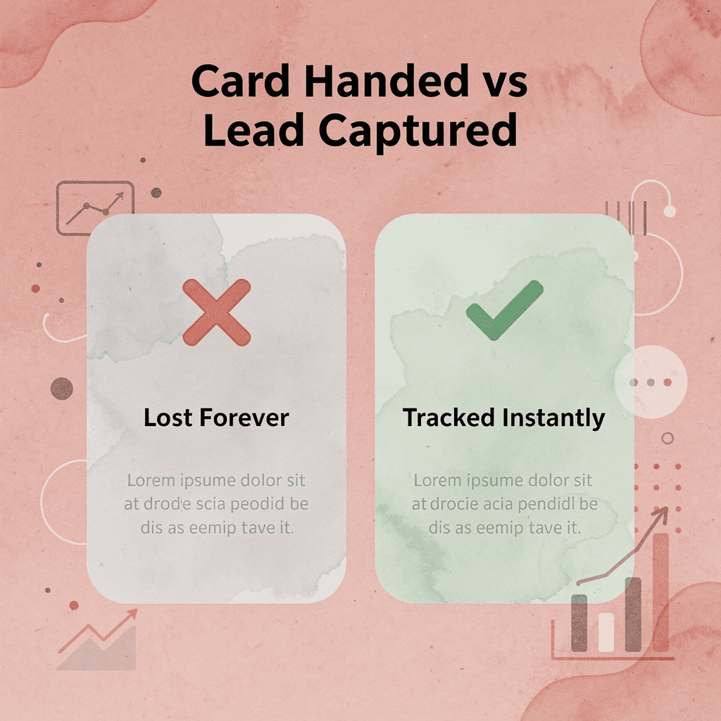
A digital business card like Mobilo closes this gap entirely. Instead of static printed contact information, every shared detail becomes a trackable interaction that feeds directly into your CRM. You'll know exactly who engaged, when, and whether the conversation continued — turning a networking moment into a measurable pipeline entry.
Traditional vs. Digital (Mobilo) Comparison
- Tracking: None vs. Full engagement analytics.
- Contact Details: Static vs. Dynamic and updatable.
- CRM Workflow: Manual entry vs. Automatic integration.
- Follow-up: Unknown status vs. Real-time interaction data.
💡 Tip: With Mobilo, every card share becomes a data point — giving your sales team the actionable intelligence they need to prioritize and close leads faster.
Book a Mobilo demo today and receive your first 25 digital business cards free — a $950 value. See how your contact details can generate leads and automate follow-up, transforming every handshake into a measurable business outcome.
🎯 Key Point: Your business card shouldn't just introduce you — it should work for you, tracking engagement and feeding your pipeline automatically.

Related Reading
- Best Real Estate Business Cards
- Electrician Business Card Ideas
- Plumbing Business Cards Examples
- HVAC Business Cards Examples
- How To Put Social Media on a Business Card
- Therapist Business Cards Examples
- Unique Business Card Ideas
- Artist Business Cards Examples


