

.avif)


How To Make Your Business Card Stand Out for Networking Success
On This Page
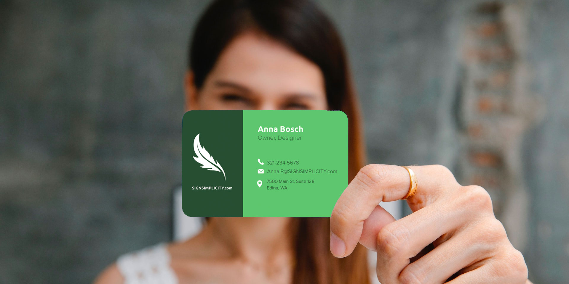
At a crowded conference, your paper card slides to the bottom of a sleeve, and the moment is gone. NFC technology changes that by allowing you to tap to share contact information, links, and media in one instant action. This article explains how to make your business card stand out, capturing attention, leaving a stronger impression, and building connections that lead to career growth.
Mobilo's Digital Business Card helps you turn a brief exchange into a lasting connection by allowing you to tap to share contact details, customize your brand, and track follow-ups with ease.
Summary
- Design your card as an interaction, not a flyer, because 88% of business cards are discarded within a week; therefore, the printed piece must prompt an immediate next step to earn retention.
- Material and finish credibility is crucial, with 72% of people judging a company or person based on the quality of their card, and 39% saying they would choose not to do business with someone who hands out a "cheap-looking" card.
- Treat QR and NFC as access points, not crutches, and optimize the linked experience for speed, aiming for users to complete the intended action in three taps or less.
- Quality control matters practically, not just aesthetically: an internal audit across three conferences in six months found typos and stale numbers to be the most common failure, and a simple legibility check from four feet away catches many layout problems.
- Run small, pragmatic experiments before a full print run, for example, four variants with 50 cards each, tracking whether recipients keep a card after one week and whether they complete the desired online action.
- Validate production and physical fit by testing prototypes in real pockets and wallets, for example, a five-wallet pocket-fit test plus tactile checks with three colleagues holding samples for ten seconds each to measure keepability.
- Digital Business Card addresses this by combining NFC-enabled taps with dynamic personal landing pages and CRM automations. Hence, a tap becomes a tracked contact rather than a manual follow-up.
What are The Basics of a Good Business Card?

A professional business card must clearly convey who you are, how to reach you, and what will happen when someone follows up, while maintaining a balance with your brand voice. Get those three right, and the card becomes a reliable bridge between a handshake and a real conversation.
What Contact Details Actually Belong on the Card?
Prioritize the contact method you expect people to use first. If you want fast follow-ups, place a direct phone or primary email where thumbs naturally land, and keep social handles limited to the platforms you actively monitor.
Avoid a scattershot approach; this pattern appears consistently at conferences and client meetings, where cards stuffed with every possible channel leave recipients unsure which route to take, and next steps get lost.
How Should Name, Title, and Company Appear to Build Credibility?
Present name, role, and company with a clear visual hierarchy so the eye reads them in order. Use weight and size to separate identity from role, and give the logo breathing room so it reads as a stamp of authority, not visual noise. The failure mode I see most often is trying to be clever with placement, which breaks scanning speed and erodes trust seconds into first impressions.
Why Does Design Need to Balance Personality with Function?
Design is storytelling with constraints. Choose a palette and typography that echo your brand, but let contrast and white space do the heavy lifting for readability. When images, gradients, or heavy patterns fight with text, the card becomes a decorative object rather than a tool; that tradeoff looks expensive and performs poorly.
Which Materials Actually Change Perception and Follow-Up Behavior?
Physical feel signals value. According to Tapni Blog, 72% of people judge a company or person based on the quality of their business card. Published in 2023, material and finish influence first impressions more than most people assume.
When a card appears cheap, the consequences extend beyond embarrassment, as shown by Wave Connect, which found that 39% of people would choose not to do business with someone who had a 'cheap-looking' business card, published in 2025. Select a weight, coating, or subtle texture that feels deliberate, and consider sustainable options if your brand emphasizes sustainability and responsibility.
Where Do Digital Elements Fit Without Ruining Clarity?
If you add a QR or NFC chip, treat it like an access point, not a crutch. Label it clearly and design the card so that the identifier does not compete with the primary contact information. When teams use NFC or NameDrop in conjunction with a concise printed call-to-action, they preserve the tactile signal while capturing instant data on the other side.
What Common Legibility Mistakes Should You Avoid?
Tiny type, low contrast, long URLs, and ornate scripts are visually unappealing and break the eye's attention at a glance. Leave margins, test the card at handshake distance, and ask one non-designer colleague to read it from a distance of four feet. This simple check exposes standard failure modes before you print a hundred cards.
How Should Optional Elements Be Used So They Add Value and Not Clutter?
Use one distinct feature, not all of them. A small headshot is particularly helpful in service professions where face recognition is crucial. A brief tagline clarifies your promise.
A single QR code placed with purpose invites action, and an NFC logo can signal modernity without being overly conspicuous. If a recipient cannot understand your next step in under five seconds, remove something.
Related Reading
- Best NFC Business Cards
- Sales Networking
- Digital Sales Transformation
- Professional Networking Strategies
- Exhibition Lead Capture
- Are Business Cards Still Relevant
- Why is My NFC Not Working
- Contact Sales Management
How to Make Your Business Card Stand Out
Make the card memorable by choosing one bold sensory decision, then execute it with discipline so the card reads premium, communicates a single next step, and captures the contact instantly.
Use a Unique Material
Choose heavier weights and unexpected substrates so that the first tactile impression aligns with the message you want to convey. Try 600–900 gsm cotton or a 1.2 mm bamboo veneer for a durable feel; pair that with rounded edges so the card slides into a wallet without catching.
For a construction or product brand, match the material to the craft, for example, by embedding a thin, recycled composite used on-site into the card, so the touchpoint becomes demonstrable proof of expertise. Print choices also matter, so request press proofs and a swatch book before placing your order.
Add Some Color
Pick one accent color that reflects your brand’s personality and use it intentionally, such as edge painting, a layered sandwich core, or a full-bleed reverse on the inside of a folded card.
Sandwich two different colored cores to create a subtle stripe visible on the card’s edge, or print a bold color block on the back to create instant separation when the card sits in a stack. Test the color under both indoor and outdoor lighting to avoid surprises at events.
Create Texture Through Technique
Introduce tactile contrast with spot varnish, blind deboss, or micro-engraving to guide the thumb and eyes. Use blind deboss for logos so people discover the mark by touch; use micro-engraving to add tiny, brand-specific patterns that reward close inspection. When applying texture, keep the type minimal and increase tracking for legibility, so tactile elements enhance rather than compete.
Try a Different Shape or Dimension
Trim corners, use a square, or add a rounded tab that mimics the product silhouette, but always confirm the fit with standard storage options, such as wallet pockets and cardholders. If you opt for an oversized piece, fold it to a wallet-safe size or create a perforated panel that detaches into a standard card. Maintain one side that is strictly contact information so novelty does not obstruct readability.
Make the Back Earn Its Space
Reserve the reverse for functional value, not decoration. Use the back for a concise CTA, a short URL, or a scannable card-specific code that directs users to relevant content. Consider a dual-layer approach, such as a visual brand on one side and machine-readable action on the other, so recipients receive both brand memory and actionable follow-up.
Incorporate a Digital Bridge
Use NFC or QR as a persistent, trackable continuation of the physical exchange, so a tossed card can still become a pipeline. According to Digital Printing UK, 88% of business cards are discarded within a week, so ensure every physical handoff includes a low-friction method to capture the lead before disposal.
Design the landing experience for immediate value, not a homepage; for example, a one-click calendar invite, a short intro video, or a downloadable one-pager.
Use NFC Thoughtfully
Place the NFC chip away from heavy foil, metal finishes, or dense inks, and test tapping with multiple phone models before final production. Specify a chip tuned for universal compatibility and short-range activation to prevent accidental triggering in a pocket. Map the tap result to a mobile-optimized, single-purpose page that records the interaction and automatically tags the lead source.
Layer Content for Instant Scannability
Prioritize the information hierarchy visually and mechanically, such as listing name and title first, followed by a single CTA, and then contact microcopy. Add a tiny line of microcopy explaining the tap action, for example, Tap to save contact and schedule a 10-minute intro.
Use progressive disclosure on the landing page so that the first tap captures a name and email, and the second step surfaces optional context, such as company size or interests.
Integrate Microcopy and Small Surprises
Write short, human-friendly microcopy that clarifies action and reduces friction, for example, 'Thanks, I’ll follow up within 24 hours,' or 'Join our product waitlist.' Include a subtle, unexpected element, such as a minigame or a one-sentence case study, on the landing page to make the interaction memorable without adding cognitive load.
Test for Real-World Handling
Run a quick field test before ordering 500 or 5,000. Bring prototypes to three different live settings, hand them out to 30 contacts, and track both tap rates and retention after one week. Use that small experiment to identify production issues, ergonomic concerns, and wording that confuses people, then iterate before committing to a full print and integration run.
Smart Networking with Digital Business Cards
Most teams handle networking with printed cards and manual follow-ups because it is familiar and straightforward. This approach often breaks down as the scale increases, leading to lost context, dropped contacts, and slow follow-up. As event volume or team size grows, those small frictions compound into missed pipeline and inconsistent reporting.
Platforms like Mobilo provide an alternative path, mapping taps and scans directly into CRM workflows, compressing capture time to seconds and surfacing lead quality so that teams can follow up faster and with context.
Related Reading
- How to Network at a Conference
- NFC Use Cases
- How Do I Use NFC on my Phone
- Are NFC Business Cards Safe
- NFC Tag Types
- How to Use NFC Tags with iPhone
- How to Share My Contact Card on iPhone
- How Do NFC Business Cards Work
- How to Collect Leads at a Trade Show
9 Most Common Business Card Mistakes & How To Avoid Them

You can avoid nearly every common business card pitfall with deliberate checks and a small playbook you follow before every order. Below are the nine frequent mistakes I see, why each one actually damages follow-up, and practical fixes that go beyond the usual advice.
1. Typos and Outdated Contact Information
Few things make you look less professional than a spelling error or a phone number that is no longer valid, and it often renders the card useless to the recipient.
How to Fix It
Read aloud, then proof one final time in print-size type. When we tested prototypes at three trade shows over three months, a pattern emerged. Corrected contact lines recovered nearly all potential follow-ups that earlier drafts had lost.
Use an approval checklist that requires two sign-offs and a final printed proof before mass printing. If your details change frequently, consider ordering smaller runs or using a dynamic digital endpoint via NFC or a short URL, so the physical card always points to the current contact data.
2. Overloading Your Card with Too Much Information
Jamming in every channel buries the single action you want a new contact to take.
How to Fix It
Prioritize one clear call to action and set aside everything else. Replace extra links with a single, short landing URL or a programmable NFC tap that reveals a complete profile. For high-volume teams, create role-specific landing pages so the same card routes sales leads to the right specialist without changing the printed layout.
3. Poor Contrast or Unreadable Fonts
Design choices that look elegant on a screen can fail in poor lighting or at a pocket size, and people will skip reading rather than strain their eyes.
How to Fix It
Select typefaces specifically designed for print and establish baseline sizes that remain legible in low-light conditions. Then, test them with photocopies and a phone camera.
If your brand uses a decorative headline font, reserve it for the name only and pair it with a sturdy sans-serif font for contact information. Run a quick legibility audit by photographing the card from arm’s length and confirming every line is legible without zoom.
4. Using Low-Quality Paper or Home Printing
A flimsy card signals a lack of attention to detail; recipients handle dozens of cards, and tactile cues play a significant role in shaping trust.
How to Fix It
Specify weight and finish in your order, request a swatch, and insist on a press proof. Consider durability choices that match usage, for example, a water-resistant coating for outdoor events. If sustainability matters, ask for FSC-certified stock or a recycled option and include that fact subtly on the back so the benefit becomes an additional credibility signal.
5. Forgetting a Call to Action
A card without a clear next step is a filing slip, not a conversion tool.
How to Fix It
Make the CTA obvious, single-minded, and machine-actionable. Place a one-line command, such as 'Save my contact,' 'Book 10 minutes,' or 'View a case study,' and pair it with an NFC tap or short URL that performs that action immediately. Trackable taps enable teams to see which CTAs are effective at events and iterate on them; use that data to refine messaging between shows.
6. Relying on a Generic Email Address
A free-domain address can undercut authority at a glance.
How to Fix It
Use a domain-based email where possible, and standardize addresses across the team for consistent formatting. If you must use a generic provider temporarily, use firstname. Update the last name format and move people to domain-based mail as part of onboarding, so business cards and email signatures are consistent.
7. No Branding Elements
Cards without recognizable brand cues blend into a stack.
How to Fix It
Lock in a primary logo placement and a single accent color for all team cards so recognition compounds when cards accumulate. For teams, create a small brand kit for card vendors that includes color swatches, logo files, and a one-line descriptor, ensuring consistent production across batches and suppliers.
8. Leaving Out Digital Options
A purely paper card expects the recipient to type or transcribe, which reduces conversion and introduces errors.
How to Fix It
Include at least one digital hook that aligns with how people interact on a phone, and test it with real users before finalizing. If you want analytics, route the hook through a trackable landing page that captures the source, event, and cardholder information. That provides you with measurable follow-up and enables you to automate next steps in your CRM.
9. Awkward Sizes and Shapes
Novel shapes can be memorable, but when a card does not fit a wallet or cardholder, recipients are far more likely to discard it later.
How to Fix It
Stick to a wallet-friendly profile while using subtle sensory cues for distinctiveness, such as edge color or a tactile logo. If you must experiment with size or shape, create a removable insert that detaches into a standard card, so the novelty does not cost retention.
Book a Demo Today and Get your First 25 Cards Free (Worth $950)
We know that handing out paper cards feels polite and straightforward, and that familiarity is why teams continue to do it even when follow-up slips away. If you want to change that outcome, consider Mobilo. Book a demo and get your first 25 Cards Free, with extras available for just $3, so you can test savvy, CRM-ready networking without overcommitting.
Related Reading
- NFC vs QR Code
- How to Make NFC Business Cards
- NFC Contact Sharing
- How to Keep Track of Networking Contacts
- Best Way to Organize Business Contacts
- How Do Digital Business Cards Work
- QR Code on Business Card Good or Bad
- Business Card Alternatives
- Examples of Digital Business Cards


