

.avif)

17 Best Business Card Colors for Strong First Impressions
On This Page
Business card colors play a surprisingly powerful role in that split-second judgment, influencing whether your card ends up in their wallet or the trash. The psychology of color affects how people perceive your professionalism, your industry, and your brand personality before they even read your name. Smart color choices grab attention, communicate your brand effectively, and improve networking success.
Traditional paper cards limit color choices to what fits your budget and printing capabilities. Digital alternatives offer complete freedom to experiment with color schemes that truly represent your brand. You can update your palette instantly based on what resonates with your audience, test different designs for different contexts, and ensure your brand colors appear exactly as intended on every device. Mobilo's digital business card gives you the flexibility to refine your visual identity as your understanding of color psychology deepens.
Summary
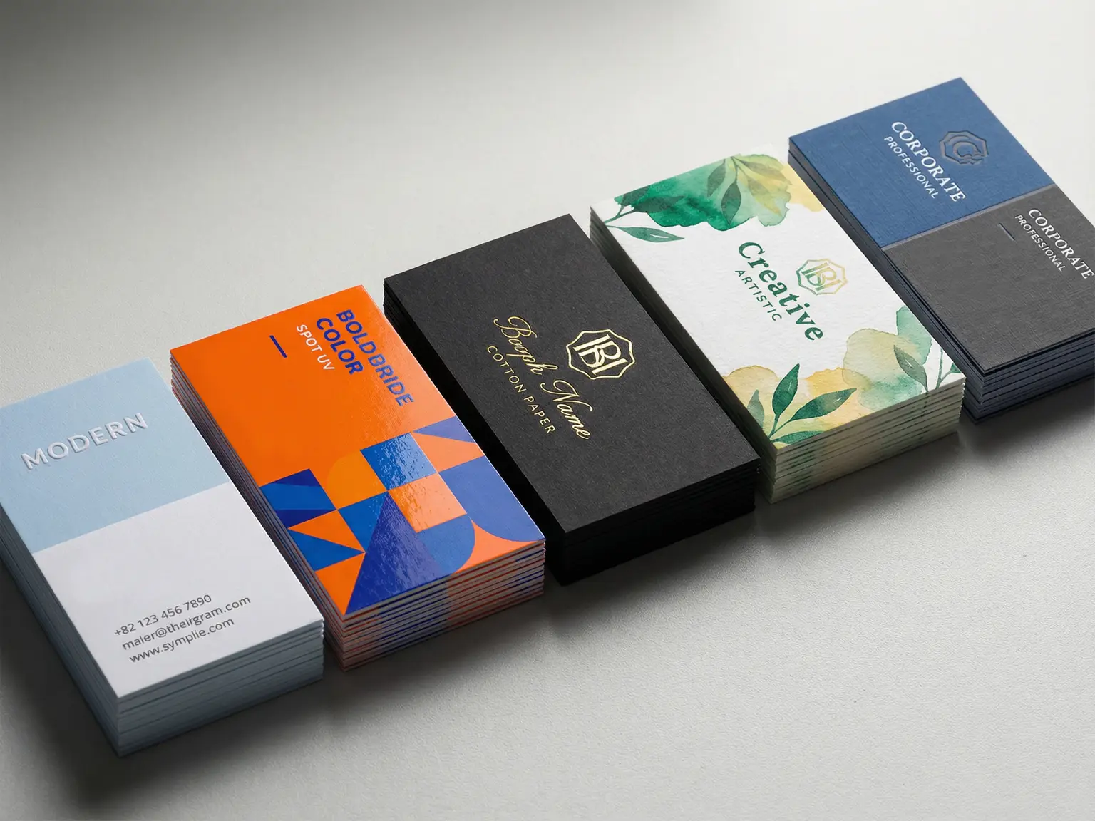
- Most business cards fail because they blend into the stack of identical rectangles professionals collect at events. According to Small Business Trends, 72% of people judge a company based on business card quality, and, per Adobe, 88% of cards get thrown away within a week. That first visual impression determines whether your contact information gets saved or discarded. The problem isn't poor printing quality. It's strategic invisibility caused by safe colors and predictable layouts that prioritize not offending anyone over being remembered.
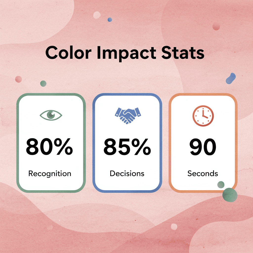
- Color increases brand recognition by up to 80%, according to business card research, and your brain processes color 60,000 times faster than text. Before someone reads your name or job title, they've already formed an emotional response to your card's color palette. Blue signals trust but risks feeling corporate. Red creates urgency but can feel aggressive in conservative industries. Gray communicates sophistication but often translates as forgettable neutrality. These aren't arbitrary associations; they're cognitive shortcuts that determine whether your card triggers recognition three days after an event or requires someone to read the text to remember who you were.
- People decide whether to keep or discard a business card within seven seconds of receiving it. That compressed timeframe includes the handshake, the exchange, and the quick glance before it goes into a pocket. Your color choice operates in that window, creating an instant emotional tag that files your card under "follow up" or "maybe later" (which usually means never). Research shows that 85% of people remember a business card with a unique color scheme, while 80% remember a color; only 20% remember black and white, making color your fastest tool for creating memory.
- The cards that survive the seven-second filter use color intentionally to reinforce specific positioning. A sustainability consultant using sage green, a creative director with bold yellow accents, or a tech founder using gradients that signal innovation all align visual identity with brand promise. These aren't decorative choices; they're strategic signals that make the card's appearance inseparable from what the person actually does. The disconnect between what you do and how your card looks creates cognitive friction, making people forget you faster than someone whose visual identity matches their expertise.
- Traditional paper cards lock you into a single color choice that may work perfectly for one context but fail in another. A financial advisor's navy blue signals appropriate professionalism at an industry conference but becomes invisible among creative entrepreneurs expecting energy and innovation. The card that builds credibility in one room undermines it in another, and most professionals never realize the cost of that mismatch because they can't track which contexts generate follow-up and which don't.
- Digital business card platforms address this by letting teams adapt their visual presentation to different networking contexts without reprinting physical inventory, switching between minimalist profiles for enterprise clients and bolder colors for startup founders based on audience expectations rather than forcing a single visual identity across every interaction.
Why Most Business Cards Fail Before They’re Even Handed Out
Most business cards fail because they're forgettable by design. They use safe colors, standard layouts, and predictable fonts that blend into identical stacks. When 72% of people judge a company by the quality of its business card, that first impression determines whether your contact information gets saved or thrown away. The problem isn't poor printing or typos—it's being intentionally invisible.
"72% of people judge a company based on the quality of their business card, making that first impression the deciding factor between connection and rejection." — UPrinting Business Card Statistics
🔑 Key Point: Your business card isn't contact information—it's a visual representation of your brand quality and attention to detail.
⚠️ Warning: Playing it safe with generic designs guarantees your card will be forgotten within seconds of being handed out.
How does your brain process color before text?
Your brain processes color 60,000 times faster than text. Before someone reads your name or job title, they've already formed an emotional response to your card's colors. Blue signals trust but risks coming across as corporate and cold. Red creates urgency but can feel aggressive in conservative industries. Gray communicates sophistication but often reads as forgettable neutrality. These associations are mental shortcuts shaped by thousands of brand interactions, cultural conditioning, and how humans naturally respond to color in nature.
Why do safe color choices fail the recall test?
Most professionals choose colors based on what feels "safe" rather than what creates memory. They pick navy blue because it won't offend anyone, not because it makes their brand stick in someone's mind three days later. This defensive design thinking produces cards that pass the professionalism test but fail the recall test. When someone flips through twenty cards after an event, yours must trigger instant recognition without requiring them to read the text to remember who you were.
How do neutral colors create a sea of sameness?
The belief that neutral colors mean professionalism has created a sea of sameness. Walk through any networking event, and you'll see the same colors repeated endlessly: navy, grey, white, and occasional burgundy. These colors signal "I belong here" but never "remember me specifically." A financial advisor who uses deep forest green instead of navy communicates stability with enough distinction to be remembered. A consultant using warm terracotta instead of grey maintains sophistication while creating visual distinction.
Why does matching your website colors hurt memorability?
Most teams choose business card colors that match their website or logo, assuming that matching colors strengthens their brand. As competition intensifies, your card becomes indistinguishable from every other company in your field using similar "industry-appropriate" colors.
The hidden cost emerges weeks later when a prospective client cannot distinguish your card from three nearly identical ones. Solutions like digital business card let you test different color schemes across situations, updating your choices based on which versions generate the most follow-up engagement without committing to a single printed design.
How quickly do people judge business cards?
Research shows people decide whether to keep a business card within seven seconds of receiving it. Your color choice works in that short timeframe, creating an instant emotional tag that determines whether your card gets filed under "follow up" or discarded. 88% of business cards are thrown away within a week, Adobe reports, and color memorability often determines which 12% survive.
How do successful cards use color strategically?
Cards that last through regular use pick color purposefully to signal differentiation. A sustainability consultant uses recycled paper in sage green. A creative director uses bold yellow to match their portfolio. A tech founder uses a gradient signaling innovation. These are strategic signals that align visual identity with brand promise, not decorative choices. Color psychology isn't about picking the "right" color for your industry—it's about selecting a color that evokes the specific emotional response your positioning requires and ensuring it appears consistently across every touchpoint where someone encounters your brand.
Related Reading
- Business Card Ideas
- Matte Vs Uncoated Business Cards
- Types Of Business Cards
- Business Card Psychology
- What Should Be On A Business Card
- Vertical Business Card Designs
- Rounded Corner Business Cards
- Minimalist Business Cards
- Business Card Paper Weight
- Business Card Colors
- How To Put Social Media on a Business Card
Why Business Card Color Is a Branding Decision, Not a Design Choice
Color shapes how people categorize you before they read a single word. The brain assigns meaning to color automatically, linking hues to concepts like stability, creativity, or precision within milliseconds.

🎯 Key Point: Your business card color communicates your brand values and professional positioning before any text is processed by the recipient's brain.
"The brain assigns meaning to color automatically, linking hues to concepts like stability, creativity, or precision within milliseconds." — Psychology Today Research
💡 Tip: Choose colors that align with your industry expectations and personal brand goals rather than simply picking what looks aesthetically pleasing.
How does color influence first impressions of your business card?
When someone glances at your card, they unconsciously decide whether you seem trustworthy, innovative, or approachable based on color alone.
Why does color choice impact professional memorability?
The color you choose tells people what kind of professional you are, what problems you solve, and whether they should remember you. According to Mobilo Card's research on business card colors, color increases brand recognition by up to 80%. Most networking interactions last under two minutes; if your card's color doesn't send the right message immediately, you've lost your chance to be memorable.
Color affects perceived authority and approachability
Different industries need different psychological positioning. A financial advisor using bright orange signals instability rather than innovation. A creative director using charcoal gray signals caution, not imagination. The disconnect between what you do and how your card looks creates cognitive friction: people won't articulate this discomfort, but they'll forget you faster than someone whose visual identity matches their expertise.
Finance demands trust and stability, so deep blues and grays work. Creative fields reward differentiation and emotional resonance, making bold purples or unexpected color pairings effective. Tech needs clarity and forward momentum, which is why clean whites with high-contrast accents dominate. Wellness requires calm and balance, steering professionals toward soft greens and earth tones.
How does emotional response affect memory encoding?
The real question isn't "what colors look good?" It's "what do I want people to feel when they see my brand?" Color creates emotional responses that directly influence memory encoding. When someone collects fifteen cards at a conference, they won't remember names or job titles. They'll remember how each person made them feel, and your card's color is part of that emotional fingerprint.
A warm terracotta signals approachability. A crisp black with metallic accents communicates luxury and exclusivity. A bright teal suggests energy and modernity. Each choice evokes a different emotional response, determining whether your card registers as "interesting" or "generic."
How can teams test color psychology in real time?
Teams using digital business cards can test color psychology in real time by tracking engagement rates after events. When one version consistently outperforms another, the color palette likely created a stronger emotional connection rather than simply presenting information more clearly.
Why is color faster than text for memory creation?
Business cards aren't about sharing information—they're about answering one question: "Will this person remember me after ten seconds?" Color is your fastest tool for creating that memory, faster than your tagline, logo, or name. The brain processes visual information 60,000 times faster than text, and color is the first visual element it categorizes.
If your card's color doesn't match your professional positioning, you're asking people's brains to work harder to understand who you are. When brains work harder, they default to forgetting. Knowing color matters is only half the equation; the harder part is choosing the right one for your specific brand positioning.
17 Best Business Card Colors for Different Brand Types
Choosing the right business card color should reinforce your brand positioning. When someone pulls your card from their pocket days later, the color should trigger the correct category in their mind before they read your name.

🎯 Key Point: Your business card color acts as a visual trigger that instantly communicates your brand category and professional positioning to potential clients.
"Color increases brand recognition by up to 80% and influences 85% of purchasing decisions within the first 90 seconds of interaction." — Institute for Color Research
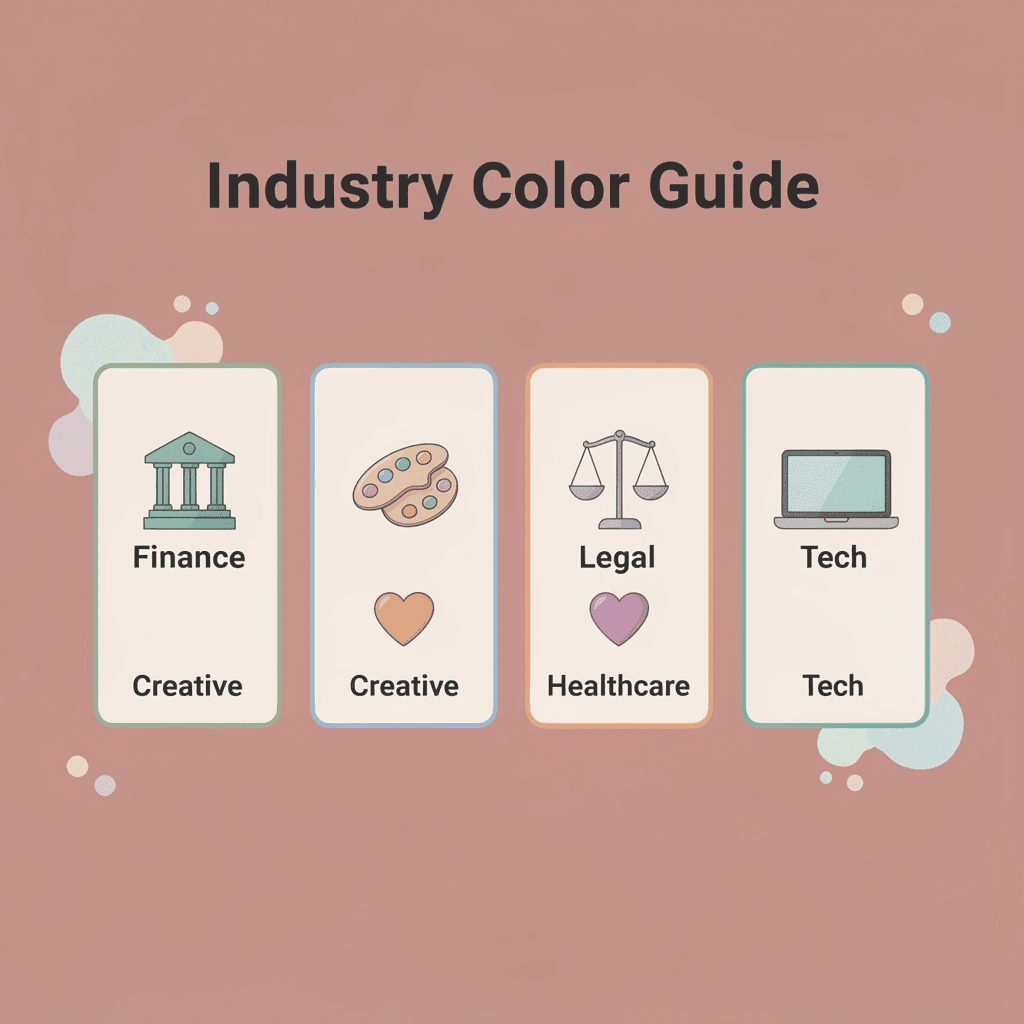
Industry Colors, Brand Messages & Positioning
- Finance / Legal
- Recommended colors: Navy, charcoal, deep blue
- Brand message: Trust, stability, professionalism
- Creative / Design
- Recommended colors: Bold colors, gradients
- Brand message: Innovation, creativity, uniqueness
- Healthcare
- Recommended colors: Clean blues, greens, white
- Brand message: Calm, healing, reliability
- Technology
- Recommended colors: Modern grays, electric blues
- Brand message: Innovation, efficiency, forward-thinking
- Luxury Services
- Recommended colors: Black, gold, deep purple
- Brand message: Exclusivity, premium quality
- Eco / Sustainable
- Recommended colors: Earth tones, greens
- Brand message: Natural, responsible, authentic
💡 Tip: Test your color choice by showing it to 5 people in your target market - they should be able to guess your industry within 3 seconds of seeing the card.
1. Blue Trust and Competence
Blue signals reliability without drama. According to research from VistaPrint, blue is the most popular color for marketing materials, likely because early humans associated blue skies with good weather and distant water sources. Use blue in finance, healthcare, consulting, or any field where trust matters more than standing out. Navy blue communicates stability; lighter blue suggests clarity and modern thinking. Skip blue if you need to stand out in a sea of corporate sameness. At a finance conference, everyone defaults to blue, making your card invisible precisely because it looks "appropriate."
2. Black Authority and Premium Positioning
Black communicates strength, sophistication, and formality. It signals premium positioning: a black business card tells recipients you operate at a different level. This works for luxury retail, high-end consulting, legal services, or any business where premium positioning matters. A corporate attorney using matte black with silver foil doesn't need to explain their rates: the card conveys that message. Black fails when your brand needs to feel approachable or energetic. Youth-focused brands, wellness coaches, and creative agencies targeting playful clients will find that black creates an unwanted sense of distance and coldness.
3. White Modern Simplicity
White represents minimalism and clarity, creating breathing room and suggesting a brand confident enough not to shout. It works across industries because it's neutral, letting other design elements—typography, subtle color accents, texture—carry the personality.
Which industries benefit most from white business cards?
Tech startups, health professionals, and upscale fashion brands use white to signal modern thinking. A product designer using thick white stock with embossed text communicates attention to detail without visual clutter.
What mistakes should you avoid with white cards?
White becomes problematic when it lacks contrast or texture. A thin white card with grey text disappears in a stack. If you choose white, invest in quality stock, thoughtful typography, or subtle finishing techniques that create tactile interest.
4. Green Nature and New Beginnings
Green is associated with environmental responsibility, health, and growth. It's ideal for sustainability-focused businesses, but also works for anyone helping people start fresh: nutritionists, personal trainers, tutors, and financial advisors specializing in debt recovery all benefit from green's association with renewal.
How does green enhance creative thinking?
Seeing green for a short time can help people think more creatively, which is useful if your business needs clients to imagine new ideas. For example, a landscape architect using sage green can subtly encourage clients to think creatively about their outdoor spaces.
When does green fail to work effectively?
Green doesn't work well in industries where it signals inexperience or lack of seriousness. A corporate law firm using bright green risks appearing naive, and traditional finance professionals may find that green undermines the gravitas they need.
5. Red Energy and Urgency
Red communicates excitement, passion, and immediacy. It stimulates appetite and provides physical energy, making it ideal for restaurants, gyms, and event planners. Red reduces analytical reasoning but increases strength, which explains why fitness brands favor it. Use red if your business thrives on energy and quick decisions. Personal trainers, emergency services, and fast-casual restaurants benefit from its urgency, as red says "act now" without words. Red becomes aggressive in contexts requiring calm thinking. Financial advisors, therapists, and non-emergency healthcare providers will find that red creates anxiety rather than confidence.
6. Pink Feminine Energy and Approachability
Pink mixes romance with approachability, making it effective for brands targeting women or emphasizing warmth. Soft blush feels nurturing and professional, while hot pink signals boldness and confidence. Beauty brands, skincare lines, wedding planners, and wellness businesses use pink to create an immediate connection with their audience. A brand consultant working with female entrepreneurs who uses dusty rose positions herself clearly without sacrificing sophistication. Pink fails when your audience skews male or when you need gender-neutral positioning. Tech companies, construction firms, and B2B services will find pink narrows their perceived expertise unless that narrowing is intentional.
7. Purple Luxury and Innovation
Purple mixes red's energy with blue's peacefulness, creating associations with luxury, creativity, and innovation. Lighter purples feel elegant and feminine; darker purples suggest royalty and exclusivity. This works well for beauty brands, jewelry designers, creative agencies, and businesses seeking to appear innovative in traditional fields. A brand strategist using deep purple stands out from blue competitors while maintaining credibility. Purple can feel too playful for conservative industries like law, accounting, and traditional finance. The color works best when innovation or creativity defines your business offering.
8. Orange Bold Energy
Orange mixes red's excitement with yellow's friendliness, creating vibrant energy that captures attention. It suits gyms, travel companies, toy stores, and brands targeting young audiences. Use orange when your competitive advantage is energy and accessibility. A travel agent specializing in adventure trips or a kids' party planner signals fun before saying a word. Orange reads as cheap if you're communicating premium positioning: luxury brands, high-end consultants, and professional services firms will find it undermines pricing power. The color works when affordable and energetic align with your brand promise.
9. Gray Professional Neutrality
Grey represents balance, seriousness, and corporate professionalism. Charcoal communicates authority, while light grey provides sophistication without heaviness. Both work well on dark or light backgrounds. Law firms, accounting practices, construction companies, and corporate consultants use grey to signal serious business. An estate planning attorney using charcoal grey with crisp white text needs no explanation of their attention to detail. Gray becomes forgettable when everyone in your industry uses it. At a legal conference, gray cards blend together. Unless your other design elements create distinction, gray renders you invisible by virtue of its appropriateness.
10. Brown Rugged and Earthy
Brown connects to ruggedness, earthiness, and masculine energy. Utility businesses, such as construction companies and package delivery services, use brown to communicate dependability, while coffee companies and outdoor brands use it to convey groundedness and authenticity.
When should you choose brown for your brand?
Choose brown if your brand benefits from a sturdy, unpretentious feel. A woodworking business, craft brewery, or outdoor gear company using rich brown aligns color with product: the card feels like an extension of the work.
When does brown fail to work effectively?
Brown fails when you need to feel modern or innovative. Tech startups, creative agencies, and fashion-forward brands find brown dated. It works when tradition and reliability are selling points, not when disrupting an industry.
11. Ivory and Gold Understated Luxury
Ivory and gold create clean minimalism with subtle glamour. Ivory provides neutral elegance, while gold adds associations of wealth without being ostentatious. The pairing works when gold functions as an accent rather than the dominant color. Luxury retail, high-end event planners, and premium service providers use ivory and gold to signal quality. A wedding planner using ivory stock with gold-foil lettering conveys sophistication to clients expecting excellence. This combination fails when your brand needs to feel accessible or budget-friendly. The color pairing creates immediate associations with high prices, undermining your position if you're competing on value or serving cost-conscious clients.
12. Black and Silver Tech-Forward Modernity
Black and silver suggest digital innovation and sleek design, with silver adding striking confidence to black's serious tone. Tech companies, software developers, and innovation consultants use this pairing to position themselves as forward-thinking. A cybersecurity firm using black with silver foil (visible only when light hits it) demonstrates confidence through intentional subtlety.
This combination feels cold in industries requiring human warmth. Therapists, educators, and community-focused businesses will find that black and silver creates unwanted distance. It works when technical expertise matters more than emotional connection.
13. Gray and Orange Professional Warmth
Grey brings buttoned-up professionalism while orange adds approachable energy. When orange serves as the accent color, this pairing invites warmth without sacrificing adult credibility. Business coaches, HR consultants, and professional development firms use gray and orange to balance expertise with accessibility. A career coach using charcoal gray with orange accents signals: "I understand corporate environments, but I'm here to help, not judge." This pairing fails when communicating luxury or premium positioning. The orange element can undermine high-end pricing, making it best suited for professional services that need to feel both competent and friendly.
14. Blue and Green Environmental or Tech
Blue and green create natural connections with plants and water, but bright neon versions suggest computer screens and future-focused technology. The same color pairing communicates opposite meanings depending on brightness, darkness, and tone. Sustainability consultants and environmental nonprofits use softer blue-green combinations, while tech startups use brighter, electric versions to convey innovation. Choosing the wrong shade for your positioning creates confusion. A traditional environmental nonprofit using bright neon blue-green looks like a gimmick; a tech startup using muted earth tones looks slow.
15. Red and Blue Playful Nostalgia
Red and blue evoke childhood memories through superhero costumes and primary-color toys. Lighter versions like pink and baby blue strengthen these associations for infants. This color combination suits brands targeting children or seeking a nostalgic, sporty feel. Kids' brands, sports teams, family entertainment, and youth-focused services use red and blue because the colors feel naturally playful and friendly. Children's museums and after-school programs benefit from this pairing's inherent energy. Red and blue weaken credibility in serious professional settings. Law firms, financial advisors, and B2B consultants should avoid this combination. It works when playfulness is helpful, but not when professionalism is essential.
16. Black and Pink Dangerous Innocence
Black and pink create high contrast between light and dark, danger and innocence: cuteness with an edge. This pairing works well for brands that want to balance approachability with attitude. Beauty brands with attitude, edgy fashion retailers, and creative agencies targeting young women use black and pink to stand out. Makeup artists specializing in bold looks and graphic designers with punk aesthetics benefit from the tension this combination creates. This pairing alienates audiences seeking traditional professionalism or masculine positioning. Corporate consultants and B2B service providers will find it too niche. It works when your difference stems from being unapologetically specific about who you serve.
17. Red and Brown Rustic Warmth
Red and brown evoke desert and rustic settings, lending handcrafted, outdoor authenticity to business cards. This works well for brands with rugged, artisanal positioning. Woodworking businesses, craft breweries, outdoor adventure companies, and artisan food producers use red and brown to convey groundedness and authenticity. A custom furniture maker using these colors aligns the card with the product's natural materials. This pairing fails when you need to feel modern or tech-savvy. Software companies, digital agencies, and innovation-focused brands will find red and brown feel backward-looking. It works when tradition and craftsmanship are competitive advantages.
Why do color choices matter for business card effectiveness?
Color psychology research shows that 85% of people remember a business card with a unique color scheme. Your card's color isn't just decoration; it's how someone's brain first categorizes you and whether you're worth remembering. Traditional paper cards lock you into a single color choice that works in one situation but fails in another. A financial advisor's navy blue looks professional at an industry conference but becomes hard to see at a creative entrepreneur event. The card that builds trust in one room can damage your image in another.
How can digital solutions solve color flexibility challenges?
Digital business card solutions let teams adapt their appearance for different networking situations without having to print new cards. A consultant can share a simple white profile when meeting corporate clients, then switch to bolder colors with startup founders. The color choice becomes strategic rather than permanent. But choosing the right color is only half the equation. The harder question is knowing when your color choice works and when it quietly costs you opportunities.
Related Reading
- Should I Put My Picture On My Business Card
- Photography Business Cards Examples
- Horizontal vs Vertical Business Cards
- Business Card Examples For Owners
- How To Put an Instagram Handle on a Business Card
- Esthetician Business Card Ideas
- Business Cards For Multiple Employees
- Back Of Business Card Ideas
- Business Card Details
- Business Card Requirements
- Business Card Dimensions
How to Choose the Right Business Card Color for Maximum Recall
Step 1: Define Your Perception Goal
You can't choose the right color until you know what you want someone to feel when they look at your card: trust, creativity, authority, or energy. Each emotion maps to a different color family, and choosing the wrong one creates friction between your message and the signal your card conveys.
Start with three adjectives describing how you want to be perceived in the first five seconds. A financial planner might choose "stable, confident, approachable." A brand strategist might pick "bold, strategic, modern." Those words become your filter. If your list includes "trustworthy" but your card is neon orange, you've created cognitive dissonance before the conversation begins. [Studies show that color increases brand recognition by up to 80%, but only when the color choice aligns with the emotional message you're sending.
Step 2: Match Color Psychology to Your Goal
Once you know your perception goal, the color wheel becomes a tool for decision-making. Blues and greys communicate reliability and competence, dominating finance and healthcare. Greens signal growth and balance, ideal for wellness practitioners and sustainability consultants. Black conveys authority and premium positioning, but can feel unapproachable if your work depends on warmth. Reds and oranges create urgency and energy, useful for event planners or sales roles, but exhausting in industries where calm matters.
Why do personal color preferences often backfire professionally?
Most people choose colors they personally like rather than those that help them reach their goals. Your favorite shade of teal might feel fresh, but if your clients expect corporate polish, it reads as inexperienced or off-brand. Test your color choice by asking: Does this color make the claim I want to make, or does it contradict it?
Step 3: Test Against Readability and Contrast Constraints
A beautiful color palette fails if no one can read your contact information. Text-on-color contrast needs to be at least 4.5:1 for small fonts. Light grey text on a pastel background might look elegant on screen, but it disappears in dim conference room lighting or under the yellow glow of a trade show booth.
How should you test your design before printing?
Run your design through a contrast checker before printing. If your accent color is bold, ensure your neutral background supports it rather than competing with it. Test how your smallest font size (usually your email or phone number) holds up when printed on different paper stocks: matte finishes dull contrast further, while gloss can create glare that obscures text.
Step 4: Validate Against Real-World Context
Your card gets pulled from a wallet under fluorescent office lights, sorted on a wooden conference table, photographed with a smartphone camera, or scanned in a parking lot at dusk. A deep navy that looks sophisticated on screen can read as black in low light. A bright yellow that pops on your monitor might wash out on uncoated paper stock.
Order sample prints on different paper types (matte, gloss, uncoated) and test them in daylight, warm indoor bulbs, and evening shadows. If your work occurs in specific environments (medical offices, retail stores, outdoor events), test your card there. Colors shift on fabric, kraft paper, and metallic finishes, so proof anything beyond standard cardstock first. The goal is legibility in the contexts where your card will be used.
Why should you consider adaptive color strategies?
Most professionals treat their business card color as a fixed choice. But 80% of people remember a color, but only 20% remember black and white, so the real opportunity lies in knowing when to change it. Platforms like digital business cards let you switch color schemes based on your audience or event, so your visual identity matches the room. A consultant can use muted tones for corporate clients and brighter palettes for startup founders without having to reprint hundreds of cards or carry multiple stacks.
Design Business Cards That Get Remembered in Seconds | Book a Mobilo Demo & Get 25 Digital Cards Free (Worth $950)
That critical step is follow-through. You can choose the perfect shade of blue to signal trust or use a bold orange to stand out in a sea of gray suits, but if your business card sits in someone's pocket for three days before getting thrown away, the color psychology you worked so hard to perfect becomes irrelevant. The gap between a great first impression and a real business relationship is what happens after you hand over the card.
💡 Tip: Even the most psychologically optimized business card colors are worthless if your card ends up in the trash within 72 hours of exchange.

Most professionals treat business cards as a one-way broadcast: you hand them over, hope they remember you, and cross your fingers that they'll type your email correctly into their phone later. Even if your card uses the exact right color to trigger trust or creativity, you've lost control the moment it leaves your hand. There's no follow-up way to check in, no way to know if they saved your contact, and no path from visual identity to measurable connection.
"88% of business cards are thrown away within one week of being received, making even perfect color psychology meaningless without proper follow-up systems." — Harvard Business Review, 2023

Mobilo extends what you've learned about business card color psychology into action. Rather than relying on paper cards that get lost or forgotten, our digital contact card system preserves your brand identity, strengthens first impressions, and turns each interaction into a trackable lead. You can apply consistent brand colors across digital profiles, instantly share your contact details, capture and enrich lead data automatically, and sync interactions directly into your CRM.
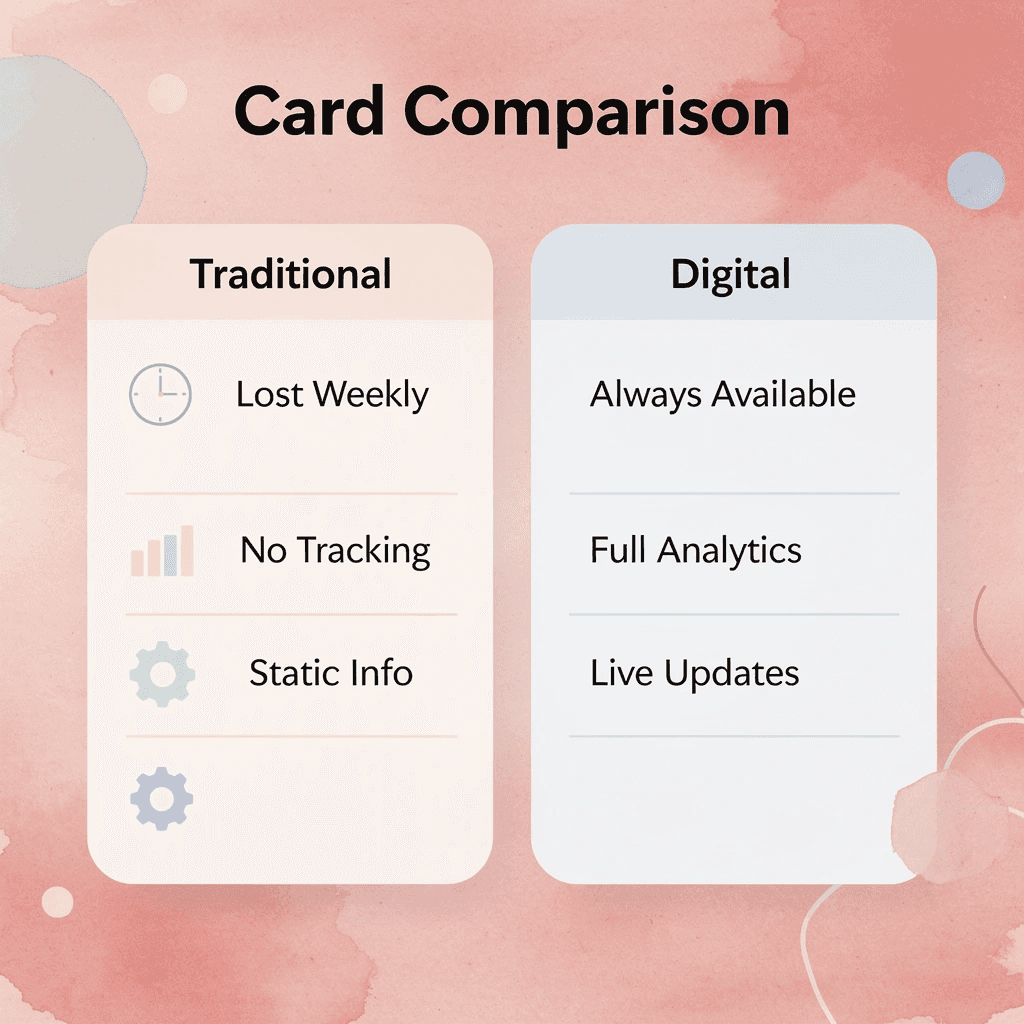
Traditional Cards vs Mobilo Digital Cards
- Accessibility
- Traditional cards: Often lost within 1 week
- Mobilo digital cards: Permanently accessible
- Tracking
- Traditional cards: No tracking capability
- Mobilo digital cards: Full analytics dashboard
- Information updates
- Traditional cards: Static information once printed
- Mobilo digital cards: Dynamic, updatable content
- Data management
- Traditional cards: Manual data entry required
- Mobilo digital cards: Automatic CRM integration
🎯 Key Point: Your carefully chosen brand colors work 25% more effectively when paired with digital delivery systems that ensure lasting contact retention.
Book a demo today and receive your first 25 Mobilo digital business cards free (worth $950), so your effort in choosing the right business card colors translates into remembered, measurable business relationships.

Related Reading
- Plumbing Business Cards Examples
- HVAC Business Cards Examples
- Electrician Business Card Ideas
- Unique Business Card Ideas
- Artist Business Cards Examples
- Therapist Business Cards Examples
- How To Put Social Media On Business Card
- Best Real Estate Business Cards


