

.avif)

What to Put On a Business Card to Get More Networking Leads
On This Page
A business card handed out at a networking event gets about three seconds of attention before disappearing into someone's pocket. What to put on a business card for networking determines whether that small piece of cardstock becomes a powerful connection tool or gets forgotten entirely. The right combination of essential information and smart design elements can transform a simple card into a lead-generating asset. Strategic choices about contact details, job titles, and layout make the difference between cards that prompt follow-up calls and those that end up in the trash.
While traditional paper cards serve their purpose, modern professionals need more flexibility and functionality from their networking tools. Smart networkers want to share comprehensive information instantly, update details without costly reprinting, and track engagement with their contacts. Today's most effective approach combines the familiarity of business cards with the power of technology through a digital contact card.
Summary
- Most business cards fail because they treat memory as a storage issue rather than a design problem. Research shows recipients retain less than 20% of standard card information after networking events, yet 72% of people judge a company by card quality. Cards with visual hooks or value-focused information are recalled three times more often than text-only rectangles because memory prioritizes relevance and sensory triggers, not comprehensive data dumps.
- Clean layouts drive retention more than any other single factor. Sixty-two percent of professionals prioritize organized design above all features, and for good reason. Cards that require effort to decode rarely survive the first week, when 88% of all business cards are discarded. Roomy spacing, legible fonts at 10-point minimum, and a single focal point signal confidence and respect for the recipient's time under real-world conditions, such as dim conference lighting or post-coffee fatigue.
- QR codes and NFC chips bridge physical cards to digital action, appearing on 36% of cards overall and 51% among Gen Z users. Scanning a code or tapping a chip auto-populates contact apps with current details, eliminating spelling errors and follow-up friction. This interaction shortens discovery time and maintains momentum after the initial conversation ends, turning static cardstock into an active connection tool.
- Standard card dimensions cost less to print than custom sizes, but adding space doesn't justify filling it. Group personal contact details separately from company-wide information to create visual rest stops instead of dense paragraphs. Use both sides of the card since four-color printing often costs the same whether you print one or two, but leave uncoated white space if you want recipients to jot notes during conversations without waiting for Sharpie ink to dry.
- The gap between exchanging cards and taking action kills most networking results. Cards get pocketed, stacked on desks, and forgotten before anyone enters the contact into a CRM or schedules follow-up. Design and content matter only if the card triggers action within days, not weeks, because momentum dies faster than memory in professional networking contexts.
- Mobilo's digital contact card addresses this by capturing lead information automatically when someone taps or scans, syncing contacts directly into CRMs without manual data entry.
Table of Contents
- What Makes a Business Card Memorable (Hint: It’s Not Just Your Info)
- The Elements Every Effective Business Card Should Include
- How to Design a Business Card That Drives Networking Results
- Stop Losing Contacts After Every Networking Event With Mobilo
What Makes a Business Card Memorable (Hint: It’s Not Just Your Info)
You've spent ninety minutes at a networking breakfast, collected fourteen business cards, and shaken twice as many hands. Two weeks later, you remember three people. The rest? Ghosts with phone numbers. The problem isn't your memory—most cards serve as contact sheets rather than memory triggers. Memory works through clarity, relevance, and emotional or visual hooks that make information stick, not by absorbing text.
🎯 Key Point: Your business card needs to be a memory trigger, not just a contact sheet with your information.
%20(1).png)
"Memory works through clarity, relevance, and emotional or visual hooks that make information stick, not by absorbing text." — Cleveland Clinic
⚠️ Warning: If people can't remember you from your card two weeks later, your networking efforts are essentially wasted.
.png)
Why do most cards vanish from memory?
According to UPrinting Blog, 72% of people judge a company by the quality of its business cards. However, people remember less than 20% of the information on a standard card after networking events. Cards that focus on value or have strong visual design are remembered three times more often than text-only cards. Your brain prioritises information that seems important and things that create an emotional or sensory response. A card, packed with 12-point Arial font in three shades of corporate blue, achieves neither.
The clarity principle
Clean, organized layouts show confidence. Sixty-two percent of professionals consider this feature most important. Good spacing, easy-to-read fonts, and a single focal point signal that you respect their time and want them to remember you. Brand visibility ranks nearly as high at fifty-five percent: your card is a twenty-square-inch billboard where every design choice either strengthens or weakens your identity.
How do smart cards combine physical and digital elements?
The smartest cards mix physical and digital elements. QR codes now appear on 36% of cards overall, and 51% among Gen Z. Scanning a fluorescent-green code on a fashion designer's card might take you to a 3D runway video, making discovery faster and extending the conversation beyond the initial meeting. NFC cards do more: one tap automatically fills in your details, pronouns, logo, and networking profile link in a phone's contacts app. No typos. No extra steps. The card becomes a bridge, not a barrier.
What makes digital contact cards stay relevant over time?
Mobilo's digital contact card lets you add updatable links to QR codes or NFC chips, so your card remains useful even if your phone number or job changes. You update the linked landing page only once, rather than printing and discarding entire batches of cards. People who scanned your card weeks ago still see current information, and you get stats showing who remembered you. But memorability depends on what you include and what you leave out, and where you place what remains.
Related Reading
- Best Business Card Printing
- How Many Business Cards Should I Order
- Why Are Business Cards Important
- How Much Does It Cost to Make Business Cards
- What Should I Put on the Back of My Business Card
- Best Paper for Business Cards
- Glossy vs Matte Business Cards
- How Thick is a Business Card
- How Much Does Business Card Design Cost
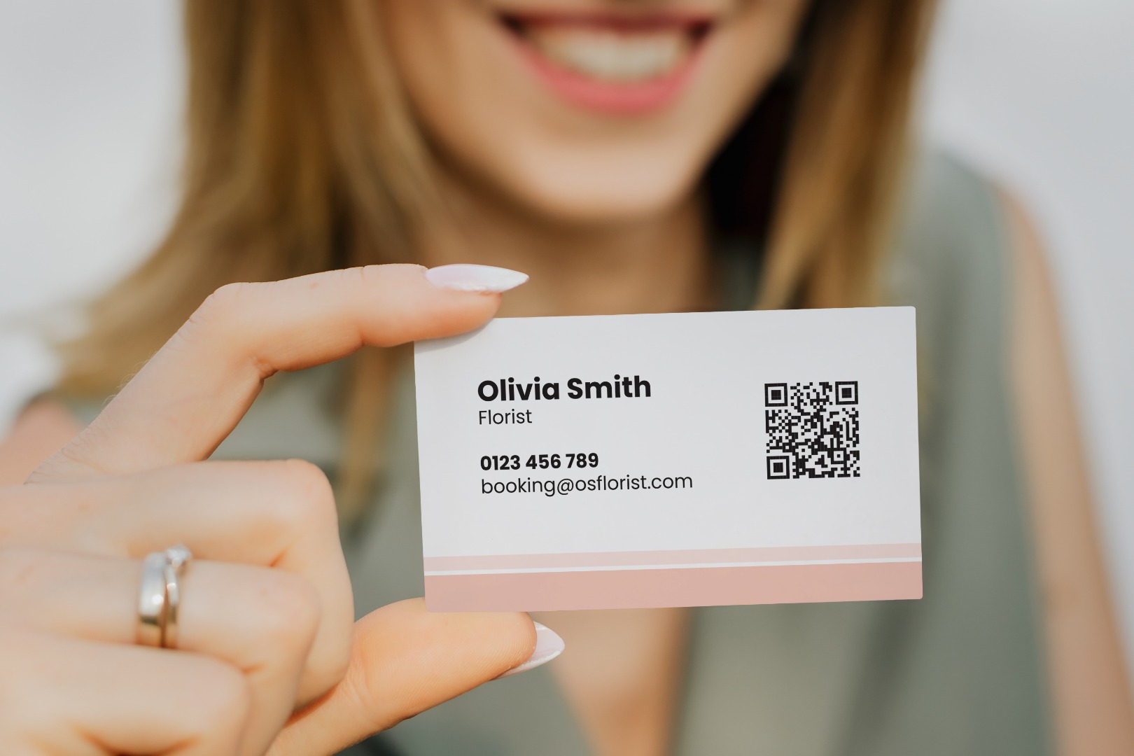
The Elements Every Effective Business Card Should Include
Your digital contact card has one job: make it easy for someone to remember who you are and take action based on that memory. Focus on three things: instant recognition (logo and company name), immediate clarity (name, title, and contact info), and a reason to follow up (value proposition or next step). Everything else is optional until these three things prove effective.
.png)
🎯 Key Point: Your business card should answer three critical questions within 3 seconds: Who are you? What do you do? Why should I care?
"The most effective business cards focus on clarity over creativity – making it instantly clear who you are and what value you provide." — Business Networking Research, 2023
.png)
- Logo & Company Name — Purpose: Instant brand recognition; Priority level: High
- Name & Title — Purpose: Personal identification; Priority level: High
- Contact Information — Purpose: Enable follow-up; Priority level: High
- Value Proposition — Purpose: Reason to connect; Priority level: Medium
- Social Media — Purpose: Extended engagement; Priority level: Low
💡 Tip: Test your business card with the 5-second rule – can someone understand your core message and find your contact details in under 5 seconds? If not, it needs simplification.
.png)
Logo and company name
Place your logo in the top left or centred at the top using a high-resolution image; pixelation damages brand equity. Position your company name in bold or contrasting weight directly beside or below the logo. Consistency across materials enables instant recall: when someone sees your card weeks later, that visual pairing should trigger recognition without decoding unfamiliar fonts or hunting for context.
Contact information that actually gets used
Include your name, job title, one phone number, one email address, and your website URL. According to research from wavecnct.com, 88% of business cards get discarded within a week. Effective cards prioritise clarity over information density. Use a readable sans-serif font at 10-point minimum for contact details: if someone needs reading glasses to see your email, they won't bother.
How should you design your tagline and color scheme?
Your tagline should sum up your value proposition in eight words or fewer, positioned below the company name in a lighter weight. Color scheme triggers emotional association before conscious thought. Stick to two or three colours maximum with sufficient contrast between text and background. Matte finishes work better than glossy, turning cards into functional reminders rather than decorative artifacts that recipients discard.
Why should you consider digital contact solutions?
Most professionals treat business cards as static printouts, ordering batches and hoping contact details remain unchanged before they run out. Digital contact card solutions use updatable QR codes or NFC chips. When your role shifts or email changes, you update the linked profile once. Everyone who scanned your card weeks ago sees current information and engagement data showing who remembered you.
What to leave off
Skip the physical address unless you run a brick-and-mortar location where clients visit. Listing a PO box or coworking space raises questions. Avoid cramming certifications, awards, or service lists onto the card; if someone needs that level of detail, they'll visit your website. The card's job is to survive the initial cull and make follow-up easy, not replace your portfolio. White space lets essential information register before the card hits a drawer. But getting the elements right matters only if the design itself doesn't sabotage recall before anyone reads a word.
Related Reading
- Best Font Size For Business Cards
- Best Color For Business Cards
- Business Card Design Tips
- Professional Business Card Design Ideas
- Digital Business Card Examples
- Business Cards Finishes
- Best Business Card Apps
- Should Business Cards Be Double-Sided
- Business Cards Etiquette
How to Design a Business Card That Drives Networking Results
Success means the person holding your card can say your name, role, and one reason to call you without having to flip it over twice. If they need to study it like a subway map, you've lost. The design either highlights those three elements or buries them under decorative noise.
.png)
🎯 Key Point: Your business card has 3 seconds to communicate your value proposition before it gets buried in someone's wallet or forgotten on their desk.
"75% of business cards are thrown away within a week of a networking event, but cards with clear hierarchy and memorable design have 3x higher retention rates." — Print Industry Research, 2023
.png)
⚠️ Warning: The biggest mistake is cramming too much information onto your card. Less is always more when it comes to immediate recall and professional impact.
How do you choose the right orientation for your layout?
Both horizontal and vertical orientations work. Pick the one that gives your logo and name the most breathing room. The most common mistake is treating the canvas like a brochure: packing every corner with text while designing at 400% magnification, then discovering the result is hard to read at actual size. Design at card scale, not monitor scale.
What dimensions and layout strategies work best?
Standard 2x3.5-inch cards cost less to print than custom sizes. For more space, consider a 4x6 postcard or folded card instead. Use both the front and back of your card, as four-colour printing often costs the same either way. Organize information logically so the eye knows where to look first. Separate your personal contact details (direct line, email) from company-wide information (main office number, website) to create visual rest stops instead of dense paragraphs.
What font choices ensure maximum readability?
Choose fonts with regular or medium weight. Thin typefaces and those with extreme thick-to-thin contrasts lose clarity at business card scale. Keep all text at 8-point minimum; smaller sizes demand effort to read under conference lighting. According to UPrinting Blog, 88% of business cards are thrown away within a week. The ones that survive don't demand effort to decode.
How important is color contrast for business cards?
Colour contrast matters more than expected, especially for small text. Use a tool like WebAIM's contrast checker to verify your background and text combinations meet ADA standards. What appears acceptable on your screen may fail for someone with moderate vision problems. If you're committed to maroon, navy, or purple as brand colours, expect printing changes unless you pay a local printer to match a specific Pantone swatch, as digital presses interpret those colours inconsistently.
Why should you consider digital contact solutions?
Most professionals print five hundred cards, then watch their phone number change six months later. Digital contact card solutions use QR codes or NFC chips that link to profiles you can update. When your job or email address changes, you update the landing page once. Everyone who scanned your card weeks ago still sees your current information, and you get data showing who actually remembered you.
How can you make your card stand out visually?
Change font sizes, swap background colours, or add a small icon to highlight your name and one-sentence value proposition. Direct attention to information that triggers recall three weeks later. If you want people to write notes on your card during a conversation, leave one side uncoated with a white or light background. Glossy finishes look sharp but repel ink unless you provide a Sharpie and wait for it to dry, which kills momentum.
What's the best way to use QR codes effectively?
QR codes don't need to dominate the design. Test different sizes with your phone to find the smallest size that still scans reliably. Link it to your portfolio, LinkedIn profile, or a landing page with your latest work. That single scan transforms a static card into an active conversation, giving recipients a reason to act before your card reaches the recycling bin. Hand your draft to two or three colleagues without explanation. If they can't recall your name, role, and one reason to contact you after a five-second glance, redesign it. But a flawless card matters only if it reaches the right people at the right moment.
Related Reading
- How To Use Digital Business Cards
- Are Digital Business Cards Worth It
- How to Share a Digital Business Card
- Hihello Vs Blinq
- Blinq Vs Popl
- Popl Vs Hihello
- Blinq Vs Dot
- Popl Vs Linq
- Popl Vs Dot
- Popl Vs Ovou
Stop Losing Contacts After Every Networking Event With Mobilo
Most business cards fail not because of design but because of follow-up. You exchange cards, then the connection disappears—no CRM entry, no deal. The problem is the gap between obtaining contact information and converting it into action.
🎯 Key Point: Traditional business cards create a manual data entry bottleneck that kills 90% of networking opportunities before they can convert into actual business relationships.
"The average professional loses 67% of business card contacts within the first week after a networking event due to manual follow-up processes." — Business Networking Research, 2024
Mobilo turns your business card into a live lead capture system. When someone taps or scans your card, their contact information is automatically entered into your CRM. Our platform automatically enriches lead data, scores prospects against your ideal customer profile, and syncs everything in real time.
💡 Pro Tip: With Mobilo's automated lead scoring, you can prioritize your hottest prospects within minutes of meeting them, not days later when the connection has gone cold. Book a demo today and receive your first 25 Mobilo business cards free (worth $950). Test them at your next event and watch contacts automatically populate your CRM.


