

.avif)

Top 40 Professional Business Card Design Ideas to Stand Out in 2026
On This Page
A business card gets about two seconds of attention before disappearing into someone's pocket. During those brief moments, you must communicate professionalism, creativity, and value while effectively representing your brand. The right design choices can transform a simple card exchange into a memorable first impression that leads to meaningful business relationships.
Modern professionals need designs that capture attention immediately and make information sharing effortless. Smart design elements, strategic color choices, and innovative formats help cards stand out from the stack while maintaining professional credibility. For those seeking maximum impact and convenience, Mobilo's digital contact card offers a modern solution that combines visual appeal with instant information sharing.
Summary
- Business card quality directly influences business decisions, with 72% of people judging a company by its card quality and 39% refusing to do business with companies whose cards look cheap. The assessment happens in seconds, before any conversation concludes, making design choices a critical factor in whether casual encounters convert into business relationships. Physical attributes like texture, finish, and spacing communicate brand standards before words are exchanged.
- Typography mistakes kill card effectiveness faster than aesthetic choices. Fonts below 8 points force squinting, which creates friction between interest and action. When recipients can't easily read contact details under typical lighting conditions (conference halls, restaurants, car interiors), they keep cards from competitors whose information they can actually access. Readability isn't about visual preference; it's about removing barriers to follow-up.
- White space prevents overcrowding, which accelerates the 88% of business cards thrown away within a week. Cramming logos, taglines, multiple phone numbers, social media handles, and QR codes onto a limited surface area creates visual chaos that forces recipients to work for information that should be obvious. Generous margins and intentional spacing between elements communicate confidence and make scanning effortless, while dense layouts signal anxiety rather than authority.
- QR code usage quadrupled in 2022 because smartphones made scanning effortless, turning cards into instant portals to booking pages, portfolios, and menus. The small design addition solves the friction problem between interest and action by eliminating manual typing. Restaurants showing daily specials and service providers linking to scheduling tools benefit from immediate digital access that increases conversion rates without requiring recipients to remember URLs or search for websites later.
- Specialty finishes like embossing, spot UV gloss, and metallic foil create multi-sensory brand experiences through tactile differentiation that flat cards can't match. When someone runs their thumb across raised lettering or textured stock, they encode sensory memory beyond visual recognition. These premium signals cost more than standard printing but position brands above competitors who chose cheaper options, with the perceived quality investment paying back in elevated brand perception.
- Mobilo's digital contact card addresses the measurement gap by tracking when contacts open profiles, how long they engage with specific sections, and which links they click, while automatically syncing lead data and engagement metrics into existing CRM workflows.
Table of Contents
- Why Your Business Card Design Can Make or Break First Impressions
- Key Elements of a Professional Business Card Design
- 40 Professional Business Card Design Ideas That Stand Out Without Being Gimmicky
- Mistakes to Avoid in Professional Business Card Design
- Turn Every Networking Opportunity into Measurable Results
First impressions form in seconds, not minutes
Your business card signals whether you care about details, whether your brand is coherent, and whether someone should trust you with their time or money. According to UPrinting Blog, 72% of people judge a company by the quality of its business cards before the conversation ends.
The weight of the first contact
A flimsy, poorly printed card signals cut corners and low standards. Texture, finish, and spacing communicate your values. When someone runs their thumb across a well-designed card with thoughtful typography and clean margins, they experience your brand identity tangibly. Tiny fonts or cluttered contact information create the friction you've introduced.
Memory depends on distinction
Networking events produce countless introductions and pitches that blur together within hours. A generic white card with black Helvetica text becomes indistinguishable from the dozen others collected that day. A card with a memorable layout, unexpected color, or clever negative space creates a mental anchor: the reference point when someone thinks, "Who was that person who mentioned the supply chain solution?" Design isn't decoration. It's the difference between being remembered and being forgotten.
Why do cheap business cards hurt your business?
Saving money on card design and printing often backfires. UPrinting Blog found that 39% of people would refuse to do business with a company if their business card looked cheap. If someone won't invest in presenting their brand professionally, why would clients trust them to deliver on promises? The card becomes proof of priorities.
How do digital cards solve quality concerns?
Digital contact card solutions completely solve this problem. Our digital contact card lets teams update information instantly, track engagement, and maintain a polished, consistent brand without the constraints of printing. Digital cards position companies as tech-forward while addressing the core challenge of keeping contact information current across growing organisations. But even the best technology cannot fix unclear thinking about what your card should communicate or how it fits into your broader networking strategy.
Related Reading
- Best Business Card Printing
- How Many Business Cards Should I Order
- What To Put On A Business Card For Networking
- Why Are Business Cards Important
- How Much Does It Cost To Make Business Cards
- What Should I Put on the Back of My Business Card
- Best Paper For Business Cards
- How Much Does Business Card Design Cost
- How Thick Is A Business Card
Key Elements of a Professional Business Card Design
Typography determines whether people will read your card or skip it entirely. Use a minimum of 8-point font for body text and 10-point font for names and titles to ensure maximum readability. Pick fonts with clear letter spacing and distinct character shapes that maintain clarity across different viewing conditions. Condensed or overly stylized typefaces fail under dim lighting or when someone reads your contact information in a crowded lobby.

🎯 Key Point: Your font choice can make or break the first impression – prioritize readability over style every time.
"Typography is the foundation of effective business card design – without proper font selection and sizing, even the most creative layout fails to communicate essential contact information." — Design Industry Standards, 2024

💡 Best Practice: Test your business card design under various lighting conditions and ask colleagues to read the text from arm's length to ensure your typography choices work in real-world scenarios.
Hierarchy guides the eye
Every card needs a clear entry point. Your name or company logo should grab attention first, followed by your title, then contact details. When someone receives five cards in ten minutes, they scan for the fastest way to find important information. Use font size, boldness, or position to establish a clear reading order. Place the most important element in the upper third of the card where eyes naturally land first.
White space prevents visual chaos
Filling every available space with text, logos, taglines, and social media icons makes it look desperate. Margins are essential. Keep at least 3mm of empty space around all edges to prevent important information from being cut off during printing or from being lost when someone holds the card. Space between elements lets each piece stand out and improves readability. A card with generous margins conveys confidence: you know what matters and aren't afraid to let it stand out.
Color choices carry meaning beyond aesthetics
Color triggers associations before conscious thought. Deep blues and grays signal stability and professionalism for financial services or legal practices, while bright oranges and greens convey energy and approachability for creative agencies or wellness brands. High-contrast combinations (dark text on light backgrounds) remain readable in any lighting, while low-contrast choices (light gray text on white) appear sophisticated until someone tries to read them in dim conditions. Test your design in poor lighting before committing to subtle palette choices.
What advantages do digital platforms offer over fixed designs?
Many teams use digital contact card platforms that let them update details instantly, embed video introductions, and track recipient engagement. These systems eliminate the tradeoff between design ambition and readability because content adapts to screens rather than being locked into fixed layouts. Teams also gain real-time analytics on which contacts opened their profile and which details received the most attention. But knowing what elements to include gets you only halfway. The harder question is determining which design ideas create memorability without crossing into gimmick territory.
40 Professional Business Card Design Ideas That Stand Out Without Being Gimmicky
Each design choice determines whether your card gets kept or thrown away. The ideas below address specific problems: memorability, engagement, brand perception, and lead capture.

🎯 Key Point: Your business card has 3 seconds to make an impression before someone decides to keep it or toss it in the trash.
"78% of business cards are thrown away within a week of receiving them, but cards with strategic design elements have 3x higher retention rates." — Print Industry Research, 2023

💡 Tip: Focus on one primary goal per card design - whether that's brand recognition, contact information clarity, or memorable visual impact.
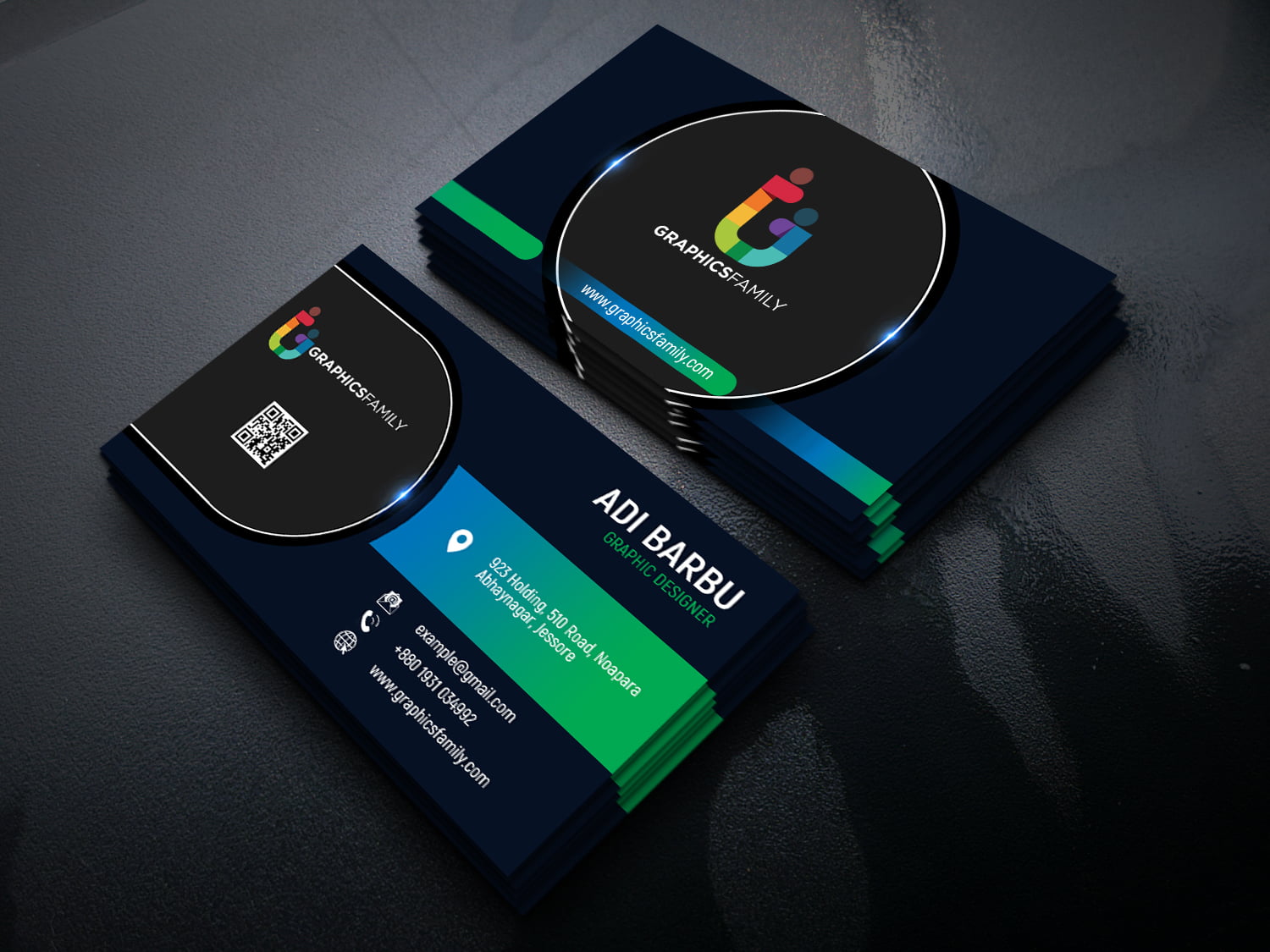
1. Evoke a luxe feeling with color, layout, and finishes
Black and gold combinations signal premium positioning through high contrast and colour psychology. Foil or metallic ink finishes from providers like VistaPrint add physical texture that reinforces the perception of quality. While more costly than standard printing, this investment positions you above budget competitors and pays off in perceived brand value.
2. Create interest using oversized graphics and initials
Scale creates impact. Among the ten cards received in an hour, one with a photograph of a flower filling the entire background and bold initials in a contrasting colour becomes the reference point. Oversized elements work because they break expectations without requiring explanation, communicating confidence through spatial boldness.
3. Take a modern selfie
A well-lit, editorial-style photograph answers "Who am I hiring?" for service providers whose personality drives their business. This works for photographers, designers, copywriters, and personal service professionals. The image becomes a memory anchor that generic logos cannot match.
4. Lean on classic images and vintage fonts
Business cards for the automotive industry featuring old car shapes or classic lettering immediately communicate your business focus. These familiar images help people understand your card at a glance. This approach works well for car sales, repair shops, and collector businesses because it leverages shared cultural symbols that require no additional explanation.
5. Go big or go mini
Standard-sized cards disappear into wallets and stacks. Mini cards fit into the smallest pockets and purses, serving as a physical reminder each time someone reaches for their wallet. For makeup artists distributing samples or service providers seeking portable cards, the compact format improves retention more effectively than visual design alone.
6. Set the stage for romance
Soft pink backgrounds, handwritten fonts, flowers, and ribbon graphics instantly evoke weddings and celebrations. These design choices create feelings that match your services, making your card feel important upon receipt. Event planners, florists, caterers, and venues benefit from this visual shorthand because it eliminates the need to explain what you do.
7. Read between the lines
Notebook paper graphics work for teachers, tutors, administrators, and writers because they reference a shared experience everyone recognizes. The design is practical and easy to read, with a strong accent colour making your company name stand out.
8. Create a sense of calm
Soft green colours and abstract shapes convey stability and approachability without overwhelming users. Simple designs signal that you won't complicate matters unnecessarily, which is crucial for services that prioritise trust over excitement.
9. Take people on a journey
A passport image on a travel agent's business card immediately evokes travel and adventure, sparking conversation. Travel planners, hotel workers, and tourism professionals find this effective because the card conveys the excitement clients seek rather than merely a business transaction.
10. Drive traffic to your site with a QR code
QR code usage quadrupled in 2022 as smartphones made scanning easy. Adding one to your card gives recipients instant access to menus, booking pages, or portfolios without typing. Restaurants use them to display daily specials, but any business benefits when immediate digital access reduces friction between interest and action.
11. Use a silhouette backdrop to separate content
Construction business cards featuring building shapes immediately signal your industry to recipients. They also provide a clear organisation of your contact information. This style works well for contractors, subcontractors, and real estate professionals who need cards that clients can locate quickly when seeking assistance.
12. Get twice the space with folded cards
Folded cards give service businesses room for pricing menus, product lists, or instructions without cramping the design. Cleaning services, repair companies, and appointment-based businesses benefit from the extra space because it transforms the card into a reference tool people keep rather than discard. The higher printing cost pays back in usefulness and retention.
13. Use texture to make a tactile impression
Brown construction paper texture and specialty stocks engage the sense of touch, creating memory encoding beyond visual recognition. Printers like VistaPrint offer textured options, embossing, and raised lettering, making your card physically distinct. When someone runs their thumb across a textured surface, they create a sensory memory that flat cards cannot match.
14. Let your logo and brand colors do the work
A simple design with your logo and one bold statement colour creates instant brand recognition. Icons for phone, email, and web address reduce friction in finding contact methods. This approach works when your logo carries meaning, and you want the card to reinforce existing brand equity. If layout and graphics aren't your strength, freelance designers on Fiverr can create custom designs starting at $5, eliminating the expertise barrier without significant investment.
15. Find a layout you like and make it your own
Template customization lets you maintain a professional design while showcasing your specific work. Bakers and caterers can upload different product photos and print multiple designs in one run through services like MOO, solving the portfolio problem of displaying a range without separate card designs for each offering.
16. Add reminders for appointments
Appointment reminder cards serve two purposes for dentists, stylists, manicurists, counselors, and physicians: they work as visible tools that people keep on display rather than store away. Customizable templates from VistaPrint let you add your brand colours and images without starting from scratch.
17. Go retro to reach your target audience
Old-fashioned images and colours help you connect with people immediately. When people see these styles, they recognize them and feel a connection. The design choices reveal what you value and what your culture cares about. This approach works across many industries when your target audience appreciates nostalgia and vintage styling.
18. Use icons to send a subtle background message
Small icons and background patterns signal your industry, helping recipients understand your business at a glance. Pet-related businesses using paw prints or floral patterns communicate their focus while maintaining brand aesthetics. Icons serve as visual shortcuts that aid memory without requiring conscious effort.
19. Boost your brand image with raised lettering
Raised text and logos create a tactile difference that signals quality investment. The physical sensation when someone handles your card communicates attention to detail and positions you as someone who values quality in ways competitors using cheaper options cannot match.
20. Keep it simple to emphasize your authority
Minimalist layouts work well for accountants, architects, and lawyers because they convey confidence and professionalism through simplicity. Bold fonts replace images while strategic white space highlights important information. The design communicates that your expertise speaks for itself.
21. Use graphics to call out your specialty
Bold graphics that belong in the industry work well for private detectives, forensic experts, and law enforcement businesses. They help people immediately understand what you do and avoid confusion about your skills. Strong colours combined with clear images create a distinctive look that stands out among competing business cards.
22. Make your expertise obvious
Electrician cards with bold electrical imagery need nothing else on the front—the picture conveys everything. Your contact information on the back provides what people need. This approach works well for specialized services where the main challenge is being found during emergencies, not explaining your services.
23. Double down on color
Bold, contrasting colors and geometric shapes replace logos and photos, creating a strong visual identity. Using signature colors consistently builds brand recognition and helps people connect specific colours with your business.
24. Use images to dictate information layout
Real estate cards with property photos organise contact details while signalling your industry. A professional headshot connects expertise to a specific person, building trust and improving recall.
25. Put the most important info in the main frame
Bold colour blocks draw attention to your contact details and make the card stand out among neutral-coloured alternatives. This design works well for landscaping and decking companies, though you can swap the photo to suit any business type.
26. Showcase your own original artwork
Artists with visual design skills can create unique cards using original artwork instead of stock images. The card becomes a portfolio piece that demonstrates your capabilities while sharing your contact information, which works especially well when visual work is your primary credential.
27. Be brave with a close-up close cut
Modern editorial photography showcases real work results, making it effective for beauty professionals. Hair stylists benefit from images of colour treatments or cuts that remind customers of specific services. A QR code linking to online booking tools converts inspiration into appointments.
28. Get attention with an unexpected shape
Square cards with rounded corners and textured stock signal curation and personal aesthetic. Craft entrepreneurs, jewellery makers, wedding planners, and gift shops benefit from shapes that break the rectangular norm: the physical difference makes cards more memorable and supports premium positioning.
29. Make your card shine with metallic foil ink
Gold or silver foil adds texture and ensures your card stands out in any stack. The shine creates visual interest while the material replaces other graphic elements. Strong geometric designs, combined with metallic finishes, communicate quality and investment without elaborate layouts.
30. Use die cutting to give your brand an edge
Die-cut shapes create tactile and visual interest: a die-cutout for a food business or custom edge treatment makes your card physically distinctive. This appeals to touch and sight while adding whimsy that makes cards conversation pieces, people are less likely to discard.
31. Keep it classic
Basic designs with bold colours and clean layouts work across industries because they provide a customizable foundation. The blue jeans pocket graphic in certain templates suits handy services or painters, while the overall structure adapts to any business.
32. Amp up your design with embossing
Raised dots or patterns create texture without relying on colour or imagery, intriguing contacts, and making your card stand out. This tactile element delivers multi-sensory brand experiences that flat designs cannot match.
33. Create intrigue with art-inspired graphics
Abstract graphics that reference your work (like a conductor's motion for a music business) create visual mystery. When someone flips your card to discover the story behind the design, this interaction increases engagement time and memorability.
34. Get people interested in your story
Traditional layouts stand out through professionally designed logos, bright colours, and strategic white space. A whimsical logo (like a fish-shaped storybook) creates visual interest, while bold accent colours ensure the card won't get lost in stacks. The design balances professionalism with personality.
35. Use creative finishes to stand out
Unusual colour treatments, such as holographic or iridescent effects, make cards stand out. Designers on Fiverr can create these digitally, and printers like VistaPrint support them with metallic inks and glossy finishes. Creative finishes, not just layout, make your card visually distinctive. Many teams now use digital contact card platforms that update information in real time, embed video introductions, and track engagement. Our Mobilo platform eliminates design constraints as content adapts to any screen. Teams gain real-time analytics that show which contacts opened their profiles and which details captured attention, converting every exchange into measurable networking intelligence.
36. Minimalist black and white cards
Clean black-and-white designs with bold typography create a timeless, professional appeal by emphasizing your logo and contact information through contrast and clarity.
37. Spot UV gloss finish
Spot UV creates a shiny contrast against matte backgrounds, making logos or text stand out through the texture difference. This finishing touch elevates perceived quality and adds sophistication to the design.
38. Metallic foil stamping
Foil stamping in gold, silver, or holographic finishes signals luxury positioning. These cards suit brands targeting high-end markets where the physical card communicates premium value. The cost increase pays back in enhanced brand perception for businesses with high-quality expectations.
39. Holographic finishes
Shimmering holographic effects grab attention and work particularly well in tech and creative industries, signalling innovation and creating memorability while differentiating from traditional business cards.
40. Multi-language cards
Printing different languages on each side shows that a business understands and respects different cultures. This matters to companies serving customers worldwide, as it helps customers feel welcome and demonstrates professionalism. Though it requires additional design work, this effort provides a competitive advantage. The question isn't whether these ideas work, but whether you'll notice the mistakes that can ruin even good designs before someone discards your card.
Related Reading
- Best Font Size For Business Cards
- Best Color For Business Cards
- Business Card Design Tips
- Digital Business Card Examples
- Business Cards Finishes
- Best Business Card Apps
- Should Business Cards Be Double-Sided
- Business Cards Etiquette
Mistakes to Avoid in Professional Business Card Design
Too much stuff on a business card ruins how easy it is to read. Putting logos, taglines, multiple phone numbers, social media handles, QR codes, and decorative graphics on a 3.5 by 2-inch surface makes it too hard for people to find the information that should be simple. According to UPrinting Blog, 88% of business cards get thrown away within a week. Dense, cluttered designs accelerate that outcome because they signal nervousness rather than confidence.
"88% of business cards get thrown away within a week." — UPrinting Blog
⚠️ Warning: Cramming multiple elements onto your business card creates visual chaos that makes recipients work harder to find your contact information.
🔑 Takeaway: Clean, minimal designs with essential information only create professional confidence and improve retention rates.

Tiny fonts signal poor judgment
If you set body text below 8 points or contact details at 6 points, people will squint to read it. They won't pull out reading glasses to decipher your email address at conferences or networking events; they'll keep the card from someone whose information they can read. Font size removes friction between interest and action. When you make it hard for someone to find your phone number, you've given them a reason not to call.
Poor contrast makes information disappear
Light gray text on white backgrounds looks fancy in design software but becomes impossible to read in dim lighting, car interiors, or wallets. Reversed text (white on dark backgrounds) has the same problem when the font weight is too thin. Test your design by printing it, viewing it in dim lighting at arm's length, and after it's been in someone's wallet for a day. If you can't read it easily in all three conditions, your contrast ratio has failed.
Gimmicks distract from credibility
Die-cut shapes that make cards hard to store, unusual materials that feel fragile, or clever folding mechanisms that break after two uses create memorable experiences for the wrong reasons. The card becomes the story instead of your abilities. Novelty works when it reinforces your message (a carpenter using wood veneer stock makes sense). It backfires when the format creates practical problems or overshadows the information. Your card should make people remember you, not the card itself.
How do digital solutions solve these problems?
Most teams now avoid these trade-offs by using digital contact card platforms that eliminate font-size limits, update information instantly without reprinting, and work on any screen or in any lighting condition. These systems include complete contact details, portfolio links, and booking tools without physical overhead. Teams gain real-time analytics showing which contacts engaged with their information and which details received attention, converting every exchange into measurable networking intelligence while maintaining enterprise professionalism. But perfect execution of design principles only gets you halfway to results that matter.
Related Reading
- How To Use Digital Business Cards
- Are Digital Business Cards Worth It
- How to Share a Digital Business Card
- Hihello Vs Blinq
- Blinq Vs Popl
- Popl Vs Hihello
- Blinq Vs Dot
- Popl Vs Linq
- Popl Vs Dot
- Popl Vs Ovou
Turn Every Networking Opportunity into Measurable Results
Your card creates the connection, but what happens next determines whether that encounter generates revenue or joins the 90% of business contacts that never reach your CRM. Mobilo changes how teams track, qualify, and convert networking interactions by automatically capturing lead data, scoring prospects against your ideal customer profile, and syncing everything to your existing sales infrastructure. The difference between collecting business cards and building a pipeline comes down to whether you can measure engagement and act on it before the opportunity goes cold.
🔑 Key Takeaway: Most networking connections are lost due to poor follow-up systems, making automated lead capture and qualification essential for ROI.
"90% of business contacts never make it into your CRM without proper automation systems in place." — Bluffton Today Business Intelligence Report
💡 Pro Tip: Set up automatic lead scoring based on your ideal customer profile to prioritise follow-ups and maximise conversion rates from networking events.

From contact exchange to conversion intelligence
Traditional networking creates a measurement black hole. You hand out cards, collect a stack in return, and have no idea which recipients viewed your website, forwarded your information to colleagues, or what details caught their attention. Mobilo closes that gap by tracking when contacts open your digital profile, how long they engage with specific content sections, and which links they click. Sales teams gain visibility into prospect behaviour that paper cards cannot deliver, turning every exchange into actionable data for follow-up timing and messaging strategy.
Qualification happens automatically, not manually
Manually typing contact details into spreadsheets wastes hours that could be spent on sales conversations. Mobilo enriches lead data automatically by pulling company information, social profiles, and firmographic details the moment someone exchanges contact information. Our platform scores prospects against your ideal customer profile in real time, flagging high-value opportunities while they're still at the event. Your team prioritizes contacts before leaving the conference floor, not three days later when momentum has faded.
CRM integration eliminates data entry friction
The gap between collecting a contact and logging it in your CRM creates leakage that kills pipeline development. Mobilo syncs directly with Salesforce, HubSpot, and other major platforms, pushing contact data, engagement metrics, and lead scores into your existing workflows without manual data entry. This eliminates follow-up delays that let promising leads go cold while you're still entering email addresses into forms. Book a demo today and receive your first 25 Mobilo business cards free (worth $950). Since 90% of business contacts never enter your CRM, this is the smart way to make every first impression profitable.


