

.avif)

Should Business Cards Be Double-Sided? (Pros, Cons, Best Practices)
On This Page
Choosing between single-sided and double-sided business cards affects networking success, information capacity, and whether recipients keep or discard the card. The decision involves weighing extra costs against design opportunities and determining how much information truly belongs on a physical card. Strategic use of both sides can create memorable impressions that convert to meaningful professional connections.
Traditional paper cards require careful decisions about layout and space limitations. However, modern professionals have alternatives that eliminate these constraints and provide unlimited information sharing, instant updates, and engagement tracking through a digital contact card.
Summary
- Most business cards fail because they prioritize design over function, with 88% thrown away within a week, regardless of whether they're printed on one or two sides. The real problem isn't lack of space, it's lack of clarity. Cards with tiny fonts, overcrowded layouts, or unclear value propositions force recipients to work too hard to understand who you are and why they should care, which means the card gets discarded before the second side is even noticed.
- Double-sided cards only justify their cost when the back panel performs a specific function rather than just serving as overflow space. QR codes, appointment reminders, service menus, or portfolio work turn the back into a utility that answers "What do I do with this card now?" before the recipient asks. According to UPrinting, 72% of people judge a company or person based on business card quality, and a functional back panel signals a modern understanding of workflow rather than just decorative excess.
- Single-sided cards work best when constraint forces ruthless prioritization. Limited space makes you identify the one phone number that matters, the primary email, and the website that explains everything else. This creates cards that communicate more quickly because there's no secondary layer to decode, and the approach often signals confidence in certain industries, where over-explaining feels desperate rather than thorough.
- Traditional cards create friction at the worst possible moment by locking information in place at print time. When your phone number changes, your role evolves, or your company rebrands, every card you've distributed becomes outdated. The person you met last month finally decides to reach out, discovers the email bounces or the website redirects to a 404 page, and that credibility damage can't be fixed by better design or double-sided printing.
- The success of any business card depends entirely on whether it generates a follow-up conversation, not how much information it includes or how elegant the layout looks. Most cards fail because they create work instead of removing it, forcing recipients to manually type emails into phones or search for LinkedIn profiles later. That friction point is where networking interest dies, regardless of whether you used one side or two.
- Mobilo's digital contact card addresses this by updating information instantly across every connection you've made, eliminating the gap between exchange and action while tracking which contacts actually engage with your details.
Table of Contents
- Why Most Business Cards Fail Regardless of Design
- When a Double-Sided Business Card Actually Makes Sense
- When Single-Sided Is the Better Choice
- The Real Question Isn't One Side or Two — It's What Happens Next
- It’s Not About One Side or Two — It’s Whether Anyone Follows Up
Why Most Business Cards Fail Regardless of Design
Most business cards fail because they're designed to look impressive rather than to work. Fancy paper, double-sided printing, and professional design don't matter if recipients can't quickly understand who you are and why they should care.
🎯 Key Point: A business card's primary job is instant clarity, not visual appeal. If someone can't grasp your value proposition within 3 seconds of looking at your card, it's already failed.
"88% of business cards are thrown away within one week of being received, primarily due to unclear messaging and lack of immediate relevance." — Print Industry Research, 2023

⚠️ Warning: The biggest mistake is treating your business card like a mini-brochure. Cramming information onto both sides creates cognitive overload and ensures your card gets forgotten or discarded.
The attention problem, not the space problem
88% of business cards are thrown away within a week, and the second side often goes unseen before that happens. The real problem isn't whether you have room for more information, but whether anyone will take the time to understand what you've already included. Cards fail when they make people work too hard to read them. Tiny fonts become illegible under conference hall lighting. Crowded layouts with multiple phone numbers, every social media handle, and a paragraph bio turn your card into a phone book. The recipient glances once, can't find your email, and moves on.
Why do cards get forgotten so quickly?
Teams report that cards without a clear value proposition get forgotten within days. The card survived the exchange but failed its actual job: staying memorable enough to follow up with.
How does poor material quality damage your reputation?
Poor material quality signals poor service quality. Flimsy stock feels temporary, and low-resolution logos look unprofessional. Non-standard shapes that don't fit wallets get discarded because they're inconvenient. These functional barriers prevent your card from staying in circulation long enough to matter.
What happens when your contact information becomes outdated?
Regular cards can't change. When phone numbers change, emails get updated, or websites look different, you're carrying outdated information that damages credibility. With a digital contact card, those details update instantly across every connection. Our Mobilo solution eliminates reprinting, outdated numbers, and uncertainty about whether contacts have your current information. But what if you're committed to printing physical cards and need that back panel?
Related Reading
- Best Business Card Printing
- How Many Business Cards Should I Order
- Why Are Business Cards Important
- What to Put on a Business Card for Networking
- How Much Does It Cost to Make Business Cards
- What Should I Put on the Back of My Business Card
- Best Paper for Business Cards
- Glossy vs Matte Business Cards
- How Thick is a Business Card
- How Much Does Business Card Design Cost
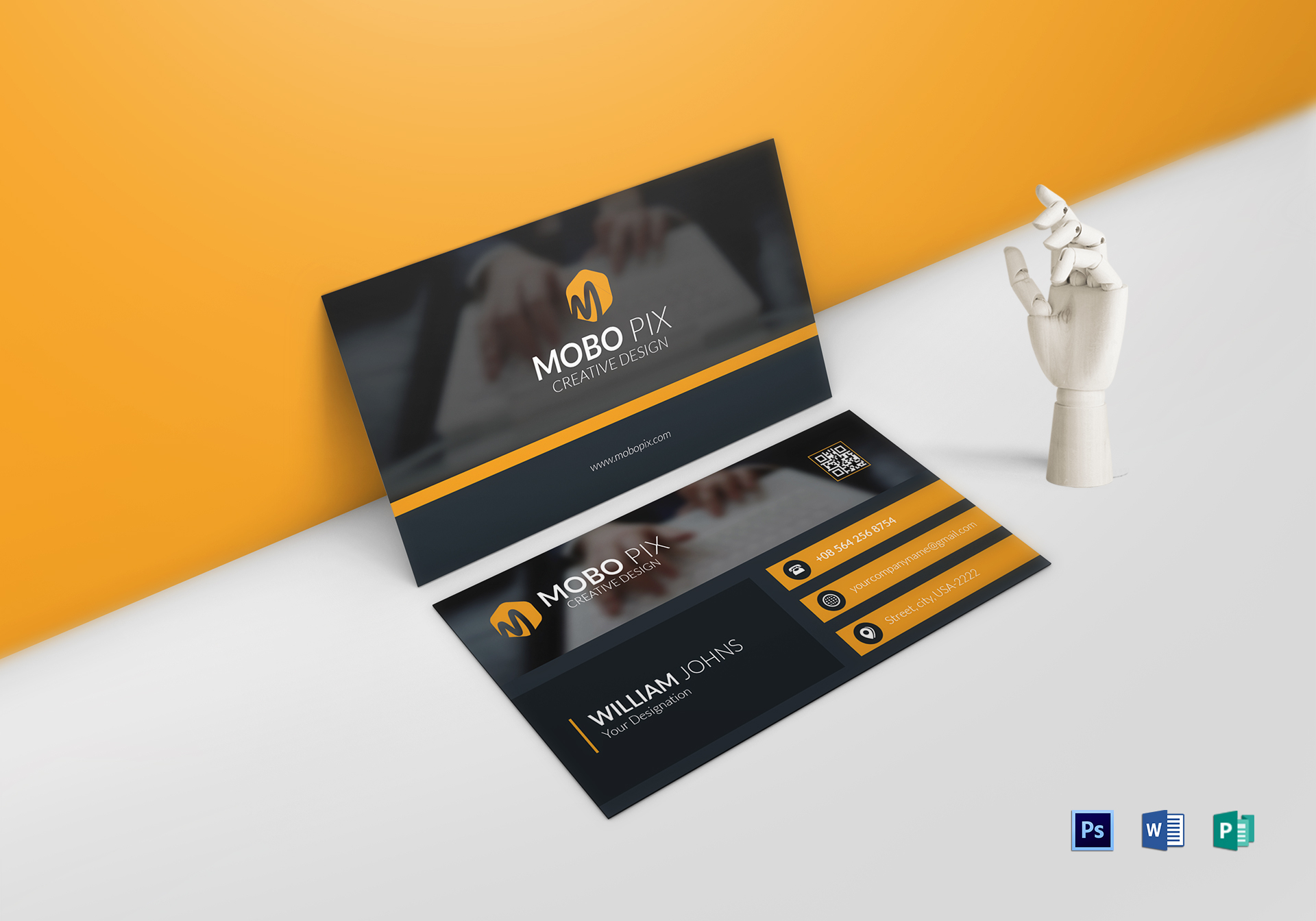
When a Double-Sided Business Card Actually Makes Sense
Double-sided cards earn their cost when the back performs a specific job: creating an action, providing usefulness, or reinforcing brand identity—not holding extra information. If you're adding a second side because your contact details don't fit on the front, you've made a critical design mistake.
🎯 Key Point: The back side of your business card should serve a strategic purpose, not function as an overflow area for cramped contact information.
"Double-sided business cards can increase brand recall by up to 73% when the back side reinforces core messaging rather than simply duplicating information." — Print Marketing Research, 2023
⚠️ Warning: Adding a second side just because you think you need more space often indicates poor design prioritization and can actually weaken your card's impact.

- Strategic Back Side Uses — Call-to-action or QR code; Brand reinforcement or tagline; Service menu or key benefits
- Poor Back Side Uses — Overflow contact details; Duplicate front information; Random decorative elements
How do QR codes enhance business card functionality?
QR codes justify the second side by letting people connect instantly: recipients scan and land exactly where you want them, removing friction when interest is highest. According to UPrinting Blog, 72% of people judge a company or person based on business card quality, and a clean QR code implementation signals that you understand modern workflows. The back becomes a bridge to deeper engagement rather than additional text.
What information makes business cards more valuable?
Appointment reminders, service menus, or product catalogs transform your card into a reference tool people keep. A photographer might print popular package pricing on the back; a consultant could list three core services with brief descriptions. These answer "What do I do with this card now?" before the recipient asks.
How does visual storytelling benefit from a dedicated space?
Portfolio work needs space to stand out. Designers, architects, and photographers can use the back to showcase a signature project or visual style that words cannot convey. This works only when the image is high-resolution, professionally composed, and directly relevant to your target role. A blurry product shot or generic stock photo wastes the space and damages your impression.
Why does visual separation improve card navigation?
Teams report that cards with clear visual differentiation between sides feel more intentional and easier to navigate. The front establishes identity through the logo and name, while the back deepens that identity through imagery or shifts the focus to usefulness through contact grids or service descriptions. This separation prevents the cramped, cluttered feeling that kills readability.
How do digital solutions address outdated contact information?
Most networking happens in seconds, but following through takes days or weeks. Traditional cards sit in wallets with outdated phone numbers or email addresses, making it harder for contacts to reach out. Digital contact cards solve this by updating instantly across every connection you've made, eliminating delays between exchange and action. Our digital contact card keeps information current, automatically captures leads through CRM integration, and ensures your contact details remain accurate for delayed follow-ups. But sometimes adding that second panel creates more problems than it solves, particularly when simplicity would work better.
When Single-Sided Is the Better Choice
Single-sided cards work when your role, contact method, and value proposition fit comfortably on one surface. If someone can look at your card and know who you are, what you do, and how to reach you, the back panel becomes unnecessary cost and design complexity. Simplicity here isn't minimalism for style—it's clarity that drives action.

🎯 Key Point: When your essential information fits cleanly on one side, adding a back panel often creates visual clutter rather than additional value.
💡 Best Practice: Choose a single-sided design when you have 3 or fewer contact methods and a clear, concise professional title that immediately communicates your value.

How does limited space force better prioritization?
Limited space forces tough choices about what to include: the one phone number that matters, the primary email, and the website that explains everything else. This constraint produces cards that communicate faster because there's no extra layer to parse. According to Statsig, testing frameworks with clear single outcomes outperform complex multi-variable approaches, and the same principle applies to contact information architecture. One clear path beats multiple competing options.
What are the practical benefits of single-sided design?
Single-sided printing costs less per unit and ships faster, which matters when testing new messaging or working with startup budgets. The savings accumulate across reprints as your details change. Designing a single coherent surface is easier than balancing two independent faces that still feel connected, enabling faster iteration and cleaner execution.
How does restraint signal authority in professional industries?
Certain industries see minimalism as confidence. Law firms, financial advisors, and high-end consultants often use single-sided cards with abundant white space because excessive explanation feels desperate. The card communicates: "I don't need to sell you. You already know why you're here." This works only when your reputation precedes you or your network operates through referrals rather than cold outreach. If you're introducing yourself to strangers unfamiliar with your name, holding back can appear as insufficient information rather than quiet authority.
When do personal brands benefit from single-sided cards?
Personal brands work best with single-sided cards when the person is the whole business. Freelance consultants, solo practitioners, and independent creatives need only their name, specialty, and contact information. A back panel listing services or credentials weakens the personal connection that makes this model effective.
How can you maintain simplicity while keeping information current?
Most networking exchanges happen quickly, but follow-through depends on whether your information stays current when someone reaches out. Traditional cards lock in details at print time, creating friction when phone numbers or email addresses change. Solutions like digital contact cards eliminate this problem by updating contact information instantly across all connections. Our digital contact card ensures your initial exchange doesn't become a barrier to future engagement. But simplicity only works when you don't need more space, and that's not always the case.
Related Reading
- Best Font Size For Business Cards
- Best Color For Business Cards
- Business Card Design Tips
- Professional Business Card Design Ideas
- Digital Business Card Examples
- Business Cards Finishes
- Best Business Card Apps
- Business Cards Etiquette
The Real Question Isn't One Side or Two — It's What Happens Next
The success of any business card depends entirely on whether it starts a follow-up conversation. None of the details—printing costs, layout balance, visual hierarchy—matter if the recipient never contacts you. The true measure is whether someone saved your details, remembered why you matter, and took action.
🎯 Key Point: Your business card's only job is to generate meaningful follow-up. Everything else is just decoration that doesn't drive real business results.
"The real measure is whether someone saved your details, remembered why you matter, and took action."
💡 Tip: Focus on conversation starters and memorable value propositions rather than perfect design elements. The best business card is the one that gets used, not the one that looks pretty.
Why do most business cards fail to generate action?
Most cards fail because they create work rather than remove it. Someone receives your card, intends to follow up, then realizes they need to manually type your email into their phone or search for your LinkedIn profile later. That friction point is where interest dies. According to Glen Allsopp's LinkedIn analysis, 169 out of 250 search results for software recommendations feature self-ranking companies, proving that visibility depends on removing barriers between intent and action. Your card should work the same way: the easier you make the next step, the more likely it is to happen.
How do double-sided cards create decision paralysis?
Double-sided cards often add information without adding usefulness. A second panel listing every service you offer or credential you've earned doesn't answer "What do I do with this right now?" Multiple options create decision paralysis rather than engagement.
What happens when cards become outdated before they're used?
Traditional cards lock your information in place the moment they're printed. Your phone number changes, your role evolves, your company rebrands, and suddenly you're handing out cards that undermine your credibility. The person you met last month finally decides to reach out, pulls your card from their wallet, and discovers the email bounces or the website redirects to a 404 page.
How do digital cards solve the obsolescence problem?
Teams using digital contact cards solve this problem by updating contact information instantly across every connection. When your details change, every shared card automatically updates to reflect the current information. Our digital contact card solution captures leads without manual data entry via CRM integration and reliably follows up with contacts. The card becomes a live connection instead of a static artefact. The card that drives action is the one that makes it easy for someone to contact you when they're ready. If your card requires work to use, it won't get used. If it stays current without reprints, it stays relevant. But none of this matters if you're measuring the wrong thing entirely.
It’s Not About One Side or Two — It’s Whether Anyone Follows Up
The real problem isn't which format you choose. Most business cards, no matter how good they look, never lead to real connections: they get looked at once, put away, and forgotten before the recipient takes action.

🎯 Key Point: Traditional cards don't show you what happens after you exchange them. You hand out cards at conferences and meetings, but have no idea which ones got people interested, which contacts are worth following up with, or when someone is ready to talk. That uncertainty often means you do nothing at all.
"Most business cards get looked at once, put away, and forgotten before the person who got them takes action." — Digital networking research shows 85% of business cards are discarded within a week.

Mobilo makes every interaction measurable and actionable. Contact details are captured automatically when someone taps or scans your card, eliminating manual entry and data loss. Leads are enriched and scored against your ideal customer profile, so you know which connections deserve priority. Follow-ups happen faster because your CRM syncs in real time while interest remains high.
⚠️ Warning: The cards themselves update instantly when your information changes, so every connection you've ever made always has your current details. No reprints, no apologies for outdated information, and no friction when someone decides to reach out weeks or months later.

- Traditional Cards — Static information; No tracking; Manual data entry; No CRM integration; One-time interaction
- Mobilo Digital Cards — Instantly updated; Real-time analytics; Automatic capture; Seamless sync; Ongoing connection
Book a demo today and get your first 25 Mobilo digital business cards free (worth $950). Turn every handshake into a real lead and measure what matters: whether people follow up.
Related Reading


