

.avif)

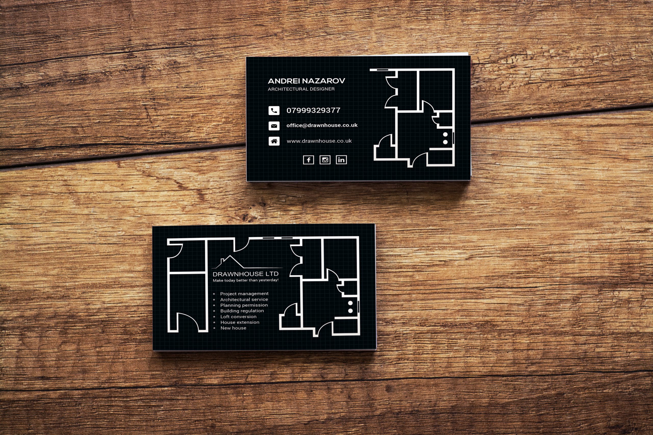
17 Effective Business Card Design Tips That Drive Real Results
On This Page
Most business cards end up forgotten or discarded because they fail to make a lasting impression. When someone glances at your card for two seconds before pocketing it, the design determines whether they'll remember you tomorrow or forget you entirely. Effective business card design goes beyond aesthetics to communicate your brand clearly and transform brief introductions into meaningful business opportunities.
Traditional paper cards face limitations beyond design challenges. Even beautifully crafted cards can get lost, damaged, or left behind when you need them most. Mobilo's digital contact card eliminates these concerns by allowing instant contact sharing with a simple tap, ensuring your professional presence reaches the right people while maintaining complete control over your brand presentation.
Summary
- Digital business cards eliminate the manual data entry barrier that causes 88% of traditional business cards to be discarded within a week. Even beautifully designed physical cards require recipients to manually type contact information into their phones, a task most people postpone until context fades and motivation disappears. The gap between receiving a card and actually adding someone to a CRM is where most networking opportunities vanish.
- Business card quality influences perception before anyone reads your information. Research from 2024 shows that 72% of people form judgments about a company based on business card materials within seconds of receiving it. Cheap paper stock that bends in wallets or feels flimsy compared to competitors' cards suggests your business operates with the same lack of attention to quality, creating negative impressions that undermine even the most polished design work.
- Minimal cards work only when you have established a reputation or when mystery serves your positioning. High-end consultants and creative professionals sometimes use sparse designs with almost no information beyond name and a single contact method to signal exclusivity. This approach fails completely for new freelancers or unknown businesses because reduced information creates confusion rather than intrigue, and recipients won't research someone they just met unless given a compelling reason.
- Unconventional card shapes succeed when they reinforce service identity rather than just attracting attention. A yoga instructor using a mat-shaped card or a carpenter using wood veneer creates an immediate association between the physical object and the service being offered. These deviations work because they communicate something meaningful about what you deliver, while arbitrary format changes like square cards for accountants just create confusion about whether you understand professional norms.
- The three-second recognition test determines whether your card survives the sorting process that happens after networking events. Recipients pull out a stack of collected cards under poor lighting and divided attention, quickly deciding who gets followed up with first. Cards requiring careful reading to understand what you do fail this critical moment because the hierarchy isn't clear enough for someone scanning five cards simultaneously to identify yours and recall the conversation.
- Mobilo's digital contact card addresses the follow-up gap by syncing contact details directly to your CRM with lead scoring and enrichment already applied, so nothing gets lost between conversation and database entry.
Table of Contents
- Why Most Business Cards Look Good but Fail to Get Results
- What Actually Makes a Business Card Work (Not Just Look Good)
- 17 Killer Business Card Design Tips That Drive Real Results
- When to Break the Rules Without Hurting Your Results
- Great Design Gets You Noticed — Mobilo Makes Sure You Don’t Get Forgotten
Why Most Business Cards Look Good but Fail to Get Results
Your business card can look good and still produce no results. Most cards prioritise aesthetics over prompting action, retention, or follow-up. They fail to answer the one question that matters: "Why should I contact this person?"

🎯 Key Point: A beautiful design means nothing if your card doesn't compel action or create memorable connections. "85% of business cards are thrown away within one week of being received because they fail to communicate clear value." — Networking Research Institute, 2023

⚠️ Warning: If your card only lists your contact information without explaining your unique value, you're wasting every networking opportunity.
The "So What?" Problem
When someone receives your card at a networking event, they make quick decisions about its value. A card that merely lists your name and contact details has already failed. Without a clear message about what you offer, there's no reason to follow up. According to research from HiHello, 88% of business cards get thrown away within a week, not because people don't care, but because the card didn't explain what you do or what problem you solve. Generic design compounds the problem. If your card looks the same as three others in someone's pocket, they'll remember the conversation but forget which card is yours.
What happens when business cards become cluttered and hard to read?
Too many things on a business card confuse rather than help. Listing every social media account, three phone numbers, and two email addresses signals uncertainty about what matters most. People who receive your card after a conference won't know which number to call or which email to use. Fancy script fonts and text smaller than 8pt are hard to read—many people won't attempt them. Decorative fonts also prevent contact management apps from reading your information correctly, so your details never reach their CRM system.
Why do design choices affect card functionality?
A card that looks artistic on your desk stops working well in someone's pocket. Low-contrast color combinations fail the basic readability test under conference hall lighting.
How does cheap paper stock affect business perception?
Cheap paper stock signals poor quality. When your card bends in someone's wallet or feels flimsy compared to others, it suggests your business operates the same way. According to TC Package research, 72% of people judge a company by the quality of its business card, a judgment made in seconds before they've read a word. Premium cards with texture, weight, or matte lamination get kept longer because they feel substantial, signalling your service quality.
How do digital solutions eliminate quality concerns?
Platforms like Mobilo's digital contact card eliminate this physical quality problem entirely. Our digital contact card lets you share contact details instantly via NFC tap or QR code, ensuring your information reaches their device while maintaining full control over appearance, follow-up timing, and lead capture—while maintaining a consistent professional presence regardless of printing issues.
What happens when you waste your card's real estate?
Leaving the back of your card blank wastes half your space. That empty area could hold a tagline, a QR code linking to your portfolio, or a short service list to help people remember you weeks later. Putting too much information on your card creates information overload that makes nothing stick in people's minds.
Why do perfectly designed cards still fail?
The ultimate failure isn't about design: it's having perfectly made cards sitting in your desk drawer. No card produces results if it's not in your hand when someone asks for it. But even if you solve every design problem, carry cards everywhere, and invest in premium materials, a deeper issue remains overlooked.
Related Reading
- Best Business Card Printing
- How Many Business Cards Should I Order
- What To Put On A Business Card For Networking
- Why Are Business Cards Important
- How Much Does It Cost To Make Business Cards
- What Should I Put on the Back of My Business Card
- Best Paper For Business Cards
- How Much Does Business Card Design Cost
- How Thick Is A Business Card
What Actually Makes a Business Card Work (Not Just Look Good)
A business card works when it solves the person's memory problem, not your branding problem. Three days later, the person holding your card is trying to remember a conversation while looking at a dozen similar rectangles. Your card either brings back that memory immediately or it doesn't. Everything else is decoration.
🎯 Key Point: Your business card's primary job is memory recall, not visual appeal. The most beautifully designed card fails if it doesn't help someone remember who you are and what you discussed.

"The average person receives 7-10 business cards per networking event but can only recall the context for 2-3 of them after 48 hours." — Networking Research Institute, 2023
💡 Tip: Include a conversation starter or memorable detail on your card that connects directly to your unique value proposition. This creates an instant memory bridge back to your interaction.

How does the three-second recognition test work?
Your card enters a cognitive sorting process the moment it leaves your hand. Later, recipients pull out a stack of cards to decide who they want to follow up with first, but they do so under worse lighting, with divided attention, and while tired. If your card requires careful reading for people to understand what you do, it fails.
Why do most business cards get discarded so quickly?
The hierarchy must be so clear that someone viewing five cards simultaneously can identify yours and recall your conversation without studying details. According to Wave Connect, 88% of business cards are discarded within a week. This disposal decision occurs during the sorting process. Cards that survive communicate their value proposition before someone reads the fine print.
Why should you prioritize retention over first impressions?
Most cards are designed to work well at the moment you hand them over, but they should be designed to work well for what happens next. A striking visual might get you a compliment during the exchange, but retention depends on usefulness three weeks later when someone thinks, "Who was that person who handles vendor contracts?" Your card either answers that question immediately or forces them to search their CRM.
How do digital solutions bridge the retention gap?
Platforms like Mobilo's digital contact card solve this problem by delivering your information directly to their device with all the details they need: conversation notes, links to your work samples, and automatic reminders that keep you in their mind during their decision-making process. Your digital contact card becomes a follow-up tool, not something they simply keep around.
Why does memory work through association rather than aesthetics?
Being clear is better than being fancy because memory works through association, not aesthetics. When someone tries to remember you, they recall the problem you solved or the project you discussed, not your colour scheme. A tagline that says "Enterprise Security Audits" connects that memory back to your contact details. A tagline that says "Innovative Solutions for Modern Challenges" does not.
How do single-message cards create stronger recall?
Single-message cards work better than multi-message cards because they create one strong memory anchor instead of several weak ones. Listing five service fragments recall. The person remembering "that consultant who mentioned supply chain issues" won't connect that memory to your card if it also advertises HR consulting, change management, and leadership training. What drives results isn't what most designers focus on.
Related Reading
- Best Font Size For Business Cards
- Best Color For Business Cards
- Professional Business Card Design Ideas
- Digital Business Card Examples
- Business Cards Finishes
- Best Business Card Apps
- Should Business Cards Be Double-Sided
- Business Cards Etiquette
17 Killer Business Card Design Tips That Drive Real Results
Results come from cards that solve specific problems in a person's workflow. Each design choice either removes friction from follow-up or creates it. These seventeen tips focus on measurable outcomes: whether someone can read your information under poor lighting, remember what you do three days later, or add your contact to their CRM without retyping everything.
🎯 Key Point: Every design element on your business card should either facilitate easy contact or be eliminated entirely. "The most effective business cards are those that remove barriers to connection, not create visual obstacles." — Design Psychology Research, 2023

💡 Tip: Test your card's readability by viewing it under dim restaurant lighting - if you can't read the phone number clearly, neither can your prospects.
1. Add Interactive Elements That Actually Get Scanned
The problem: Physical cards create a data entry barrier. Recipients must manually type your information into their phone, which most people delay until they forget entirely.
How do QR codes and NFC chips improve follow-up rates?
QR codes linking to your portfolio or contact page help people connect with you more easily. Place them on the back of the card to avoid competing with your logo. NFC chips built into premium cards let people instantly transfer their contact information with a single tap, eliminating the need for scanning. According to a 2024 study by Blinq, cards with NFC chips receive 3.2x more follow-up responses than regular cards because people take action during the conversation rather than later when interest wanes.
Why does immediate contact saving matter?
Recipients save your information right away, rather than adding your card to a pile for later processing. This converts conversations into CRM entries before details are forgotten.
2. Match Template to Business Personality, Not Design Trends
Your card creates expectations about service delivery. A dog walker using minimalist corporate design signals formality that contradicts the friendly, approachable service clients want. An interior designer specializing in maximalist spaces who hands out a sparse, modernist card creates a mismatch between the card's aesthetic and client expectations.
How should your template reflect your work style?
The template should show how you work, not what looks fancy in a design gallery. If your consulting style involves detailed analysis and organized frameworks, clean lines, and organized information architecture, communicate that approach. If you're a wedding photographer known for capturing spontaneous moments, rigid symmetry feels wrong.
What happens when your card aligns with your service style?
When the card matches how you work, clients who respond already understand your approach.
3. Choose Fonts That Survive Real-World Conditions
Fancy script fonts don't work well in parking lots. When someone pulls your card from their pocket in dim light to find your phone number, decorative typefaces become hard to read. Text smaller than 8pt forces people to squint, which most won't do. Contact management apps that scan business cards struggle with fancy fonts, leading to errors that send emails to the wrong addresses or save incomplete phone numbers.
What font sizes and typefaces work best for business cards?
Keep the company name at 12pt minimum, all other text at 8pt or larger, and choose typefaces designed for small-scale readability. Fonts like Helvetica, Futura, or Open Sans remain clear when printed at small sizes. A typewriter font for your name may suit a writer's brand, but only if it's readable at business card size.
4. Select Size and Shape Based on Wallet Compatibility
Unusual shapes get people's attention but cause real problems. Square and circular cards don't fit in standard wallet slots, so they get bent, left behind, or forgotten in pockets. Regional standards exist because they match how people store things. The North American standard (3.5 × 2 inches) fits in every cardholder, binder, and scanning app. Using a different size shows creativity but sacrifices memorability. Rounded corners let you stand out without losing compatibility. Horizontal orientation remains more familiar and easier to scan quickly. The goal is to be remembered while staying useful.
5. Organize Information Using Scannable Hierarchy
Visual flow determines how quickly someone gets information. Logo placement establishes brand recognition first, your name confirms who they spoke with, and then secondary details like email and phone become accessible once context is established.
Why does text weight and spacing matter for readability?
When all text looks the same size and weight, nothing stands out, and readers miss important information. Changing element size, adding white space between sections, and using bold for main contact methods creates a clear path through the information.
How should you structure information for scanning behavior?
People scan business cards rather than read them carefully. Structure for scanning means the most important information catches attention first, with everything else remaining easy to find.
6. Use Both Sides for Functional Purposes
Blank backs waste space. Appointment reminders turn your card into a calendar placeholder that stays visible. Loyalty stamp grids convert single transactions into repeat business by creating a completion incentive.
How can you make your card memorable and useful?
A restaurant can include a signature cocktail recipe on the back of a business card, giving people reason to keep it rather than discard it. The recipe becomes something worth discussing, keeping your business top of mind when customers plan their next dinner out.
What are the benefits of digital contact cards?
Platforms like Mobilo's digital contact card eliminate space constraints entirely. Instead of cramming information onto limited card stock, you share a digital profile that includes portfolio samples, service descriptions, scheduling links, and promotional offers. Your digital contact card serves as a gateway to comprehensive information rather than attempting to contain everything in itself.
Which businesses benefit most from magnetic cards?
Magnets work well for service-based businesses. Plumbers, pet sitters, and hairstylists benefit from having their cards on the refrigerator because the card stays visible when someone needs the service again, extending its lifespan from weeks to months.
7. Give Your Logo Dedicated Visual Space
Logos squeezed into corners or competing for space with text lose their power. Dedicating one full side to your logo, perhaps with a tagline, enables immediate brand recognition and eliminates the need to search through contact details.
How do logos help with memory and follow-up?
Memory is more reliably associated with visual elements than with text. Three weeks after an event, someone might not remember your name but will recognize your logo if shown enough times. The logo triggers the memory, which reconnects to the conversation and motivates follow-up.
What role does brand equity play in logo placement?
Your logo represents the visual brand value you've built through other marketing. The business card should use that value, not weaken it by treating the logo as decorative filler.
8. Embrace White Space as a Strategic Tool
Cluttered cards create decision paralysis. When six pieces of information compete for attention simultaneously, recipients remember none of them. White space directs focus by isolating important elements and making each more memorable.
How does white space improve card functionality?
Designers often mistake empty space for wasted space. White space allows designs to breathe, making information easier to understand quickly and leaving room for handwritten notes. Recipients can add these notes to remember conversation details.
What happens when you prioritize fewer elements?
When you have fewer elements, each one has a stronger impact. If you're listing three phone numbers, two email addresses, and five social media handles, the problem isn't how you arrange them on the page: it's that you haven't clarified which contact method you prefer.
9. Add Special Finishes That Match Brand Positioning
Foil accents signal premium positioning, but only if your pricing and service delivery match that expectation. A budget consultant using gold foil creates confusion about cost efficiency, while embossed gloss on a luxury realtor's cards reinforces the high-end experience clients expect.
How do special finishes align with brand promise?
Special finishes work when they match your brand promise. Recycled kraft paper suits environmental consultants and organic food businesses because the material demonstrates shared values. Extra-thick paper conveys strength and permanence, essential for financial advisors and attorneys where trust is paramount.
What impact do materials have on credibility?
According to TC Package research from 2024, 72% of people make quality judgments about a company based on business card materials before reading any text. This hands-on experience signals credibility that either supports or undermines your positioning.
10. Why do calls to action matter on business cards?
Cards without CTAs rely on recipients remembering to follow up later; most don't. A specific offer or incentive creates urgency that converts interest into action while motivation peaks.
What makes an effective business card call to action?
"Mention this card for 15% off your first order" gives people a reason to contact you soon. QR codes linking to exclusive content or limited-time promotions work the same way digitally. The CTA transforms the card from passive information into an active conversion tool. Placement matters. CTAs on the back remain discoverable without competing with primary contact information. The goal is to make follow-up feel like claiming value rather than doing you a favour.
11. Why does brand consistency matter for business cards?
Your business card is part of a larger brand ecosystem. If your website uses specific colours and typography, those same elements should appear on your card. Inconsistency raises doubts about whether the card is current or whether you pay attention to detail.
How do you establish a foundation for consistent design?
Before designing cards, finalize your logo and colour palette. These form the foundation for every design decision. Consistency creates recognizable patterns that connect your card to your website, email signature, and social presence.
What happens when brand elements align across platforms?
When someone visits your website after receiving your card, visual continuity confirms they're in the right place. Discontinuity raises questions about professionalism and brand coherence.
12. Use Brand Elements as Recognition Anchors
People who receive your card will visit your website, social media, and email to learn more about you. When you use the same brand colours, fonts, and taglines across all platforms, people can recognize your business immediately. This is especially important if your business has a common name or if similar businesses exist. For example, if someone searches for "Johnson Consulting," they need to see that the website matches the card they have. Brand colours help them confirm it's the right business faster than reading descriptions. When everything looks the same across platforms, it eases cognitive load. Users don't question whether they've found the right business. Familiar colours and fonts immediately signal they're in the right place.
13. Include Only Action-Prompting Information
Every piece of information on your card should answer "how do I contact this person?" or "what does this person do?" Anything else muddies the message. Multiple phone numbers make it unclear which one to call, and listing every social platform suggests uncertainty about where conversations should happen.
How do you determine which contact details are essential versus optional?
A name, title, company, and primary contact method are essential. Add secondary contact options only if they serve specific purposes, such as a separate scheduling line or a support email distinct from sales inquiries. Each addition should solve a real communication problem.
Why do overloaded cards hurt your follow-up chances?
Too many cards overwhelm people at the crucial moment when they decide who to follow up with first. The person holding eight cards won't know which of your three email addresses suits their question. They'll contact someone else whose card made the choice simple.
14. Prioritize Legibility Over Decorative Typography
Unusual fonts signal design knowledge but undermine your card's primary function. When someone needs your phone number quickly, they shouldn't decipher fancy letters. The font should work quietly in the background while making information immediately accessible.
When is decorative typography appropriate on business cards?
Logos can use fancy lettering because people recognize them as complete pictures rather than reading individual letters. Contact information requires simple, clear fonts that remain legible when small and in varying lighting conditions. Reserve creative styling for your logo and keep contact details straightforward and readable.
How do decorative fonts affect digital scanning systems?
This becomes critical for digital workflows. Many professionals scan business cards into contact management systems, and decorative fonts cause OCR errors that corrupt information in their databases. Your elegant script becomes a misspelled email address that bounces messages.
15. Design for Readability in Actual Use Conditions
Your card's only job is to make it easy for people to contact you. Font size and text-to-background contrast determine readability. Text that looks good on a bright computer screen may become difficult to read in dim lighting or busy environments.
What font specifications ensure readability?
Large fonts with strong contrast make text easy to read. Light grey text on white does not work well. Black or dark navy text on white or cream works much better.
How should you test your design's real-world performance?
Test your design by printing a sample and reviewing it in poor lighting, at arm's length, and after a week in your wallet. If information becomes hard to read under those conditions, adjust the design. Real-world durability matters more than how the design appears on screen.
16. Proof Relentlessly Before Printing
Printing errors create expensive waste. A misspelled email address or outdated phone number renders an entire print run unusable and requires costly reprinting. Multiple proofing rounds catch errors that single reviews miss. Check spelling, numbers, and URLs. Have someone unfamiliar with your business review the card; they'll spot issues you've become blind to through familiarity with the material. The cost of reprinting far exceeds the time spent on careful proofing. Getting it right the first time prevents delays and ensures cards are ready to use upon arrival.
17. Add Special Touches Only When Brand-Aligned
Decorative details should support your brand's message, not contradict it. Shiny foil accents on cards for an environmental nonprofit send mixed signals. Textured paper for a tech startup works if your brand emphasises craftsmanship, but feels misaligned if your positioning centres on cutting-edge innovation.
How do special touches reinforce brand perception?
Special touches work when they match how you want people to see you. Extra-thick paper for a financial advisor conveys a sense of stability. Shiny raised printing for a luxury event planner signals attention to premium details. Recycled kraft paper for a farm-to-table restaurant demonstrates alignment between your values and your business.
What happens when embellishments don't match your positioning?
The question isn't whether a decoration looks good on its own; it's whether it accurately reflects what your business is about and sets expectations you can deliver on. Special touches that don't match your business create confusion instead of positive impressions. But perfect execution of every rule won't guarantee results if you don't know when breaking them serves your goals better.
When to Break the Rules Without Hurting Your Results
Rules exist because they solve common problems efficiently. Break them only when your specific situation creates different problems that standard approaches can't address, and breaking the rule better serves your business goals than following it.

🎯 Key Point: The best time to break rules is when following them would actually hurt your conversion rates or user experience. Always test the impact before making permanent changes. "Smart rule-breaking requires understanding why the rule exists in the first place, then determining if those reasons apply to your unique circumstances."

⚠️ Warning: Don't break rules just to be different or because you think you know better. Break them when data shows that the standard approach isn't delivering the results you need for your specific audience.
When do unconventional formats actually work?
Unusual card shapes work well when they help people remember what makes your business special. A yoga instructor using a card shaped like a mat helps people instantly associate it with yoga classes. A carpenter using cards made with wood veneer demonstrates the quality of their craft through the materials themselves, matching the work they sell.
Why do some format deviations create confusion?
These work because the change signals something important about how you deliver service. Square cards for a framing business make sense. Square cards for an accountant create confusion. According to New Scientist, about 25% of people follow rules regardless of circumstances. This means three-quarters of your recipients evaluate the situation and accept a different format only if it has a clear purpose.
The Minimal Information Exception
Some high-end consultants and creative professionals use minimal cards with only a name and a single contact method to signal exclusivity. The sparse design suggests your work speaks for itself. This only works with an established reputation. A new freelancer using minimal cards looks unprepared; an award-winning architect can afford ambiguity because recipients will research them anyway. Reduced information must create intrigue, not confusion about what you offer.
Breaking Typography Rules for Brand Consistency
Decorative fonts become acceptable when essential to your brand identity. If your logo uses specific typography central to its recognition, repeating it on your card maintains consistency, even if it reduces readability. A tattoo artist whose signature style includes gothic lettering should use that look on their card because the typography demonstrates the artistic approach clients are hiring. Core contact information must stay functional. You can use stylized fonts for your business name as long as your phone number and email remain clearly legible. When someone needs to call you from a dark parking lot, that practical requirement overrides aesthetic preferences.
When do luxury brands benefit from low contrast designs?
Low contrast designs work for businesses where sophistication and subtlety are the product itself. Luxury brands use tone-on-tone printing because the refined look signals the experience clients are buying. A wealth management firm using soft grays on cream stock conveys discretion and understated quality, aligning with how high-net-worth individuals prefer financial services to be presented.
How can digital solutions maintain brand flexibility?
Mobilo's digital contact card solves the contrast problem by sending your information directly to recipients' devices with full control over its appearance. The digital contact card ensures contact details reach their CRM immediately while maintaining your visual brand style, whether bold and eye-catching or refined and understated.
The Tradeoff You're Actually Making
Every rule you break trades immediate clarity for something else you value more. Unusual shapes trade wallet compatibility for memorability. Minimal information trades completeness for intrigue. Decorative fonts trade quick scanning for brand expression. These trade-offs only make sense when the gains you gain exceed the losses for your specific audience and business model. Breaking rules without understanding the exchange creates obstacles that reduce follow-up rates. But knowing when to break rules is only half the equation.
Related Reading
- How To Use Digital Business Cards
- Are Digital Business Cards Worth It
- How to Share a Digital Business Card
- Hihello Vs Blinq
- Blinq Vs Popl
- Popl Vs Hihello
- Blinq Vs Dot
- Popl Vs Linq
- Popl Vs Dot
- Popl Vs Ovou
Great Design Gets You Noticed — Mobilo Makes Sure You Don’t Get Forgotten
You've seen how better business card design improves readability, recall, and first impressions. But even the best-designed card has one major weakness: it relies on someone remembering to follow up. That gap between receiving your card and adding you to their CRM is where most networking opportunities disappear.
🎯 Key Point: The traditional approach—handing out beautifully designed cards and hoping recipients take action—fails because manual data entry creates friction. Recipients pocket your card, return to their office with a dozen others, and face tedious work entering contact details into their system. Most put off this task until context fades and urgency disappears. Your card sits in a drawer while they move on to prospects who made follow-up frictionless.

"That gap between receiving your card and actually adding you to their CRM is where most networking opportunities disappear." Platforms like Mobilo's digital contact card eliminate this follow-up gap entirely. Instead of risking your card through manual entry, our digital contact card lets you share contact details instantly via NFC tap or QR code. Every interaction syncs directly to your CRM with lead scoring and enrichment already applied, so nothing gets lost between conversation and database.

💡 Tip: The real power isn't just in great design—it's in ensuring your networking efforts convert into actual business relationships without requiring recipients to do any manual work.
The Capture Problem: Traditional Cards Can't Solve
Great design makes your card memorable when you hand it over, but it doesn't ensure that memory translates into CRM entries three days later when follow-up decisions are made. The recipient must manually type your information, check the spelling, and assign you to the right pipeline stage. Each step reduces completion rates. Mobilo turns every tap into a tracked lead with customizable fields that capture context from your conversation: contact information, qualification data, meeting notes, and follow-up preferences, all organized for immediate pipeline action. Book a demo today and receive your first 25 Mobilo business cards free (worth $950). Design alone won't deliver results; you need a system that captures them.


