

.avif)

How Different Business Card Finishes Affect First Impressions
On This Page
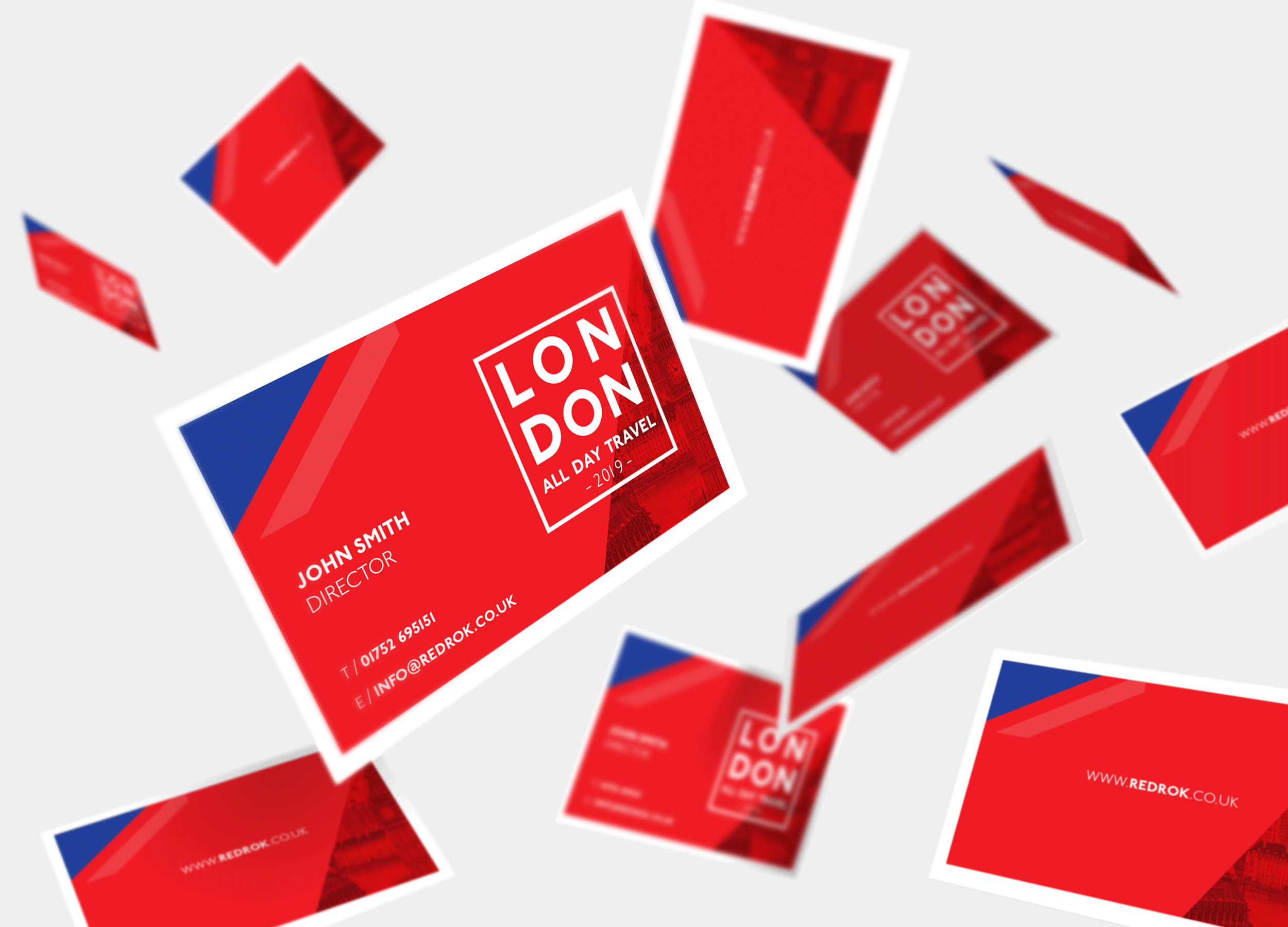
When someone receives a business card, they form an impression within seconds based on its appearance and feel. Business cards transform ordinary cardstock into a tactile experience that communicates quality and professionalism. The right finish can mean the difference between a card that gets discarded and one that stays memorable.
Traditional printed cards with premium finishes like matte, glossy, embossed, or foil-stamped surfaces certainly create impact through texture and visual appeal. However, modern professionals are discovering that combining physical appeal with digital functionality creates even stronger first impressions. For those seeking maximum memorability and convenience, Mobilo's digital contact card ensures contact information transfers instantly to recipients' phones, where it won't get lost or forgotten like traditional cards.
Summary
- The finish you choose determines credibility within three seconds of someone holding your card. According to UPrinting Blog, 72% of people judge a company or person based on business card quality, and that judgment happens through touch before sight. Premium finishes like soft-touch coating or substantial cardstock trigger unconscious associations with reliability and attention to detail, while thin, flimsy cards communicate the opposite, regardless of design quality.
- Specialty finishes create disproportionate perceived value compared to their cost. UPrinting Blog reports that 88% of business cards get thrown away within a week, which means cards that survive do so because they feel different enough to keep. Spending more per card on finishes like foil stamping, embossing, or spot UV to ensure yours gets kept rather than discarded shifts the cost calculation entirely. Ten premium cards that get kept outperform fifty standard cards that get tossed.
- Mixing too many finishes on one card creates sensory chaos instead of impact. Combining spot UV, foil stamping, embossing, and soft-touch coating on a single card makes the eye struggle to focus and reads as trying too hard rather than confident positioning. The most effective cards use one primary finish with at most one complementary accent, such as a soft-touch base with spot UV on the logo, or a matte coating with foil stamping on key text.
- Premium finishes applied to thin stock undermine the credibility they're meant to create. People register weight and rigidity before they notice surface treatment, so soft-touch coating on 12pt cardstock feels like a costume rather than substance. The finish and substrate need to match in quality level, or the disconnect becomes the dominant impression, overriding any specialty treatment.
- Even beautifully finished cards fail when they require manual data entry and follow-up. UPrinting Blog found that 90% of business cards never make it into a CRM system because the friction of manual entry kills most potential connections. Mobilo's digital contact card addresses this by pairing premium physical materials with embedded technology that transfers contact details instantly and syncs directly to CRM systems, turning introductions into trackable business opportunities rather than cards sitting in drawers.
Table of Contents
- Why Your Business Card Finish Matters More Than the Design
- 12 Business Card Finishes (And What Each One Says About You)
- How to Choose the Right Business Card Finish for Your Brand
- The Hidden Mistakes That Make Business Cards Feel Cheap
- A Great Finish Gets You Noticed—But It Doesn’t Get You Remembered
Why Your Business Card Finish Matters More Than the Design
You can spend weeks perfecting a logo, but the person holding your card decides its value in about three seconds—based on how it feels between their fingers, not your typography or color palette. According to UPrinting Blog, 72% of people judge a company or person based on the quality of their business card, and that judgment occurs through touch before sight.
"72% of people judge a company or person based on the quality of their business card." — UPrinting Blog
🎯 Key Point: Your business card finish creates the first physical impression—making it more critical than any design element you choose.

🔑 Takeaway: The three-second rule means your card's texture and finish quality determine whether someone sees you as professional or forgettable before they even read your name.
How does card weight create instant credibility?
The weight and texture of a card create an instant impression of trustworthiness and reliability. Thick card stock with textured finishes signals quality and care, while thin, shiny cards convey the opposite. This tactile experience becomes a measure of how you handle everything else: premium-feeling cards with velvet lamination or substantial weight unconsciously lead people to associate those qualities with your business practices.
Why do textured cards get kept instead of thrown away
Keepability decides whether your card ends up in a wallet or in the trash. Cards with unique textures (soft-touch coating, uncoated linen, embossed elements) create physical memories that standard cards cannot. People remember how things feel longer than what they say. A card that feels different gets kept, and a kept card eventually gets used.
How do special finishes create visual impact?
Spot UV coating against a matte background creates visual depth that flat design cannot achieve. The contrast between glossy raised elements and a soft-touch base invites tactile engagement: that brief pause to feel the texture communicates more than any tagline. It's the difference between glancing at information and experiencing a brand.
What psychological impact do premium finishes have?
Letterpress and embossing transform a card into a three-dimensional object. The indentation or raised surface creates shadows, catches light at different angles, and invites touch. Foil stamping in metallic finishes (gold, silver, copper) signals luxury and exclusivity. These psychological triggers position your brand before the conversation begins.
How does tactile branding communicate your brand personality?
Soft-touch or velvet finishes feel expensive and modern, signalling premium markets and contemporary aesthetics. Uncoated stock, linen texture, or kraft paper suggests authenticity and handcrafted quality. High gloss communicates energy and creative confidence. Each finish tells a different story about your brand through sensation alone.
What makes the right finish your brand's handshake?
The finish you choose becomes your brand's handshake. Premium finishes on digital contact cards, like those offered through Mobilo, pair tactile brand statements with instant digital connection. The physical card signals quality through materials like metal or wood, while embedded technology transfers your contact information directly to their phone—combining memorable tactile experience with practical utility that paper alone cannot deliver. The finish you choose isn't about making a good impression once. It's about which specific impression you're trying to create, and that changes everything about which finish works.
Related Reading
- Best Business Card Printing
- How Many Business Cards Should I Order
- Why Are Business Cards Important
- What to Put on a Business Card for Networking
- How Much Does It Cost to Make Business Cards
- What Should I Put on the Back of My Business Card
- Best Paper for Business Cards
- Glossy vs Matte Business Cards
- How Thick is a Business Card
- How Much Does Business Card Design Cost
12 Business Card Finishes (And What Each One Says About You)
Every finish on a business card creates a specific feeling through the senses that comes before you introduce yourself. The texture someone feels, the visual contrast they notice, the weight they register—these physical signals build credibility or doubt before a single word is exchanged. Your finish choice determines whether your card communicates premium positioning, creative energy, approachable authenticity, or forgettable mediocrity.

🎯 Key Point: The tactile experience of your business card creates an immediate impression that either reinforces or undermines your professional brand before any conversation begins.
"First impressions are formed within the first 7 seconds of contact, and physical materials like business cards play a crucial role in shaping these initial perceptions." — Harvard Business Review, 2023
💡 Tip: Consider your target audience and industry expectations when selecting a finish—what feels premium in one context might seem overly flashy in another professional setting.
1. Matte Understated Confidence
Matte coating provides a smooth, non-reflective surface that eliminates glare for easy reading in any light. It resists fingerprints better than uncoated stock and conveys confidence through its subdued finish. This finish works best for consultants, architects, designers, and professionals in industries where sophistication matters. It pairs exceptionally well with spot UV or foil accents because the contrast creates visual hierarchy. The downside is that ink won't stick to matte coating, so you cannot write appointment times or notes on cards. Matte says you're polished, confident, and focused on substance over spectacle.
2. Glossy Bold and Visual-First
A glossy coating brightens colours and creates a shiny surface that makes images and graphics stand out. It's ideal for photographers, event planners, creative agencies, and retail businesses: brands that lead with visual identity. The high-shine surface conveys energy, boldness, and confidence. The tradeoff: gloss shows every fingerprint, smudge, and scratch, and reflects light in ways that make it harder to read in bright conditions. However, when your brand identity depends on colour intensity and visual impact, gloss delivers that better than any other finish. Glossy signals you're dynamic, visually driven, and unafraid to stand out.
3. Soft-Touch (Velvet Lamination) Premium Tactile Luxury
Soft-touch coating feels like suede or velvet and signals high quality. People hold soft-touch cards longer because the tactile sensation invites repeated touch, creating a physical memory. This finish works for luxury brands, high-end service providers, and boutique businesses where exclusivity matters. It pairs well with spot UV or foil stamping: the contrast between the velvety base and glossy accents creates a multi-sensory experience. The higher cost is justified when your pricing depends on premium positioning. Soft-touch signals that you operate at the top tier of your market, where every detail matters.
4. Spot UV Contrast and Emphasis
Spot UV applies a shiny, high-gloss coating to specific areas of a matte or soft-touch card, creating raised, tactile elements that catch light. The textural contrast produces visual depth and encourages tactile engagement. The most common use is to highlight logos, but spot UV also works equally well for key text elements, patterns, or design accents. It dries quickly and doesn't affect the back side of the card, so both sides remain fully usable. This differs from matte finishes that prevent pen ink from working or embossing that creates unwanted marks on the back. Spot UV demonstrates understanding of contrast's power and investment in details most people skip.
5. Embossed and Debossed: Craftsmanship and Dimension
Embossing raises elements above the card surface, while debossing presses them below the surface. Both create three-dimensional texture that people feel before they see, with raised or recessed areas casting shadows and catching light differently depending on the angle. A limitation of embossing is that it creates a matching debossed impression on the back side, which can interfere with the back-side design. Letterpress offers a solution by applying lighter pressure to create a subtle debossed effect on one side without affecting the other. These finishes work best for brands that emphasize craftsmanship, heritage, and attention to detail, such as law firms, financial advisors, artisan businesses, and established brands with legacy positioning. Embossing signals you value tradition, precision, and quality that reveals itself through touch.
6. Foil Stamping: High-End Standout
Foil stamping applies metallic foil (gold, silver, copper, black, or specialty colours) to paper using heat and pressure, creating a shiny accent that catches light and draws attention. The foil sits slightly recessed into the card surface, adding subtle dimension and metallic shine. The constraint is colour limitation. Foil comes in specific metallic shades, so if your brand palette excludes gold, silver, or copper tones, this finish may not align with your visual identity. When it does align, foil stamping communicates exclusivity and sophistication more effectively than any other finish. It works for high-end service providers, luxury goods, executive-level professionals, and brands where prestige matters. Foil stamping signals you operate at the top of your market and invest in materials that reflect that positioning.
7. Die Cut: Purposeful Differentiation
Die cutting shapes your card into a custom form, or cuts shapes into it, creating visual interest and making it stand out. A dentist using a tooth-shaped card creates a meaningful connection between the card's form and the business. A random shape without a clear connection to your business comes across as gimmicky. Most printing companies maintain libraries of ready-made dies (such as coffee cups, vehicles, tools, and common shapes), but custom dies cost more and require longer production times. Aggressive die cuts also reduce the usable area for contact information, so you must balance aesthetics against functionality. Die cut works when the shape strengthens your brand identity or makes people instantly recognise what you do. It demonstrates creativity, memorability, and a willingness to break standard formats when appropriate.
8. Edge Painting: Subtle Brand Reinforcement
Edge painting puts colour on the exposed edges of your card stock, creating a thin line visible when the card sits on a table or at an angle. People notice it because it's unexpected.
How does edge painting enhance your brand without overwhelming
The best use is adding secondary brand colours that might not show up prominently in your main design. Edge painting adds polish and attention to detail without overwhelming primary visual elements, making it work across industries because it's subtle enough to enhance rather than dominate. Edge painting signals that your brand identity extends to every visible surface: the finish equivalent of wearing shoes that the right people will notice.
9. Textured Paper Stock: Organic and Tactile
Textured paper (linen, felt, laid, canvas, kraft) creates tactile surface variation. Unlike coatings that sit on top, texture is built into the paper itself. Linen suggests traditional professionalism, felt conveys softness and approachability, and kraft signals environmental consciousness and handcrafted authenticity.
How should textured paper be finished for the best results?
These finishes work best without a coating or with a light coating, since heavy lamination flattens the texture and removes the tactile experience. They're ideal for creative professionals, environmental brands, artisan businesses, and anyone positioning themselves as authentic, handmade, or rooted in traditional craft. Textured stock signals that your brand values natural materials and has depth beyond surface appearance.
10. Uncoated Stock: Authentic and Writable
Uncoated paper absorbs ink and accepts pen writing. Its natural, slightly rough surface differs from coated cards and is the only finish suitable for handwritten notes, making it essential for appointment cards, referral cards, or any situation requiring written information.
What are the durability tradeoffs with uncoated cards?
The tradeoff is durability: uncoated cards show wear faster, stain more easily, and lack protective barriers. But that imperfection works in your favor if your brand emphasises authenticity, approachability, or human connection over polished perfection. Uncoated says you're accessible, genuine, and prioritise real connection over impressive presentation—the finish equivalent of a handwritten note in a world of digital messages.
11. Folded Cards Expanded Information Space
Folded business cards double or triple your available surface area while maintaining standard wallet-friendly dimensions when closed. Use them for service lists, appointment scheduling, product information, or visual storytelling across multiple panels. The most effective folded cards use the format purposefully. An IT repair business with a card that opens like a laptop creates a connection between form and function. For appointment cards, skip all coatings so the ink adheres properly. Folded cards signal that you have more to communicate than fits in conventional space and that you've found a creative solution to that constraint.
12. Painted Edges: Bold Visual Differentiation
Painted edges (also called edge colouring or edge gilding) apply opaque colour to all four edges of your card stock, creating a solid band of colour visible from every angle. This produces a bolder, more saturated colour block, making your card instantly recognisable in a stack. This finish works when you want maximum differentiation, and your brand uses bold, confident colours. It's more common in creative industries, fashion, design, and businesses where visual impact drives brand recognition.
How should you choose colors for painted edges?
The colour choice should reinforce your primary brand palette, not introduce a random accent. Painted edges signal confidence, visual boldness, and a design meant to be noticed: the finish equivalent of a signature colour that becomes part of your brand identity. The real question isn't which finish looks best in a mockup: it's which finish creates the exact impression your positioning requires.
Related Reading
- Best Font Size For Business Cards
- Best Color For Business Cards
- Business Card Design Tips
- Professional Business Card Design Ideas
- Digital Business Card Examples
- Best Business Card Apps
- Should Business Cards Be Double-Sided
- Business Cards Etiquette
How to Choose the Right Business Card Finish for Your Brand
The finish you choose should convey how you want people to perceive you in the first three seconds someone holds your card. Start with your brand personality, then filter through use case and budget. A luxury consultant needs a different tactile signal than a creative director, and a card distributed at trade shows faces different durability demands than one exchanged in boardroom meetings.

🎯 Key Point: Your business card finish is a tactile representation of your professional brand - choose one that aligns with your industry expectations and target audience.
"You have 7 seconds to make a first impression - your business card finish contributes to that crucial initial perception." — Forbes, 2018

⚠️ Warning: Don't choose a premium finish like embossed foil if your budget requires you to compromise on card quality or design elements - a well-executed standard finish beats a poorly-executed luxury finish every time.
How do luxury brands benefit from premium finishes?
Luxury brands benefit from soft-touch coating or foil stamping, which create tactile and visual signals that reinforce premium positioning. These finishes feel expensive because they are, and that investment communicates instantly through touch. Financial advisors, luxury real estate agents, and boutique service providers use these finishes to convey substance and refinement.
What finishes work best for creative professionals?
Creative professionals need finishes that demonstrate visual sophistication and experimentation. Spot UV over matte creates contrast and dimension. Die cuts show conceptual thinking. Painted edges signal confidence in bold visual choices. The finish becomes proof of creative capability before the portfolio conversation begins.
How should corporate industries approach business card finishes?
Corporate and traditional industries (law, accounting, consulting) require finishes that convey reliability and professionalism without appearing flashy. Matte coating or uncoated linen stock demonstrates quiet confidence, while glossy finishes or metallic foil risk seeming overwrought in contexts where conservative credibility is paramount.
What finish works best for high-volume networking events?
Business cards distributed at large networking events must prioritize durability over aesthetics. Shiny or matte coatings protect against wear, moisture, and friction from being stacked in bags or pockets. Uncoated cards deteriorate in such environments. Soft-touch coating shows fingerprints and smudges quickly when handled repeatedly by multiple people.
How should client meetings influence your finish choice?
Client meetings allow for more delicate finishes since cards get handled carefully and stored intentionally. Embossing, letterpress, and textured stocks work here because recipients treat cards as keepsakes rather than disposable items. If your business depends on repeat clients and referrals, invest in finishes that create memorable tactile experiences.
What finish do appointment-based businesses need?
Businesses that operate by appointment (such as salons, doctors' offices, and service providers) need surfaces you can write on. Uncoated stock is the only finish that reliably accepts pen ink. If you're writing appointment times or follow-up details on cards, skip all coatings: functionality matters more than a premium feel.
When should you choose standard versus specialty finishes
Standard finishes (matte, gloss, uncoated) cost less and work when volume matters more than standing out or creating a premium feel. A startup networking heavily at industry events might prioritise quantity and durability over luxury finishes until brand recognition grows. Specialty finishes (soft-touch, foil stamping, embossing, spot UV) increase per-card cost significantly but create disproportionate perceived value. According to UPrinting Blog, 88% of business cards are discarded within a week. Cards that survive do so because they feel distinctive enough to keep. Ten premium cards that get retained outperform fifty standard cards that get discarded.
How can you strategically combine different finishes
The smartest approach combines finishes strategically: use premium finishes for high-value prospects, key clients, and strategic networking contexts, and standard finishes for volume distribution at conferences or trade shows. This matches investment to opportunity. But here's what determines whether your finish choice works: avoiding the specific mistakes that make even expensive finishes feel cheap. Most people make at least two of them without realizing it.
The Hidden Mistakes That Make Business Cards Feel Cheap
Choosing a premium finish doesn't guarantee a premium look. Common mistakes include mixing finishes that compete with each other, applying expensive treatments to low-quality materials, or neglecting how the finish works with your design. These errors undermine specialty finishes, making them appear cheap because they reveal a misunderstanding of what you're paying for.
🎯 Key Point: The most expensive finish applied incorrectly will always look cheaper than a basic finish executed with thoughtful intention.
"A premium finish on poor-quality cardstock is like putting designer shoes on a poorly tailored suit – it highlights the quality mismatch rather than elevating the overall impression." — Print Industry Standards, 2024
- Foil + emboss + spot UV — Why it looks cheap: Too many competing elements; Better approach: Choose one hero to finish
- Metallic foil on thin stock — Why it looks cheap: Finish overpowers the base; Better approach: Use thicker cardstock (16pt+)
- Spot UV over poor design — Why it looks cheap: Highlights design flaws; Better approach: Perfect design first, then enhance
⚠️ Warning: Mixing multiple premium finishes on a single card creates visual chaos and makes each individual treatment look less intentional and more desperate for attention.
What happens when you mix too many finishes on one card?
Spot UV, foil stamping, embossing, and soft-touch coating each create different tactile and visual experiences. Combining all of them on a single card creates sensory chaos: the eye doesn't know where to focus, the hand encounters competing textures, and the overall effect reads as trying too hard rather than confident.
How should you combine finishes for maximum impact?
The best cards use one main finish with at most one accent. A soft-touch base with spot UV on the logo creates contrast. A matte coating with foil stamping on key text adds emphasis. Embossing alone on quality stock makes a statement. Multiple specialty finishes together diminish each other's effectiveness.
When does a glossy finish hurt readability?
High-gloss finishes make colours look brighter but create reflections that impair text readability in certain lighting. Small font sizes, detailed contact information, and important text become difficult or impossible to read when someone tilts the card to avoid glare. While the finish appears bright and vibrant under controlled lighting, it fails in real-world situations where legibility matters.
Which business types should avoid glossy finishes?
Gloss works for portfolio cards, where the image is the message, or for retail brands, where colour saturation drives recognition. For professional services where someone needs to quickly find your phone number or email, matte or uncoated finishes work better. A card that looks impressive but can't be read isn't premium; it's a decorative failure.
Why does paper quality matter more than the finish itself?
Special finishes on thin cardstock feel like expensive paint on cheap materials. The card bends too easily, feels flimsy, and undermines the credibility that the finish was meant to create. People notice weight and stiffness before noticing surface treatment. When those basic qualities signal low investment, no amount of foil stamping compensates. Premium finishes require premium cardstock to perform as intended. Soft-touch coating on 16pt cardstock delivers the tactile luxury the finish promises; the same coating on 12pt cardstock feels like a costume. Thicker cardstock costs more, but the difference is small compared to the impact on appearance and feel. The finish and cardstock must match in quality, or the mismatch becomes what people notice.
How do digital contact cards solve the quality equation?
Traditional printed cards display static information. Digital contact cards combine high-quality physical materials (metal, wood, or thick coated stock) with embedded NFC technology that instantly transfers live contact information. Our digital contact card feels expensive because it is, but it delivers capabilities that paper cannot match: capturing lead data and automatically syncing to CRM systems. The finish signals quality while the technology ensures measurable business outcomes rather than languishing in a wallet. But even perfect materials and thoughtful finish selection don't matter if the card ends up in the trash within days, which happens when you miss the final critical element most people never consider.
A Great Finish Gets You Noticed—But It Doesn’t Get You Remembered
That premium finish creates a first impression, but impressions fade. The card gets filed, stacked with others, or tucked into a wallet where texture ceases to matter. What happens next depends on whether the holder remembers who you are, what you do, and why they should reach out. Most cards fail that test because they rely entirely on someone else's memory and initiative.
💡 Tip: Even the most expensive finishes can't overcome the fundamental problem of manual data entry and follow-up friction.
"90% of business cards never make it into a CRM system." — UPrinting Blog
According to UPrinting Blog, 90% of business cards never make it into a CRM system. Even beautifully finished cards require the recipient to manually enter your information, remember to follow up, and take action later. This friction kills most potential connections before they begin.
- Traditional Cards — Manual data entry required; No CRM integration; Relies on recipient memory; No tracking capability
- Digital Cards — Instant transfer; Automatic sync; Automated follow-up; Lead scoring included
Digital contact cards solve this by pairing premium physical materials with embedded technology that instantly transfers contact details. With Mobilo, the recipient taps or scans, your information populates their phone automatically, and the interaction syncs directly to your CRM with lead scoring and enrichment. The finish creates credibility that makes someone want to connect, while our technology ensures that connection converts into a trackable business opportunity.
⚠️ Warning: Without digital integration, even premium cards become expensive drawer decorations that generate zero ROI.
Premium finishes establish your card's positioning and make it worth keeping, but without instant digital transfer and automated CRM integration, you're relying on someone else to turn that introduction into a real relationship. Most won't. The card sits in a drawer, and the opportunity disappears regardless of how good the coating felt.
🔑 Takeaway: Premium finishes get attention, but digital technology gets results—combining both creates the ultimate networking advantage.
Next step: Book a demo today and get your first 25 Mobilo digital business cards free (worth $950). Turn every introduction into a connection that reaches your pipeline.
Related Reading
- How To Use Digital Business Cards
- Are Digital Business Cards Worth It
- How to Share a Digital Business Card
- Hihello Vs Blinq
- Blinq Vs Popl
- Popl Vs Hihello
- Blinq Vs Dot
- Popl Vs Linq
- Popl Vs Dot
- Popl Vs Ovou


