.avif)

11 Therapist Business Card Examples for Every Practice Style
On This Page
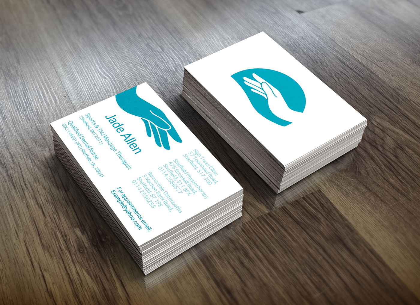
A therapist's business card does more than share contact details. It signals professionalism, communicates approach, and helps potential clients decide within seconds whether to reach out. Reviewing therapist business card examples reveals what builds trust, what falls flat, and how design choices can attract the right clients to a practice.
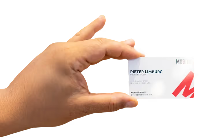
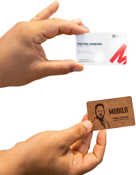
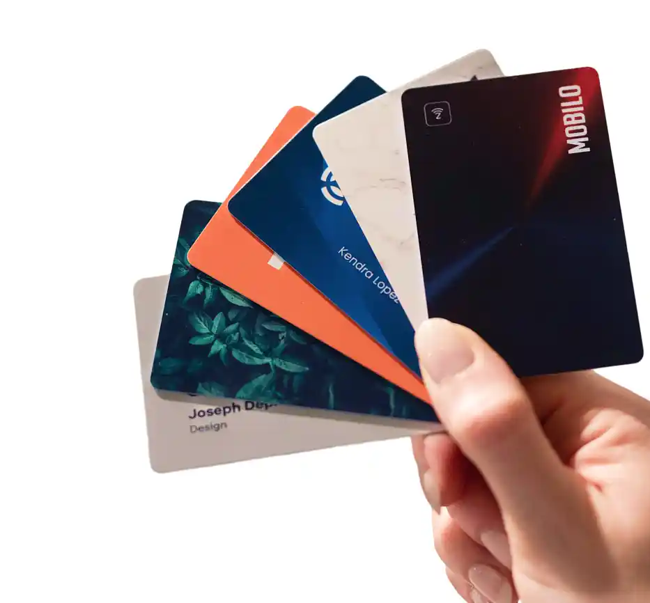
The shift toward digital alternatives has made it easier to share credentials, contact information, and booking links in a single interaction. Rather than handing someone a paper card they may lose, therapists can leave a lasting, actionable impression with a digital business card from Mobilo.
Summary
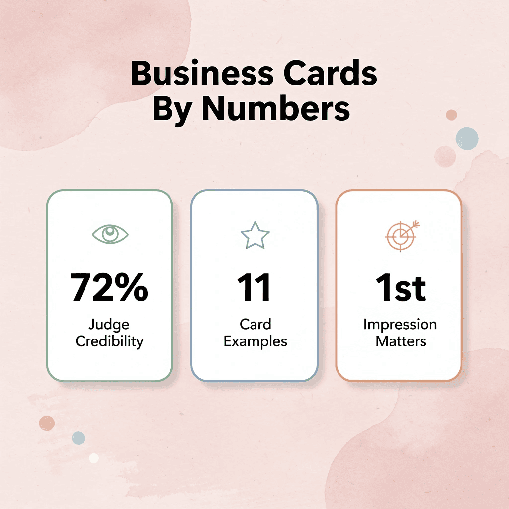
- Trust is the foundation of any therapeutic relationship, and it begins to form before a single word is spoken. Research consistently shows that 72% of people judge a person's credibility based on the quality of their business card alone. For therapists, where the entire practice depends on a client feeling safe enough to reach out, that first impression carries more weight than in almost any other profession.
- Design choices communicate emotional tone before the conscious mind processes the content. Color psychology research shows that muted earth tones and soft blues signal calm and approachability, while rounded sans-serif fonts read as warmer than rigid serif alternatives. These are not aesthetic preferences but functional decisions that affect whether a prospective client feels drawn in or pushed away.
- Specificity on a business card functions as a trust signal in ways that generic credentials do not. A card listing "Licensed Professional Counselor, Specializing in Adolescent Anxiety" tells a potential client whether they have found the right fit in under three seconds, while a card that simply lists a credential communicates almost nothing about who the therapist actually serves.
- Readability directly affects whether a card gets kept or discarded. According to Wave Connect's business card statistics, 88% of business cards are thrown away within a week of being received, and design friction, such as low-contrast text or decorative fonts used for contact details, accelerates that timeline. A minimum 10pt font for body text and clean typography for contact information reduce the effort required from someone who may already be anxious about reaching out.
- The moment a card changes hands is more consequential than most practitioners treat it. Most therapists hand over a card and have no way of knowing what happens next, creating a gap between a promising conversation and an actual booked session. Turning that exchange into a trackable event rather than a forgotten paper artifact requires a fundamentally different approach to how contact information is shared and followed up on.
- Format and material choices signal investment in professional identity in ways that affect how a practice is perceived. Cards with unusual shapes, quality stock, or sustainability-forward materials like seed paper or recycled kraft communicate intentionality, and 39% of people report they would not do business with someone whose card looks cheap, a number that becomes more consequential when a practice depends on first impressions converting into booked sessions.
- Mobilo's digital business card addresses this by letting therapists share contact details, credentials, and a direct booking link in a single tap while automatically feeding each new connection into a follow-up workflow.
What Makes a Therapist's Business Card Memorable?
Your business card arrives before you do. Before you shake someone's hand or explain your approach, that small rectangle has already made a judgment call on your behalf. The question isn't whether your card communicates something — it's whether it communicates the right thing.
"Your business card is a silent ambassador — it speaks on your behalf before you ever say a word." — Design & Branding Principle
🎯 Key Point: A therapist's business card isn't just contact information — it's a first impression, a trust signal, and a brand statement all compressed into one tiny but powerful format.
💡 Tip: Ask yourself: if a potential client saw only your business card, would they feel safe, understood, and compelled to reach out? If the answer is anything less than absolutely yes, your card needs work.
- Design & Color: Establishes warmth and professionalism, setting the emotional tone for the interaction.
- Typography: Ensures readability and approachability, which fosters immediate trust.
- Credentials: Highlights expertise and legitimacy, significantly reducing customer hesitation.
- Contact Details: Signals availability and ease of use, directly encouraging prompt action.

Why does card quality matter so much for therapists?
A therapist's business card means something different than a contractor's or realtor's card. It conveys safety, skill, and warmth before anyone reads it. According to the UPrinting Blog's Business Cards Statistics, 72% of people judge a company or person by the quality of their business card. For a therapist, where trust is paramount, that judgment happens fast and lingers.
Why does design do the talking first?
Color psychology isn't decoration. Muted earth tones and soft blues communicate calm and approachability in ways bright red or sharp geometric layouts do not. Typography works similarly: a rounded sans-serif reads warmer and more accessible than a rigid serif, even with identical words. Cognitive fluency research shows that easier visual processing increases perceived trustworthiness. Your card's design performs emotional labor before the reader's conscious mind catches up.
What happens when a therapist's card looks generic?
Most therapists download a template, add their name and phone number, and stop. For a potential referral partner or anxious client deciding whether to trust you with their mental health, that difference matters. 39% of people would choose not to do business with a company if it had a "cheap looking" business card, a statistic that carries weight when your practice depends on first impressions converting into booked sessions.
How does a digital card turn a first impression into a real connection?
A digital business card like Mobilo goes beyond basic contact details into a connected experience, linking directly to a booking page, credentials, or an intake form with a single tap. It becomes a trackable starting point for a real relationship, not a paper artifact buried in a wallet.
Why does branding consistency signal competence to therapy clients?
Branding consistency strengthens this effect. When your card's colors, fonts, and tone match your website, email signature, and office, clients perceive a sense of cohesion. That unified appearance signals professionalism, which in a therapeutic context translates directly into perceived competence.
Related Reading
- Business Card Ideas
- Matte Vs Uncoated Business Cards
- Types Of Business Cards
- Business Card Psychology
- What Should Be On A Business Card
- How to Make a Professional Business Card
- Rounded Corner Business Cards
- Minimalist Business Cards
- Business Card Paper Weight
- Business Card Colors
11 Therapist Business Card Examples for Every Practice Style
Each example was built with intention, not assembled from a template. According to Blueprint AI's 2024 analysis of therapist business cards, 72% of people judge a company's credibility based on business card design alone. Your card isn't decoration — it's a credibility signal that fires before you've said a word.
"72% of people judge a company's credibility based on business card design alone." — Blueprint AI, 2024
🔑 Takeaway: Your therapist business card isn't a formality — it's the first clinical impression you make. A poorly designed card can undermine trust before a single session begins.
💡 Tip: Treat your business card as a credibility investment, not a printing expense. Every design choice — font, color, layout — signals the quality of your practice.
- Clean typography: Signals a professional, detail-oriented approach to your work.
- Clear credentials: Validates your expertise, instantly building professional trust.
- Consistent branding: Conveys that your practice is established, stable, and reliable.
- Contact clarity: Demonstrates an accessible, client-first mindset that invites engagement.
1. Minimalist and Modern
Style
Clean lines, ample white space, one or two neutral colors, and a simple wordmark or geometric logo.
Design
Nothing fights for your attention. Your name, credentials, and one contact method sit on a white or off-white background, with a strong, clear sans-serif font doing the work.
Why it works
Holding back communicates confidence. When a card doesn't try too hard, it signals the practitioner doesn't need to. It's easier to understand, and the reader's eye lands exactly where intended.
Ideal for
CBT therapists, psychologists in clinical or academic settings, and practitioners working with high-functioning professionals. It may feel too sterile for play therapy or trauma-informed practices that prioritize warmth.
2. Nature-Inspired Designs
Style
Botanical line drawings, leaf patterns, stone textures, or earthy palettes: sage, terracotta, warm sand, or deep forest green.
Design
Nature motifs appear as background textures or as single illustrated elements, without overwhelming the contact information. The palette remains grounded and functional rather than decorative.
Why it works
Nature imagery triggers an automatic calming response. Research in environmental psychology links organic visual patterns to reduced anxiety, the emotional state you want prospective clients to associate with your practice.
Ideal for
Somatic therapists, ecotherapy practitioners, mindfulness-based counselors, and anyone whose practice philosophy centers on grounding and body awareness.
3. Soft, Pastel Colors
Style
Blush pink, lavender, powder blue, or mint paired with light gray or warm white typography.
Design
Typography remains simple and readable, typically a rounded serif or soft sans-serif. Borders or subtle watercolor washes add texture without visual clutter.
Why it works
Pastel tones communicate approachability and safety without the clinical coldness of pure white. For anxious clients, a gentle card reduces hesitation about reaching out.
Ideal for
Marriage and family therapists, perinatal mental health counselors, adolescent therapists, and practitioners whose referral base includes people in acute emotional distress.
4. Interactive Cards
Style
Fold-out panels, perforated tear-off sections, or printed prompts encouraging participation—such as a short grounding exercise or QR code linking to a self-assessment.
Design
The interaction must serve a purpose, not surprise. A fold-out might showcase your areas of specialization; a QR code might connect to a welcome video. The physical card stays clean while the interaction adds depth.
Why it works
Engagement creates memory. A card that someone interacts with stays in their hand longer and gets stored differently in their mind than one that goes straight into a wallet. That extra time translates to recall when they're ready to book.
Ideal for
Group practice owners, therapists exhibiting at wellness fairs or community events, and practitioners building referral relationships with other providers. A digital business card transforms how connections are made. Rather than relying on someone to retain a paper card and manually enter your details, a digital card immediately saves the connection and integrates your contact information into a follow-up workflow. Every handoff becomes trackable and actionable, rather than a paper artifact lost in a bag.
5. Unique Shapes and Formats
Style
Rounded corners, square format, vertical orientation, or die-cut shapes matching your logo or specialty.
Design
The format itself becomes a brand signal. A vertical card in a horizontal world gets noticed. Die-cut shapes, used sparingly, reinforce visual identity.
Why it works
According to the SimplePractice Blog's guide to counseling referral business cards, 39% of people would not do business with a company whose business card looks cheap. Unusual formats demonstrate care for your practice and signal seriousness about your work.
Ideal for
Therapists in competitive city markets, private pay practices with premium positioning, and practitioners whose brand identity has a clear visual signature.
6. Custom Illustrations
Style
Hand-drawn or digitally illustrated icons, scenes, or abstract shapes that convey your therapeutic method or practice values.
Design
The illustration serves as a visual shortcut for your approach. An art therapist might use a painted brushstroke; a narrative therapist, an open book. It should be legible at small sizes and align with your brand.
Why it works
Custom illustrations demonstrate care for your professional identity and spark conversation about your practice.
Ideal for
Creative arts therapists, narrative therapists, play therapists, and practitioners in expressive or integrative methods.
7. Professional Portrait
Style
A high-quality headshot occupies about one-third of the card, paired with clean typography and a restrained color palette.
Design
The photo must be current, well-lit, and professionally shot. A blurry or outdated image undermines the entire card. The portrait should feel warm and approachable, not stiff or corporate.
Why it works
Faces build trust faster than any other visual element. A recognizable face helps referral sources remember who they're recommending, which is critical when a colleague must choose between two therapists they met at the same conference.
Ideal for
Therapists who speak publicly, consultants, supervisors, and professionals whose practice depends on referrals.
8. Elegant and Classic
Style
Cream or ivory paper, engraved or letterpress typography, restrained serif fonts, and one subtle accent color, typically navy, charcoal, or deep burgundy.
Design
Elegance stems as much from material quality as from visual design. Thick card stock, precise printing, and careful spacing communicate that you take your practice seriously.
Why it works
Classic design doesn't go out of style. A card printed this way looks as trustworthy in five years as it does today. For practices built on long-term therapeutic relationships, that timelessness sends a powerful message.
Ideal for
Psychoanalysts, psychiatrists in private practice, therapists working with executives or high-net-worth individuals, and practitioners whose positioning centers on depth and expertise rather than accessibility.
9. Bold Typography-Led Design
Style
Oversized font treatments where your name or specialty becomes the main visual element, with minimal imagery and maximum typographic presence.
Design
One typeface, two weights, and a single accent color. Your name or specialty leads the hierarchy, credentials follow, and contact information anchors the bottom.
Why it works
Typography-led design works when words carry meaning. "Grief Therapist" in a large, confident serif communicates specialization instantly, helping people seeking that specific service feel found.
Ideal for
Specialists with a defined niche, therapists building a referral reputation in a specific area, and practitioners whose target clients actively search for particular types of help.
10. Bilingual or Culturally Specific Design
Style
Two-language layouts, culturally meaningful color choices, or design patterns from specific cultural traditions, executed with care and accuracy.
Design
The two-language version typically features the main language on the front and the second language on the back. Cultural patterns should be specific and meaningful rather than generic.
Why it works
A two-language card removes a practical barrier and demonstrates intentional service to a specific community, building trust with groups historically underserved by mental health systems.
Ideal for
Therapists serving immigrant communities, multilingual practitioners, and clinicians in community mental health settings with diverse client populations.
11. Sustainability-Forward Design
Style
Recycled or seed paper stock, soy-based inks, minimal printing, or a QR code linking to a digital-first contact experience.
Design
The choice of material is the message. Seed paper cards that can be planted after use, recycled kraft stock, or cards functioning as bridges to digital profiles all communicate environmental intentionality.
Why it works
Therapists with a mindful, purpose-led identity often find their values naturally extend into their practice materials. A sustainability-forward card signals to clients how you think and what you care about before the first session begins.
Ideal for
Eco-conscious practitioners, therapists in wellness-integrated practices, and clinicians whose clients seek values-aligned providers. Choosing which example fits your practice is only half the equation. The harder question is what makes a card stick in someone's memory long after the conversation ends.
Related Reading
- Should I Put My Picture On My Business Card
- Photography Business Cards Examples
- Horizontal vs Vertical Business Cards
- Business Card Examples For Owners
- How To Put an Instagram Handle on a Business Card
- Esthetician Business Card Ideas
- Photography Business Cards Examples
- Back Of Business Card Ideas
- Business Card Details
- Business Card Requirements
- Business Card Dimensions
How to Design a Therapist Business Card Clients Will Remember
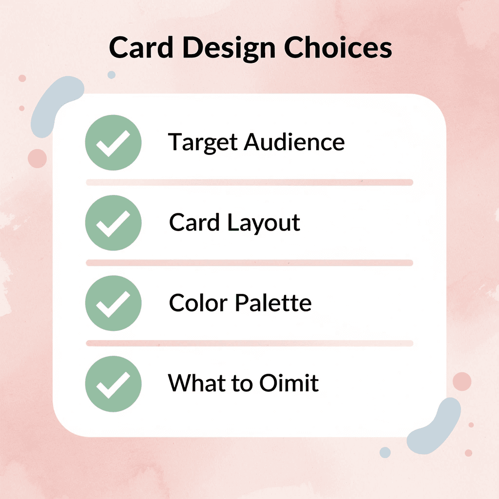
A memorable card comes from making careful choices at every level — from who you want to reach to what you decide to leave out.
"The most effective business cards are not the ones that say the most — they are the ones that say exactly the right things to the right people." — Design & Branding Principle
🎯 Key Point: Your therapist business card is not just contact information — it is your first impression, your brand statement, and your silent salesperson all in one.
💡 Tip: Before you design a single element, define your ideal client clearly. Every font choice, color decision, and word you include (or intentionally exclude) should speak directly to that person.
⚠️ Warning: Overcrowding your card with every credential, service, and contact method is one of the most common mistakes therapists make — it creates visual noise and undermines the sense of calm you want to project.
Start with your ideal client, not your preferences
A trauma therapist and a child therapist both need business cards, but they should never look the same. The trauma therapist's client is an adult carrying something heavy, someone who responds to calm, understated professionalism. The child therapist's client is usually a parent seeking warmth, approachability, and assurance that their child will feel safe. When you design for yourself instead of for that specific person, you create a generic card. Start by writing one sentence describing the person most likely to pick up your card, then let that sentence guide every design decision.
Choose colors with a reason, not just a preference
Color does psychological work before your name is even read. Cool blues and soft greens signal calm and clinical steadiness, dominating cards for anxiety specialists and trauma-focused clinicians. Warm earth tones like terracotta, sand, and muted ochre communicate groundedness and approachability for somatic therapists or those working with grief. The mistake is choosing color by personal taste alone: a bright coral might feel energetic to you, but to an overwhelmed client, it reads as overstimulating. The right color isn't your favorite; it's the one your ideal client finds reassuring before they've read a single word.
Make your specialty impossible to miss
Most therapists' business cards list a name, credentials, and phone number. According to Wave Connect's Business Card Statistics, 72% of people judge a company by the quality and relevance of its business card. A card reading "Licensed Professional Counselor, Specializing in Adolescent Anxiety" communicates your focus in three seconds, whereas "Licensed Professional Counselor" alone conveys little. Specificity signals trust: it demonstrates you know exactly who you help and aren't attempting to serve everyone.
How do digital cards turn a conversation into a lasting connection?
Digital business cards like Mobilo close the gap between connection and follow-up by turning every card share into a trackable event that automatically feeds contact details into a workflow. The conversation you have at a wellness fair becomes a follow-up relationship instead of a forgotten exchange.
Prioritize readability over design complexity
The failure point is usually contrast. A card with light gray text on a white background or a delicate script font at 8pt forces the reader to work. When someone is already anxious about reaching out for therapy, friction at the card level is friction at the relationship level. Use a minimum 10pt font for body text, and never let your font choice override legibility. Decorative typefaces work for your name or practice title, but contact details should always be set in a clean, easy-to-scan font. Wave Connect's Business Card Statistics report that 88% of business cards are thrown away within a week of being received; a card that's hard to read speeds up that timeline.
Include only what earns its space
Every element on a business card competes for attention. A QR code with no clear purpose, a logo too small to recognize, or a vague tagline weakens rather than adds value. Include only your name, credentials, specialty, one primary contact method, and your website or booking link. If something doesn't help your ideal client take the next step, it doesn't belong. A logo or subtle texture can reinforce your visual identity without crowding the space, but only when it serves the design rather than decorates it. But designing a memorable card is only part of the equation. The moment you hand it over matters as much as what's printed on it.
Related Reading
- Plumbing Business Cards Examples
- HVAC Business Cards Examples
- Unique Business Card Ideas
- Artist Business Cards Examples
- Therapist Business Cards Examples
- How To Put Social Media On Business Card
- Best Real Estate Business Cards
Turn Your Therapist Business Card Into a Networking Tool That Actually Wins Clients
The moment you hand over your card is a decision point. If it leads to a booking link, a clear specialty, and a genuine reason to follow up, it works. If it sits forgotten in a pocket, the design has failed.
"A business card is only as powerful as the action it triggers. Without a clear next step, it's paper." — Networking Best Practices
💡 Tip: Every card you hand out should answer one question for the recipient: "What do I do next?" If your card doesn't make that obvious, it's working against you.

Most therapists treat their business card as the end of the interaction. The smarter move is treating it as the beginning of a trackable relationship. A digital business card from Mobilo lets you exchange contact details instantly, capture referral opportunities, and sync connections directly to your CRM — turning conversations at wellness fairs or referral meetings into measurable follow-up.
- Contact exchange: Move from manual, error-prone entry to instant, automatic data transfer.
- CRM integration: Eliminate manual data entry with direct synchronization to your database.
- Referral tracking: Transition from blind networking to built-in, measurable referral analytics.
- Follow-up capability: Shift from passive business cards to trackable, active engagement tools.
- Cost to start: Replace ongoing printing fees with a model where the first 25 cards are free.
Your first 25 Mobilo cards are free (a $950 value), and over 59,000 companies already use them to convert introductions into an organized pipeline. A card that feeds your practice — not just your filing system — is worth carrying.
🎯 Key Point: Over 59,000 companies trust Mobilo to turn first introductions into structured, follow-up-ready relationships — and your therapy practice can do the same.
✅ Best Practice: Pair your Mobilo digital card with a direct booking link so every new connection can schedule a consultation before the conversation even ends.