.avif)

10 Creative Artist Business Card Examples for Every Art Style
On This Page
For an artist, a business card is more than contact information — it is a compact expression of creative identity. Seeing real artist business card examples reveals how other creatives have translated their style, medium, and personality into a small but memorable format that opens conversations with clients and collectors.
Printed cards, however, have natural limits. They go out of date, get misplaced, and rarely do justice to a body of work that deserves more space. Artists who want to share their portfolio, update their details on the fly, and never lose a lead to a forgotten stack of paper can explore a smarter option with a digital business card.
Summary
- Physical business cards remain a dominant networking tool, but their effectiveness is undermined by sheer volume. Research from Wave Connect shows that 88% of business cards are discarded within a week of receipt. The problem is not design quality in isolation. It is that most cards are structurally identical, which makes them invisible before they are even read.
- Material quality functions as a form of communication before any content is processed. According to Wave Connect, 72% of people judge a person based on the quality of their business card, with that judgment happening through touch as much as sight. A card printed on 400gsm stock or finished with soft-touch matte laminate signals care and precision before the recipient focuses on the typography or imagery.
- Visual hierarchy is the principle most artists overlook, and its absence is the most common reason a card fails to register. When everything on a card competes for attention simultaneously, the brain records nothing. Guiding the eye deliberately, from name to discipline to contact details, mirrors how people naturally process a new connection and increases the likelihood that the card is retained.
- The physical finish of a card should reflect the dominant quality of the artist's medium. A painter whose work features visible texture benefits from a soft-touch matte surface that absorbs light the way canvas does. A sculptor can use embossing to create the same involuntary tactile response that draws someone toward three-dimensional work in a gallery. The card does not need to show the work. It needs to create the same kind of experience.
- An intentionally placed QR code is not a design shortcut. For digital artists, motion designers, and generative artists whose work cannot be compressed onto a printed surface, a minimal card with a prominent QR code linking to a live portfolio is an honest acknowledgment that the work requires a screen. The card becomes a door rather than a compromise.
- Typography on an artist's business card should function as a supporting element, not a focal point. Using a single typeface for the name and a complementary weight from the same family for contact details keeps attention on the artwork. When typography draws attention to itself, it competes directly with the visual work it is supposed to frame. Restraint in type, like restraint in color, signals confidence rather than limitation.
- Mobilo's digital business card addresses the static nature of printed cards by allowing artists to update portfolio links and contact details in real time while capturing new connections in a trackable workflow from the moment of the first handoff.
Why Most Artist Business Cards Are Forgotten
Most artists design their business cards identically: name, logo, website, phone number. This cookie-cutter approach makes your card invisible in today's crowded creative market, blending into a sea of identical rectangles that offer no reason to be remembered.
💡 Tip: If your card looks like every other artist's card, it's not working as a marketing tool—it's contact information on paper.
🎯 Key Point: The design of your card isn't the problem; the sameness is. Standing out starts with rethinking what your card does for you.

After a gallery opening or art fair, cards end up in drawers and get thrown away. According to Wave Connect's Business Card Statistics, 88% of business cards are thrown away within a week of being received. That's a problem with how useful the card is, not how it looks.
"88% of business cards are thrown away within a week of being received." — Wave Connect Business Card Statistics
- Card utility: Artists assume a beautiful design is enough; in reality, looks without a clear call-to-action rarely drive professional outcomes.
- Memorability: Artists believe their design is unforgettable; the data shows 88% of physical business cards are discarded within a week.
- Follow-up: Artists expect prospects to initiate contact; without a purposeful hook or immediate digital path, most connections simply fade away.
🔑 Takeaway: 88% discard rate means the vast majority of your cards — and the money spent printing them — are wasted within days. The fix isn't a prettier card; it's a more purposeful one.
⚠️ Warning: Blaming card design for poor results is a costly mistake. The real issue is that your card gives people no compelling reason to keep it, reference it, or take action.
Why generic cards lose before they're even read
The problem is when everything looks the same. When every card has the same design, white background, and information layout, your brain stops seeing them as different. Your memory remembers experiences, not objects. Scientific research on pattern recognition shows that the brain filters out stimuli that match existing templates—a generic artist card fits perfectly, so it disappears.
What does blending in actually cost an artist?
Most artists add heavier stock or matte finishes, but the deeper cost remains: when your card blends in, you lose commissions from potential clients who forget you, referrals that never materialize, and brand recognition that takes years to rebuild. A digital business card from Mobilo changes this by carrying your actual portfolio, updating as your work evolves, and capturing contact details in real time so follow-up isn't left to chance.
The card is your portfolio in miniature
Your business card is a creative brief about who you are as an artist. Every choice—typeface, finish, what you leave off—signals your visual language, attention to detail, and professional identity. An illustrator using flat, bold color blocking tells a different story than one printing a detail from an oil painting on textured cotton stock. Both communicate before a word is read, serving as a sample of your creative judgment.
What separates a card people keep from one they discard?
The goal was never to hand out more cards, but to hand out cards people keep. That distinction changes everything about how you design them. What makes a card truly memorable is far more specific than most artists expect.
Related Reading
- Business Card Ideas
- Matte Vs Uncoated Business Cards
- Types Of Business Cards
- Business Card Psychology
- What Should Be On A Business Card
- How to Make a Professional Business Card
- Rounded Corner Business Cards
- Minimalist Business Cards
- Business Card Paper Weight
- Business Card Colors
What Makes an Artist Business Card Memorable?
Visual hierarchy is the first principle most artists overlook. When someone gets your card, their eye moves before their brain does. If everything competes for attention at once, nothing registers. A well-designed artist business card uses scale, weight, and placement to guide the eye on purpose: your name first, your discipline second, your contact details last. That sequence mirrors how people actually process a new connection, moving from "who are you" to "what do you do" to "how do I reach you."
"If everything competes for attention at once, nothing registers — a well-designed card uses scale, weight, and placement to guide the eye with intention."
🎯 Key Point: The three-step visual sequence — name → discipline → contact — mirrors the exact order in which a new connection processes who you are and whether to follow up.
- Your Name: First priority (largest/boldest) — ensures immediate recognition and brand recall.
- Your Discipline: Second priority (medium weight) — provides essential context for what you bring to the table.
- Contact Details: Third priority (smallest/subtlest) — keeps the design clean while providing the necessary "next step" for communication.
💡 Tip: Before finalizing your card design, squint at it. Whatever your eye lands on first is your actual visual hierarchy — if it's not your name, redesign immediately.

Why signature artwork changes the equation
The most remembered cards have a single, clear visual anchor: often a cropped detail of a signature work, a distinctive mark, or a texture from the artist's medium. This image communicates something about the work before the recipient reads a word. The failure point is usually the opposite: too many images or generic stock illustrations that signal nothing specific about the artist's practice.
How materials shape perception before the card is even read
According to Wave Connect's Business Card Statistics, 72% of people judge a person based on the quality of their business card. That judgment happens in seconds, through touch as much as sight. A card printed on 400gsm cotton stock communicates something fundamentally different from one printed on standard office paper. Premium materials—textured, uncoated, or die-cut—function as physical proof of the care you bring to your work. Material choice speaks before content does.
How do color and white space work together on a card?
Color psychology and white space work together in ways most artists underestimate. Holding back on color—a single accent against a neutral background—creates contrast that draws the eye without overwhelming it. White space isn't emptiness; it's breathing room that signals thoughtfulness. Crowding a card with information signals anxiety, not abundance.
How does a digital business card keep the conversation going after the exchange?
Most artists hand over a card and hope the recipient remembers them. This passive approach fails when someone collects a dozen cards weekly. A digital business card solves this differently: it connects the physical exchange to an active lead-capture workflow, so the conversation continues automatically, with the artist's portfolio, contact details, and follow-up prompt already in motion before the recipient reaches their car.
What readability and QR codes actually accomplish
Readability isn't font size—it's contrast ratio, letter spacing, and the removal of anything that doesn't earn its place. A name set in a clean serif at 10pt on white stock is more legible and memorable than the same name in decorative script at 14pt on a dark background. QR codes, used intentionally, extend the card's functionality without cluttering its surface. A single code linking to a live portfolio or booking page turns a static object into an active connection point. Brand consistency ties everything together: the typeface, color palette, and tone should feel like they came from the same mind that made your studio work. Once you understand these principles, the difference between a card worth keeping and one headed for the trash becomes impossible to unsee.
Related Reading
- Should I Put My Picture On My Business Card
- Photography Business Cards Examples
- Horizontal vs Vertical Business Cards
- Business Card Examples For Owners
- How To Put an Instagram Handle on a Business Card
- Esthetician Business Card Ideas
- Photography Business Cards Examples
- Back Of Business Card Ideas
- Business Card Details
- Business Card Requirements
- Business Card Dimensions
10 Creative Artist Business Card Examples That Stand Out
Seeing design principles applied across different creative disciplines provides genuine education. Visual examples are more instructive than abstract rules: they show how intentional design choices translate into memorable, tangible results that resonate long after the first encounter.

"72% of people judge a company or person based on the quality of their business card — for artists, that judgment happens before a single word is read." — Wave Connect's Business Card Statistics
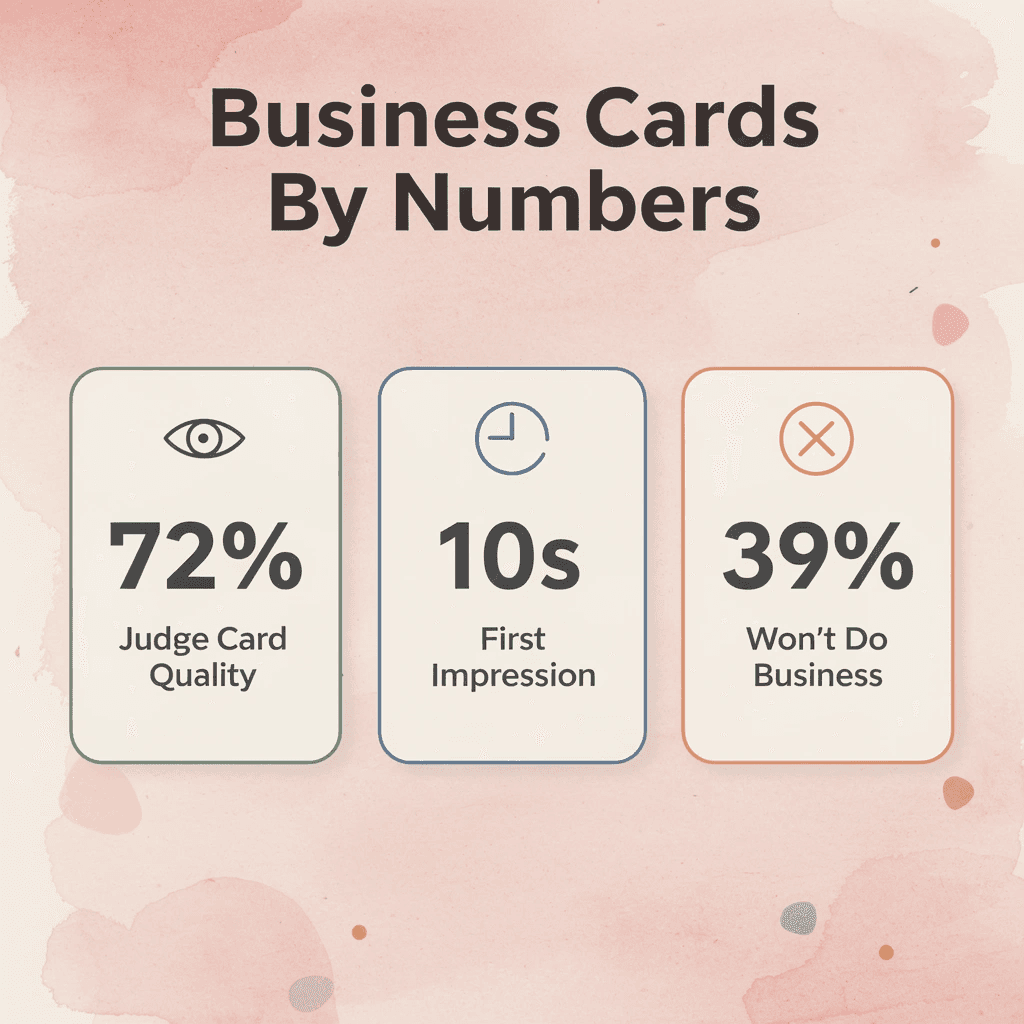
According to Wave Connect's Business Card Statistics, 72% of people judge a company or person based on the quality of their business card. For artists, that judgment happens before a single word is read. The card stock, the print finish, the weight in someone's hand — all communicate something about the quality of your work before it's ever seen.
🔑 Takeaway: For artists, a business card isn't just contact information — it's a first impression, a portfolio sample, and a brand statement compressed into 3.5 × 2 inches.
💡 Tip: Invest in premium card stock and finishes — matte, gloss, or textured — because the physical feel of a card directly influences how your professionalism and craft are perceived.
Each example below follows the same consistent framework: the image concept, why it works, who it's best for, and the core design takeaway. A card is worth keeping because every single decision on it was intentional — nothing is accidental, and nothing is wasted.
⚠️ Warning: Avoid the most common artist card mistake — treating it like a generic contact card. Without intentional design, even the most talented artist risks being forgotten the moment the card leaves their hand.
- Card stock weight: Signals quality, durability, and a commitment to professional excellence.
- Print finish: Sets the mood; matte feels sophisticated and modern, while gloss projects vibrancy and high energy.
- Typography choice: Acts as your brand’s voice, instantly communicating whether you are traditional, avant-garde, or minimalist.
- Visual concept: Serves as a "mini-portfolio," giving prospects an immediate, tangible sample of your creative capabilities.
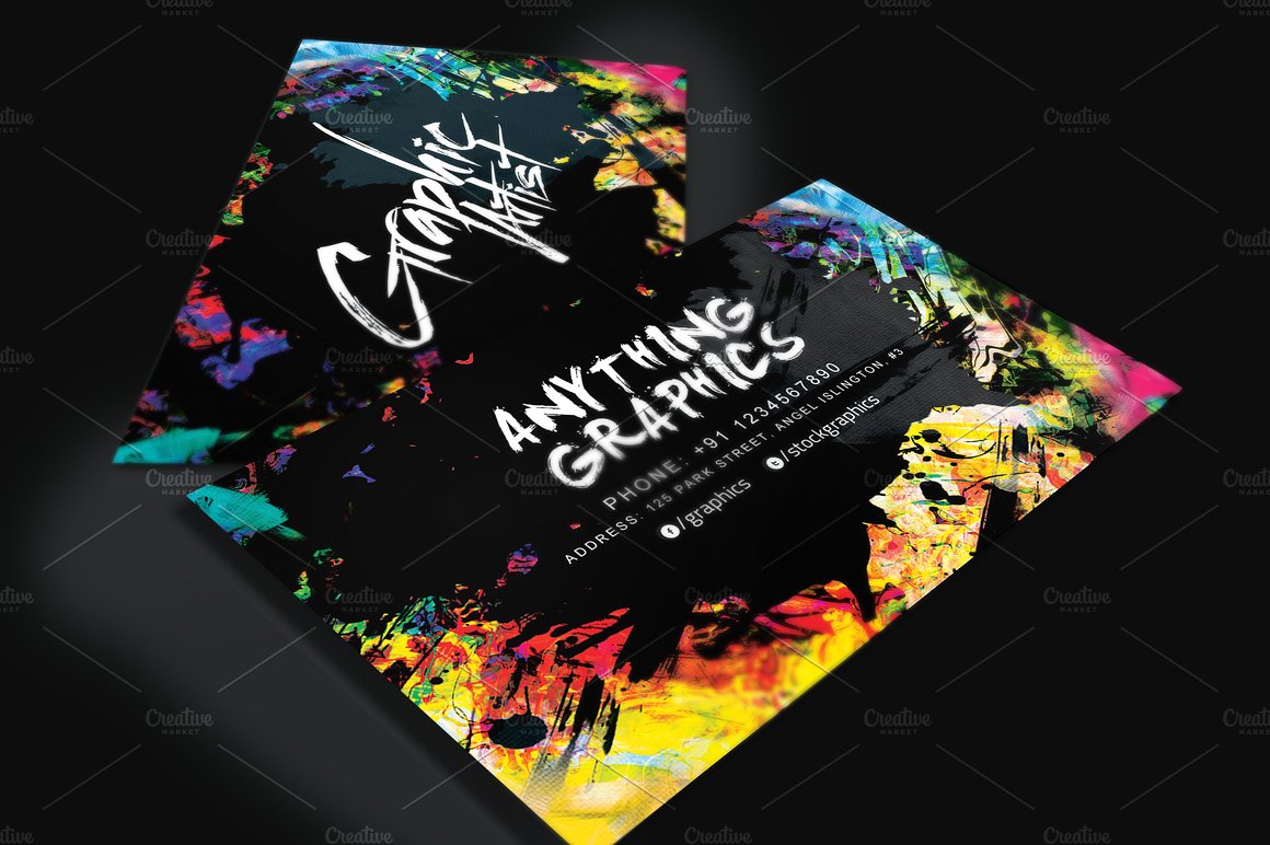
1. Painter Brushstroke-Textured Matte Card
Why it works
A painter who prints a close-cropped section of their most textured canvas work onto a soft-touch matte card creates a tactile experience that mirrors the original painting. The matte surface absorbs light rather than reflecting it, making the image feel closer to the original medium than glossy prints.
Best for
Oil and acrylic painters whose work features visible brushwork or layered texture.
Design takeaway
Match your card's physical finish to your medium's dominant quality. If your work is tactile, your card should be too.
2. Illustrator Die-Cut Silhouette Card
Why it works
When cut into a repeating character or motif from the illustrator's body of work, the shape itself becomes the identity. Recipients interact with the card rather than passively reading it. A fox, geometric figure, or creature from the illustrator's universe signals a cohesive creative world.
Best for
Character illustrators, children's book artists, and editorial illustrators with a distinctive visual signature.
Design takeaway
Die-cutting is expensive, but it earns its cost when the shape reinforces the brand rather than serving as random decoration.
3. Graphic Designer: Grid-System Minimal Card
Why it works
A card built on a strict typographic grid with deliberate negative space and a single accent color demonstrates design skill without explanation. The simplicity speaks for itself. If a designer cannot make their own card look finished, people will doubt the quality of the work on their website.
Best for
Brand designers, UI/UX designers, and design consultants whose clients expect systems thinking.
Design takeaway
Your card is a proof of concept. Treat it like a brief you gave yourself, applying the same care you would to a client's identity project. Most artists hand over their card and wait passively for a follow-up. A digital business card changes this: with Mobilo, the recipient saves contact details immediately, you receive notification of the interaction, and the connection enters a workflow rather than a pocket. The card becomes the beginning of a relationship, not the end of an introduction.
4. Tattoo Artist Black-on-Black Letterpress Card
Why it works
A thick black card with black letterpress ink creates a design that becomes visible only when light hits it at an angle, revealing the artist's name and flash-style illustration pressed into the surface. The technique mirrors the precision of tattooing itself.
Best for
Fine-line, blackwork, and traditional tattoo artists whose style relies on contrast and craft.
Design takeaway
Letterpress on heavy stock demonstrates commitment to craft; nothing about your process is casual.
5. Photographer Full-Bleed Portrait or Landscape Card
Why it works
A full-bleed photograph that extends edge-to-edge lets the work speak for itself without distraction. No border, frame, or decorative element competes with the image. The back carries only essentials: name, specialty, and a link.
Best for
Portrait, landscape, and commercial photographers with a strong, immediately recognizable visual style.
Design takeaway
Avoid adding design elements to a photograph. The image is the design, and anything added competes with it.
6. Sculptor Three-Dimensional Embossed Card
Why it works
An embossed card that raises a tiny version of the sculptor's signature form off the surface creates physical surprise. The recipient's involuntary touch mirrors how sculpture is meant to be experienced: a response to form in space.
Best for
Sculptors, ceramicists, and installation artists whose work is primarily experienced through touch and dimension.
Design takeaway
The card should create physical curiosity rather than show the sculpture, drawing the recipient in the same way a gallery sculpture does.
7. Digital Artist: QR-Code-Forward Minimal Card
Why it works
A digital artist whose work lives on screens should not squeeze it onto a 3.5-by-2-inch card. Instead, a simple card with a large, styled QR code linking directly to an animated portfolio or motion reel is honest about the medium. The card is not the work; it is the door.
Best for
Motion designers, 3D artists, generative artists, and digital illustrators whose best work cannot be printed.
Design takeaway
A QR code placed in a visible spot is not a shortcut. It is an honest admission that the work requires a screen and respects the recipient's time by taking them directly there. A card that connects directly to a real, active portfolio does more than show work: it confirms the person behind it. Artists understand how a single detail—a portfolio link, a named creator, a verifiable body of work—can shift trust.
8. Painter (Abstract) Color Field Card With Painted Edge
Why it works
A hand-painted edge transforms each card into a unique original. No two are identical, and that variability is the point: it makes throwing away the card feel like throwing away art.
Best for
Abstract painters, mixed-media artists, and anyone whose process values the handmade over the reproduced.
Design takeaway
Hand-finishing cards in small batches creates perceived value far beyond production cost; the irregularity signals human craftsmanship.
9. Illustrator (Editorial) Two-Sided Narrative Card
Why it works
An editorial illustrator using both sides to tell a two-panel story—setup on one side, resolution on the other—demonstrates core sequential storytelling skills within the card format. Flipping the card creates engagement and memory.
Best for
Editorial illustrators, comic artists, and sequential narrative artists whose work depends on visual storytelling across panels.
Design takeaway
If your work is sequential, your card can be sequential. Use both sides as canvases, not the front and back.
10. Graphic Designer (Brand Strategist) Variable-Data Printed Card
What all the examples above share is this: the card is not the destination but the first step in a longer conversation. Artists who understand this design their cards accordingly.
Why does this approach work for brand strategists?
A brand strategist who prints a small run of cards with different color schemes or typographic treatments within the same grid system demonstrates range without sacrificing coherence. Handing someone a card and saying "I chose this version for you" creates a moment of personalization that a single static design cannot replicate.
Who is this format best suited for?
Brand strategists, creative directors, and senior designers across multiple industries who need to demonstrate versatility without losing their identity.
What is the key design takeaway from variable-data printing?
Variable-data printing is no longer expensive for short runs. Designing a system that allows controlled variation demonstrates the skill you are selling. What all the examples above have in common is this: the card is not the destination. It is the first step in a longer conversation, and the artists who understand that design their cards accordingly. But knowing what makes a great card is only half the equation. The harder question is how you actually build one that fits your specific practice, your medium, your clients, and the way you actually work.
How to Create an Artist Business Card That Matches Your Style
Layout shapes every decision that follows. A horizontal card signals stability and readability; a vertical card signals creative confidence and stands apart in a stack. A photographer who shoots clean architectural lines belongs on a horizontal card with tight margins. An illustrator whose work spills off the edges belongs in a vertical format where the composition breathes differently.
"Your business card is the first physical touchpoint a potential client has with your brand — layout, format, and finish communicate your aesthetic before a single word is read." — Design Industry Insight
- Horizontal
- Best For: Corporate sectors (law, finance, consulting) and text-heavy designs.
- Key Signal: Stability, professionalism, and functional reliability.
- Vertical
- Best For: Creative industries (photography, fashion, graphic design) and minimalist branding.
- Key Signal: Innovation, modern design vision, and bold disruption.
- Square
- Best For: Artsy, experimental, or mixed-media brands seeking a memorable "quirky" factor.
- Key Signal: Unconventional creativity and non-traditional identity.
🎯 Key Point: Your card orientation isn't a random choice — it's a visual extension of your artistic identity. Match the format to your work's energy.
⚠️ Warning: Never default to horizontal simply because it's the standard format. Choosing the wrong orientation can send a mismatched brand signal before your work even gets a second glance.

Choosing finishes and paper stock
The finish transforms your card from paper into an experience. Soft-touch matte laminate creates tactile warmth, while spot UV coating highlights elements—such as a signature, logo, or detail—to catch the light against a flat background. For weight, 350gsm to 400gsm is the practical minimum for quality; anything below flexes when held, signaling fragility. According to Format Magazine, 39% of people would choose not to do business with a company if they had a cheap-looking business card, meaning physical quality persuades before anyone reads a word.
Typography that does not compete with your art
Typography on an artist's business card should be a supporting actor, not the lead. Choose one typeface for your name and a complementary one for contact details. The failure point is usually contrast: designers use two similar sans-serifs, and the card feels flat, or they use a decorative script that competes with the artwork. A clean, slightly weighted sans-serif for your name, paired with a lighter weight of the same family for contact details, is a reliable combination. If your typography draws attention, it steals it from your work.
How should you use color and QR codes on your card?
Color should come from your existing body of work, not from a trend. Pull a dominant tone from your portfolio and use it as a single accent against a neutral background. This connection reinforces your identity across every touchpoint. On QR codes: use them with purpose. A QR code linking to a generic homepage wastes the moment. One linking to a curated portfolio page, booking form, or artist statement earns its space.
What happens to connections when there is no follow-up mechanism?
Most artists print cards, consider the job complete, hand them out, and hope for follow-up. This approach loses connections because there's no way to follow up, no way to know who kept the card, and no way to update portfolio links after printing. A digital business card solves this: with Mobilo, when your work changes, your card changes with it, keeping the connection active rather than expiring when the card goes into a pocket.
Printing where decisions become permanent
Print in small runs until you are certain. Digital offset printing offers flexibility at low quantities, while letterpress or foil stamping requires larger minimums but delivers tactile results no standard process can replicate. Test your card under different lighting conditions before committing to a full run: spot UV and foil behave differently under warm gallery lighting than under fluorescent trade show lights. But the card you design today is only part of the story; what happens after it leaves your hand is where most artists lose the thread entirely.
Related Reading
- Plumbing Business Cards Examples
- HVAC Business Cards Examples
- Unique Business Card Ideas
- Artist Business Cards Examples
- Therapist Business Cards Examples
- How To Put Social Media On Business Card
- Best Real Estate Business Cards
Turn Your Business Card Into a Portfolio People Actually Keep
A beautifully printed card with spot UV and signature artwork makes an impact in the moment, but without a follow-up plan, the connection fades within days.
"The first impression is only as powerful as the system behind it: without follow-up, even the most stunning card becomes forgotten." — Networking Best Practices
💡 Tip: Pair your physical card design with a digital follow-up strategy so every conversation has somewhere to go.

Most artists lose relationships after events because they don't have a system to capture and follow up. A gallery opening with forty conversations becomes forty business cards in a pile that disappears. A digital business card through Mobilo turns each tap or share into a trackable connection, automatically feeding contact details into your workflow, so the relationship has somewhere to go after the handshake ends.
- Physical card only: Data remains trapped on paper, leading to inevitable clutter, forgotten leads, and lost opportunities.
- Digital card via Mobilo: Contact data is instantly digitized, synced to your systems, and primed for automated, timely follow-up.
⚠️ Warning: Without a trackable system, even 40 meaningful conversations at a single event can vanish into a pile of unactionable paper.
The card you design is the first impression. What you build behind it determines whether that impression grows into something real.
🎯 Key Point: Your card design opens the door, but your follow-up system keeps it open and turns fleeting connections into lasting relationships.