.avif)


11 Best Real Estate Business Card Ideas for New Agents
On This Page
Starting out in real estate means making a strong impression at every handshake, open house, and networking event. A well-designed business card does more than share contact details — it signals professionalism and trustworthiness before a single word is spoken. The difference between a forgettable card and one that generates referrals often comes down to design choices, layout, and the quality of materials used.
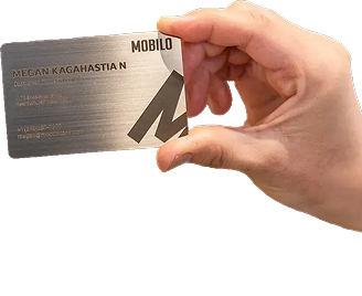
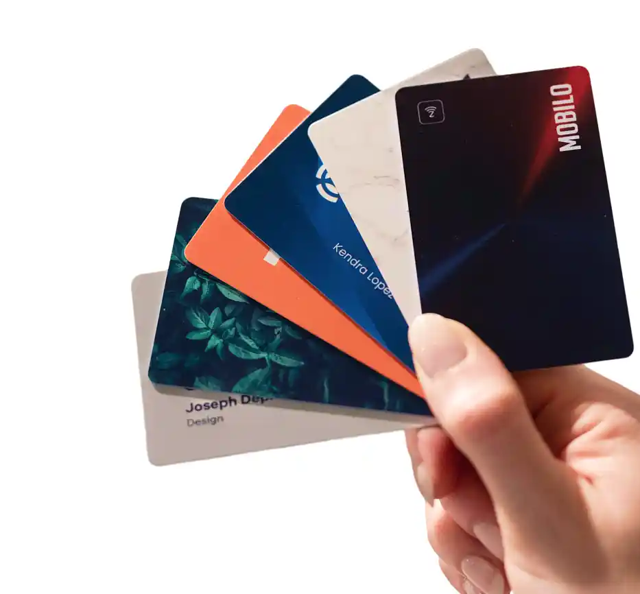
For new agents building a client base, pairing a printed card with a digital option adds a practical edge. Contacts can save your information directly to their phone in seconds, keeping your name accessible long after the event ends. Mobilo makes this seamless with a digital business card that works alongside your printed cards to keep follow-ups fast and your brand top of mind.
Summary
- Business cards have a measurable survival problem. According to NAR Real Estate News, 88% of business cards handed out are thrown away within a week. This means most networking interactions, the handshake, the conversation, the follow-up that never happens, produce no lasting result. The card is the last point of contact, and for most agents, it fails silently.
- Design quality functions as a trust signal before a single word is read. Research from Princeton University found that people form judgments of trustworthiness within a tenth of a second of seeing a face, and that the same rapid encoding applies to designed objects. Separately, UPrinting's business card statistics found that 72% of people judge a company or person based on card quality. A cluttered or low-quality card does not just look bad. It triggers a subconscious friction response that undermines credibility before any conversation begins.
- Including a headshot significantly affects recall and response. According to Wise Pelican's research on real estate business cards, cards with a photo generate 2.5 times as many sales calls as those without. The mechanism is straightforward: a face anchors a name in memory, which means a prospect who finds your card days later can place you immediately rather than trying to reconstruct who you were from text alone.
- Card format affects whether a card gets kept at all. Non-standard shapes (house-shaped, key-shaped) are often cited as memorable, but they do not fit in wallets, so they get left on counters, dropped into bags, and eventually discarded. Wise Pelican also found that 39% of people would not do business with a company that has a cheap-looking business card, which means both format and finish carry real consequences for perceived professionalism.
- Timing and context determine whether a card converts into a follow-up. Behavioral research on the peak-end rule, documented by Daniel Kahneman, shows that people remember experiences by their most intense and final moments. A card handed at the right conversational peak becomes attached to that memory. The words used during the handoff matter equally. A specific offer tied to something the prospect already cares about activates the reciprocity principle and creates a stronger pull toward responding than a generic "here's my card if you need anything."
- Speed of follow-up matters more than card design alone. According to wCard.io's research on digital business cards for real estate agents, 78% of homebuyers end up working with the first agent who responds to their inquiry. This means the agent who acts fastest after a networking interaction, not the one with the most polished card, wins the relationship. The gap between handing over a card and capturing a lead is where most referrals quietly disappear.
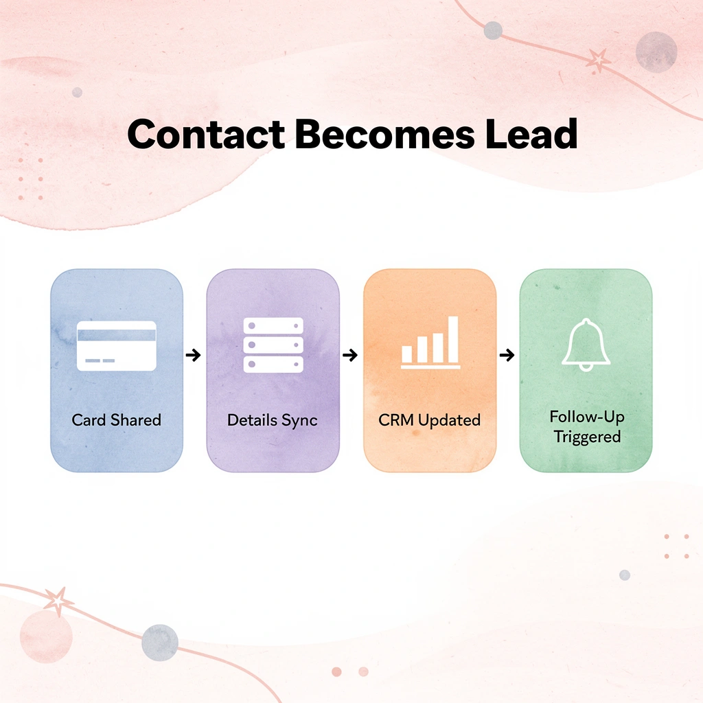
- Mobilo's digital business card addresses this by notifying agents the moment a contact taps or scans their card, which triggers follow-up based on the prospect's action rather than the agent's memory.
Why Do Some Real Estate Business Cards Get Kept While Others Get Thrown Away?
Picture the end of a busy open house. A prospect leaves with five business cards in their pocket. By morning, three are in the recycling bin. By the weekend, one survives—because something made the prospect pause before throwing it away.
"By morning, three out of five cards are already gone—discarded before the prospect even remembers your name." — The Real Estate Card Problem
💡 Tip: That single surviving card earned its place through intentional design choices that made the prospect stop and look twice.
⚠️ Warning: Handing out more cards at an open house does not increase your odds of being remembered—it only increases your odds of being thrown away faster.

That pause is everything. And it has almost nothing to do with the cardstock's quality. What creates that critical moment of hesitation is a combination of visual clarity, instant credibility signals, and a reason to keep it—elements that go far deeper than paper weight or finish.
🎯 Key Point: The real differentiator between a card that gets kept and one that gets tossed is whether it communicates clear value in under three seconds.
- Discarded Cards: Feature generic designs, minimal info, stock imagery, and low-quality materials that offer no incentive for contact.
- Kept Cards: Utilize a distinct visual identity, clear value proposition, professional imagery, and a specific call-to-action on high-quality, tactile stock.
The Real Cost of a Forgettable Card
Most agents focus on making their card look impressive, when the real goal is to make it memorable and easy to act on. Every discarded card wastes the conversation that preceded it, the handshake, and the follow-up that never happens. According to NAR Real Estate News, 88% of business cards are thrown away within a week, meaning the average agent loses nearly every networking moment they invest in, not because they failed to show up, but because their card failed to hold attention after they left the room.
Why do some cards survive the weekly purge?
Some cards survive that process because of cognitive fluency, a concept brain scientists use to describe how easily your brain processes information. When something is easy to process, your brain assigns it greater value. A card with clear visual hierarchy, readable type, and logical information flow feels trustworthy before the viewer consciously considers the words. A messy card, regardless of paper quality, sends the opposite message. Design friction mirrors relationship friction.
Why first impressions are encoded, not just felt
Research from Princeton University found that people make judgments about whether they can trust someone within a tenth of a second of seeing a face. The same applies to designed objects. Your business card signals professionalism, and its visual impression gets stored in memory almost instantly. Memory works by making connections: a prospect who remembers your card as "the clean, dark one with the clear phone number" is far more likely to retrieve it than one who recalls it as "some card from that open house." The UPrinting Blog's business card statistics support this: 72% of people judge a company or person by the appearance of their business card. Design quality is a trust signal that operates before anyone reads a single word.
What makes one card stand out when every other card looks the same?
Most agents copy what they see other agents doing: a headshot, a logo, a phone number, a tagline. That approach isn't wrong; it's invisible. When every card in a prospect's pocket uses the same layout and visual language, none stand out. A card earns its place through contrast, a single dominant visual element that anchors memory, white space that gives the eye rest, and a call to action specific enough to prompt the next step. Readability is how your card turns a conversation into a contact.
How does thinking of your card as a lead capture tool change the design decision?
The shift worth making is from thinking of your card as a branding asset to seeing it as the first step in a lead-capture sequence. A card that is easy to read, act on, and remember keeps you in the consideration set long after the open house ends. Choosing the right design becomes less about personal taste and more about deliberate intent.
Related Reading
- Business Card Ideas
- Matte Vs Uncoated Business Cards
- Types Of Business Cards
- Business Card Psychology
- What Should Be On A Business Card
- How to Make a Professional Business Card
- Rounded Corner Business Cards
- Minimalist Business Cards
- Business Card Paper Weight
- Business Card Colors
10 Best Real Estate Business Cards for Networking Events
Design principles without real examples are just theory. Here's what each card type actually looks like when built around psychology, not preference.
"The best real estate business cards aren't designed by gut feeling — they're engineered around human psychology and first-impression science." — Design & Networking Research
🎯 Key Point: Every card type covered below is rooted in psychological principles — from color theory to information hierarchy — not just aesthetic preference.
💡 Tip: When evaluating your business card design, always ask: does this choice serve the reader's brain, or just your own taste?
- Bold Typography: Signals authority and confidence, making your card stand out and increasing recall after events.
- Minimal Layout: Reduces cognitive load, allowing prospects to retain your core contact information much faster.
- Premium Materials: Triggers tactile trust signals, ensuring the physical quality of the card creates a stronger, more professional first impression.
- Strategic Color: Evokes a specific emotional response, ensuring your brand remains distinct when your card is in a stack of others.

1. The QR-Linked Portfolio Card
Who is it for
Residential agents seeking to bridge the gap between a physical card and a complete digital presence.
The standard card runs out of space fast. A QR code transforms a 3.5-by-2 inch card into a gateway to a mobile-friendly landing page featuring your best listings, bio, client testimonials, and contact information.
Why does this design work?
It removes the friction of manual contact entry. A QR code that links to a useful destination gives people a reason to scan it immediately, while the moment is fresh.
Key elements
Clean layout with the QR code positioned purposefully (lower right or back of card), your name and phone number prominently displayed on the front, and a one-line prompt such as "Scan to see current listings." Keep the code large enough to scan without difficulty.
Where it performs best
Open houses, community events, and brief encounters where the card carries the follow-up.
Potential downside: If the landing page is not mobile-optimized or loads slowly, the QR code becomes problematic. Test it on multiple devices before printing.
2. The Digital-First NFC Card
Who is it for
Tech-forward agents and brokerages targeting younger buyers, particularly Gen Z and Millennial homebuyers who expect seamless digital interaction.
Most agents hand over a paper card and hope for the best. A near-field communication chip removes that friction entirely. One tap transfers your full contact profile, social handles, and links directly to their phone, eliminating the single biggest failure point of traditional cards: the gap between receiving a card and actually saving the contact.
Key elements
A sleek physical design in credit card format that fits standard wallets, a clear instruction prompt on the card face ("Tap to connect"), and a digital profile including your photo, phone number, email, brokerage name, and active social platforms.
How does NFC card technology connect to your CRM pipeline?
Platforms like Mobilo capture contact information automatically when tapped and feed it directly into a CRM, triggering follow-up sequences without manual entry. For brokerages managing multiple agents, this centralized lead capture and consistent branding convert every handshake into a trackable pipeline entry.
Where it performs best
Networking events, commercial real estate meetings, and luxury open houses, where a modern, frictionless experience signals high-level operation.
Possible downside
People unfamiliar with NFC technology may not know how to use the card. A verbal prompt ("Tap it to your phone") resolves this, but requires the agent to be present for the interaction.
3. The Headshot Recognition Card
Who is it for
Agents who work high-volume networking events, open houses, or similar settings where they meet dozens of people in a single afternoon.
According to Wise Pelican's research on real estate business cards, business cards with photos generate 2.5x as many sales calls. A face anchors a name in memory; when someone finds your card days later, the photo does the recognition work your name alone cannot.
Why does this design work?
It closes the time between "I met someone at an open house" and "I remember exactly who this is." That recognition gap is where referrals and callbacks get lost.
Key elements
A professional headshot with a neutral background occupying no more than one-third of the card face. The photo should be straight-on, well-lit, and recent, paired with your name in an easy-to-read font, phone number, and brokerage logo.
Possible downside
A headshot card depends on the situation. In one-on-one referral meetings or commercial real estate settings, the photo consumes space that could display useful information. Consider where you'll use it before choosing this format.
4. The Luxury Finish Card
Who is it for
Agents representing high-end residential or commercial properties where the card signals status.
Touch matters more than most agents expect. Each fingertip has roughly 3,000 touch receptors, so the moment someone picks up your card, they form an impression before reading a word. A card printed on 16-point or heavier cardstock with a black satin finish, silver foil, or metallic embossing communicates quality through tactile experience.
Why this design works
In luxury real estate, every detail sends a message about the property. A cheap-feeling card in a high-end setting creates a mismatch that prospects notice, even if they cannot articulate why. The card's tactile quality reinforces the trust signal your listing presentation builds.
Key elements
You need at least 16-point cardstock, a specialty finish (such as silver foil, black satin, or embossing), a limited color palette (black, white, gold, or deep navy), and one clean logo. The typography should be elegant and legible.
Where it performs best
Luxury listing appointments, high-end open houses, and commercial real estate meetings.
Potential downside
Premium printing costs more. For agents working across multiple price points, this card may feel out of place at community events or first-time buyer seminars. Consider keeping two versions of the card if your client base spans different market segments.
5. The Social-Forward Agent Card
Who is it for
Agents actively building an audience on Instagram, TikTok, or Facebook who want their card to extend their online presence into offline interactions.
A ReMax study found that two out of three Gen Z and Millennial homebuyers say real estate agents on social media make it easier to find properties and learn about the homebuying process. A social media handle provides an additional contact method available outside business hours.
Why this design works
Social platforms help you stay connected with people after you first meet them. A prospect who follows you on Instagram remains aware of your activities, so when they're ready to move, you're already someone they know.
Key elements
Your most active platform handle printed clearly, a clean QR code linking to your profile or landing page, and your primary contact details. Focus on Facebook, Instagram, and TikTok based on where your target audience spends time.
Where it performs best
Community events, open houses for younger buyers, and settings where your audience is under 45.
Potential downside
If your social presence is inconsistent or inactive, listing your handle creates a negative impression. Include only platforms you update regularly.
6. The Standard-Size Consistent Brand Card
Who is it for
Every agent at every price point who wants a card that gets kept, not thrown away.
Non-standard shapes (house-shaped, key-shaped) sound memorable but don't fit in wallets: they end up on counters or in bags and get thrown away. The standard 3.5-by-2 inch format exists because it fits where cards need to survive.
Why does this design work?
A card that fits in a wallet stays in a wallet, where it gets found again when someone decides to call. According to Wise Pelican, 39% of people would not do business with a company that has a cheap-looking business card, making consistency and quality essential.
Key elements
Standard sizes, consistent logo use, brokerage name, brand colors, and typefaces across all marketing materials.
Where it performs best
Every setting. This is the baseline card every agent should have.
What is the potential downside of a standard-size card?
Without a different finish, texture, or design element, a standard-size card looks generic. A grid-based layout, strong typographic hierarchy, and sufficient contrast between text and background distinguish a clean card from a forgettable one.
7. The Team Card
Who is it for
Agent teams and brokerages where multiple people serve as the first point of contact for prospects.
A single agent's card creates a single point of failure. If that agent is unreachable, the lead goes cold. A team card lists multiple names, direct numbers, and roles, ensuring the prospect always has someone to call. As one broker put it, "If someone can't get ahold of me, they can reach somebody on this card. It helps customers know you've got the whole team working for you."
Why does this design work?
It demonstrates infrastructure and reassures prospects that they aren't relying on one person's availability, which is particularly valuable in commercial real estate and high-transaction residential markets where timing is critical.
Key elements
Team name or brokerage prominently displayed; individual names and direct lines for two to four team members; a shared QR code linking to the team's landing page; and consistent branding across all cards.
Where it performs best
Commercial real estate meetings, luxury listings, and settings where reliability and responsiveness matter most.
Potential downside
Too many names create visual clutter. Limit the card to roles most likely to be the first point of contact, and let the QR-linked landing page display the full team profile.
8. The 3D-Printed Novelty Card
Who is it for
Agents targeting innovation-forward markets or luxury buyers who respond to high-novelty touchpoints.
Most people have never held a 3D-printed business card. That novelty creates genuine surprise, one of the most reliable memory triggers in behavioral psychology. Services like PrintshaQ offer 3D-printed cards with embedded NFC chips that link directly to digital profiles.
Why this design works
Something new or different stops your brain from going on autopilot. When something is unexpected, your brain remembers it better, making a surprising card something people remember and want to share.
Key elements
Tactile design (raised texture, architectural detail, or geometric form), NFC chip for instant digital transfer, and a clean surface for your name and brokerage. The physical form should reinforce your brand identity.
Where it performs best
Luxury listing presentations, commercial real estate introductions, and high-end networking events where differentiation provides a competitive advantage.
Potential downside
3D-printed cards are expensive per unit and impractical for high-volume distribution. Reserve them for high-value introductions where the investment justifies the cost.
9. The Demographic-Matched Card
Who is it for
Agents who work with a clearly defined group of clients, such as first-time buyers, retirees, luxury buyers, or commercial investors.
Why does design alignment matter for your target client?
The failure point is usually a mismatch between the card's design and client expectations. A playful, colorful card handed to a commercial real estate investor signals misalignment that is hard to recover from. A stiff, formal card given to a first-time buyer in their late 20s can feel cold and unapproachable. Design signals whether you confirm or contradict the relationship you are trying to build.
Why this design works
When a card's visual language matches client expectations, it reduces subconscious friction. The prospect feels the agent understands their world.
Key elements
Color palette, typefaces, and finishes should reflect your target group's preferences. Use simple, polished design for luxury or older customers; warmer, friendlier design for younger or community-focused buyers. Maintain balance with a grid layout.
Where it performs best
Any setting where you work within a defined niche. The more specialized your market, the more critical it becomes to align with your demographic's wants.
Possible downside
A card designed for one group may appear out of place outside your primary market. If you serve diverse customer segments, a simpler design with strong branding might outperform a niche-focused design.
10. The Consistent Branding Card
Who is it for
Agents and brokerages seeking quick recognition across all touchpoints: yard signs, social media, and business cards.
Why does branding consistency make prospects feel like they already know you?
Branding consistency works through the psychological principle of familiarity. When a prospect sees the same colors, logo, and typography across your marketing materials, each exposure reinforces the last. By the time they hold your card, they already feel they know you. Recognition reduces the perceived risk of working with someone new and signals that you are organized, established, and intentional.
Key elements
Exact brand colors (not approximations), your logo at the correct proportions, brokerage name or logo alongside your personal brand, and typography that matches your other materials. Follow your brokerage's branding guidelines before finalizing any design.
Where it performs best
Referral-heavy environments where the prospect may have encountered your marketing before meeting you in person.
Related Reading
- Should I Put My Picture On My Business Card
- Photography Business Cards Examples
- Horizontal vs Vertical Business Cards
- Business Card Examples For Owners
- How To Put an Instagram Handle on a Business Card
- Esthetician Business Card Ideas
- Photography Business Cards Examples
- Back Of Business Card Ideas
- Business Card Details
- Business Card Requirements
- Business Card Dimensions
How to Turn Your Business Card Into More Listings and Referrals
Brokerage compliance is not an afterthought — it's a critical foundation that shapes every design and strategy decision you make with your business card. Avoiding compliance friction means getting your card right the first time, so you can focus on what matters most: turning every handshake into a listing opportunity.
"Your business card is often the first tangible impression a prospect keeps — make sure it works for you, not against you by triggering compliance issues." — Real Estate Marketing Best Practices
💡 Tip: Before printing a single card, review your brokerage's branding guidelines to ensure your name, logo placement, and disclaimers meet every requirement — this one step can save you from costly reprints and delays.
⚠️ Warning: Skipping compliance review is one of the most common — and avoidable — mistakes agents make. A card that violates brokerage rules cannot be distributed, turning a marketing asset into a wasted expense.
- Agent Name & Title: Must match brokerage records exactly to maintain professional credibility and legal trust.
- Brokerage Logo/Name: Must adhere to strict size and placement rules to ensure the card is compliant for distribution.
- Contact Information: Must be current and approved to ensure all referral traffic reaches you directly and legitimately.
- Tagline or Branding: Must avoid conflicts with brokerage identity to protect your personal brand while remaining within corporate guidelines.
🔑 Takeaway: Mastering compliance first is what allows you to shift confidently from card design to card strategy — transforming a simple piece of paper into a referral-generating machine.

When is the right moment to hand over your card?
The card in your hand is valuable only when used strategically. Timing is critical: the difference between a card that gets filed and one that gets acted on. When a prospect has just walked through a property they love, their emotional engagement peaks. Offer your card then, not as a formality but as a natural extension of the conversation: "Here is my contact information, and I included the address of this property on the back so you have it handy." This anchors your card to a specific memory, creates immediate usefulness, and signals that you were paying attention.
Why context determines whether your card converts
The failure point is usually a mismatch between when the card is given and when the prospect is ready to use it. Handing someone a card who has just arrived at an open house is too early—they haven't formed an impression of you yet. Handing it as they leave, after a genuine exchange, is a different transaction. A card handed mid-conversation about school districts carries more weight than one passed across a table at a networking event because it's attached to something the prospect already cares about. Sales psychology calls this the "peak-end rule," a concept from Daniel Kahneman's research showing that people remember experiences by their most intense and final moments. Your card, handed at the right peak, becomes part of that memory.
What do you actually say when you hand it over?
The words you use matter as much as the timing of their use. A weak handoff sounds like, "Here is my card if you need anything." A strong handoff sounds like, "I want to make sure you have my direct line. If you have questions about anything you saw today, or if you want to see the comparable that sold two streets over, text me." The difference is specificity. You are not offering a generic connection but a specific next step tied to something they already want. Reciprocity, a principle documented in Robert Cialdini's influence research, activates when you give something of value first.
How does real-time notification change your follow-up?
Most agents handle follow-up by waiting. According to wCard.io's research on digital business cards for real estate agents, 78% of homebuyers work with the first agent who responds to their inquiry. Our digital business cards from Mobilo notify you the moment someone taps or scans your card, triggering follow-up based on their action rather than guesswork. This shift from passive waiting to real-time response converts a networking interaction into a captured lead.
How personalization increases response rates
When you send a follow-up message that references something specific from your conversation, the prospect recognizes that you were genuinely present. "Great to meet you at the Maple Street open house. You mentioned you were looking for a home office setup, and I have two listings coming up that might fit" is not a template—it is a signal. Research in consumer behavior shows personalized outreach outperforms generic follow-up by a significant margin because it confirms the relationship is real, not transactional. Your card should function as the first step in that personalized sequence, not the last impression of a forgettable exchange.
Why does a personalized follow-up produce better long-term leads?
The expected outcome is better leads: people who remember you because you were specific, timely, and useful, and who refer you because that experience was worth sharing. Referral marketing research from the Wharton School shows that referred customers have a 16% higher lifetime value than those acquired through other channels and convert faster because trust is already established. Your card's design earns the first glance, but the process around it earns the client.
Yet even agents who master the handoff and follow-up often discover an unanticipated gap in the system.
Related Reading
- Plumbing Business Cards Examples
- HVAC Business Cards Examples
- Unique Business Card Ideas
- Artist Business Cards Examples
- Therapist Business Cards Examples
- How To Put Social Media On Business Card
- Best Real Estate Business Cards
Stop Hoping Your Business Card Gets Remembered—Know It Does with Mobilo
Even a perfectly designed card handed at the right moment still depends on the prospect to act. They must save your number, remember your name, and reach out on their own timeline. Most won't—not because they forgot you, but because friction is invisible until it costs you a deal.
⚠️ Warning: Every second you rely on a prospect to manually follow up, you're betting a potential deal on their motivation—not yours.
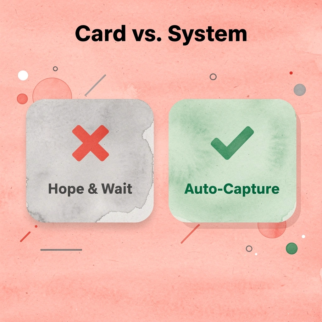
"When contact details transfer instantly, sync to your CRM, and trigger follow-up workflows automatically, your digital contact card becomes a system instead of a hope." — Mobilo
Mobilo eliminates that friction. When contact details transfer instantly, sync to your CRM, and trigger follow-up workflows automatically, our digital contact card becomes a system instead of a hope. For brokerages managing multiple agents, this means consistent branding, centralized visibility, and no leads lost to forgotten follow-ups.
🎯 Key Point: Mobilo doesn't just replace your paper card—it replaces the entire manual process of capturing, storing, and following up on leads.
- Contact Management: Traditional cards rely on manual input; Mobilo triggers instant contact transfer.
- CRM Integration: Traditional cards are data silos; Mobilo ensures automatic, seamless CRM sync.
- Follow-up: Traditional cards rely on prospect effort; Mobilo initiates automated follow-up workflows.
- Team Oversight: Traditional cards offer no visibility; Mobilo provides a centralized dashboard for brokerage analytics.
- Lead Capture: Traditional cards suffer from high friction and data loss; Mobilo ensures zero lead leakage.
Book a Mobilo demo today and receive your first 25 digital business cards free—a $950 value. More than 59,000 companies already use Mobilo to turn networking conversations into captured, qualified leads.
💡 Tip: With 59,000+ companies already on board, the question isn't whether Mobilo works—it's how many deals you've lost without it.