.avif)

85 Best Business Card Fonts for a Polished, Professional Look
On This Page
Your business card still speaks for you long after you leave a meeting, and the right typography can make it convey professionalism, confidence, and brand alignment. In this practical guide to the best fonts for business cards, we cover typography basics and trade-offs, typeface choices like serif, sans serif, and script, font pairing, size and hierarchy, contrast and legibility, so your card reads well in print and on digital templates. Want a card that people remember and that shows your brand personality at a glance?
Mobilo’s digital business card helps you put those font choices into action with simple templates, easy font selection, and instant sharing, so your card looks professional, matches your logo, and leaves a solid impression.
Why Business Card Font Choice Matters
Why Typography Shapes First Impressions and Brand Perception
Typography acts as the voice of your brand before anyone hears you speak.
A single typeface can read as:
- Formal
- Casual
- Creative
- Clinical
People form judgments in seconds, so the type you choose sets expectations about how you work and what you deliver. Fonts communicate tone and intent in the same way a handshake does, and they anchor brand perception across touch points.
Small Canvas, Big Choices: Business Card Size Matters
The average size of business cards in the United States is just 3.5 x 2 inches, which leaves very little room for creativity or elaborate designs.
That compact space limits you to:
- Logo style
- Copy
- Paper stock
- Font
Every letter must pull its weight.
With so little real estate, font selection and hierarchy determine whether the card:
- Reads easily
- Draws attention
- Fits the brand
How the Right Font Signals Professionalism, Creativity, or Trust
Which fonts look trustworthy? Which feels inventive? Serif typefaces such as Garamond and Baskerville suggest tradition and authority. Sans-serif faces like Futura and Avenir feel modern and clean. A carefully chosen script can convey craft or luxury when used sparingly for a name or accent.
The best fonts for business cards match personality to purpose:
- Choose prestige fonts for law or finance
- Choose minimalist fonts for design or tech
How Poor Font Choices Erode Credibility
It can make a brand look amateur, such as a decorative font that reads poorly at:
- Small sizes
- Odd letter spacing
- A mismatched display face
Busy script fonts, novelty display faces, or thin weights with low contrast often fail in print or on mobile screens. When contact details blur or feel unprofessional, recipients assume similar sloppiness in service. Bad typography signals careless design thinking and reduces trust.
Readability: Make Contact Details Effortless to Read
Legibility wins over personality when it comes to contact details. Choose type sizes and weights that remain readable at a small scale. Keep tracking and kerning tight enough to avoid gaps, but not so tight that letters touch. Use sufficient contrast between text and background, and avoid tiny script for phone numbers or emails.
For print readability, prefer font sizes of 8 to 10 points for secondary info and 10 to 12 for primary names, depending on the typeface.
Aligning Fonts with Brand Identity
Brand typography should:
- Join logo
- Color palette
- Tone of voice
Ask this: Do we want:
- Classic
- Modern
- Playful
- Refined
Pair a primary brand font for headings with a simpler secondary font for contact details to create hierarchy. Serif with sans serif pairing often balances heritage with clarity.
To build recognition, keep type families consistent across:
- Business cards
- Web
How Font Style Drives Emotional Response
Type evokes feeling. A strong geometric sans signals efficiency and innovation. A warm humanist sans invites approachability. A high contrast serif can feel elegant or exclusive.
Emotional cues come from:
- Stroke contrast
- Terminal shapes
- X-height
- Letter spacing
Small changes in weight or proportion shift perception, so test fonts on actual card mockups to see how they influence mood.
Practical Specs: Best Fonts for Business Cards and Technical Tips
Pick stable, print-friendly fonts and avoid experimental display faces for essential information.
Consider these technical points:
- Choose vector outlines for logos
- Check DPI for images
- Allow for a 1 8-inch bleed when necessary
- Convert type to outlines if sending files to specific printers
Use fonts with multiple weights to create hierarchy without adding families. Test print on the actual paper stock to verify contrast and ink spread.
Font Pairing and Visual Hierarchy: One or Two Fonts Done Right
Limit yourself to one or two complementary fonts. Use a single family with different weights or pair a serif with a sans serif to create contrast.
Establish a typographic hierarchy:
- Name or logo as the focal point
- Title and company next
- Contact details
Apply bold weight or a larger size to the primary element, but avoid overcrowding. Clear visual hierarchy speeds recognition and improves memorability.
Choosing Font Size, Weight, Spacing, and Contrast
Decide font size by function. Headline names can sit at 11 to 14 points depending on typeface. Secondary lines sit smaller. Use medium or semibold for emphasis rather than heavy display weights that clog letters.
Adjust leading so lines breathe and increase tracking for small caps. Look for a strong contrast between text and background to aid scan ability.
Display, Script, and Decorative Fonts: When to Use Them
Reserve display and script fonts for accents only. A custom signature style for a personal brand can work for a name, but avoid scripts for addresses or phone numbers. Decorative fonts may attract attention, but often fail in legibility at small sizes.
Use display faces as a creative focal point without letting them carry essential data.
Printing and Paper: Material Meets Typeface
Paper changes how a typeface reads. Uncoated stock absorbs ink and softens thin strokes, while coated stock keeps crisp edges and preserves fine details. Thick cotton or textured paper supports luxury type choices but may require bolder weights.
Match font weight and contrast to the chosen paper and print method, whether:
- Offset
- Digital
- Letterpress
Memorability: Stand Out Without Sacrificing Clarity
A unique yet readable font helps your card stay in someone’s pocket and memory. Use an unexpected but legible display for the logo or name and keep other text neutral.
Consistent brand typography across:
- Card
- Website
- Collateral creates recall
Which fonts do you want people to remember when they need your services?
Test, Iterate, and Proof Before Printing
Always proof at actual size and check legibility under real lighting and at arm's length.
Verify:
- Kerning
- Email addresses
- Phone numbers
Print a sample on the chosen paper and evaluate how:
- Ink spread
- Texture
- Finish affects readability and tone
Minor adjustments now prevent costly reprints and preserve brand integrity.
Related Reading
- Uniqode Reviews
- How to Share Contact Card on iPhone
- CamCard Reviews
- Popl Digital Business Card
- Wave Digital Business Card
85 Best Fonts for Business Cards for a Lasting Impression
1. Bella Queta: A Poised Serif For Refined Identity
Bella Queta is a classic serif with gently tapered strokes and crisp terminals that feel both formal and approachable. Its letterforms show careful contrast between thick and thin strokes, giving names and titles an upscale presence.
The typeface carries a timeless quality that nods to traditional book typography while remaining modern enough for contemporary branding. Use Bella Queta for luxury goods, boutique consultancies, and high-end service providers seeking polished credibility.
Why It Makes The Best Business Card Font
The controlled contrast and elegant terminals translate well to print finishes like letterpress or foil, keeping names prominent without overpowering layouts. Its balanced proportions help maintain legibility at small sizes and create a memorable signature across touchpoints.
2. Aviatica Classic Serif: Formal Gravity For Corporate Marks
Aviatica channels the authority of 19th-century serifs with robust stems and defined bracketed serifs that read as dependable and professional. The face favors slightly condensed proportions, which lets more information fit without feeling cramped.
It carries a conservative yet refined personality that signals competence and longevity. Ideal for law firms, financial services, and established corporate brands that need a trustworthy visual tone.
Why It Makes The Best Business Card Font
The strong serifs anchor type in compact layouts and maintain clarity when printed small, while the condensed width supports efficient hierarchy for:
- Names
- Titles
- Contact details
Its formal voice helps a card read as authoritative at a glance.
3. Voigante Display Classic Serif: High-End Display With Sculpted Form
Voigante is a display serif crafted with pronounced contrast and sculpted terminals that recall luxury fashion wordmarks. Each character feels hand-drawn with attention to refined curves and dramatic hairlines. The overall personality is confident and aspirational, suited to brands that sell status and aesthetic refinement.
Use it on:
- High-end boutique cards
- Premium product labels
- Brands that want a couture edge
Why It Makes The Best Business Card Font
The display proportions and high contrast make logos and names feel iconic when printed large or embossed, and selective use for headings preserves legibility while boosting brand memorability. It reads as premium even on thick stock and specialty finishes.
4. Gresic Modern Sans Serif Font: Clean, Compact Clarity
Gresic is a no-nonsense sans serif with narrow letterforms and uniform stroke weight designed for restraint and focus. Its geometric skeleton minimizes decorative elements, so the content feels direct and organized.
The compact width helps fit more information without crowding and gives cards a contemporary, efficient look. Choose Gresic for tech startups, consultancies, and minimal brand systems where clarity and economy matter.
Why It Makes The Best Business Card Font
Tight spacing and consistent strokes reproduce sharply in print and at small sizes, supporting clear contact lines and readable hierarchies. Its neutrality pairs well with bold logos and clean layouts to reinforce a modern brand voice.
5. Undergrow Elegant Serif Font: Soft Refinement With Personality
Undergrow blends delicate serifs and soft curves to create a refined script-like serif that feels modern yet warm. The letterforms show modest contrast and slightly rounded terminals, producing a friendly but still sophisticated tone. It reads as approachable luxury, inviting engagement without losing composure.
Those who want elegance with warmth use Undergrow for:
- Lifestyle brands
- Creative agencies
- Personal brands
Why It Makes The Best Business Card Font
The subtle contrast and gentle terminals render attractively on coated and uncoated stocks, while the distinctive shapes give names character in tight layouts. It pairs well with minimalist graphics to create memorable, tactile cards.
6. Incognita: Roman-Influenced Serif With Formal Posture
Incognita takes cues from classic Roman type with pronounced serifs and upright axis, producing an authoritative, formal voice. Its generous serifs and clear construction recall institutional typography used in finance and law.
The typeface supports a broad language set, making it practical for international identity systems. Use Incognita for law firms, banks, and organizations that need a traditional, global presence.
Why It Makes The Best Business Card Font
Strong serif anchors preserve recognition in small formats, and the robust structure works well in embossing and engraving processes used on premium cards. The historic reference delivers trust without fuss.
7. Addington CF: Minimalist Tone With Steady Presence
Addington CF is a restrained, humanist sans serif that emphasizes legibility through clear counter shapes and moderate stroke contrast. The design reads as minimalist but confidently present, allowing layouts to breathe. Its neutrality makes it highly adaptable across industries without stealing focus.
This approach favors understated authority; use Addington for:
- Modern consultancies
- Architects
- Boutique firms
Why It Makes The Best Business Card Font
The balanced letter shapes keep type stable at small sizes and in tight columns, delivering crisp printing and reliable hierarchy. Its simplicity lets brand marks and finishes remain the focal point.
8. Mont Glinoza Modern Serif Font: Subtle Eccentricity For Boutique Brands
Mont Glinoza pairs a formal serif skeleton with playful details like unexpected terminals and gentle curves that add charm. The type blends classic proportions with a hint of whimsy, producing a personable sophistication. That mix connects with audiences seeking tasteful creativity rather than strict formality.
If you’re looking to balance seriousness and individuality, apply Mont Glinoza to:
- Fashion labels
- Artisan studios
- Boutique consultancies
Why It Makes The Best Business Card Font
The minor signature quirks help names stay memorable on a pocket-sized card, while the serif framework supports legible printed text. It stands out without sacrificing professional polish.
9. Articulat CF: Neutral Sans For Flexible Layouts
Articulat CF is a crisp sans serif with consistent stroke widths and open counters that keep words stable and readable. The face avoids expressive flourishes in favor of geometric clarity and neutral tone.
That restraint makes it versatile for a wide range of identities and print finishes. Use Articulat on corporate and creative cards where a clear, modern typographic voice is required.
Why It Makes The Best Business Card Font
Its restrained design reproduces cleanly across digital and print production, offering reliable spacing and legibility at small sizes. The neutrality ensures it integrates smoothly with logos and images.
10. Carbon: Classic Type With Futuristic Edge
Carbon is a sharp, condensed sans serif with angular terminals and a slightly technical character that feels modern and direct. Its compact proportions emphasize names and headlines without consuming space.
The overall tone reads as forward-looking and efficient. Use Carbon for tech brands, product designers, and businesses that want a decisive, engineering-minded identity.
Why It Makes The Best Business Card Font
Narrow letterforms and high character recognition allow a clear information hierarchy on limited real estate, and the crisp geometry prints crisply on both matte and glossy stocks. It gives cards a strong, contemporary presence.
11. Vintage Quotes: Hand-Lettered Retro For Expressive Cards
Vintage Quotes is a script-inspired display type with sweeping connections and curated swashes that recall classic signage. Its handcrafted feel provides personality and invites tactile finishes like embossing or spot varnish.
The voice spans retro and contemporary designs and adds warmth to minimalist layouts. Use it for creative studios, cafes, and lifestyle brands that want a personal, handcrafted mark.
Why It Makes The Best Business Card Font
The handwritten energy reads well when used for names or signatures, helping cards feel unique and memorable in a stack. When paired with a neutral sans for details, it maintains clarity while delivering character.
12. Melinda Evania: Graceful Script For Luxury Impressions
Melinda Evania is an elegant script with fine hairlines and flowing loops that evoke couture and refined hospitality. Its rhythm is deliberate and ornamental without becoming fussy, producing a poised personality. The type plays well with premium paper and metallic finishes, elevating tactile impressions.
If you’re seeking a feminine luxury tone, apply Melinda Evania to:
- Beauty brands
- Bridal services
- High-end boutiques
Why It Makes The Best Business Card Font
The refined strokes render beautifully as a focal name treatment, and selective use preserves legibility while signaling premium positioning. It pairs effectively with clean, minimalist supporting type for readable contact details.
13. Serena: Wave-Like Elegance For Poetic Brands
Serena features gentle, wave-inspired terminals and a flowing rhythm that gives text a lyrica quality. The form blends script sensibility with structured letterforms, creating an approachable elegance. It provides a signature voice without sacrificing compositional control.
If you want an artistic but disciplined identity, use Serena for:
- Creative professionals
- Designers
- Lifestyle brands
Why It Makes The Best Business Card Font
Unique terminals make names memorable in small formats, while the controlled strokes hold up in print and foil processes. Its personality strengthens brand recognition on tactile materials.
14. Roxborough CF: Calligraphic Serif With Formal Warmth
Roxborough CF is a calligraphic serif where classical serifs meet expressive curves to produce an informed, cultured tone. The letterforms show subtle contrast and fluid connections that suggest handcrafted refinement. It bridges formal and decorative language, making it versatile across semi-formal identities.
If you want dignified warmth, use Roxborough for:
- Boutique law practices
- Heritage brands
- Venues
Why It Makes The Best Business Card Font
The calligraphic details provide a distinctive nameplate effect on a compact card, and the serif backbone preserves legibility for contact information. It photographs well and holds character across finishes.
15. Salty Ages: Bold Retro Slab With Presence
Salty Ages is a chunky slab serif with a retro attitude and pronounced, blocky serifs that command attention. The heavyweight and wide stance give headlines a confident, vintage-inflected voice. It works well when brands want to project authenticity and strength with a nod to heritage.
If you want to celebrate tradition with bold personality, use Salty Ages for:
- Craft producers
- Specialty retailers
- Brands
Why It Makes The Best Business Card Font
The strong slab serifs maintain surface presence on textured stocks and die-cut shapes, ensuring names remain prominent. It's distinct silhouette makes cards stand out in crowded exchanges.
16. Grace Elegant Font: Soft Rounded Forms For Approachable Brands
Grace combines rounded terminals and smooth stroke transitions to produce a gentle, approachable serif with a modern touch. The face reads as friendly and composed, offering a soft alternative to sharper serifs. Its tone suits brands that want elegance without austerity.
If you want to have identities aiming to be welcoming and polished, choose Grace for:
- Hospitality
- Wellness
- Personal service
Why It Makes The Best Business Card Font
Rounded shapes reduce harsh contrasts in print, keeping text warm and tactile under close inspection. The friendly forms help names feel personable while preserving typographic structure.
17. Garcedo Display Serif Font: Bold Display With Friendly Bones
Garcedo is a display serif with robust weight and soft bracketed serifs that balance authority with approachability. It includes ligatures and alternates to introduce tasteful variation and a tailored feel. The design sits comfortably between formal and conversational, making it flexible for brand storytelling.
If you want strong, likable branding, Use Garcedo on:
- Retail identity
- Product cards
- Service businesses
Why It Makes The Best Business Card Font
The bold display weight gives prominent names visual weight without sacrificing readable counters for smaller details. Alternates let designers craft distinctive wordmarks that reproduce cleanly in print.
18. Rychard Walker: Retro-Modern Serif With Human Warmth
Rychard Walker is a modern serif influenced by mid-century letterforms with softly rounded features and modest contrast. It balances classical dignity with a friendly voice that avoids stuffiness. The font’s curves lend approachability to professional identities that also want personality.
If you aims to appear competent and welcoming, use it for:
- Consulting boutiques
- Creative agencies
- Studios
Why It Makes The Best Business Card Font
The balanced contrast and open counters preserve detail in small sizes, while the retro nods provide memorability without compromising professionalism. It prints well across varied materials.
19. Avaboca: Sport Sans For Bold Leadership
Avaboca is an assertive, high-impact sans with wide strokes and compact counters designed to read as dominant and athletic. The face emphasizes blunt terminals and strong horizontal lines that convey motion and strength. It’s tailor-made for brands seeking assertive authority.
If you want to project power and confidence, use Avaboca for:
- Sports teams
- Performance brands
- Businesses
Why It Makes The Best Business Card Font
The heavy weight stays legible at card scale and reads clearly on textured stocks, while geometric forms create immediate brand recognition. It holds up under embossing and varnish, making cards feel substantial.
20. Vicenza: Vintage-Informed Luxury Serif
Vicenza is a refined serif with delicate curves and modest contrast that suggest classic Italian typographic heritage. The letterforms feature elegant terminals and graceful stroke modulation for a high-fashion presence. It fits identities seeking understated luxury rather than flashy ornament.
Use Vicenza for apparel brands, design studios, and upscale hospitality businesses seeking timelessness.
Why It Makes The Best Business Card Font
Fine details in the strokes reproduce attractively on premium papers and metallic foils, giving names a subtle distinction. The type’s elegance supports a restrained layout that signals quality.
21. QAVO FONT: Purpose-Built Business Type With Clean Muscle
QAVO is a purposeful sans serif with efficient proportions and crisp terminals designed for business clarity and modernity. The face emphasizes readable shapes and balanced spacing so contact blocks stay orderly. It carries a professional, no-frills personality suited to disciplined brands.
If you want plainspoken competence, use QAVO for:
- Corporate identity
- Consulting
- Brands
Why It Makes The Best Business Card Font
The compact construction allows generous information density without congesting the card, and the neutral tone pairs well with stronger logo treatments. Its consistent strokes print predictably across production runs.
22. La Patio Script: Casual Monoline For Approachable Brands
La Patio is a monoline script with even stroke weight and relaxed connections that read as casual and friendly. The hand-drawn rhythm provides a human touch that feels informal without losing polish. It works well on cards that want to feel personable, like boutique shops and artisan services.
If you want to emphasize approachability, use La Patio for:
- Lifestyle brands
- Feminine products
- Businesses
Why It Makes The Best Business Card Font
Monoline strokes reproduce cleanly in print and cut easily for engraving or die cutting, making it versatile for tactile finishes. It makes names feel personal, which helps build instant rapport.
23. Zeogari Font: Hybrid Serif-Sans That Balances Formality
Zeogari blends formal serif hints with sans-serif cleanliness to create a hybrid voice that’s both composed and conversational. The design uses subtle angular cuts and tidy counters to feel contemporary while respecting tradition. It supports brands that need to be professional and approachable at once.
If you straddle craft and commerce, use Zeogari for:
- Agencies
- Consultants
- Product brands
Why It Makes The Best Business Card Font
The hybrid nature preserves legibility for contact text while offering a distinctive headline style, letting designers create contrast within a single family. It prints sharply and pairs with simple iconography.
24. Neisya: Bold Script With Casual Spirit
Neisya is a bold script that captures a confident, free-spirited tone with strong strokes and flowing connections. The heavier weight gives the signature form's presence on small formats and holds up in print. It reads as friendly and accessible, suitable for brands that want to feel lively and personal.
If you want to benefit from personality of the print, use Neisya for:
- Creative entrepreneurs
- Lifestyle brands
- Product labels
Why It Makes The Best Business Card Font
The robust strokes keep letterforms intact at small sizes and maintain legibility across textures. Used for names or taglines, it helps the card stand out in a pile.
25. Shows Gracious: Classic Script With Custom Flair
Shows Gracious is a script-style display with elegant loops and a classic rhythm that evokes refined hand lettering. It includes ligatures and alternates to tailor word shapes and avoid repetition. The overall aesthetic is ceremonial without being ostentatious.
Apply "Gracious" to events, hospitality, and personal branding, where a curated signature treatment elevates perception.
Why It Makes The Best Business Card Font
The alternates let you craft unique nameplates that read as bespoke design, while the script motion draws attention to the primary identity. It prints well on premium stocks and complements minimalist supporting type.
26. Scouthels: Handmade Script With A Confident Stroke
Scouthels displays a handmade quality with rounded terminals and generous bowls that feel friendly and assured. The plump letters give a tactile impression that suits artisanal goods and creative services. Included ligatures and alternates allow a custom, signature look for names and titles.
If you want a human touch on your print, use Scouthels on cards for:
- Makers
- Studios
- Boutique services
Why It Makes The Best Business Card Font
The crafted forms read memorably in small spaces and translate well to textured printing techniques, reinforcing the handcrafted brand story. Multilingual support ensures consistency across markets.
27. Kenjo + Omega Sans Family: Art Deco Balance With Functional Range
Kenjo carries art deco and Japanese influences with tall, elegant proportions and refined terminals, while Omega Sans offers balanced sans companions. The duo provides both expressive headline options and restrained text styles, covering diverse layout needs. Its design reads as sophisticated and thoughtfully engineered.
Use this combination that need visual versatility for premium:
- Hospitality
- Fashion
- Design labels
Why It Makes The Best Business Card Font
Paired families allow a strong headline with harmonious body text, keeping hierarchy clear and cohesive across cards. The refined shapes reproduce cleanly at business card scale and adapt to special finishes.
28. Vitanala: Art Deco Thin Elegance
Vitanala channels art deco with long, thin strokes and geometric counters that feel aristocratic and deliberate. Its lightweight provide an airy presence, lending a sense of high society and composed style. The font suits brands that prefer understated glamour over loud ornament.
If you want to seek restrained luxury, use Vitanala for:
- Upscale stationery
- Craft cocktails
- Fashion identities
Why It Makes The Best Business Card Font
The narrow, elegant letterforms print crisply on heavyweight stocks and pair well with metallic treatments to signal premium positioning. Its refined aesthetic keeps cards feeling curated and exclusive.
29. Avoidance Genevra: Versatile Sans With Wide Weight Range
Avoidance Genevra is a clean sans serif that spans multiple weights and maintains consistent proportions across its family. The type offers neutral, modern shapes with open counters and balanced metrics for comfortable alignment. Its wide weight range gives designers flexibility for hierarchy without switching typefaces.
If you want a single versatile family, use it for:
- Corporate identity systems
- Startups
- Design-savvy brands
Why It Makes The Best Business Card Font
Multiple weights let you emphasize names and de-emphasize details while preserving visual cohesion. The neutral letterforms print predictably across stock types. It supports a clean, structured layout that reads professionally.
30. Prestigious: Luxury Modern Serif For Premium Appeal
Prestigious is a contemporary serif that emphasizes refined contrast and slender terminals to convey an upscale polish. Its letterforms are sculpted for elegance while maintaining readable shapes at card sizes. The voice is modern luxury, suited to brands that trade on sophistication.
If you want to focus on exclusive clientele, use Prestigious for:
- Jewelry
- High-end services
- Boutique consultancies
Why It Makes The Best Business Card Font
The refined contrast reproduces attractively on metallic foil or letterpress, and the narrow counters keep smaller text readable while lending a luxe appearance. It elevates brand perception immediately.
31. Lord Aquilland: Dual personality with script and sans
Lord Aquilland pairs a bold sans with an elegant script to give brands a dual toolkit for structured and expressive messaging. The sans supplies clarity for details, while the script serves as a signature voice for names or logos. This pairing supports layered identity systems that need both professionalism and personality.
If you’re looking for contrast, use Lord Aquilland for:
- Lifestyle brands
- Personal brands
- Creative consultancies
Why It Makes The Best Business Card Font
The combination allows distinct typographic hierarchy, clear contact information alongside an expressive nameplate, keeping cards readable and memorable. The pairing prints reliably across finishes and maintains brand cohesion.
32. Prague: Dominant Sans For Confident Statements
Prague is a bold sans serif that emphasizes mass and presence with broad strokes and sturdy proportions. It reads as decisive and confident, creating strong focal points for names and titles. The design is direct and contemporary, fitting brands that want to assert a clear identity.
If you need a commanding card, use Prague for:
- Modern enterprises
- Design studios
- Brands
Why It Makes The Best Business Card Font
The wide strokes ensure high legibility even at small sizes and under varied print conditions, while the bold form keeps identities visible in brief exchanges. It pairs well with negative space to maximize impact.
33. Borgund: Geometric Minimalism For Subtle Refinement
Borgund is a geometric sans with reduced contrast and clean, circular counters that favor minimal composition. Its simple shapes give a calm, orderly personality that fits minimalist branding systems. The even rhythm keeps layouts balanced and professional.
If you are seeking restrained elegance, use Borgund for:
- Architecture firms
- Tech consultancies
- Brands
Why It Makes The Best Business Card Font
Geometric forms maintain consistency in tiny print and support tight tracking without losing letter recognition, making the type ideal for compact cards. Its simplicity ensures long-term brand clarity.
34. Monik: Classy Serif For Premium Packaging And Cards
Monik is an elegant serif with narrow proportions and refined terminals that read as premium and curated. The face includes subtle contrast and a poised stance suited to curated goods and upscale packaging. Its three weights provide options for headline and body use within a single family.
Use Monik for luxury product cards, packaging, and boutique service brands.
Why It Makes The Best Business Card Font
The narrow, elegant shapes keep long names compact while preserving legibility; they also respond well to foil and letterpress techniques that enhance premium perception. The family flexibility supports a cohesive hierarchy.
35. Nakilla: Soft Serif With Friendly Form
Nakilla softens classical serif features with rounded edges and gentle curves, creating an inviting, approachable tone. Ligatures and alternates add customizable flourishes for names and headings. The combination reads as refined and personable.
If you seek connection through crafted typography, use Nakilla for:
- Hospitality
- Personal services
- Brands
Why It Makes The Best Business Card Font
Soft edges reproduce smoothly on tactile stocks and reduce harsh contrast that can distract at small scales, ensuring names remain appealing and accessible. The alternates enable distinct wordmarks without losing clarity.
36. Korsson: Bold Stylized Display For Confident Branding
Korsson is a bold display face with striking proportions and decorative alternates that deliver a strong personality. The heavy weight and stylized curves create a memorable headline treatment. It suits brands that want a commanding visual mark and expressive identity.
Use Korsson for:
- Creative agencies
- Fashion labels
- Trend-forward businesses
Why It Makes The Best Business Card Font
Decorative alternates let designers craft signature headlines that stand out in a stack, while the heavy strokes keep forms readable under specialty printing processes. It makes a card feel unmistakably branded.
37. Braveold Font Family: Full-Range Serif For Authoritative Systems
Braveold is a comprehensive serif family available in multiple weights from light to black, with classic proportions and a modern sensibility. The design supports a strong editorial presence while remaining adaptable for branding use. Its steady forms convey trust and tradition with a contemporary edge.
Use Braveold for institutions, consultancies, and brands that need typographic flexibility and authority.
Why It Makes The Best Business Card Font
A wide weight range allows consistent hierarchy across card elements while preserving a unified voice, and the serif structure prints well across stock types and finishes. It provides a dependable foundation for identity systems.
38. Chevalon: Sophisticated Family With Custom Flourishes
Chevalon is a refined type family with multiple styles, offering elegant alternates and ligatures that enhance bespoke wordmarks. The clean serif baseline combined with decorative options creates a tailored, editorial tone. It’s ideal for designers who want both restraint and ornament in their toolkit.
If you need a polished, adaptable voice, use Chevalon for:
- Branding
- Advertising
- Cards
Why It Makes The Best Business Card Font
Multiple styles give designers control over hierarchy and visual rhythm, and the alternates let you craft distinct name treatments that reproduce cleanly in print. It’s versatile for both minimalist and ornate layouts.
39. Vinylbuzz: Sturdy Slab For Assertive Identities
Vinylbuzz is a slab serif with wide, block-like serifs and solid strokes that deliver a grounded, confident tone. The robust nature of the letters gives weight to names and titles, creating visual authority. It matches brands that want to be perceived as dependable and bold.
If you want to benefit from strong, tangible branding, use Vinylbuzz for:
- Craft manufacturers
- Restaurants
- Businesses
Why It Makes The Best Business Card Font
The slab serifs maintain letterform integrity under tactile finishes and screen printing, and the bold shapes help a card stand out when stacked. It offers a reliable visual weight for brand identity.
40. Trellis Bold Serif: Big Presence For Name-First Layouts
Trellis is a heavy serif designed to prioritize prominence, with generous serifs and thick stems that anchor text. The type creates a headline-forward approach that suits cards where the name or company must dominate. Its confident voice supports a modern form of traditional typography.
Use Trellis for:
- Strong personal brands
- Boutique consultancies
- Headline-forward identities
Why It Makes The Best Business Card Font
The weight holds up on textured paper and under embossing, ensuring names remain legible and authoritative. It’s built to capture attention in quick exchanges.
41. Loren Blake: Magazine-Level Polish With Duo Flexibility
Loren Blake arrives as a font duo pairing a stylish serif with an elegant script, combining editorial polish and a handcrafted signature. The serif provides structured information while the script offers a distinctive name treatment. The dual approach supports layered identity systems and polished brand applications.
If you want magazine-quality cards, use Loren Blake for:
- Lifestyle brands
- Salons
- Creative professionals
Why It Makes The Best Business Card Font
The serif ensures readable contact blocks while the script creates an attention-grabbing nameplate, producing an immediate sense of crafted professionalism. The duo scales well for both print and digital touchpoints.
42. Madre Rose: Confident Serif With Tasteful Weight Options
Madre Rose is a composed serif family with three weights that balance presence and restraint. Its letterforms favor clarity and a refined aesthetic that adapts across business formats. The type projects a controlled confidence that complements premium brands.
If you’re seeking a polished identity, use Madre Rose for:
- Boutique consultancies
- High-end services
- Fashion labels
Why It Makes The Best Business Card Font
Multiple weights let you assign visual importance without introducing additional typefaces, and the refined strokes migrate cleanly to specialty finishes. The family supports a clear hierarchy on limited card real estate.
43. Singo: Robust Display Sans With Extensive Glyph Set
Singo is a bold display sans with broad forms and a large glyph set that supports diverse typographic needs. The heavyweight and straightforward geometry make it compelling for modern brand marks. Its broad character coverage suits international identity systems.
If you want a bold, consistent display type, use Singo for:
- Global startups
- Product brands
- Companies
Why It Makes The Best Business Card Font
The extensive glyph set and bold shapes support clear names and titles in multiple languages while holding up to printing and finishing techniques. Singo’s presence helps cards remain recognizable.
44. Taruno Wide Family: Wide Display For Emphatic Branding
Taruno is an expanded, wide-set display family with confident strokes and an assertive horizontal emphasis. Its broad letterforms create a sense of space and dominance that suits bold layouts. The type reads as contemporary and unapologetic.
Use Taruno for fashion, entertainment, and brands that want to make an immediate visual declaration.
Why It Makes The Best Business Card Font
The wide proportions give names a dramatic footprint on a card and reproduce strongly under foil or emboss, creating immediate recognition. It’s a good choice for cards designed to be noticed first.
45. Qochy: Refined Modern Serif With Stylistic Options
Qochy is a modern serif offering clean lines and tasteful alternates that let designers tailor word shapes. The type balances minimalism with small ornamental gestures, producing an elegant modern voice. It’s suitable for brands that want to be contemporary yet classic.
Use Qochy for upscale boutiques, design studios, and identity systems that favor subtlety.
Why It Makes The Best Business Card Font
Alternates and ligatures add bespoke character to names without compromising readability for essential details, and the modern serif framework prints reliably on diverse stocks. It supports a high-end, composed layout.
46. Marinok Hoby: Vintage-Modern Hybrid For Distinctive Marks
Marinok Hoby fuses vintage proportions with modern execution, delivering a typeface that feels familiar and fresh simultaneously. The design balances sturdy serifs with contemporary spacing to work across media. Its hybrid nature makes it adaptable for varied brand stories.
If you need charm plus clarity, use Marinok Hoby for:
- Modern heritage brands
- Product labels
- Cards
Why It Makes The Best Business Card Font
The balanced contrast gives names a memorable silhouette while ensuring smaller information remains discernible, and the hybrid style pairs well with tactile finishes. It gives cards an approachable classic look.
47. Kosans: Heavy-Stroke Branding Tool With Refined Edges
Kosans is built for branding with heavy strokes, clean terminals, and tight spacing that feel authoritative and streamlined. The bold forms give names a sculptural quality on small formats. The face supports designers who want strong typographic statements.
If you’re seeking a confident visual anchor, use Kosans for:
- Corporate identity
- Product branding
- Businesses
Why It Makes The Best Business Card Font
The weight and clean shapes maintain presence under print variables, and the bold strokes ensure immediate legibility and recognition in physical exchanges. Kosans lends a durable logo-like quality to names.
48. Ronteks: Semi-Serif Balance For Versatile Use
Ronteks is a semi-serif that introduces modest brackets and subtle flares to an otherwise sans-like skeleton, offering both friendliness and structure. The hybrid nature preserves legibility while adding distinct character to headlines. It adapts across casual and professional settings.
Use Ronteks for brands that need approachable professionalism, such as:
- Studios
- Consultancies
- Boutique firms
Why It Makes The Best Business Card Font
Semi-serif details add personality to names while maintaining crispness for contact text, and the face reproduces cleanly on varied materials. It provides designers with a flexible typographic voice.
49. Klick Font: Distinctive Modern Serif For Standout Cards
Klick delivers a modern serif with unusual cuts and tightened spacing that creates a unique silhouette without compromising structure. It feels contemporary and slightly idiosyncratic, ideal for brands seeking distinction. The type works as a headline or nameplate to attract attention.
If wanted an unexpected signature, use Klick for:
- Creative entrepreneurs
- Design studios
- Boutique shops
Why It Makes The Best Business Card Font
Distinctive letter shapes create instant memorability on a small card, and the solid construction ensures the design reproduces well in print and specialty processes. Klick delivers personality while staying practical.
50. Garacie Vintage Modern Font: Bold Retro Softened By Minimalism
Garacie mixes strong, retro letterforms with clean modern spacing to balance warmth and restraint. The bold shapes are softened by minimal detailing, producing a confident yet approachable look. It’s ideal for identities that honor tradition but move forward.
If you need a friendly, established presence, use Garacie for:
- Product brands
- Hospitality
- Lifestyle businesses
Why It Makes The Best Business Card Font
The bold vintage shapes pop in small-scale applications, while the modern spacing maintains legibility for contact details. It’s a reliable choice for tactile and visual treatments.
51. Problack: Elegant Sans For Fashion-Forward Identities
Problack is a high-contrast sans with slender strokes and elegant swashes that bring fashion sensibility to a modern skeleton. The design communicates refinement and understatement at once. It pairs well with minimalist layouts and luxury finishes.
If you require a polished, stylish identity, use Problack for:
- Fashion labels
- Design agencies
- Apparel brands
Why It Makes The Best Business Card Font
Thin strokes and selective swashes add sophistication to names, while the sans structure keeps contact information clean and calibrated. It translates well to metallic foils and spot varnish.
52. Bustor Rhikan: Solid Slab With Versatile Seriousness
Bustor blends slab robustness with measured proportions to create a face that reads serious but not severe. The slab serifs lend durability and presence, suited for statements that need weight. The font covers practical business needs while offering style.
If you need straightforward strength, use Bustor for:
- Editorial projects
- Corporate cards
- Identities
Why It Makes The Best Business Card Font
The heavy serifs produce strong silhouettes on textured stock and print processes, making names visible from a distance and tactile under the hand. Its simplicity supports a clear information hierarchy.
53. Golden Wings Sans Serif: Modern Solid With Subtle Futurism
Golden Wings is a modern sans serif with clean geometry and subtle futuristic notes in certain terminals and joins. The face feels contemporary and optimistic, suited for forward-looking brands. Its solid forms make it adaptable across formats.
If you want a fresh professional look, use Golden Wings for:
- Tech brands
- Startups
- Modern consultancies
Why It Makes The Best Business Card Font
The modern geometry reproduces cleanly across print and digital, while the subtle futuristic cues keep the card feeling current. It balances personality with practical legibility for compact layouts.
54. Hayline: Bold Script For Stylish Signatures
Hayline is a bold script with confident strokes and flowing connections that read as stylish and personable. The weight gives names strong emphasis without losing the fluid script aesthetic. It suits brands that want an expressive, signature-like mark.
If you want to benefit from a distinctive handwritten voice, use Hayline for:
- Salons
- Photographers
- Personal brands
Why It Makes The Best Business Card Font
The robust strokes hold up in print and engraving, making signature treatments legible and tactile. When used with a clean sans for details, it creates a balanced hierarchy.
55. Helotypo: Crisp Modern Sans With Assertive Weight
Helotypo is a clean, bold sans serif with straightforward geometry and confident presence that supports professional identity. The face avoids ornate features, focusing on legibility and composure. Its bold weights are ideal for names that must be seen quickly.
If you want a strong, modern look, use Helotypo for:
- Corporate cards
- Startups
- Businesses
Why It Makes The Best Business Card Font
Clear strokes and measured spacing maintain recognition in small-scale print, and the bold styles ensure names remain focal in compact layouts. It provides predictable reproduction across stocks.
56. Bercarets: Elegant Display Serif For Fashionic Cues
Bercarets offers thin, refined strokes and delicate serifs that give it a high-fashion sensibility. The display nature favors larger treatments, like names and logos, where detail can be appreciated. It's minimal but chic personality aligns with stylish brands.
Use Bercarets for:
- Jewelry
- Couture
- High-end boutique identities
Why It Makes The Best Business Card Font
The elegant strokes respond beautifully to metallic foils and letterpress, creating a tactile premium impression, and the display quality makes names feel crafted and exclusive. Paired with a neutral body type, it balances readability and style.
57. Grown: Bold, Elegant Serif With Crafted Letterforms
Grown is a bold serif that balances strong stems with elegant terminals and optical adjustments that read deliberate and polished. The tight character shapes feel considered and refined. It includes alternates and ligatures that enhance a designer’s control over word shapes.
Use Grown for:
- Premium consultancies
- Editorial brands
- Design-forward companies
Why It Makes The Best Business Card Font
The bold serif structure retains legibility at small sizes and renders attractively on high-quality stock, while alternates create signature name treatments. It gives cards a modern, substantial edge.
58. Galleds Stars: Soft Display For Classy Minimalism
Galleds Stars offers soft curves and gentle terminals that blend classic charm with a minimalist sensibility. The display forms keep names graceful without excess ornament. It reads as understated luxury suitable for curated identities.
If you want to prefer subtle refinement, use Galleds Stars for:
- Boutique studios
- Artisan labels
- Brands
Why It Makes The Best Business Card Font
Rounded curves render pleasantly under tactile finishes and maintain good letter recognition at card sizes, producing approachable and elegant nameplates. It pairs well with simple layouts for a balanced result.
59. Romen: Clean Cutouts For Distinctive Shapes
Romen features precise cutouts and clean strokes that create a distinctive silhouette without sacrificing order. The geometric details add personality while maintaining a neat, tailored tone. It’s suitable for brands that want modern distinction with professional restraint.
Use Romen for:
- Product design
- Editorial cards
- Boutique consultancies
Why It Makes The Best Business Card Font
Unique character detailing makes names recognizable in compact formats while the overall construction preserves legibility across print processes. It stands out while remaining functional.
60. Borniarte: Soft, Elegant Serif With Global Accents
Borniarte is a soft, elegant serif with gentle curves, open counters, and multilingual support for broad application. The rounded features create a calm, refined voice that feels intimate and trustworthy. It suits brands that want to foster connection through approachable elegance.
With international reach, use Borniarte for:
- Hospitality
- Wellness
- Personal services
Why It Makes The Best Business Card Font
Soft letter shapes reproduce cleanly across stocks, and the multilingual accents ensure consistent branding across markets, making it practical for global business interactions. The type’s warmth supports positive first impressions.
61. Brown Austin: Slender Sophistication For Modern Luxury
Brown Austin is a slender serif with high contrast and elongated proportions that read as sophisticated and understated. The thin strokes and refined forms suit refined identity systems and editorial aesthetics. It signals quiet luxury and polished taste.
Use Brown Austin for design firms, upscale services, and brands that value subtlety.
Why It Makes The Best Business Card Font
The narrow strokes pair well with premium finishes, producing an elegant card that signals care in production, and the refined proportions allow compact layouts without clutter. It supports a luxe visual identity.
62. Engine: Forceful Geometric Sans For Dynamic Brands
Engine is a robust geometric sans with engineered proportions and bold weight that read as active and purposeful. The type communicates motion and strength through angular joints and confident terminals. It suits athletic and performance-focused brands.
Use Engine for sports, fitness, and product brands needing a dynamic identity.
Why It Makes The Best Business Card Font
The geometric forms maintain consistent reproduction across printing methods, and the bold shapes ensure clarity and presence, even on functional or rugged stocks. It creates a strong first impression.
63. Vigosamine: Bold Luxury Serif With Modern Balance
Vigosamine is a bold luxury serif with generous proportions and modern detailing that feel both grand and approachable. The letterforms are designed to stand out as nameplates while providing readable supporting text. It supports identities that signal premium quality without excess.
Use Vigosamine for:
- High-end products
- Law firms
- Luxury services
Why It Makes The Best Business Card Font
The bold serif presence ensures names read clearly under tactile finishes and in quick glances, while moderate contrast keeps small text legible. It helps cards convey confident refinement.
64. Luxiachy: Fashion-Forward Serif With Strong Legibility
Luxiachy combines fashion-oriented strokes with solid legibility, giving it runway-ready elegance that still performs in small formats. The design balances characterful terminals with stable counters to support practical use. It works across masculine and feminine brand expressions.
Use Luxiachy for:
- Fashion houses
- Luxury goods
- Editorial brands
Why It Makes The Best Business Card Font
Fashion cues add an aspirational tone. At the same time, the clear construction ensures contact details remain functional, and the face reproduces well on specialty papers and foils. It strikes a balance between style and utility.
65. Megat: Geometric Modernity For Stable Identity
Megat is a modern geometric sans with tight construction and modular shapes that communicate solidity and precision. Its forms project a calm authority that fits technology and industrial brands. The geometric logic ensures coherent rhythm and consistent alignment.
Use Megat for engineering firms, tech firms, and brands that want modern reliability.
Why It Makes The Best Business Card Font
Geometric consistency keeps tight layouts tidy and predictable in print, enabling efficient placement of logos and contact blocks. The stable shapes foster recognition across printed and digital touchpoints.
66. George Sans: Futuristic Humanist Sans For Modern Systems
George Sans is a dynamic sans with futuristic hints and humanist proportions, balancing forward momentum and approachable readability. The forms are slightly condensed, lending a contemporary stance that still feels accessible. It suits brands that want to appear cutting-edge without alienating users.
Use George Sans for:
- Tech startups
- Creative studios
- Modern service providers
Why It Makes The Best Business Card Font
The modern details help a brand look progressive, while the humanist structure preserves comfortable reading of contact details in small formats. It adapts well across print and screen.
67. Moden Type: Bold Statement Type For Visible Identity
Moden is a heavy display sans crafted for large titles and bold visual statements, with minimal ornament and maximum presence. Its condensed boldness makes it best used at larger sizes where the shapes breathe. That forceful character works for brands that want a strong visual signature.
Use Moden for:
- Headline-driven cards
- Event brands
- Urban identities
Why It Makes The Best Business Card Font
When used for names or primary marks, Moden creates an immediate presence and prints strongly on expressive materials. Reserve it for focal elements to maintain legibility for secondary details.
68. Mango Exotica: Exotic Display With Distinct Strokes
Mango Exotica offers unusual stroke contrasts and distinctive letter shapes that evoke an exotic, editorial style. The face favors decorative qualities that work well as a primary name treatment. It’s suited for brands that want to signal uniqueness and creative flair.
Use Mango Exotica for:
- Cultural projects
- Specialty retailers
- Creative portfolios
Why It Makes The Best Business Card Font
The distinct strokes make names memorable and help cards feel curated, while careful use keeps contact details clear. It lends a signature look that stands out in tactile exchanges.
69. Larson Mix: Advertisement-Inspired Elegance For Standout Cards
Larson Mix is an ad-style display font with strong headline energy and refined details that make names feel authoritative and stylish. The type’s rhythm suits attention-grabbing layouts and editorial contexts. It pairs well with minimal supporting text for a bold card.
Use Larson Mix for:
- Advertising creatives
- Publicists
- Design-forward businesses
Why It Makes The Best Business Card Font
The advertising pedigree gives names a headline-ready presence while conserving space for necessary contact details, and it reproduces well in both matte and glossy finishes. It’s effective for memorable, high-impact cards.
70. Camaufalge: Minimalist Sans For Focused Layouts
Camaufalge is a stripped-back sans with precise letterforms and restrained personality, optimized for minimalist composition. The face prioritizes clean counters and even stroke weight to support zen-like layouts. It suits brands that communicate through simplicity and negative space.
Use Camaufalge for designers, consultancies, and brands committed to minimal identity.
Why It Makes The Best Business Card Font
The minimalist construction reduces visual noise on small-format print and lets paper and finish choices take center stage, while still delivering clear hierarchy. It’s a dependable choice for understated cards.
71. Clarendon: Timeless Slab With Historic Character
Clarendon is a 19th-century slab serif known for bracketed serifs and sturdy geometric forms that provide strong typographic character. Its decorative terminals and generous proportions give it a historic yet assertive presence. The face bridges vintage charm and modern application, fitting brands that honor tradition with style.
Use Clarendon for heritage brands, pubs, and boutique consultancies seeking recognizable authority.
Why It Makes The Best Business Card Font
The slab structure produces strong printed silhouettes, and the decorative details help names stand out when used as the primary treatment. It holds up well in tactile production like letterpress.
72. Lapture: Modern Serif With Subtle Geometric Personality
Lapture is a contemporary serif designed with geometric subtleties in its rounded counters, creating a professional voice with a hint of edge. The type balances bold strokes and soft curves for an approachable, modern tone. It adapts across both headline and supporting roles in identity systems.
Use Lapture for personal brands, consultants, and creative professionals seeking polished impact.
Why It Makes The Best Business Card Font
The geometric clarity and bold forms ensure strong print reproduction and clear hierarchy for names and titles, and the well-considered spacing avoids crowding in tight layouts. It prints sharp and consistently.
73. Plantin: Sturdy Book Serif With Print Pedigree
Plantin, created in the early 20th century, is a sturdy serif optimized for print with ample counters and modest contrast that prioritize legibility. Its proportions informed many later newspaper and magazine faces, showing proven performance in typesetting. The voice is reliable and classical without excess flourish.
Use Plantin for editorial identities, academic professionals, and institutions that value traditional trust cues.
Why It Makes The Best Business Card Font
Plantin’s robust counters and measured spacing perform well at small sizes and across different stocks, making contact information stable and legible. Its long print history makes it a dependable choice for printed cards.
74. Rockwell: Blocky Slab For Friendly Solidity
Rockwell is an iconic slab-serif with strong, block-like serifs and geometric shapes that read as solid and friendly. The even stroke weight and sturdy counters give it a grounded, approachable personality. It translates effortlessly across weights and styles, making it versatile.
Use Rockwell for creative workshops, craft businesses, and brands that want bold, friendly authority.
Why It Makes The Best Business Card Font
The uniform strokes keep letterforms consistent in small-scale printing, and the slab serifs create a recognizable silhouette that stands out in exchanges. Its character supports both headline and name treatments.
75. Akkurat: Clean Neo-Grotesque For Balanced Systems
Akkurat is a neo-grotesque sans known for its balanced proportions, neutral tone, and reliable performance across media. It reads as unobtrusive yet professional, making it a favorite for functional branding. The type supports harmonious layouts and clear typographic systems.
Use Akkurat for established brands, corporate systems, and identities that need neutral, trustworthy typography.
Why It Makes The Best Business Card Font
Akkurat’s steady letterforms and neutral voice harmonize with bolder logos, allowing contact details to remain composed and legible. Its predictable printing behavior suits consistent production.
76. Avenir: Refined Geometric Sans For Versatile Identity
Avenir refines geometric sans principles with humanist touches, producing soft curves and friendly terminals that feel modern and approachable. The family’s range of weights allows expressive hierarchy while maintaining a cohesive voice. It pairs smoothly with logos and images for balanced layouts.
Use Avenir for design studios, tech firms, and personal brands seeking friendly sophistication.
Why It Makes The Best Business Card Font
Avenir’s varied weights let you emphasize names without changing typeface, and the refined curves ensure readable forms in small print and specialty finishes. It’s a reliable choice for polished, modern cards.
77. Helvetica Neue: Timeless Neutral For Systems And Clarity
Helvetica Neue modernizes the classic Helvetica with expanded weights and refined metrics, granting designers precision and flexibility. Its neutral, no-nonsense forms let brand elements take priority while providing consistent legibility. It adapts across industries and maintains a professional, timeless voice.
Use Helvetica Neue for corporate systems, minimal brands, and identities that require enduring clarity.
Why It Makes The Best Business Card Font
With many weights available, Helvetica Neue supports a clear typographic hierarchy and prints predictably across materials, keeping names and details stable. Its neutrality complements diverse brand elements without competing for attention.
78. Cortado Script: Energetic Brush Script For Human Touch
Cortado is an energetic brush script with lively strokes and alternate glyphs that simulate natural handwriting while remaining controlled. The angled cadence guides the eye and imparts a spontaneous, human touch. It suits brands that want the warmth of handwriting without inconsistent execution.
Use Cortado for creative professionals, hospitality, and personal brands that benefit from an approachable signature.
Why It Makes The Best Business Card Font
Cortado provides a human, handcrafted feel that works as a name treatment, and alternates reduce repetition for more natural word shapes. It reproduces well when scaled appropriately and combined with a neutral body type.
79. Fabfelt Script: Retro Signage Charm With Measured Weight
Fabfelt adapts classic signage scripts into a modern form without the rough brush texture, giving it a clean retro charm. The even weight and considered curves make it readable while retaining nostalgic appeal. It evokes friendly, familiar signage suited to hospitality and retail.
Use Fabfelt for cafes, boutique shops, and brands that trade on approachable heritage.
Why It Makes The Best Business Card Font
The consistent weight and readable curves ensure clear reproduction at small scales, and the retro cues add personality that helps a card stand out. It’s ideal for approachable, polished name treatments.
80. Manus: Bold Brush Script For Confident Headlines
Manus is a bold brush-style script that simulates confident handwriting with strong strokes and organic flourishes. It works best when used as a prominent name or logo treatment where its nuances can register. The bold character makes an immediate visual statement when scaled for cards and signage.
Use Manus for creative leadership, brand identities, and cards that call for expressive personality.
Why It Makes The Best Business Card Font
Manus excels as a focal typographic element; its strong brush strokes reproduce well in larger name treatments and pair effectively with a neutral support face for contact details. It provides energetic contrast in a compact layout.
81. Futura: Geometric Modern Classic For Precise Branding
Futura is a geometric sans built on perfect circles and straight lines that convey precision and modernity. Its minimalist forms have long appealed to designers seeking clarity and timeless design language. The face works well in bold and light weights for varied hierarchy treatments.
Use Futura for architecture, technology, and brands that want a clean, forward-thinking identity.
Why It Makes The Best Business Card Font
Futura’s geometric clarity maintains letter recognition at small sizes and creates crisp printed shapes, supporting clear brand messaging and tidy contact blocks. It pairs effectively with strong layout grids.
82. Times New Roman: Classic Text Face For Formal Trust
Times New Roman was designed in 1929 for newspaper legibility and has since become a universal, reliable serif with compact proportions and clear contrast. Its familiar voice signals seriousness, tradition, and professional authority. The dense metrics allow efficient information placement on small formats.
Use Times New Roman for legal, academic, and professional services where formal trust is central.
Why It Makes The Best Business Card Font
The compact forms enable more information ina limited space while keeping text structured, and its historical use in print makes it a recognizable, dependable typographic choice. It supports clarity in dense layouts.
83. Georgia: Screen-Optimized Serif That Prints With Warmth
Georgia was designed for clarity on screens but translates well to print, with open counters and friendly serifs that give it warmth and readability. The generous x-height helps characters hold shape at smaller sizes and under various printing conditions. It reads as approachable and professional without stiffness.
Use Georgia for consulting, publishing, and brands that want a human serif voice.
Why It Makes The Best Business Card Font
Georgia’s open counters and robust letter shapes keep small text legible and pleasant to read, and its versatile character set adapts to varied identity needs. It provides a solid, warm foundation for printed cards.
84. Roboto: Neutral Modern Sans For Digital-First Brands
Roboto combines mechanical skeletons with friendly curves to create a neutral, contemporary sans built for digital environments. The face balances geometric shapes and open counters for wide usability across devices and print. It feels modern and efficient without being cold.
Use Roboto for tech startups, app designers, and digital-first brands that require a consistent identity across screens and print.
Why It Makes The Best Business Card Font
Roboto’s balanced shapes print predictably and pair well with striking logos to maintain clarity, while its common availability ensures consistent production. It bridges digital and print identity systems effectively.
85. Xaviera: Modern Type For Flexible Identity Systems
Xaviera is a modern typeface family designed for versatility across print and web with clean strokes, balanced counters, and practical spacing. The simple forms make it suitable for both names and supporting contact text, and webfont availability ensures consistent reproduction across platforms. Its unadorned elegance fits a broad range of brand moods from minimal to refined.
Use Xaviera for agencies, freelancers, and businesses that need a flexible, contemporary identity.
Why It Makes The Best Business Card Font
Xaviera’s consistent metrics across digital and print allow cohesive brand application, and its clarity supports diverse finishes while keeping important details readable and professional.
Related Reading
- Apple Wallet Business Card
- What Is a Digital Business Card
- HiHello Digital Business Card
- How to Create a Digital Business Card on iPhone
- Business Card Alternatives
- Blinq Digital Business Card
- QR Code Alternatives
- Best Digital Business Card for Realtors
Typography Tips for Designing Business Cards
Set a clear type hierarchy by size. Use the largest point size for the company or personal name so it reads first. Put job title and taglines in a medium size. Place contact details smaller, but never below about 7.5 to 8 points for print on standard cardstock; many printers recommend 8 to 9 points as a practical minimum for legibility.
Always print a one-to-one mockup and read it from a normal holding distance to ensure these are clear:
- Phone number
- Address
Keep It Clean: Use One or Two Fonts Only
Limit fonts to one or two families. Pick a primary font for name and headlines and a secondary font for contact details or body text. Use family variations like weight and italic rather than adding new typefaces.
This keeps your card cohesive and supports strong brand typography and type hierarchy without cluttering the layout.
Match Type to Brand Personality: Choosing Fonts That Fit
Choose a font that reflects your business identity.
- For a modern, minimal brand, pick a sans-serif like:
- Helvetica
- Avenir
- Montserrat
- For a classic or editorial voice, use a serif such as:
- Georgia
- Merriweather
- For bold, craft, or industrial brands, try a slab serif like Roboto Slab.
Ask yourself which emotion you want the card to convey and test a few options at the final size to see which aligns with your corporate identity.
Let White Space Breathe: Layout and Spacing Strategies
Give content room to breathe. Maintain consistent margins and a generous safe zone so text never sits too close to the edge or the logo. Use line spacing that makes multi-line elements easy to scan; for contact blocks, set leading slightly above single spacing to improve readability.
White space guides the eye and increases perceived quality of the card.
Use Lines Like a Pro: Decorative Lines for Structure and Focus
Add thin rules to separate zones or to anchor the logo and contact block.
Keep lines simple:
- 0.25 to 0.5 point for subtle division
- Thicker for dramatic emphasis
Use alignment so lines tie visually to type elements. Avoid ornate or heavy decorations that compete with type; lines should clarify hierarchy and direct attention.
Type and Logo Harmony: Make Them Work Together
Match the tone and weight of type to the logo. If your logo is bold and heavy, use lighter weights to avoid fighting for dominance. If the mark is delicate, choose a sturdy companion typeface so the text reads at small sizes.
Place the logo and text on a verbal and visual grid so neither overshadows the other. Test the whole composition in grayscale to confirm balance without color cues.
Control Letter Spacing: Kerning, Tracking, and Line Height
To avoid awkward gaps, manually adjust kerning for:
- Initials
- Names
- Short words
Use tracking to tighten or loosen longer lines of text, but avoid extreme values that impair legibility. Set the line height so that stacked information, like address lines, reads without collision. Minor adjustments can improve readability and create a polished, professional finish.
Hierarchy and Contrast: Guide Attention with Weight and Color
To lead the viewer, use:
- Font weight
- Color contrast
- Size
Balance clarity with hierarchy so every element earns its visual weight:
- Bold or heavy weights for names and brand names.
- Lighter weights for titles and details.
- High contrast between text color and card background increases legibility, especially for small type.
Ask which information must stand out and apply a stronger contrast there.
Print Smart: How Type Behaves in the Real World
Choose fonts with good print rendering and avoid extreme display faces for small text. Convert type to outlines or embed fonts when sending print files to prevent substitution. Check the color mode for print in CMYK, and plan special finishes like foil or embossing, which can reduce legibility for wonderful strokes.
Allow for printer safe zones and bleed, and run a press proof when possible to confirm crisp type at the final size.
Best Fonts for Business Cards: Practical Recommendations
Consider these options by brand need and legibility:
- Modern sans serifs:
- Helvetica Neue
- Avenir
- Proxima Nova
- Montserrat
- Gotham
- Clean system fonts for broad compatibility:
- Arial
- Open Sans
- Classic serifs: For a refined tone:
- Georgia
- Merriweather
- Playfair Display
- Slab serifs for strength:
- Roboto Slab
- Museo Slab
Use scripts or decorative display fonts only for single, significant elements like a signature or accent word, and never for contact lines. Test each face at actual print size to confirm stroke thickness and counters hold up.
Font Pairing Made Easy: How to Combine Without Clashing
Pair a neutral sans with a modest serif for readable contrast. Use matching x heights or optical balance to keep pairs consistent. When pairing, let one family dominate and use the other sparingly.
Try one font for the name and one for contact details, or use a single family with two weights to simplify alignment and kerning.
Accessibility and Scannability: Make Info Work for Everyone
Prioritize legibility for people with low vision by choosing open letterforms, avoiding condensed faces, and ensuring sufficient color contrast. Keep phone numbers and email addresses in plain, machine-readable layouts for mobile scanning.
Use simple separators like dots or vertical bars to break up lines so scanning apps and eyes find data quickly.
Quick Checklist Before You Send to Print
- Print a one-to-one proof on your chosen stock
- Confirm minimum font sizes and adequate contrast
- Check kerning on initials and small caps
- Convert fonts to outlines or embed them
- Verify CMYK color and special finish effects
- Leave safe margins and respect bleed guidelines
Which element will you test first on a printed proof?
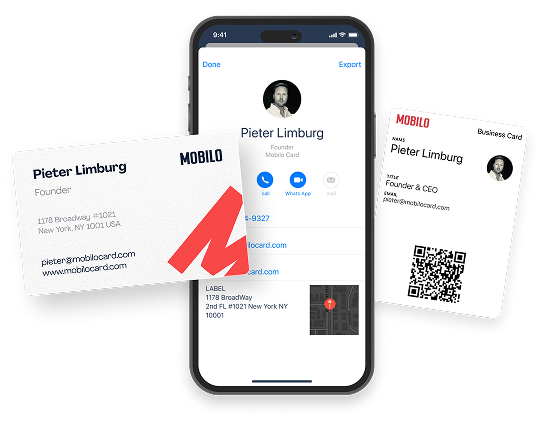
Book a Demo Today and Get your First 25 Cards Free (Worth $950)

Mobilo helps teams transform networking into a measurable pipeline.
Tap to:
- Exchange contact information
- Scan a QR code
- Share a link
The platform automatically:
- Captures contacts
- Enriches them with company and role data
- Scores prospects against your ideal customer profile
- Pushes everything into your CRM
Over 59,000 companies use Mobilo to increase lead capture and follow up at conferences and meetings.
How the Exchange and Enrichment Process Works
Mobilo uses NFC and QR triggers, allowing a single interaction to create a full lead record.
The system enriches raw contact data with:
- Firmographics
- Job title normalization
- Company size
- Public social profiles
Built-in lead scoring compares behavior and attributes to your ICP, allowing sales to see prioritized prospects first. It maps fields to your CRM in real time so reps never rekey details.
Why Paper Cards Lose Deals
Paper cards sit on tables or get stuffed into wallets and then forgotten. Sales teams waste hours typing contacts and correcting errors. With Mobilo, you capture information at the moment of contact and maintain audit trails, timestamps, and event context for every exchange, ensuring follow-up occurs while the meeting is still fresh.
Measure Lead Volume, Quality, and Time Saved
Teams report up to 10x more leads at events because every exchange becomes a trackable, actionable record. Lead quality improves through enrichment and scoring, and pipeline velocity increases when qualified contacts land directly in your CRM.
Book a demo today and get your first 25 cards free (worth $950). If 90% of business contacts never make it into your CRM, you cannot afford to keep using paper cards.
Best Fonts for Business Cards That Work with Digital Cards
Choose fonts that stay legible at small sizes and match your brand voice.
These fonts read well in compact layouts: clean sans-serif fonts like:
- Helvetica
- Arial
- Futura
- Roboto
- Open Sans
- Proxima Nova
- Lato
- Montserrat
Classic serif choices such as Garamond, Baskerville, Georgia, and Times New Roman work for formal brands.
Avoid tight script or ornate display fonts for contact lines. Consider using professional, modern, classic, and clean fonts when designing both print and digital cards.
Font Size, Spacing, and Hierarchy for Business Cards
Set a clear hierarchy: name first at 14 to 20 point depending on typeface, role, and company at 8 to 12 point, and contact details at 7.5 to 10 point to keep everything readable. Use letter spacing and kerning to improve clarity for smaller text. Maintain consistent leading so lines do not crowd. Test the readability of digital cards at the actual card size and on mobile screens.
Choosing Typefaces for Print and Digital Consistency
- Use the same type family across printed stock and your digital profile when possible.
- Pick typefaces that render well in both RGB for screens and CMYK for print.
- Prefer OpenType or TrueType fonts for print production and include web-safe fallbacks for digital sharing.
- Prepare SVG or PNG exports for avatars and card previews to ensure crisp text is displayed on different devices.
Printing Techniques, Production Specs, and Typography Limits
- Plan for 300 DPI and correct CMYK color profiles for print.
- Avoid ultra-thin strokes if you expect letterpress or embossing, since those techniques can fill in fine details.
- For letterpress, choose slightly heavier weights and allow for ink spread.
- For foil or metallic finishes, choose simple, bold letterforms that hold up in production.
Font Pairing Rules and Brand Guidelines for Events
- Limit yourself to two fonts to keep the design clean.
- Pair a neutral sans with a distinctive serif or a refined display for names, but keep contact details in the simpler face.
- Create a small brand guide that specifies font files, sizes, weights, and spacing rules for event teams so every rep uses consistent typography and messaging.
How Typography Affects Lead Perception and Trust
- Typeface choice signals professionalism and decision-making.
- Readability builds confidence during quick scans at exhibits and meetings.
- Use high contrast color for text against backgrounds.
- Match your logo treatment to the card typeface to ensure consistent brand recognition across printed and digital interactions.
Ready to Try Mobilo at Your Next Event
Want to see how this lowers friction and improves follow-up? Book a demonstration today and get your first 25 cards free (worth $950).
Join over 59,000 companies already using intelligent digital business cards that automatically exchange contact information, enrich lead data, score prospects against your ICP, and sync directly to your CRM.
Related Reading