
October 14, 2025
Mobilo Card Team
.svg)
.jpg)
Smart digital business card design aims to stop that friction, and CamCard Reviews often focus on scan accuracy, OCR quality, contact management, CRM sync, vCard export, and lead capture in mobile networking apps. Read on to quickly understand whether CamCard truly meets your business networking needs, and to discover a smarter, more reliable digital alternative that saves time and builds better connections.
To help with that, Mobilo's Digital Business Card gives you a clean, shareable profile that syncs with your phone and CRM, removes manual entry, and keeps contacts organized so you can follow up faster.
CamCard is a digital business card management app that helps professionals and teams scan, store, and organize physical business cards. The app captures contact details with OCR and places them in a centralized cloud-based repository. It aims to simplify contact management for sales reps, recruiters, event attendees, and office teams who collect cards at meetings, webinars, trade shows, and seminars.
CamCard uses optical character recognition to convert card text into editable contact records. It supports batch scanning, allowing you to process many cards in one session, and it stores contacts in a central cloud-based location.
The platform offers contact sharing and cloud synchronization across devices so teams stay aligned. These core functions target users who need reliable capture and easy access to contacts from multiple places and devices.
The app provides multi-device access, allowing managers and employees to view team contacts on mobile devices across different locations. Batch scanning speeds up data capture at events. Users can add meeting notes, including images and text, directly to e-cards, making context available to all team members.
CamCard includes a reminder system and bulk actions to update many records at once. Interaction tracking records touch points and activity so teams can follow up on opportunities. Users can add customizable fields to contacts to match internal processes. Alerts notify teams when contacts join a new company or receive a promotion, helping people time their outreach.
The app supports tagging so users can classify cards and search by tags or custom fields. Managers can locate and filter contacts across the team repository, and the interface offers tools for proofreading and cleaning OCR results. The deduplication feature merges repeated entries to reduce clutter in the database.
CamCard integrates with Salesforce CRM and supports exports to Google Contacts and Outlook Office 365. The Salesforce integration allows enterprises to scan cards and push contact data into CRM, enabling users to send emails directly to scanned contacts from the app. You also get options to export contacts to a phone and to generate professional email signatures from templates.
User feedback in CamCard reviews notes inconsistent auto-scanning accuracy. The OCR sometimes jumbles text such as company names and titles. The app includes an automated proofreading feature that corrects errors after scanning, typically within about five minutes, although this delay can feel long compared to faster alternatives. Automatic card detection and immediate prompts to save new contacts help keep the capture process practical.
The Enterprise Inquiry capability gives access to millions of company records, from basic details to shareholder information and credit assessments. This feature suits users who regularly research businesses, though it may feel intrusive to some career professionals.
CamCard’s deduplication helps resolve duplicate entries caused by repeated scans. Export options include Salesforce, Google Contacts, and Outlook Office 365. The app also offers an email signature generator with pre-made templates, which streamlines professional communication for teams.
Sales teams use CamCard at trade shows and client meetings to convert stacks of business cards into CRM contacts. Recruiters capture candidate details at career fairs and add interview notes to e-cards. Small business owners scan vendor cards and share contacts with staff across locations.
CamCard offers a free plan that covers up to 100 scans. Paid plans start at about $4.16 per month and scale up for higher volume and enterprise features. Pricing supports casual users as well as teams that need advanced CRM integration and company research tools.

Users and app store reviewers give CamCard mixed marks. Many praise the app for speeding up contact capture and keeping business cards organized in a cloud-synced contact list.
Experts note the same benefits but also call out weaknesses in OCR accuracy and recent shifts in pricing. Reviews often split along use case lines, like casual users value the convenience, while power users and reviewers who test at scale report frustrations with recognition errors and subscription limits.
Those integrations appear in many positive CamCard reviews and expert write-ups.
Optical character recognition often fails to read non-standard fonts, special characters, or specific languages. Reviewers report Turkish characters misread, Greek letters missed, and stylized fonts rendered as gibberish.
Users say clear names like MARIA sometimes become MARUi after scanning. Paid subscribers wrote they still had to edit 9 times out of 10. That level of error forces manual rework and reduces the time savings many expect from a business card scanner.
Long-time users reacted sharply when limits arrived. Accounts that once added many cards without extra cost now hit caps, such as 100 or 500 cards, and require a pro subscription to continue. Several reviewers feel the product changed the deal they paid for, saying previously purchased ad-free versions were later limited.
Customer service messages often provide a standard reply stating that free users are allowed 100 scans and pro users receive unlimited scans, which customers find unhelpful. That response pattern appears repeatedly in user complaints about account value and trust.
Users report some interface issues. Examples include a default profile card that cannot be deleted after being set by mistake, edit screens that freeze when correcting a batch of scans, and login verification links that loop back into the app, blocking access. These are not isolated comments, as similar problems frequently appear in app store reviews and forum threads, often at critical moments like onboarding or mass import.
Scanning accuracy and cloud sync reliability are the topics that come up most often. Positive CamCard reviews highlight quick capture, contact export, and CRM sync. Negative reviews cluster around unreliable OCR, subscription enforcement, and spotty customer support. Experts testing the app repeat those themes when they measure accuracy rates and integration ease.
Try the free version with a small batch of cards to test OCR on your card styles and languages, and back up exports to Excel or Outlook before migrating large lists. If you use CRM integration, verify the mapping and test a few contacts first.
Expect to correct many scanned fields manually if your cards use unusual fonts or special characters. If long-term cost matters, compare the pro subscription price against alternative business card scanner apps and contact management tools.
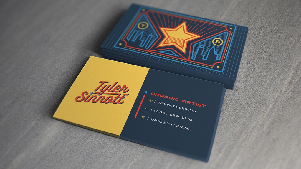
Set a clear type hierarchy by size. Use the largest point size for the company or personal name so it reads first. Put job title and taglines in a medium size. Place contact details smaller, but never below about 7.5 to 8 points for print on standard cardstock; many printers recommend 8 to 9 points as a practical minimum for legibility.
Always print a one-to-one mockup and read it from a normal holding distance to ensure these are clear:
Limit fonts to one or two families. Pick a primary font for name and headlines and a secondary font for contact details or body text. Use family variations like weight and italic rather than adding new typefaces.
This keeps your card cohesive and supports strong brand typography and type hierarchy without cluttering the layout.
Choose a font that reflects your business identity.
Ask yourself which emotion you want the card to convey and test a few options at the final size to see which aligns with your corporate identity.
Give content room to breathe. Maintain consistent margins and a generous safe zone so text never sits too close to the edge or the logo. Use line spacing that makes multi-line elements easy to scan; for contact blocks, set leading slightly above single spacing to improve readability.
White space guides the eye and increases perceived quality of the card.
Add thin rules to separate zones or to anchor the logo and contact block.
Keep lines simple:
Use alignment so lines tie visually to type elements. Avoid ornate or heavy decorations that compete with type; lines should clarify hierarchy and direct attention.
Match the tone and weight of type to the logo. If your logo is bold and heavy, use lighter weights to avoid fighting for dominance. If the mark is delicate, choose a sturdy companion typeface so the text reads at small sizes.
Place the logo and text on a verbal and visual grid so neither overshadows the other. Test the whole composition in grayscale to confirm balance without color cues.
To avoid awkward gaps, manually adjust kerning for:
Use tracking to tighten or loosen longer lines of text, but avoid extreme values that impair legibility. Set the line height so that stacked information, like address lines, reads without collision. Minor adjustments can improve readability and create a polished, professional finish.
To lead the viewer, use:
Balance clarity with hierarchy so every element earns its visual weight:
Ask which information must stand out and apply a stronger contrast there.
Choose fonts with good print rendering and avoid extreme display faces for small text. Convert type to outlines or embed fonts when sending print files to prevent substitution. Check the color mode for print in CMYK, and plan special finishes like foil or embossing, which can reduce legibility for wonderful strokes.
Allow for printer safe zones and bleed, and run a press proof when possible to confirm crisp type at the final size.
Consider these options by brand need and legibility:
Use scripts or decorative display fonts only for single, significant elements like a signature or accent word, and never for contact lines. Test each face at actual print size to confirm stroke thickness and counters hold up.
Pair a neutral sans with a modest serif for readable contrast. Use matching x heights or optical balance to keep pairs consistent. When pairing, let one family dominate and use the other sparingly.
Try one font for the name and one for contact details, or use a single family with two weights to simplify alignment and kerning.
Prioritize legibility for people with low vision by choosing open letterforms, avoiding condensed faces, and ensuring sufficient color contrast. Keep phone numbers and email addresses in plain, machine-readable layouts for mobile scanning.
Use simple separators like dots or vertical bars to break up lines so scanning apps and eyes find data quickly.
Which element will you test first on a printed proof?

Mobilo helps teams transform networking into a measurable pipeline.
Tap to:
The platform automatically:
Over 59,000 companies use Mobilo to increase lead capture and follow up at conferences and meetings.
Mobilo uses NFC and QR triggers, allowing a single interaction to create a full lead record.
The system enriches raw contact data with:
Built-in lead scoring compares behavior and attributes to your ICP, allowing sales to see prioritized prospects first. It maps fields to your CRM in real time so reps never rekey details.
Paper cards sit on tables or get stuffed into wallets and then forgotten. Sales teams waste hours typing contacts and correcting errors. With Mobilo, you capture information at the moment of contact and maintain audit trails, timestamps, and event context for every exchange, ensuring follow-up occurs while the meeting is still fresh.
Teams report up to 10x more leads at events because every exchange becomes a trackable, actionable record. Lead quality improves through enrichment and scoring, and pipeline velocity increases when qualified contacts land directly in your CRM.
Book a demo today and get your first 25 cards free (worth $950). If 90% of business contacts never make it into your CRM, you cannot afford to keep using paper cards.
Choose fonts that stay legible at small sizes and match your brand voice.
These fonts read well in compact layouts: clean sans-serif fonts like:
Classic serif choices such as Garamond, Baskerville, Georgia, and Times New Roman work for formal brands.
Avoid tight script or ornate display fonts for contact lines. Consider using professional, modern, classic, and clean fonts when designing both print and digital cards.
Set a clear hierarchy: name first at 14 to 20 point depending on typeface, role, and company at 8 to 12 point, and contact details at 7.5 to 10 point to keep everything readable. Use letter spacing and kerning to improve clarity for smaller text. Maintain consistent leading so lines do not crowd. Test the readability of digital cards at the actual card size and on mobile screens.
Want to see how this lowers friction and improves follow-up? Book a demonstration today and get your first 25 cards free (worth $950).
Join over 59,000 companies already using intelligent digital business cards that automatically exchange contact information, enrich lead data, score prospects against your ICP, and sync directly to your CRM.
Mobilo replaces the old mobile business card scanner model with a system designed for teams and events. CamCard reviews often highlight issues such as scan accuracy, duplicate contacts, limited team features, and clumsy cloud sync.
Mobilo uses smart NFC cards and digital profiles to share contact details instantly without relying on OCR or photos. It provides teams with unified admin controls, analytics, and direct CRM mapping to prevent contact loss and the manual work that CamCard users complain about.
Tap to connect. A Mobilo smart NFC business card sends a digital profile in a second, eliminating the need for camera capture, OCR mistakes, and slow manual correction. CamCard depends on scanning printed cards or images, and CamCard often reviews flags for recognition errors and layout problems.
Mobilo supports NFC tap, QR fallback, and share links, allowing users to exchange details on any phone without a scanning app. That reduces friction and keeps conversations moving.
Mobilo captures leads the moment a tap or scan happens and enriches the data with firmographic and intent signals. The system can append company size, role, and social profiles, then score the prospect against your ICP.
Many CamCard reviews note missing analytics and basic export features. With Mobilo, you can see which contacts are qualified, where they met your team, and how they interacted with your profile, allowing sales to follow up while the meeting is still fresh.
Sync contacts automatically to Salesforce, HubSpot, Microsoft Dynamics, Pipedrive, or through Zapier. Mobilo offers field mapping, two-way sync, and deduplication rules to stop the duplicates and stray entries that CamCard users often report in reviews.
Push lead events, custom fields, and meeting context into your CRM and trigger lead routing or workflows. That keeps marketing and sales aligned and removes the manual entry that delays follow-up.
Mobilo removes the recurring cost and waste of printed cards. Teams that switch to digital solutions reduce paper consumption and show corporate responsibility during events. A digital card also stays current; updates to a profile propagate instantly, so you never hand out an out-of-date business card again.
CamCard reviews list issues such as scan errors, app-only sharing, limited team management, poor cloud sync, and confusing subscription tiers. Mobilo removes the scan step entirely and gives a centralized admin portal for issuing, tracking, and revoking cards.
Real-time CRM sync avoids lost contacts and messy CSV exports. Built-in reporting shows event ROI and card performance, so teams stop guessing which interactions matter.
Mobilo focuses on minimal friction. Users tap, share a link, or scan a QR code, no training required. Admins brand templates, issue multiple card types, and set role-based access. For enterprise deployments, you get SSO, audit logs, and security controls.
CamCard reviews often mention a learning curve and inconsistent results across devices; Mobilo standardizes the experience across Android and iPhone and provides support for rollout.
Mobilo gives admins control over data retention, consent capture, and who can access enriched lead details. You control CRM mappings and retention policies. CamCard reviewers sometimes worry about cloud sync and data duplication. Mobilo applies role-based access, encryption, and clear audit trails so IT and legal teams can approve adoption quickly.
Join over 59,000 companies who've made the switch to intelligent digital business cards that automatically exchange contact information, enrich lead data, score prospects against your ICP, and sync directly to your CRM. Book a demo today and get your first 25 cards free (worth $950), because in a world where 90% of business contacts never make it into your CRM, you can't afford to keep using paper cards.
CamCard scanner issues, CamCard OCR accuracy, duplicate contacts in CamCard, CamCard cloud sync, CamCard app problems, CamCard pricing complaints, and CamCard contact management limits are addressed by Mobilo, which directly targets each of these pain points with tap-based sharing, enrichment, deduplication, enterprise sync, and transparent plans for teams.
Mobilo replaces manual scanning and fragmented workflows with contactless exchange, real-time leads, and full CRM integration, enabling sales and marketing to act on interactions, not paperwork. If your team wants faster follow-up, cleaner CRM data, and lower event costs, Mobilo delivers tools built for enterprise networking and measurable outcomes.
• Blinq vs Linq
• Vistaprint Digital Business Card
• Google Digital Business Card
• How to Create a Digital Business Card on Android
• HiHello Alternatives
• Popl Alternatives
Get your digital business card today.
